
You are currently browsing the category archive for the ‘reviews’ category.
In a Tablet Magazine article titled “How the Gaza Ministry of Health Fakes Casualty Numbers” posted on March 6, 2024, Professor of Statistics and Data Science Abraham Wyner from the Wharton School at the University of Pennsylvania argues that statistical analysis of the casualty numbers reported by the Gaza Ministry of Health is “highly suggestive that a process unconnected or loosely connected to reality was used to report the numbers”.
In the post, he shows the following plot

which he describes as revealing “an extremely regular increase in casualties over the period” and from which he concludes that “this regularity is almost surely not real.”
Wyner’s plot shows cumulative reported deaths over a period of 15 days from October 26, 2023 to November 10, 2023. The individual reported deaths per day are plotted below. These numbers have a mean of 270 and a standard deviation of 42.25:

The coefficient of determination for the points in this plot is R2 = 0.233. However, the coefficient of determination for the points shown in Wyner’s plot is R2 = 0.999. Why does the same data look “extremely regular” one way, and much less regular another way?
If we denote the deaths per day by 


In the plots above, the

The All of Us Research Program, whose mission is to “to accelerate health research and medical breakthroughs, enabling individualized prevention, treatment, and care for all of us”, recently published a flagship paper in Nature on “Genomic Data in the All of Us Research Program“. This is a review of Figure 2 from the paper (referred to below as AoURFig2).
Background
The first U.S. Census that commenced on August 2, 1790 included a record of the race of individuals. It used three categories: “free whites”, “all other free persons”, and “slaves”. Since that time, racial categories as defined for the U.S. Census have been a recurring controversial topic, with categories changing many times over the years. The category “Mulatto”, which was introduced in 1850, shockingly remained in place until 1930. Mulatto, which comes from the Spanish word for mule (the hybrid offspring of a horse and a donkey), was used for multiracial individuals of African and European descent. In the most recent decennial census in 2020, the race categories used were determined by the Office of Management and Budget (OMB) and were “White”, “Black or African American”, “American Indian or Alaska Native”, “Asian”, “Native Hawaiian” or “Other Pacific Islander”, and a sixth category “Some Other Race” for people who do not identify with any of the aforementioned five races. Separately, the 2020 census included standards for ethnicity which were first introduced in 1977 as part of OMB Directive No. 15. Two ethnicity categories were introduced: “Hispanic or Latino” and “Not Hispanic or Latino”. The OMB was specific that race and ethnicity are distinct concepts: an ethnically Hispanic or Latino person can be of any race.

While race and ethnicity are social constructs, ancestry is defined in terms of geography, genealogy, or genetics. The relationship between these three types of ancestry is complex, and can be nonintuitive. Graham Coop has a great series of blog posts illustrating the subtleties around the different types of ancestry. For example, in “How many genetic ancestors do I have?” he illustrates the distinction between the number of genetic vs. genealogical ancestors:

AoURFig2 utilizes the concept of genetic ancestry groups. These do not have a precise accepted definition, but analysis of how the term is used reveals that genetic ancestries labels such as “European” are based on genetic similarity between present day individuals. This is explained carefully and clearly in an important paper by Coop: Genetic similarity versus genetic ancestry groups in as sample descriptors in human genetics.
In AoURFig2 the ancestry groups used are “African”, “East Asian”, “South Asian”, “West Asian”, “European” and “American”. In their Methods section, the authors claim these are based on labels used for the Human Genome Diversity Project, and 1000 Genomes, which specifically they explain in the methods are: African, East Asian, European, Middle Eastern, Latino/admixed American and South Asian (in the figure legend they have renamed “Latino/admixed American” as “American” and “Middle Eastern” as “West Asian”). For each of these labels, obtained via self identified race and ethnicity by participants in the 1000 genomes project, the authors collated their genetic data to obtain genetic ancestry groups. Inherent in these groupings is an assumption of homogeneity, which is of course not true, because the individuals may vary in their genetics and their self identified race and ethnicity may be based on genealogy or geography, which could be at odds with their genetic relatedness to other individuals in their artificially constructed “genetic ancestry group”. Coop makes this point eloquently in his summarizing a key point of his paper:

In summary, there are three notions crucial to understanding AoURFig2: race, ethnicity, and genetic ancestry, each of which is distinct from the others. Individuals who self identify with a particular ethnicity, for example Hispanic or Latino, can self identify with any race. Individuals self identifying with a specific race, e.g. “Black or African American” can be genetically related to a different extent with the six groups of genetic ancestry, and a genetic ancestry group is neither a race nor an ethnicity, but rather a genetic average computed over a set of (mostly genetically similar but also somewhat arbitrarily defined) individuals.
AoURFig2 is shown below. In the following sections we discuss each of the panels in detail.

The figure legend
We begin with the figure legend, which lists Race, Ethnicity and Ancestry. Race and Ethnicity refer to the self identified race choices for participants (based on the OMB categories). Ancestry refers to the genetic ancestry groups discussed above. While these three concepts are distinct, the Ancestry colors are the same as some of the Race and Ethnicity colors:

This is problematic because the coloring suggests a 1-1 identification between certain races and ethnicities, and genetic ancestry groups. In reality, there is no such clear cut relationship, as shown in the admixture panels in AoURFig2 (more on this below). Ideally, the distinct nature of the concepts of race, ethnicity, and genetic ancestry, would be represented by distinct color palettes. The authors may have been confused on this point, because in the paper they write “Of the participants with genomic data in All of Us, 45.92% self-identified as a non-European race or ethnicity.” This makes no sense, because none of the race categories are “European”, and “European” is also not an ethnicity category. Therefore “non-European” does not make sense as either a race or ethnicity category. The authors seem to have assumed that White = European as indicated by their color scheme, and therefore “non-European race” is non-“White”. But by that logic “Hispanic or Latino” = “American” would mean that “Hispanic or Latino” is not “European” which implies that “Hispanic or Latino” is not White, contradicting the specific definition of race and ethnicity categories by the OMB. An individual’s ethnic self identification is independent of their race self identification, and someone may self identify as White and Hispanic or Latino. Clearly the authors would benefit from reading the NASEM report on the use of population descriptors in genetics and genomics research and the NIH style guide on race and national origin.
The ancestry analysis
Panel c) of AoURFig2 presents an ancestry analysis consisting of running a program called Rye on to assign, to each individual, a fraction of each of the genetic ancestry groups. The panel with its subfigures is shown below:

There are several problems with this figure. First, it has no x- or y- axes. The caption describes it as showing “Proportion of genetic ancestry per individual in six distinct and coherent ancestry groups defined by Human Genome Diversity Project and 1000 Genomes samples” from which it can be inferred that each row in each panel corresponds to an individual, and the horizontal axis divides an interval (width of the plot) into proportions of the six ancestry groups. In principle the panels could be in the transpose, with columns corresponding to individuals, but a clue that this is not the case is, for example, the ancestry assignment for Black or African American individuals, presumably none of which turn out to have an assignment 100% to European. That’s just a guess though. It’s best to label axes.
A second problem with the figure is that the height of each panel is the same, thereby not reflecting the number of individuals of each self-reported race and ethnicity. For instance, there are only 237 Native Hawaiian or Other Pacific Islander individuals versus 125,843 Whites. The numbers are there, but the height of the panels suggest otherwise. Below is a bar plot showing the number of people self identifying with each race in the data used for panel c) of AoURFig2:

The All of Us Research Program (henceforth referred to as All of Us) lists as a Diversity and Inclusion goal: “Health care is more effective when people from all backgrounds are part of health research. All of Us is committed to recruiting a diverse participant pool that includes members of groups that have been left out of research in the past.” That is an admirable goal, and while All of Us is to be commended on the relatively large number of self identifying Black or African American participants recruited in comparison to previous cohorts, it’s worth noting that in this analysis White still wins (by a lot).
A third problem with the figure is the placement of the “Hispanic or Latino” ethnicity in the middle of panels assigning ancestry groups to individuals by race. As discussed previously, self identification of ethnicity is orthogonal to race. There is therefore ambiguity in the figure, namely it is unclear whether some of the individuals represented in the Hispanic or Latino plot appear in other panels corresponding to race. The juxtaposition of an ethnicity category with race categories also muddles the distinction between the two.
The ancestry analysis is based on a program called Rye, which was published in Conley et al., 2023. The point of Rye is runtime performance: unlike previous tools, the software scales to UK Biobank sized projects. Indeed, it’s runtime performance is impressive when compared to the standard in the field, the program ADMIXTURE:

However, while Rye is faster than ADMIXTURE, its results differ considerably from those of ADMIXTURE, as shown in Supplementary Figure S5 of the paper:

I haven’t benchmarked these programs myself, but geneticists have some experience with ADMIXTURE which was published in 2009 and has been cited more than 7,000 times. The Rye program, from two groups associated with All of Us, has been cited twice (both times by the authors of Rye who are members of the All of Us consortium; one of the two citations is the paper being discussed here). Of course, one shouldn’t judge the quality of a paper by the number of citations. A paper cited twice could be describing a method superior to a paper cited more than 7,000 times. But I was discomfited by the repeated appearance of a p-value = 0 in the paper (see below for one example among many). It reminded me of pondering p-values before breakfast.

Also R2 is the wrong measure here. The correct assessment is to examine the concordance correlation coefficient. Finally, and importantly, the Rye paper describes results based on inference not with the high-dimensional datatypes but rather a projection to the first 20 principal components. Notably the All of Us paper, and in particular the results reported in AoURFig2, use 16 principal components. There is no justification provided for the use of 16 principal components, no description of how results may differ when using 20 principal components, nor is there a general analysis describing robustness of results to this parameter.
In any case, setting aside feelings of being left Rye and dry and taking the admixture results at face value, it is evident that individuals self reporting ethnicity as “Hispanic or Latino” are highly admixed between European and American (the latter label meaning Latino/Admixed American). This stands in contrast to the coloring scheme chosen, with Hispanic or Latino colored purely “American” implying individuals self identifying with that ethnicity are not European. It also is at odds with the UMAP displays in panels a) and b) of AoURFig2.
UMAP nonsense
The AoURFig2 presents two UMAP figures, shown below. The UMAP is the same in both figures; in the top subplot (a) it is colored by race, and in the bottom subplot (b) it is colored by ethnicity.

The first thing to note about this plot is that it has axes when it shouldn’t. There is no meaning to UMAP 1 and UMAP 2, and the tick marks (-20, -10, 0, 10, 20) on the y axis and (-10, 0, 10, 20) on the x-axis are meaningless because UMAP arbitrarily distorts distances. Somehow the authors managed to put axes on plots which shouldn’t have them, and omitted axes on plots that should. Furthermore, by virtue of plotting points by color resulting in an overlay of one color over another, it’s difficult to see mixture of colors where it exists. This can be very misleading as to the nature of the data.
More concerning than the axes (which really just show that the authors don’t understand UMAP), are the plots themselves. The UMAP transform distorts distances, and in particular, as a result of this distortion, is terrible at representing admixture. The following illustrative example was constructed by Sasha Gusev:

But one doesn’t have to examine simulations to see the issue. This problem is evident in panel c) of AoURFig2. Consider, for example, the Hispanic or Latino ancestry assignments shown below:

The admixture stands in start contrast to the UMAP in b), which suggests that the Hispanic or Latino ethnicity is almost completely disjoint from European (which the authors identify with White via the color scheme). This shows that UMAP can and does collapse admixed individuals onto populations, while creating a hallucination of separation where it doesn’t exist.
I recently published a paper with Tara Chari on UMAP titled “The specious art of single-cell genomics“. It methodically examines UMAP and shows that the transform distorts distances, local structure (via different definitions), and global structure (again via several definitions). There is no theory associated to the UMAP method. No guarantees of performance of any kind. No understanding of what it is doing, or why. Our paper is one of several demonstrating these shortcomings of the UMAP heuristic (Wang, Sontag and Lauffenberger, 2023). It is therefore unclear to me why the All of Us consortium chose to use UMAP, especially considering that they (in particular one of the authors of Rye and a member of the All of Us consortium) were warned of the shortcomings of UMAP a year ago.
Scientific racism
The misuse of the concepts of race, ethnicity and genetic ancestry, and the misrepresentation of genetic data to create a false narrative, is a serious matter. I say this because such misrepresentations have been linked to terror. The Buffalo terrorist who murdered 10 black people in a racist rampage in 2022 wrote that

Included in his manifesto, from which this text is excerpted, was the following figure:

This plot is eerily similar to one made by Razib Khan, in which he used the term “Quadroon-Jews” (Khan’s figure was published in the Unz Review, which is a website published by far-right activist and holocaust denier Ron Unz). The term “Quadroon” appeared in the 1890 U.S. Census as a refinement of “Mulatto” (see the first at the top of the post).

These plots show the projection of genotypes to two dimensions via principal component analysis (PCA), a procedure that unlike UMAP provides an image that is interpretable. The two-dimensional PCA projections maximize the retained variance in the data. However PCA, and its associated interpretability, is not a panacea. While theory provides an understanding of the PCA projection, and therefore the limitations of interpretability of the projection, the potential for misuse makes it imperative to include with such plots the rationale for showing them, and appropriate caveats. One of the main reasons not to use UMAP is that it is impossible to explain what the heuristic transform achieves and what it doesn’t, since there is no understanding of the properties of the transform, only empirical evidence that it can and does routinely fail to achieve what it claims to do.
The pseudoscientific belief that humans can be genetically separated into distinct racial groups is part of scientific racism. Such pseudoscience, and its spawn of racist policy, has roots in many places, but it must be acknowledged that some of them are in academia. A few years ago I wrote about the depravity of James Watson’s scientific racism, but while his (scientific) racism has been publicly documented due to his fame, scientific racism is omnipresent and frequently overlooked. The ideas that the Buffalo terrorist and that Watson promulgated are reinforced by sloppy use of terms such as “race” and “ethnicity” in academia, along with misrepresentations of the genetic similarity between individuals. Many of the concepts in population genetics today are problematic. Coop’s eloquent critique of genetic ancestry groups is but one example. The concept of admixture is also rooted in racism and relies on unscientific notions of purity. With this in mind, I believe it is insufficient to merely relegate AoURFig2 to Karl Broman’s list of worst graphs. The numerous implications of AoURFig2, among them the authors’ claim that individuals identifying ethnically as Hispanic or Latino are genetically not European and therefore not racially White (see section on ancestry analysis above for an explanation of why this is incorrect), are scientific racism. The All of Us authors should therefore immediately post a correction to AoURFig2 that includes a clarification of its purpose, and corrections to the text so the paper properly utilizes terms such as race, ethnicity and ancestry. All of us need to work harder to sharpen the rigor in human genetics, and to develop sound ways to interpret and represent genetic data.
Acknowledgment
This idea for this post arose during a DEI meeting of my research group organized by Nikhila Swarna on February 21, 2024, during which Delaney Sullivan presented the All of Us Resarch “Genomic Data in the All of Us Research Program” paper and discussed scientific racism issues with AoURFig2.
The widespread establishment of statistics departments in the United States during the mid-20th century can be traced to a presentation by Harold Hotelling in the Berkeley Symposium on Mathematical Statistics and Probability in 1945. The symposium, organized by Berkeley statistician Jerzy Neyman, was the first of six such symposia that took place every five years, and became the most influential meetings in statistics of their time. Hotelling’s lecture on “The place of statistics in the university” inspired the creation of several statistics departments, and at UC Berkeley, Neyman’s establishment of the statistics department in the 1950s was a landmark moment for statistics in the 20th century.
Neyman was hired in the mathematics department at UC Berkeley by a visionary chair, Griffith Evans, who transformed the UC Berkeley math department into a world-class institution after his hiring in 1934. Evans’ vision for the Berkeley math department included statistics, and Eric Lehmann‘s history of the UC Berkeley statistics department details how Evans’ commitment to diverse areas in the department led him to hire Neyman without even meeting him. However, Evans’ progressive vision for mathematics was not shared by all of his colleagues, and the conservative, parochial attitudes of the math department contributed to Neyman’s breakaway and eventual founding of the statistics department. This dynamic was later repeated at universities across the United States, resulting in a large gulf between mathematicians and statistics (ironically history may be repeating itself with some now suggesting that the emergence of “data science” is a result of conservatism among statisticians leading them to cling to theory rather than to care about data).
The divide between mathematicians and statistics is unfortunate for a number of reasons, one of them being that statistical literacy is important even for the purest of the pure mathematicians. A recent debate on the appropriateness of diversity statements for job applicants in mathematics highlights the need: analysis of data, specifically data on who is in the maths community, and their opinions on the issue, turns out to be central to understanding the matter at hand. Case in point is a recent preprint by two mathematicians:
Joshua Paik and Igor Rivin, Data Analysis of the Responses to Professor Abigail Thompson’s Statement on Mandatory Diversity Statements, arXiv, 2020.
This statistics preprint examines attempts to identify the defining attributes of mathematicians who signed recent letters related to diversity statement requirements in mathematics job searches. I was recently asked to provide feedback on the manuscript, ergo this blog post.
Reproducibility
In order to assess the results of any preprint or paper, it is essential, as a first step, to be able to reproduce the analysis and results. In the case of a preprint such as this one, this means having access to the code and data used to produce the figures and to perform the calculations. I applaud the authors for being fully transparent and making available all of their code and data in a Github repository in a form that made it easy to reproduce all of their results; indeed I was able to do so without any problems. 👏
The dataset
The preprint analyzes data on signatories of three letters submitted in response to an opinion piece on diversity statement requirements for job applicants published by Abigail Thompson, chair of the mathematics department at UC Davis. Thompson’s letter compared diversity statement requirements of job applicants to loyalty oaths required during McCarthyism. The response letters range from strong affirmation of Thompson’s opinions, to strong refutation of them. Signatories of “Letter A”, titled “The math community values a commitment to diversity“, “strongly disagreed with the sentiments and arguments of Dr. Thompson’s editorial” and are critical of the AMS for publishing her editorial.” Signatories of “Letter B”, titled “Letter to the editor“, worry about “direct attempt[s] to destroy Thompson’s career and attempt[s] to intimidate the AMS”. Signatories of “Letter C”, titled “Letter to the Notices of the AMS“, write that they “applaud Abigail Thompson for her courageous leadership [in publishing her editorial]” and “agree wholeheartedly with her sentiments.”
The dataset analyzed by Paik and Rivin combines information scraped from Google Scholar and MathSciNet with data associated to the signatories that was collated by Chad Topaz. The dataset is available in .csv format here.
The Paik and Rivin result
The main result of Paik and Rivin is summarized in the first paragraph of their Conclusion and Discussion section:
“We see the following patterns amongst the “established” mathematicians who signed the three letters: the citations numbers distribution of the signers of Letter A is similar to that of a mid-level mathematics department (such as, say, Temple University), the citations metrics of Letter B are closer to that of a top 20 department such as Rutgers University, while the citations metrics of the signers of Letter C are another tier higher, and are more akin to the distribution of metrics for a truly top department.”
A figure from their preprint summarizing the data supposedly supporting their result, is reproduced below (with the dotted blue line shifted slightly to the right after the bug fix):

Paik and Rivin go a step further, using citation counts and h-indices as proxies for “merit in the judgement of the community.” That is to say, Paik and Rivin claim that mathematicians who signed letter A, i.e. those who strongly disagreed with Thompson’s equivalence between diversity statements and McCarthy’s loyalty oaths, have less “merit in the judgement of the community” than mathematicians who signed letter C, i.e. those who agreed wholeheartedly with her sentiments.
The differential is indeed very large. Paik and Rivin find that the mean number of citations for signers of Letter A is 2397.75, the mean number of citations for signers of Letter B is 4434.89, and the mean number of citations for signers of Letter C is 6226.816. To control for an association between seniority and number of citations, the computed averages are based only on citation counts of full professors. [Note: a bug in the Paik-Rivin code results in an error in their reporting for the mean for group B. They report 4136.432 whereas the number is actually 4434.89.]
This data seems to support Paik and Rivin’s thesis that mathematicians who support the use of diversty statements in hiring and who strongly disagree with Thompson’s analogy of such statements to McCarthy’s loyalty oaths, are second rate mathematicians, whereas those who agree wholeheartedly with Thompson are on par with professors at “truly top departments”.
But do the data really support this conclusion?
A fool’s errand
Before delving into the details of the data Paik and Rivin analyzed, it is worthwhile to pause and consider the validity of using citations counts and h-indices as proxies for “merit in the judgement of the community”. The authors themselves note that “citations and h-indices do not impose a total order on the quality of a mathematician” and emphasize that “it is quite obvious that, unlike in competitive swimming, imposing such an order is a fool’s errand.” Yet they proceed to discount their own advice, and wholeheartedly embark on the fool’s errand they warn against. 🤔
I examined the mathematicians in their dataset and first, as a sanity check, confirmed that I am one of them (I signed one of the letters). I then looked at the associated citation counts and noticed that out of 1435 mathematicians who signed the letters, I had the second highest number of citations according to Google Scholar (67,694), second only to Terence Tao (71,530). We are in the 99.9th percentile. 👏 Moreover, I have 27 times more citations than Igor Rivin. According to Paik and Rivin this implies that I have 27 times more merit in the judgement of our peers. I should say at least 27 times, because one might imagine that the judgement of the community is non-linear in the number of citations. Even if one discounts such quantitative comparisons (Paik and Rivin do note that Stephen Smale has fewer citations than Terence Tao, and that it would be difficult on that basis alone to conclude that Tao is the better mathematician), the preprint makes use of citation counts to assess “merit in the judgement of the community”, and thus according to Paik and Rivin my opinions have substantial merit. In fact, according to them, my opinion on diversity statements must be an extremely meritorious one. I imagine they would posit that my opinion on the debate that is raging in the math community regarding diversity statement requirements from job applicants is the correct, and definitive one. Now I can already foresee protestations that, for example, my article on “Transcript assembly and quantification by RNA-Seq reveals unannotated transcripts and isoform switching during cell differentiation” which has 9,438 citations is not math per se, and that it shouldn’t count. I’ll note that my biology colleagues, after reading the supplement, think it’s a math paper, but in any case, if we are going to head down that route shouldn’t Paik and Rivin read the paper to be sure? And shouldn’t they read every paper of mine, and every paper of every signatory to determine it is valid for their analysis? And shouldn’t they adjust the citation counts of every signatory? Well they didn’t do any of that, and besides, they included me in their analysis so… I proceed…
The citation numbers above are based on Google Scholar citations. Paik and Rivin also analyze MathSciNet citations and state that they prefer them because “only published mathematics are in MathSciNet, and is hence a higher quality data source when comparing mathematicians.” I checked the relationship between Scholar and MathSciNet citations and found that, not surprisingly, they have a correlation of 0.92:

I’d say they are therefore interchangeable in terms of the authors’ use of them as a proxy for “merit”.
But citations are not proxies for merit. The entire premise of the preprint is ridiculous. Furthermore, even if it was true that citations were a meaningful attribute of the signatories to analyze, there are many other serious problems with the preprint.
The elephant not in the room
Paik and Rivin begin their preprint with a cursory examination of the data and immediately identify a potential problem… missing data. How much data is missing? 64.11% of individuals do not have associated Google Scholar citation data, and 78.82% don’t have MathSciNet citation data. Paik and Rivin brush this issue aside remarking that “while this is not optimal, a quick sample size calculation shows that one needs 303 samples or 21% of the data to produce statistics at a 95% confidence level and a 5% confidence interval.” They are apparently unaware of the need for uniform population sampling, and don’t appear to even think for a second of the possible ascertainment biases in their data. I thought for a second.
For instance, I wondered whether there might be a discrepancy between the number of citations of women with Google Scholar pages vs. women without such pages. This is because I’ve noticed anecdotally that several senior women mathematicians I know don’t have Google Scholar pages, and since senior scientists presumably have more citations this could create a problematic ascertainment bias. I checked and there is, as expected, some correlation between age post-Ph.D. and citation count (cor = 0.36):

To test whether there is an association between presence of a Google Scholar page and citation number I examined the average number of MathSciNet citations of women with and without Google Scholar pages. Indeed, the average number of citations of women without Google Scholar pages is much lower than those with a Google Scholar page (898 vs. 621). For men the difference is much smaller (1816 vs. 1801). By the way, the difference in citation number between men and women is itself large, and can be explained by a number of differences starting with the fact that the women represented in the database have much lower age post-Ph.D. than the men (17.6 vs. 26.3), and therefore fewer citations (see correlation between age and citations above).
The analysis above suggests that perhaps one should use MathSciNet citation counts instead of Google Scholar. However the extent of missing data for that attribute is highly problematic (78.82% missing values). For one thing, my own MathSciNet citation counts are missing, so there were probably bugs in the scraping. The numbers are also tiny. There are only 46 women with MathSciNet data among all three letter signatories out of 452 women signatories. I believe the data is unreliable. In fact, even my ascertainment bias analysis above is problematic due to the small number of individuals involved. It would be completely appropriate at this point to accept that the data is not of sufficient quality for even rudimentary analysis. Yet the authors continued.
A big word
Confounder is a big word for a variable that influences both the dependent and independent variable in an analysis, thus causing a spurious association. The word does not appear in Paik and Rivin’s manuscript, which is unfortunate because it is in fact a confounder that explains their main “result”. This confounder is age. I’ve already shown the strong relationship between age post-Ph.D. and citation count in a figure above. Paik and Rivin examine the age distribution of the different letter signatories and find distinct differences. The figure below is reproduced from their preprint:

The differences are stark: the mean time since PhD completion of signers of Letter A is 14.64 years, the mean time since PhD completion of signers of Letter B is 27.76 years and the the mean time since PhD completion of signers of Letter C is 35.48 years. Presumably to control for this association, Paik and Rivin restricted the citation count computations to full professors. As it turns out, this restriction alone does not control for age.
The figure below shows the number of citations of letter C signatories who are full professors as a function of their age:

The red line at 36 years post-Ph.D. divides two distinct regimes. The large jump at that time (corresponding to chronological age ~60) is not surprising: senior professors in mathematics are more famous and have more influence than their junior peers, and their work has had more time to be understood and appreciated. In mathematics results can take many years before they are understood and integrated into mainstream mathematics. These are just hypotheses, but the exact reason for this effect is not important for the Paik-Rivin analysis. What matters is that there are almost no full professors among Letter A signers who are more than 36 years post-Ph.D. In fact, the number of such individuals (filtered for those who have published at least 1 article), is 2. Two individuals. That’s it.
Restricting the analysis to full professors less than 36 years post-Ph.D. tells a completely different story to the one Paik and Rivin peddle. The average number of citations of full professors who signed letter A (2922.72) is higher than the average number of citations of full professors who signed letter C (2348.85). Signers of letter B have 3148.83 citations on average. The figure for this analysis is shown below:

The main conclusion of Paik and Rivin, that signers of letters A have less merit than signers of letter B, who in turn have less merit than signers of letter C can be seen to be complete rubbish. What the data reveal is simply that the signers of letter A are younger than the signers of the other two letters.
Note: I have performed my analysis in a Google Colab notebook accessible via the link. It allows for full reproducibility of the figures and numbers in this post, and facilitates easy exploration of the data. Of course there’s nothing to explore. Use of citations as a proxy for merit is a fool’s errand.
Miscellania
There are numerous other technical problems with the preprint. The authors claim to have performed “a control” (they didn’t). Several p-values are computed and reported without any multiple testing correction. Parametric approximations for the citation data are examined, but then ignored. Moreover, appropriate zero-inflated count distributions for such data are never considered (see e.g. Yong-Gil et al. 2007). The results presented are all univariate (e.g. histograms of one data type)- there is not a single scatterplot in the preprint! This suggests that the authors are unaware of the field of multivariate statistics. Considering all of this, I encourage the authors to enroll in an introductory statistics class.
The Russians
In a strange final paragraph of the Conclusion and Discussion section of their preprint, Paik and Rivin speculate on why mathematicians from communist countries are not represented among the signers of letter A. They present hypotheses without any data to back up their claims.
The insistence that some mathematicians, e.g. Mikhail Gromov who signed letters B and C and is a full member at IHES and professor at NYU, are not part of the “power elite” of mathematics is just ridiculous. Furthermore, characterizing someone like Gromov, who arrived in the US from Russia to an arranged job at SUNY Stonybrook (thanks to Tony Phillips) as being a member of a group who “arrived at the US with nothing but the shirts on their backs” is bizarre.
Diversity matters
I find the current debate in the mathematics community surrounding Prof. Thompson’s letter very frustrating. The comparison of diversity statements to McCarthy’s loyalty oaths is ridiculous. Instead of debating such nonsense, mathematicians need to think long and hard about how to change the culture in their departments, a culture that has led to appallingly few under-represented minorities and women in the field. Under-represented minorities and women routinely face discrimination and worse. This is completely unacceptable.
The preprint by Paik and Rivin is a cynical attempt to use the Thompson kerfuffle to advertise the tired trope of the second-rate mathematician being the one to advocate for greater diversity in mathematics. It’s a sad refrain that has a long history in mathematics. But perhaps it’s not surprising. The colleagues of Jerzy Neyman in his mathematics department could not even stomach a statistician, let alone a woman, let alone a person from an under-represented minority group. However I’m optimistic reading the list of signatories of letter A. Many of my mathematical heroes are among them. The future is theirs, and they are right.
This post is a review of a recent preprint on an approach to testing for RNA-seq gene differential expression directly from transcript compatibility counts:
Marek Cmero, Nadia M Davidson and Alicia Oshlack, Fast and accurate differential transcript usage by testing equivalence class counts, bioRxiv 2018.
To understand the preprint two definitions are important. The first is of gene differential expression, which I wrote about in a previous blog post and is best understood, I think, with the following figure (reproduced from Supplementary Figure 1 of Ntranos, Yi, et al., 2018):

In this figure, two isoforms of a hypothetical gene are called primary and secondary, and two conditions in a hypothetical experiment are called “A” and “B”. The black dots labeled conditions A and B have x-coordinates 


The Cmero et al. preprint describes a method for testing for GDE, and the method is based on comparison of equivalence classes of reads between conditions. There is a natural equivalence relation 


In previous work (Ntranos et al. 2016) we introduced the term transcript compatibility counts to denote the cardinality of the (read) equivalence classes. We thought about this name carefully; due to the abuse of notation inherent in the term “equivalence class” in RNA-seq, we felt that using “equivalence class counts” would be confusing as it would be unclear whether it refers to the cardinalities of the (read) equivalence classes or the (transcript) “equivalence classes”.
With these definitions at hand, the Cmero et al.’s preprint can be understood to describe a method for identifying GDE between conditions by directly comparing transcript compatibility counts. The Cmero et al. method is to perform Šidák aggregation of p-values for equivalence classes, where the p-values are computed by comparing transcript compatibility counts for each equivalence class with the program DEXSeq (Anders et al. 2012). A different method that also identifies GDE by directly comparing transcript compatibility counts was previously published by my student Lynn Yi in Yi et al. 2018. I was curious to see how the Yi et al. method, which is based on Lancaster aggregation of p-values computed from transcript compatibility counts compares to the Cmero et al. method. Fortunately it was really easy to find out because Cmero et al. released code with their paper that can be used to make all of their figures.
I would like to note how much fun it is to reproduce someone else’s work. It is extremely empowering to know that all the methods of a paper are pliable at the press of a button. Below is the first results figure, Figure 2, from Cmero et al.’s paper:

Below is the same figure reproduced independently using their code (and downloading the relevant data):

It’s beautiful to see not only apples-to-apples, but the exact same apple! Reproducibility is obviously important to facilitate transparency in papers and to ensure correctness, but its real value lies in the fact that it allows for modifying and experimenting with methods in a paper. Below is the second results figure, Figure 3, from Cmero et al.’s paper:

The figure below is the reproduction, but with an added analysis in Figure 3a, namely the method of Yi et al. 2018 included (shown in orange as “Lancaster_equivalence_class”).

The additional code required for the extra analysis is just a few lines and can be downloaded from the Bits of DNA Github repository:
library(aggregation)
library(dplyr)
dm_dexseq_results <- as.data.frame(DEXSeqResults(dm_ec_results$dexseq_object))
dm_lancaster_results <- dm_dexseq_results %>% group_by(groupID) %>% summarize(pval = lancaster(pvalue, log(exonBaseMean)))
dm_lancaster_results$gene_FDR <- p.adjust(dm_lancaster_results$pval, ‘BH’)
dm_lancaster_results <- data.frame(gene = dm_lancaster_results$groupID,
FDR = dm_lancaster_results$gene_FDR)
hs_dexseq_results <- as.data.frame(DEXSeqResults(hs_ec_results$dexseq_object))
hs_lancaster_results <- hs_dexseq_results %>% group_by(groupID) %>% summarize(pval = lancaster(pvalue, log(exonBaseMean)))
hs_lancaster_results$gene_FDR <- p.adjust(hs_lancaster_results$pval, ‘BH’)
hs_lancaster_results <- data.frame(gene = hs_lancaster_results$groupID,
FDR = hs_lancaster_results$gene_FDR)
A zoom-in of Figure 3a below shows that the improvement of Yi et al.’s method in the hsapiens dataset over the method of Cmero et al. is as large as the improvement of aggregation (of any sort) over GDE based on transcript quantifications. Importantly, this is a true apples-to-apples comparison because Yi et al.’s method is being tested on exactly the data and with exactly the metrics that Cmero et al. chose:

The improvement is not surprising; an extensive comparison of Lancaster aggregation with Šidák aggregation is detailed in Yi et al. and there we noted that while Šidák aggregation performs well when transcripts are perturbed independently, it performs very poorly in the more common case of correlated effect. Furthermore, we also examined in detail DEXSeq’s aggregation (perGeneQvalue) which appears to be an attempt to perform Šidák aggregation but is not quite right, in a sense we explain in detail in Section 2 of the Yi et al. supplement. While DEXSeq’s implementation of Šidák aggregation does control the FDR, it will tend to report genes with many isoforms and consumes the “FDR budget” faster than Šidák aggregation. This is one reason why, for the purpose of comparing Lancaster and Šidák aggregation in Yi et al. 2018, we did not rely on DEXSeq’s implementation of Šidák aggregation. Needless to say, separately from this issue, as mentioned above we found that Lancaster aggregation substantially outperforms Šidák aggregation.
The figures below complete the reproduction of the results of Cmero et al. The reproduced figures are are very similar to Cmero et al.’s figures but not identical. The difference is likely due to the fact that the Cmero paper states that a full comparison of the “Bottomly data” (on which these results are based) is a comparison of 10 vs. 10 samples. The reproduced results are based on downloading the data which consists of 10 vs. 11 samples for a total of 21 samples (this is confirmed in the Bottomly et al. paper which states that they “generated single end RNA-Seq reads from 10 B6 and 11 D2 mice.”) I also noticed one other small difference in the Drosophila analysis shown in Figure 3a where one of the methods is different for reasons I don’t understand. As for the supplement, the Cmero et al. figures are shown on the left hand side below, and to their right are the reproduced figures:


The final supplementary figure is a comparison of kallisto to Salmon: the Cmero et al. paper shows that Salmon results are consistent with kallisto results shown in Figure 3a, and reproduces the claim I made in a previous blog post, namely that Salmon results are near identical to kallisto:

The final paragraph in the discussion of Cmero et al. states that “[transcript compatibility counts] have the potential to be useful in a range of other expression analysis. In particular [transcript compatibility counts] could be used as the initial unit of measurement for many other types of analysis such as dimension reduction visualizations, clustering and differential expression.” In fact, transcript compatibility counts have already been used for all these applications and have been shown to have numerous advantages. See the papers:
- Ntranos et al. 2016: Demonstrates advantages of clustering single-cell RNA-seq data directly with transcript compatibility counts rather than gene counts.
- Yi et al. 2018: Shows how to perform gene differential expression directly from transcript compatibility counts for bulk RNA-seq data.
- Ntranos, Yi, et al., 2018: Shows that logistic regression with transcript compatibility counts is a powerful approach to gene differential expression from single-cell RNA-seq data.
- Melsted et al. 2018: A new file format for single-cell RNA-seq based on equivalence classes that facilitates fast and accurate processing of single-cell RNA-seq data. This allows for very fast calculation of transcript compatibility counts for the applications above.
Many of these papers were summarized in a talk I gave at Cold Spring Harbor in 2017 on “Post-Procrustean Bioinformatics”, where I emphasized that instead of fitting methods to the predominant data types (in the case of RNA-seq, gene counts), one should work with data types that can support powerful analysis methods (in the case of RNA-seq, transcript compatibility counts).
Three years ago, when my coauthors (Páll Melsted, Nicolas Bray, Harold Pimentel) and I published the “kallisto paper” on the arXiv (later Bray et al. “Near-optimal probabilistic RNA-seq quantification“, 2016), we claimed that kallisto removed a major computational bottleneck from RNA-seq analysis by virtue of being two orders of magnitude faster than other state-of-the-art quantification methods of the time, without compromising accuracy. With kallisto, computations that previously took days, could be performed as accurately in minutes. Even though the speedup was significant, its relevance was immediately questioned. Critics noted that experiments, library preparations and sequencing take at least months, if not years, and questioned the relevance of a speedup that would save only days.
One rebuttal we made to this legitimate point was that kallisto would be useful not only for rapid analysis of individual datasets, but that it would enable analyses at previously unimaginable scales. To make our point concrete, in a follow-up paper (Pimentel et al., “The Lair: a resource for exploratory analysis of published RNA-seq data”, 2016) we described a semi-automated framework for analysis of archived RNA-seq data that was possible thanks to the speed and accuracy of kallisto, and we articulated a vision for “holistic analysis of [short read archive] SRA data” that would facilitate “comparison of results across studies [by] use of the same tools to process diverse datasets.” A major challenge in realizing this vision was that although kallisto was fast enough to allow for low cost processing of all the RNA-seq in the short read archive (e.g. shortly after we published kallisto, Vivian et al., 2017 showed that kallisto reduced the cost of processing per sample from $1.30 to $0.19, and Tatlow and Piccolo, 2016 achieved $0.09 per sample with it), an analysis of experiments consists of much more than just quantification. In Pimentel et al. 2016 we struggled with how to wrangle metadata of experiments (subsequently an entire paper was written by Bernstein et al. 2017 just on this problem), how to enable users to dynamically test distinct hypotheses for studies, and how to link results to existing databases and resources. As a result, Pimentel et al. 2016 was more of a proof-of-principle than a complete resource; ultimately we were able to set up analysis of only a few dozen datasets.
Now, the group of Avi Ma’ayan at the Icahn School of Medicine at Mount Sinai has surmounted the many challenges that must be overcome to enable automated analysis of RNA-seq projects on the short read archive, and has published a tool called BioJupies (Torre et al. 2018). To assess BioJupies I began by conducting a positive control in the form of analysis of data from the “Cuffdiff2” paper, Trapnell et al. 2013. The data is archived as GSE37704. This is the dataset I used to initially test the methods of Pimentel et al. 2016 and is also the dataset underlying the Getting Started Walkthrough for sleuth. I thought, given my familiarity with it, that it would be a good test case for BioJupies.
Briefly, in Trapnell et al. 2013, Trapnell and Hendrickson performed a differential analysis of lung fibroblasts in response to an siRNA knockdown of HOXA1 which is a developmental transcription factor. Analyzing the dataset with BioJupies is as simple as typing the Gene Expression Omnibus (GEO) accession on the BioJupies searchbox. I clicked “analyze”, clicked on “+” a few times to add all the possible plots that can be generated, and this opened a window asking for a description of the samples:

I selected “Perturbation” for the HOXA1 knockdown samples and “Control” for the samples that were treated with scrambled siRNA that did not target a specific gene. Finally, I clicked on “generate notebook”…
 and…
and…
BioJupies displayed a notebook (Trapnell et al. 2013 | BioJupies) with a complete analysis of the data. Much of the Trapnell et al. 2013 analysis was immediately evident in the notebook. For example, the following figure is Figure 5a in Trapnell et al. 2013. It is a gene set enrichment analysis (GSEA) of the knockdown:

BioJupies presents the same analysis:

It’s easy to match them up. Of course BioJupies presents a lot of other information and analysis, ranging from a useful PCA plot to an interesting L1000 connectivity map analysis (expression signatures from a large database of over 20,000 perturbations applied to various cell lines that match the signatures in the dataset).

One of the powerful applications of BioJupies is the presentation of ARCHS⁴ co-expression data. ARCHS⁴ is the kallisto computed database of expression for the whole and is the primary database that enables BioJupies. One of its features is a list of co-expressed genes (as ascertained via correlation across the whole short read archive). These are displayed in BioJupies making it possible to place the results of an experiment in the context of “global” transcriptome associations.
While the Trapnell et al. 2013 reanalysis was fun, the real power of BioJupies is clear when analyzing a dataset that has not yet been published. I examined the GEO database and found a series GSE60538 that appears to be a partial dataset from what looks like a paper in the works. The data is from an experiment designed to investigate the role of Sox5 and Sox6 in the mouse heart via two single knockout experiments, and a double knockout. The entry originates in 2014 (consistent with the single-end 50bp reads it contains), but was updated recently. There are a total of 8 samples: 4 controls and 4 from the double knockout (the single knockouts are not available yet). I could not find an associated paper, nor was one linked to on GEO, but the abstract of the paper has already been uploaded to the site. Just as I did with the Trapnell et al. 2013 dataset, I entered the accession in the BioJupies website and… four minutes later:

The abstract of the GSE60538 entry states that “We performed RNA deep sequencing in ventricles from DKO and control mice to identify potential Sox5/6 target genes and found altered expression of genes encoding regulators of calcium handling and cation transporters” and indeed, BioJupies verifies this result (see Beetz et al. GSE60538| BioJupies):

Of course, there is a lot more analysis than just this. The BioJupies page includes, in addition to basic QC and datasets statistics, the PCA analysis, a “clustergrammer” showing which genes drive similarity between samples, differentially expressed genes (with associated MA and volcano plots), gene ontology enrichment analysis, pathway enrichment analysis, transcription factor enrichment analysis, kinase enrichment analysis, microRNA enrichment analysis, and L1000 analysis. In a sense, one could say that with BioJupies, users can literally produce the analysis for a paper in four minutes via a website.
The Ma’ayan lab has been working towards BioJupies for some time. The service is essentially a combination of a number of tools, workflows and resources published previously by the lab, including:
- Elysium: RNA-Seq Alignment in the Cloud
- Enrichr: interactive and collaborative HTML5 gene list enrichment analysis tool
- KEA: kinase enrichment analysis
- LINCS Canvas Browser: interactive web app to query, browse and interrogate LINCS L1000 gene expression signatures
- Massive mining of publicly available RNA-seq data from human and mouse
With BioJupies, these tools become more than the sum of their parts. Yet while BioJupies is impressive, it is not complete. There is no isoform analysis, which is unfortunate; for example one of the key points of Trapnell et al. 2013 was how informative transcript-level analysis of RNA-seq data can be. However I see no reason why a future release of BioJupies can’t include detailed isoform analyses. Isoform quantifications are provided by kallisto and are already downloadable via ARCHS⁴. It would also be great if BioJupies were extended to organisms other than human and mouse, although some of the databases that are currently relied on are less complete in other model organisms. Still, it should even be possible to create a BioJupies for non-models. I expect the authors have thought of all of these ideas. I do have some other issues with BioJupies: e.g. the notebook should cite all the underlying programs and databases used to generate the results, and while it’s neat that there is an automatically generated methods section, it is far from complete and should include the actual calls made to the programs used so as to facilitate complete reproducibility. Then, there is my pet peeve: “library size” is not the number of reads in a sample. The number of reads sequenced is “sequencing depth”. All of these issues can be easily fixed.
In summary, BioJupies represents an impressive breakthrough in RNA-seq analysis. It leverages a comprehensive analysis of all (human and mouse) publicly available RNA-seq data to enable rapid and detailed analyses that transcend what has been previously possible. Discoveries await.
The GTEx consortium has just published a collection of papers in a special issue of Nature that together provide an unprecedented view of the human transcriptome across dozens of tissues. The work is based on a large-scale RNA-Seq experiment of postmortem tissue from hundreds of human donors, illustrated in Figure 1 of the overview by Ward and Gilad 2017:

The data provide a powerful new opportunity for several analyses, highlighted (at least for me) by the discovery of 673 trans-eQTLs at 10% genome-wide FDR. Undoubtedly more discoveries will be published when the sequencing data, available via dbGAP, is analyzed in future studies. As a result, the GTEx project is likely to garner many citations, both for specific results, but also drive-by-citations that highlight the scope and innovation of the project. Hopefully, these citations will include the key GTEx paper:
Carithers, Latarsha J, Ardlie, Kristin, Barcus, Mary, Branton, Philip A, Britton, Angela, Buia, Stephen A, Compton, Carolyn C, DeLuca, David S, Peter-Demchok, Joanne, Gelfand, Ellen T, Guan, Ping, Korzeniewski, Greg E, Lockhart, Nicole C, Rabiner, Chana A, Rao, Abhi K, Robinson, Karna L, Roche, Nancy V, Sawyer, Sherilyn J, Segrè, Ayellet V, Shive, Charles E, Smith, Anna M, Sobin, Leslie H, Undale, Anita H, Valentino, Kimberly M, Vaught, Jim, Young, Taylor R, Moore, Helen M, on behalf of the GTEx consortium, A Novel Approach to High-Quality Postmortem Tissue Procurement: The GTEx Project, Biopreservation and Biobanking 13(5), 2015, p 311–319.
The paper by Latarsha Carithers et al. provides an overview of the consent and laboratory procedures that GTEx developed and applied to obtain tissues from hundreds of deceased donors. The monumental effort is, to my knowledge, unprecedented in scale and scope, and it relied on the kindness and generosity of hundreds of family members and next-of-kin of donors, who consented to donate their loved ones to science.
To develop effective and appropriate consent procedures, the GTEx project organized a sub-study to determine how best to approach, interact and explain the project to family members. Ultimately consent was obtained either in person or over the phone, and one can only imagine the courage of families to agree to donate, especially during times of grief and for a project whose goals could only be explained in terms of the long-term benefits of basic science.
The consent procedures for GTEx were complicated by a need to rapidly place tissue in preservative postmortem. RNA degrades rapidly after the time of death, and there is a window of only a few hours before expression can no longer be effectively measured. The RNA Integrity Number (RIN) measures the extent of degradation of RNA. It used to be measured with gel electrophoresis by examining the ratio of 28S:18S rRNA; more recently RIN is computed using more sophisticated analyses with, e.g. the Agilent bioanalyzer (see Schroeder et al. 2006 for details). GTEx conducted extensive studies to determine the correspondence between postmortem interval (time taken to preserve tissue) and RIN, and also examined the RIN necessary for effective RNA-Seq library construction.

The effect of ischemic time time on RIN values (Fig 6 from Carithers et al. 2015).
These studies were used to deploy standard operating procedures across multiple source sites (an obvious necessity given the number of donors needed). All of this research was not only crucial for GTEx, but will be extremely valuable for studies relying on postmortem RNA-Seq in the future.
The collection of specimens from each source site required training of individuals at that site, and one of GTEx’s achievements is the gathering of knowledge of how to orchestrate such a complex distributed sample collection and preparation enterprise. The workflow shown below (Figure 2 from Carithers et al. 2015) hints at the complexities involved (e.g. the need for separate treatment of brain due to the requirement of proper sectioning).

A meeting discussing the findings of Carithers et al. was held on May 20-21 2015 and I encourage all users of GTEx data/results to view the recording of it (Day 1, Day 2).
It is truly moving and humbling to consider the generosity of the hundreds of families, in many cases of donors in their twenties or thirties, who enabled GTEx. The scale of their contribution, and the suffering that preceded collection of the data cannot be captured in cartoons that describe the experiment. The families can also never be fully acknowledged, not matter how many times they are thanked in acknowledgment sections. But at a minimum, I think that reading Carithers et al. 2015 is the least one can do to honor them, and those who turned their good-will into science.
Acknowledgment: the idea for this blog post originated during a conversation with Roderic Guigó.
[September 2, 2017: A response to this post has been posted by the authors of Patro et al. 2017, and I have replied to them with a rebuttal]
Spot the difference
One of the maxims of computational biology is that “no two programs ever give the same result.” This is perhaps not so surprising; after all, most journals seek papers that report a significant improvement to an existing method. As a result, when developing new methods, computational biologists ensure that the results of their tools are different, specifically better (by some metric), than those of previous methods. The maxim certainly holds for RNA-Seq tools. For example, the large symmetric differences displayed in the Venn diagram below (from Zhang et al. 2014) are typical for differential expression tool benchmarks:

In a comparison of RNA-Seq quantification methods, Hayer et al. 2015 showed that methods differ even at the level of summary statistics (in Figure 7 from the paper, shown below, Pearson correlation was calculated using ground truth from a simulation):

These sort of of results are the norm in computational genomics. Finding a pair of software programs that produce identical results is about as likely as finding someone who has won the lottery… twice…. in one week. Well, it turns out there has been such a person, and here I describe the computational genomics analog of that unlikely event. Below are a pair of plots made using two different RNA-Seq quantification programs:


The two volcano plots show the log-fold change in abundance estimated for samples sequenced by Boj et al. 2015, plotted against p-values obtained with the program limma-voom. I repeat: the plots were made with quantifications from two different RNA-Seq programs. Details are described in the next section, but before reading it first try playing spot the difference.
The reveal
The top plot is reproduced from Supplementary Figure 6 in Beaulieu-Jones and Greene, 2017. The quantification program used in that paper was kallisto, an RNA-Seq quantification program based on pseudoalignment that was published in
- Near-optimal probabilistic RNA-Seq quantification by Nicolas Bray, Harold Pimentel, Páll Melsted and Lior Pachter, Nature Biotechnology 34 (2016), 525–527.
The bottom plot was made using the quantification program Salmon, and is reproduced from a GitHub repository belonging to the lead author of
- Salmon provides fast and bias-aware quantification of transcript expression by Rob Patro, Geet Duggal, Michael I. Love, Rafael A. Irizarry and Carl Kingsford, Nature Methods 14 (2017), 417–419.
Patro et al. 2017 claim that “[Salmon] achieves the same order-of-magnitude benefits in speed as kallisto and Sailfish but with greater accuracy”, however after being unable to spot any differences myself in the volcano plots shown above, I decided, with mixed feelings of amusement and annoyance, to check for myself whether the similarity between the programs was some sort of fluke. Or maybe I’d overlooked something obvious, e.g. the fact that programs may tend to give more similar results at the gene level than at the transcript level. Thus began this blog post.
In the figure below, made by quantifying RNA-Seq sample ERR188140 with the latest versions of the two programs, each point is a transcript and its coordinates are the estimated counts produced by kallisto and salmon respectively.

Strikingly, the Pearson correlation coefficient is 0.9996026. However astute readers will recognize a possible sleight of hand on my part. The correlation may be inflated by similar results for the very abundant transcripts, and the plot hides thousands of points in the lower left-hand corner. RNA-Seq analyses are notorious for such plots that appear sounds but can be misleading. However in this case I’m not hiding anything. The Pearson correlation computed with 

For context, the Spearman correlation between kallisto and a truly different RNA-Seq quantification program, RSEM, is 0.8944941. At this point I have to say… I’ve been doing computational biology for more than 20 years and I have never seen a situation where two ostensibly different programs output such similar results.
Patro and I are not alone in finding that Salmon 


or Figure 3A from Jin et al. 2017:

Just a few weeks ago, Sahraeian et al. 2017 published a comprehensive analysis of 39 RNA-Seq analysis tools and performed hierarchical clusterings of methods according to the similarity of their output. Here is one example (their Supplementary Figure 24a):

Amazingly, kallisto and Salmon-Quasi (the latest version of Salmon) are the two closest programs to each other in the entire comparison, producing output even more similar than the same program, e.g. Cufflinks or StringTie run with different alignments!
This raises the question of how, with kallisto published in May 2016 and Salmon
How not to perform a differential expression analysis
The Patro et al. 2017 paper presents a number of comparisons between kallisto and Salmon in which Salmon appears to dramatically improve on the performance of kallisto. For example Figure 1c from Patro et al. 2017 is a table showing an enormous performance difference between kallisto and Salmon:

Figure 1c from Patro et al. 2017.
At a false discovery rate of 0.01, the authors claim that in a simulation study where ground truth is known Salmon identifies 4.5 times more truly differential transcripts than kallisto!
This can explain how Salmon was published, namely the reviewers and editor believed Patro et al.’s claims that Salmon significantly improves on previous work. In one analysis Patro et al. provide a p-value to help the “significance” stick. They write that “we found that Salmon’s distribution of mean absolute relative differences was significantly smaller (Mann-Whitney U test, P=0.00017) than those of kallisto. But how can the result Salmon >> kallisto, be reconciled with the fact that everybody repeatedly finds that Salmon
A closer look reveals three things:
- In a differential expression analysis billed as “a typical downstream analysis” Patro et al. did not examine differential expression results for a typical biological experiment with a handful of replicates. Instead they examined a simulation of two conditions with eight replicates in each.
- The large number of replicates allowed them to apply the log-ratio t-test directly to abundance estimates based on transcript per million (TPM) units, rather than estimated counts which are required for methods such as their own DESeq2.
- The simulation involved generation of GC bias in an approach compatible with the inference model, with one batch of eight samples exhibiting “weak GC content dependence” while the other batch of eight exhibiting “more severe fragment-level GC bias.” Salmon was run in a GC bias correction mode.
These were unusual choices by Patro et al. What they did was allow Patro et al. to showcase the performance of their method in a way that leveraged the match between one of their inference models and the procedure for simulating the reads. The showcasing was enabled by having a confounding variable (bias) that exactly matches their condition variable, the use of TPM units to magnify the impact of that effect on their inference, simulation with a large number of replicates to enable the use of TPM, which was possible because with many replicates one could directly apply the log t-test. This complex chain of dependencies is unraveled below:
There is a reason why log-fold changes are not directly tested in standard RNA-Seq differential expression analyses. Variance estimation is challenging with few replicates and RNA-Seq methods developers understood this early on. That is why all competitive methods for differential expression analysis such as DESeq/DESeq2, edgeR, limma-voom, Cuffdiff, BitSeq, sleuth, etc. regularize variance estimates (i.e., perform shrinkage) by sharing information across transcripts/genes of similar abundance. In a careful benchmarking of differential expression tools, Shurch et al. 2016 show that log-ratio t-test is the worst method. See, e.g., their Figure 2:

Figure 2 from Schurch et al. 2016. The four vertical panels show FPR and TPR for programs using 3,6,12 and 20 biological replicates (in yeast). Details are in the Schurch et al. 2016 paper.
The log-ratio t-test performs poorly not only when the number of replicates is small and regularization of variance estimates is essential. Schurch et al. specifically recommend DESeq2 (or edgeR) when up to 12 replicates are performed. In fact, the log-ratio t-test was so bad that it didn’t even make it into their Table 2 “summary of recommendations”.
The authors of Patro et al. 2017 are certainly well-aware of the poor performance of the log-ratio t-test. After all, one of them was specifically thanked in the Schurch et al. 2016 paper “for his assistance in identifying and correcting a bug”. Moreover, the recommended program by Schurch et. al. (DESeq2) was authored by one of the coauthors on the Patro et al. paper, who regularly and publicly advocates for the use of his programs (and not the log-ratio t-test):
This recommendation has been codified in a detailed RNA-Seq tutorial where M. Love et al. write that “This [Salmon + tximport] is our current recommended pipeline for users”.
In Soneson and Delorenzi, 2013, the authors wrote that “there is no general consensus regarding which [RNA-Seq differential expression] method performs best in a given situation” and despite the development of many methods and benchmarks since this influential review, the question of how to perform differential expression analysis continues to be debated. While it’s true that “best practices” are difficult to agree on, one thing I hope everyone can agree on is that in a “typical downstream analysis” with a handful of replicates
do not perform differential expression with a log-ratio t-test.
Turning to Patro et al.‘s choice of units, it is important to note that the requirement of shrinkage for RNA-Seq differential analysis is the reason most differential expression tools require abundances measured in counts as input, and do not use length normalized units such as Transcripts Per Million (TPM). In TPM units the abundance 


This is why, when comparing the quantification accuracy of different programs, it is important to compare abundances using estimated counts. This was highlighted in Bray et al. 2016: “Estimated counts were used rather than transcripts per million (TPM) because the latter is based on both the assignment of ambiguous reads and the estimation of effective lengths of transcripts, so a program might be penalized for having a differing notion of effective length despite accurately assigning reads.” Yet Patro et al. perform no comparisons of programs in terms of estimated counts.
A typical analysis
The choices of Patro et al. in designing their benchmarks are demystified when one examines what would have happened had they compared Salmon to kallisto on typical data with standard downstream differential analysis tools such as their own tximport and DESeq2. I took the definition of “typical” from one of the Patro et al. coauthors’ own papers (Soneson et al. 2016): “Currently, one of the most common approaches is to define a set of non-overlapping targets (typically, genes) and use the number of reads overlapping a target as a measure of its abundance, or expression level.”
The Venn diagram below shows the differences in transcripts detected as differentially expressed when kallisto and Salmon are compared using the workflow the authors recommend publicly (quantifications -> tximport -> DESeq2) on a typical biological dataset with three replicates in each of two conditions. The number of overlapping genes is shown for a false discovery rate of 0.05 on RNA-Seq data from Trapnell et al. 2014:

A Venn diagram showing the overlap in genes predicted to be differential expressed by kallisto (blue) and Salmon (pink). Differential expression was performed with DESeq2 using transcript-level counts estimated by kallisto and Salmon and imported to DESeq2 with tximport. Salmon was run with GC bias correction.
This example provides Salmon the benefit of the doubt- the dataset was chosen to be older (when bias was more prevalent) and Salmon was not run in default mode but rather with GC bias correction turned on (option –gcBias).
When I saw these numbers for the first time I gasped. Of course I shouldn’t have been surprised; they are consistent with repeated published experiments in which comparisons of kallisto and Salmon have revealed near identical results. And while I think it’s valuable to publish confirmation of previous work, I did wonder whether Nature Methods would have accepted the Patro et al. paper had the authors conducted an actual “typical downstream analysis”.
What about the TPM?
Patro et al. utilized TPM based comparisons for all the results in their paper, presumably to highlight the improvements in accuracy resulting from better effective length estimates. Numerous results in the paper suggest that Salmon is much more accurate than kallisto. However I had seen a figure in Majoros et al. 2017 that examined the (cumulative) distribution of both kallisto and Salmon abundances in TPM units (their Supplementary Figure 5) in which the curves literally overlapped at almost all thresholds:

The plot above was made with Salmon v0.7.2 so in fairness to Patro et al. I remade it using the ERR188140 dataset mentioned above with Salmon v0.8.2:

The distribution of abundances (in TPM units) as estimated by kallisto (blue circles) and Salmon (red stars).
The blue circles correspond to kallisto and the red stars inside to Salmon. With the latest version of Salmon the similarity is even higher than what Majoros et al. observed! The Spearman correlation between kallisto and Salmon with TPM units is 0.9899896.
It’s interesting to examine what this means for a (truly) typical TPM analysis. One way that TPMs are used is to filter transcripts (or genes) by some threshold, typically TPM > 1 (in another deviation from “typical”, a key table in Patro et al. 2017 – Figure 1d – is made by thresholding with TPM > 0.1). The Venn diagram below shows the differences between the programs at the typical TPM > 1 threshold:

A Venn diagram showing the overlap in transcripts predicted by kallisto and Salmon to have estimated abundance > 1 TPM.
The figures above were made with Salmon 0.8.2 run in default mode. The correlation between kallisto and Salmon (in TPM) units decreases a tiny amount, from 0.9989224 to 0.9974325 with the –gcBias option and even the Spearman correlation decreases by only 0.011 from 0.9899896 to 0.9786092.
I think it’s perfectly fine for authors to present their work in the best light possible. What is not ok is to deliberately hide important and relevant truth, which in this case is that Salmon 
A note on speed
One of the claims in Patro et al. 2017 is that “[the speed of Salmon] roughly matches the speed of the recently introduced kallisto.” The Salmon claim is based on a benchmark of an experiment (details unknown) with 600 million 75bp paired-end reads using 30 threads. Below are the results of a similar benchmark of Salmon showing time to process 19 samples from Boj et al. 2015 with variable numbers of threads:

First, Salmon with –gcBias is considerably slower than default Salmon. Furthermore, there is a rapid decrease in performance gain with increasing number of threads, something that should come as no surprise. It is well known that quantification can be I/O bound which means that at some point, extra threads don’t provide any gain as the disk starts grinding limiting access from the CPUs. So why did Patro et al. choose to benchmark runtime with 30 threads?
The figure below provides a possible answer:

In other words, not only is Salmon

Having said that, the speed differences between kallisto and Salmon should not matter much in practice and large scale projects made possible with kallisto (e.g. Vivian et al. 2017) are possible with Salmon as well. Why then did the authors not report their running time benchmarks honestly?
The first common notion
The Patro et al. 2017 paper uses the term “quasi-mapping” to describe an algorithm, published in Srivastava et al. 2016, for obtaining their (what turned out to be near identical to kallisto) results. I have written previously how “quasi-mapping” is the same as pseudoalignment as an alignment concept, even though Srivastava et al. 2016 initially implemented pseudoalignment differently than the way we described it originally in our preprint in Bray et al. 2015. However the reviewers of Patro et al. 2017 may be forgiven for assuming that “quasi-mapping” is a technical advance over pseudoalignment. The Srivastava et al. paper is dense and filled with complex technical detail. Even for an expert in alignment/RNA-Seq it is not easy to see from a superficial reading of the paper that “quasi-mapping” is an equivalent concept to kallisto’s pseudoalignment (albeit implemented with suffix arrays instead of a de Bruijn graph). Nevertheless, the key to the paper is a simple sentence: “Specifically, the algorithm [RapMap, which is now used in Salmon] reports the intersection of transcripts appearing in all hits” in the section 2.1 of the paper. That’s the essence of pseudoalignment right there. The paper acknowledges as much, “This lightweight consensus mechanism is inspired by Kallisto ( Bray et al. , 2016 ), though certain differences exist”. Well, as shown above, those differences appear to have made no difference in standard practice, except insofar as the Salmon implementation of pseudoalignment being slower than the one in Bray et al. 2016.
Srivastava et al. 2016 and Patro et al. 2017 make a fuss about the fact that their “quasi-mappings” take into account the starting positions of reads in transcripts, thereby including more information than a “pure” pseudoalignment. This is a pedantic distinction Patro et al. are trying to create. Already in the kallisto preprint (May 11, 2015), it was made clear that this information was trivially accessible via a reasonable approach to pseudoalignment: “Once the graph and contigs have been constructed, kallisto stores a hash table mapping each k-mer to the contig it is contained in, along with the position within the contig.”
In other words, Salmon is not producing near identical results to kallisto due to an unprecedented cosmic coincidence. The underlying method is the same. I leave it to the reader to apply Euclid’s first common notion:
Things which equal the same thing are also equal to each other.
Convergence
While Salmon is now producing almost identical output to kallisto and is based on the same principles and methods, this was not the case when the program was first released. The history of the Salmon program is accessible via the GitHub repository, which recorded changes to the code, and also via the bioRxiv preprint server where the authors published three versions of the Salmon preprint prior to its publication in Nature Methods.
The first preprint was published on the BioRxiv on June 27, 2015. It followed shortly on the heels of the kallisto preprint which was published on May 11, 2015. However the first Salmon preprint described a program very different from kallisto. Instead of pseudoalignment, Salmon relied on chaining SMEMs (super-maximal exact matches) between reads and transcripts to identifying what the authors called “approximately consistent co-linear chains” as proxies for alignments of reads to transcripts. The authors then compared Salmon to kallisto writing that “We also compare with the recently released method of Kallisto which employs an idea similar in some respects to (but significantly different than) our lightweight-alignment algorithm and again find that Salmon tends to produce more accurate estimates in general, and in particular is better able [to] estimate abundances for multi-isoform genes.” In other words, in 2015 Patro et al. claimed that Salmon was “better” than kallisto. If so, why did the authors of Salmon later change the underlying method of their program to pseudoalignment from SMEM alignment?
Inspired by temporal ordering analysis of expression data and single-cell pseudotime analysis, I ran all the versions of kallisto and Salmon on ERR188140, and performed PCA on the resulting transcript abundance table to be able to visualize the progression of the programs over time. The figure below shows all the points with the exception of three: Sailfish 0.6.3, kallisto 0.42.0 and Salmon 0.32.0. I removed Sailfish 0.6.3 because it is such an outlier that it caused all the remaining points to cluster together on one side of the plot (the figure is below in the next section). In fairness I also removed one Salmon point (version 0.32.0) because it differed substantially from version 0.4.0 that was released a few weeks after 0.32.0 and fixed some bugs. Similarly, I removed kallisto 0.42.0, the first release of kallisto which had some bugs that were fixed 6 days later in version 0.42.1.

Evidently kallisto output has changed little since May 12, 2015. Although some small bugs were fixed and features added, the quantifications have been very similar. The quantifications have been stable because the algorithm has been the same.
On the other hand the Salmon trajectory shows a steady convergence towards kallisto. The result everyone is finding, namely that currently Salmon

Convergence of Salmon and Sailfish to kallisto over the course of a year. The x-axis labels the time different versions of each program were released. The y-axis is PC1 from a PCA of transcript abundances of the programs.
Prestamping
The bioRxiv preprint server provides a feature by which a preprint can be linked to its final form in a journal. This feature is useful to readers of the bioRxiv, as final published papers are generally improved after preprint reader, reviewer, and editor comments have been addressed. Journal linking is also a mechanism for authors to time stamp their published work using the bioRxiv. However I’m sure the bioRxiv founders did not intend the linking feature to be abused as a “prestamping” mechanism, i.e. a way for authors to ex post facto receive a priority date for a published paper that had very little, or nothing, in common with the original preprint.
A comparison of the June 2015 preprint mentioning the Salmon program and the current Patro et al. paper reveals almost nothing in common. The initial method changed drastically in tandem with an update to the preprint on October 3, 2015 at which point the Salmon program was using “quasi mapping”, later published in Srivastava et al. 2016. Last year I met with Carl Kingsford (co-corresponding author of Patro et al. 2017) to discuss my concern that Salmon was changing from a method distinct from that of kallisto (SMEMs of May 2015) to one that was replicating all the innovations in kallisto, without properly disclosing that it was essentially a clone. Yet despite a promise that he would raise my concerns with the Salmon team, I never received a response.
At this point, the Salmon core algorithms have changed completely, the software program has changed completely, and the benchmarking has changed completely. The Salmon project of 2015 and the Salmon project of 2017 are two very different projects although the name of the program is the same. While some features have remained, for example the Salmon mode that processes transcriptome alignments (similar to eXpress) was present in 2015, and the approach to likelihood maximization has persisted, considering the programs the same is to descend into Theseus’ paradox.
Interestingly, Patro specifically asked to have the Salmon preprint linked to the journal:
The linking of preprints to journal articles is a feature that arXiv does not automate, and perhaps wisely so. If bioRxiv is to continue to automatically link preprints to journals it needs to focus not only on eliminating false negatives but also false positives, so that journal linking cannot be abused by authors seeking to use the preprint server to prestamp their work after the fact.
The fish always win?
The Sailfish program was the precursor of Salmon, and was published in Patro et al. 2014. At the time, a few students and postdocs in my group read the paper and then discussed it in our weekly journal club. It advocated a philosophy of “lightweight algorithms, which make frugal use of data, respect constant factors and effectively use concurrent hardware by working with small units of data where possible”. Indeed, two themes emerged in the journal club discussion:
1. Sailfish was much faster than other methods by virtue of being simpler.
2. The simplicity was to replace approximate alignment of reads with exact alignment of k-mers. When reads are shredded into their constituent k-mer “mini-reads”, the difficult read -> reference alignment problem in the presence of errors becomes an exact matching problem efficiently solvable with a hash table.
Despite the claim in the Sailfish abstract that “Sailfish provides quantification time…without loss of accuracy” and Figure 1 from the paper showing Sailfish to be more accurate than RSEM, we felt that the shredding of reads must lead to reduced accuracy, and we quickly checked and found that to be the case; this was later noted by others, e.g. Hensman et al. 2015, Lee et al. 2015).
After reflecting on the Sailfish paper and results, Nicolas Bray had the key idea of abandoning alignments as a requirement for RNA-Seq quantification, developed pseudoalignment, and later created kallisto (with Harold Pimentel and Páll Melsted).
I mention this because after the publication of kallisto, Sailfish started changing along with Salmon, and is now frequently discussed in the context of kallisto and Salmon as an equal. Indeed, the PCA plot above shows that (in its current form, v0.10.0) Sailfish is also nearly identical to kallisto. This is because with the release of Sailfish 0.7.0 in September 2015, Patro et al. started changing the Sailfish approach to use pseudoalignment in parallel with the conversion of Salmon to use pseudoalignment. To clarify the changes in Sailfish, I made the PCA plot below which shows where the original version of Sailfish that coincided with the publication of Patro et al. 2014 (version 0.6.3 March 2014) lies relative to the more recent versions and to Salmon:
 In other words, despite a series of confusing statements on the Sailfish GitHub page and an out-of-date description of the program on its homepage, Sailfish in its published form was substantially less accurate and slower than kallisto, and in its current form Sailfish is kallisto.
In retrospect, the results in Figure 1 of Patro et al. 2014 seem to be as problematic as the results in Figure 1 of Patro et al. 2017. Apparently crafting computational experiments via biased simulations and benchmarks to paint a distorted picture of performance is a habit of Patro et al.
Addendum [August 5, 2017]
In the post I wrote that “The history of the Salmon program is accessible via the GitHub repository, which recorded changes to the code, and also via the bioRxiv preprint server where the authors published three versions of the Salmon preprint prior to its publication in Nature Methods” Here are the details of how these support the claims I make (tl;dr https://twitter.com/yarbsalocin/status/893886707564662784):
Sailfish (current version) and Salmon implemented kallisto’s pseudoalignment algorithm using suffix arrays
First, both Sailfish and Salmon use RapMap (via `SACollector`) and call `mergeLeftRightHits()`:
Sailfish:
https://github.com/kingsfordgroup/sailfish/blob/352f9001a442549370eb39924b06fa3140666a9e/src/SailfishQuantify.cpp#L192
Salmon:
https://github.com/COMBINE-lab/salmon/commit/234cb13d67a9a1b995c86c8669d4cefc919fbc87#diff-594b6c23e3bdd02a14cc1b861c812b10R2205
The RapMap code for “quasi mapping” executes an algorithm identical to psuedoalignment, down to the detail of what happens to the k-mers in a single read:
First, `hitCollector()` calls `getSAHits_()`:
https://github.com/COMBINE-lab/RapMap/blob/bd76ec5c37bc178fd93c4d28b3dd029885dbe598/include/SACollector.hpp#L249
Here kmers are used hashed to SAintervals (Suffix Array intervals), that are then extended to see how far ahead to jump. This is the one of two key ideas in the kallisto paper, namely that not all the k-mers in a read need to be examined to pseudoalign the read. It’s much more than that though, it’s the actual exact same algorithm to the level of exactly the k-mers that are examined. kallisto performs this “skipping” using contig jumping with a different data structure (the transcriptome de Bruijn graph) but aside from data structure used what happens is identical:
https://github.com/COMBINE-lab/RapMap/blob/c1e3132a2e136615edbb91348781cb71ba4c22bd/include/SACollector.hpp#L652
makes a call to jumping and the code to compute MMP (skipping) is
https://github.com/COMBINE-lab/RapMap/blob/c1e3132a2e136615edbb91348781cb71ba4c22bd/include/SASearcher.hpp#L77
There is a different detail in the Sailfish/Salmon code which is that when skipping forward the suffix array is checked for exact matching on the skipped sequence. kallisto does not have this requirement (although it could). On error-free data these will obviously be identical; on error prone data this may make Salmon/Sailfish a bit more conservative and kallisto a bit more robust to error. Also due to the structure of suffix arrays there is a possible difference in behavior when a transcript contains a repeated k-mer. These differences affect a tiny proportion of reads, as is evident from the result that kallisto and Salmon produce near identical results.
The second key idea in kallisto of intersecting equivalence classes for a read. This exact procedure is in:
https://github.com/COMBINE-lab/RapMap/blob/bd76ec5c37bc178fd93c4d28b3dd029885dbe598/include/SACollector.hpp#L363
which calls:
https://github.com/COMBINE-lab/RapMap/blob/bd76ec5c37bc178fd93c4d28b3dd029885dbe598/src/HitManager.cpp#L599
There was a choice we had to make in kallisto of how to handle information from paired end reads (does one require consistent pseudoalignment in both? Just one suffices to pseudoalign a read?)
The code for intersection between left and right reads making the identical choices as kallisto is:
https://github.com/COMBINE-lab/RapMap/blob/bd76ec5c37bc178fd93c4d28b3dd029885dbe598/include/RapMapUtils.hpp#L810
In other words, stepping through what happens to the k-mers in a read shows that Sailfish/Salmon copied the algorithms of kallisto and implemented it with the only difference being a different data structure used to hash the kmers. This is why, when I did my run of Salmon vs. kallisto that led to this blog post I found that
kallisto pseudoaligned 69,780,930 reads
vs
salmon 69,701,169.
That’s a difference of 79,000 out of ~70 million = 0.1%.
Two additional points:
- Until the kallisto program and preprint was published Salmon used SMEMs. Only after kallisto does Salmon change to using kmer cached suffix array intervals.
- The kallisto preprint did not discuss outputting position as part of pseudoalignment because it was not central to the idea. It’s trivial to report pseudoalignment positions with either data structure and in fact both kallisto and Salmon do.
I want to make very clear here that I think there can be great value in implementing an algorithm with a different data structure. It’s a form of reproducibility that one can learn from: how to optimize, where performance gains can be made, etc. Unfortunately most funding agencies don’t give grants for projects whose goal is solely to reproduce someone else’s work. Neither do most journal publish papers that set out to do that. That’s too bad. If Patro et al. had presented their work honestly, and explained that they were implementing pseudoalignment with a different data structure to see if it’s better, I’d be a champion of their work. That’s not how they presented their work.
Salmon copied details in the quantification
The idea of using the EM algorithm for quantification with RNA-Seq goes back to Jiang and Wong, 2009, arguably even to Xing et al. 2006. I wrote up the details of the history in a review in 2011 that is on the arXiv. kallisto runs the EM algorithm on equivalence classes, an idea that originates with Nicolae et al. 2011 (or perhaps even Jiang and Wong 2009) but whose significance we understood from the Sailfish paper (Patro et al. 2014). Therefore the fact that Salmon (now) and kallisto both use the EM algorithm, in the same way, makes sense.
However Salmon did not use the EM algorithm before the kallisto preprint and program were published. It used an online variational Bayes algorithm instead. In the May 18, 2015 release of Salmon there is no mention of EM. Then, with the version 0.4 release date Salmon suddenly switches to the EM. In implementing the EM algorithm there are details that must be addressed, for example setting thresholds for when to terminate rounds of inference based on changes in the (log) likelihood (i.e. determine convergence).
For example, kallisto sets parameters
const double alpha_limit = 1e-7;
const double alpha_change_limit = 1e-2;
const double alpha_change = 1e-2;
in EMalgorithm.h
https://github.com/pachterlab/kallisto/blob/90db56ee8e37a703c368e22d08b692275126900e/src/EMAlgorithm.h
The link above shows that these kallisto parameters were set and have not changed since the release of kallisto
Also they were not always this way, see e.g. the version of April 6, 2015:
https://github.com/pachterlab/kallisto/blob/2651317188330f7199db7989b6a4dc472f5d1669/src/EMAlgorithm.h
This is because one of the things we did is explore the effects of these thresholds, and understand how setting them affects performance. This can be seen also in a legacy redundancy, we have both alpha_change and alpha_change_limit which ended up being unnecessary because they are equal in the program and used on one line.
The first versions of Salmon post-kallisto switched to the EM, but didn’t even terminate it the same way as kallisto, adopting instead a maximum iteration of 1,000. See
https://github.com/COMBINE-lab/salmon/blob/59bb9b2e45c76137abce15222509e74424629662/include/CollapsedEMOptimizer.hpp
from May 30, 2015.
This changed later first with the introduction of minAlpha (= kallisto’s alpha_limit)
https://github.com/COMBINE-lab/salmon/blob/56120af782a126c673e68c8880926f1e59cf1427/src/CollapsedEMOptimizer.cpp
and then alphaCheckCutoff (kallisto’s alpha_change_limit)
https://github.com/COMBINE-lab/salmon/blob/a3bfcf72e85ebf8b10053767b8b506280a814d9e/src/CollapsedEMOptimizer.cpp
Here are the salmon thresholds:
double minAlpha = 1e-8;
double alphaCheckCutoff = 1e-2;
double cutoff = minAlpha;
Notice that they are identical except that minAlpha = 1e-8 and not kallisto’s alpha_limit = 1e-7. However in kallisto, from the outset, the way that alpha_limit has been used is:
if (alpha_[ec] < alpha_limit/10.0) {
alpha_[ec] = 0.0;
}
In other words, alpha_limit in kallisto is really 1e-8, and has been all along.
The copying of all the details of our program have consequences for performance. In the sample I ran kallisto performed 1216 EM rounds of EM vs. 1214 EM rounds in Salmon.
Sailfish (current version) copied our sequence specific bias method
One of the things we did in kallisto is implement a sequence specific bias correction along the lines of what was done previously in Roberts et al. 2011, and later in Roberts et al. 2013. Implementing sequence specific bias correction in kallisto required working things out from scratch because of the way equivalence classes were being used with the EM algorithm, and not reads. I worked this out together with Páll Melsted during conversations that lasted about a month in the Spring of 2015. We implemented it in the code although did not release details of how it worked with the initial preprint because it was an option and not default, and we thought we might want to still change it before submitting the journal paper.
Here Rob is stating that Salmon can account for biases that kallisto cannot:
https://www.biostars.org/p/143458/#143639
This was a random forest bias correction method different from kallisto’s.
Shortly thereafter, here is the source code in Sailfish deprecating the Salmon bias correction and switching to kallisto’s method:
https://github.com/kingsfordgroup/sailfish/commit/377f6d65fe5201f7816213097e82df69e4786714#diff-fe8a1774cd7c858907112e6c9fda1e9dR76
This is the update to effective length in kallisto:
https://github.com/pachterlab/kallisto/blob/e5957cf96f029be4e899e5746edcf2f63e390609/src/weights.cpp#L184
Here is the Sailfish code:
https://github.com/kingsfordgroup/sailfish/commit/be0760edce11f95377088baabf72112f920874f9#diff-8341ac749ad4ac5cfcc8bfef0d6f1efaR796
Notice that there has been a literal copying down to the variable names:
https://github.com/kingsfordgroup/sailfish/commit/be0760edce11f95377088baabf72112f920874f9#diff-8341ac749ad4ac5cfcc8bfef0d6f1efaR796
The code written by the student of Rob was:
effLength *=alphaNormFactor/readNormFactor;
The code written by us is
efflen *= 0.5*biasAlphaNorm/biasDataNorm;
The code rewritten by Rob (editing that of the student):
effLength *= 0.5 * (txomeNormFactor / readNormFactor);
Note that since our bias correction method was not reported in our preprint, this had to have been copied directly from our codebase and was done so without any attribution.
I raised this specific issue with Carl Kingsford by email prior to our meeting in April 13 2016. We then discussed it in person. The conversation and email were prompted by a change to the Sailfish README on April 7, 2016 specifically accusing us of comparing kallisto to a “ **very old** version of Sailfish”:
https://github.com/kingsfordgroup/sailfish/commit/550cd19f7de0ea526f512a5266f77bfe07148266
What was stated is “The benchmarks in the kallisto paper *are* made against a very old version of Sailfish” not “were made against”. By the time that was written, it might well have been true. But kallisto was published in May 2015, it benchmarked with the Sailfish program described in Patro et al. 2014, and by 2016 Sailfish had changed completely implementing the pseudoalignment of kallisto.
Token attribution
Another aspect of an RNA-Seq quantification program is effective length estimation. There is an attribution to kallisto in the Sailfish code now explaining that this is from kallisto:
“Computes (and returns) new effective lengths for the transcripts based on the current abundance estimates (alphas) and the current effective lengths (effLensIn). This approach is based on the one taken in Kallisto
https://github.com/kingsfordgroup/sailfish/blob/b1657b3e8929584b13ad82aa06060ce1d5b52aed/src/SailfishUtils.cpp
This is from January 23rd, 2016, almost 9 months after kallisto was released, and 3 months before the Sailfish README accused us of not testing the latest version of Sailfish in May 2015.
The attribution for effective lengths is also in the Salmon code, from 6 months later June 2016:
https://github.com/COMBINE-lab/salmon/blob/335c34b196205c6aebe4ddcc12c380eb47f5043a/include/DistributionUtils.hpp
There is also an acknowledgement in the Salmon code that a machine floating point tolerance we use
https://github.com/pachterlab/kallisto/blob/master/src/EMAlgorithm.h#L19
was copied.
The acknowledgment in Salmon is here
https://github.com/COMBINE-lab/salmon/blob/a3bfcf72e85ebf8b10053767b8b506280a814d9e/src/CollapsedEMOptimizer.cpp
This is the same file where the kallisto thresholds for the EM were copied to.
So after copying our entire method, our core algorithm, many of our ideas, specific parameters, and numerous features… really just about everything that goes into an RNA-Seq quantification project, there is an acknowledgment that our machine tolerance threshold was “intelligently chosen”.
During my third year of undergraduate study I took a course taught by David Gabai in which tests were negatively graded. This meant that points were subtracted for every incorrect statement made in a proof. As proofs could, in principle, contain an unbounded number of false statements, there was essentially no lower bound on the grade one could receive on a test (course grades was bounded below by “F”). Although painful on occasion, I grew to love the class and the transcendent lessons that it taught. These memories came flooding back this past week, when a colleague brought to my attention the paper A simple and fast algorithm for K-medoids clustering by Hae-Sang Park and Chi-Hyuck Jun.
The Park-Jun paper introduces a K-means like method for K-medoid clustering. K-medoid clustering is a clustering formulation based on a generalization of (a relative of) the median rather than the mean, and is useful for the same robustness reasons that make the median preferable to the mean. The medoid is defined as follows: given n points 


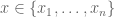


The K-medoid problem is to partition the points into k disjoint subsets 


For comparison, K-means clustering is the problem of finding

where the 

The most widely used approach for finding a (hopefully good) solution to the K-medoids problem has been a greedy clustering algorithm called PAM by Kaufman and Rousseeuw (partitioning around medoids). To understand the Park-Jun contribution it is helpful to briefly review PAM first. The method works as follows:
- Initialize by selecting k distinguished points from the set of points.
- Identify, for each point, the distinguished point it is closest to. This identification partitions the points into k sets and a “cost” can be associated to the partition, namely the sum of the distances from each point to its associated distinguished point (note that the distinguished points may not yet be the medoids of their respective partitions).
- For each distinguished point d, and each non-distingsuished point x repeat the assignment and cost calculation of step 2 with d and x swapped so that x becomes distinguished and d returns to undistinguished status. Choose the swap that minimizes the total cost. If no swap reduces the cost then output the partition and the distinguished points.
- Repeat step 3 until termination.
It’s easy to see that when the PAM algorithm terminates the distinguished points must be medoids for the partitions associated to them.
The running time of PAM is 

To speed-up the PAM method, Park and Jun introduced in their paper an analogy of the K-means algorithm, with mean replaced by median:
- Initialize by selecting k distinguished points from the set of points.
- Identify, for each point, the distinguished point it is closest to. This identification partitions the points into k sets in the same way as the PAM algorithm.
- Compute the medoid for each partition. Repeat step 2 until the cost no longer decreases.
Park-Jun claim that their method has run time complexity “

Step 3 of the algorithm is also quadratic. The medoid of a set of m points is computed in time 


Quadratic functions are not linear. If they were, it would mean that, with 


Assuming that a is positive and plugging in 


When reading the paper, it was upon noticing this “result” that negative grading came to mind. With a proof that 0=1 we are at, say, a score of -10 for the paper. Turning to the discussion of Fig. 3 of the paper we read that “…the proposed method takes about constant time near zero regardless of the number of objects.”

I suppose a generous reading of this statement is that it is an allusion to Taylor expansion of the polynomial 

It seems the authors may have truly believed that their algorithm was linear because in the abstract they begin with “This paper proposes a new algorithm for K-medoids clustering which runs like the K-means algorithm”. It seems possible that the authors thought they had bypassed what they viewed as the underlying cause for quadratic running time of the PAM algorithm, namely the quadratic swap. The K-means algorithm (Lloyd’s algorithm) is indeed linear, because the computation of the mean of a set of points is linear in the number of points (the values for each coordinate can be averaged separately). However the computation of a medoid is not the same as computation of the mean. -5, now a running total of –20. The actual running time of the Park-Jun algorithm is shown below:

Replicates on different instances are crucial, because absent from running time complexity calculations are the stopping times which are data dependent. A replicate of Figure 3 is shown below (using the parameters in Table 5 and implementations in MATLAB). The Park-Jun method is called as “small” in MATLAB.

Interestingly, the MATLAB implementation of PAM has been sped up considerably. Also, the “constant time near zero” behavior described by Park and Jun is clearly no such thing. For this lack of replication of Figure 3 another deduction of 5 points for a total of -25.
There is not much more to the Park and Jun paper, but unfortunately there is some. Table 6 shows a comparison of K-means, PAM and the Park-Jun method with true clusters based on a simulation:

The Rand index is a measure of concordance between clusters, and the higher the Rand index the greater the concordance. It seems that the Park-Jun method is slightly better than PAM, which are both superior to K-means in the experiment. However the performance of K-means is a lot better in this experiment than suggested by Figure 2 which was clearly (rotten) cherry picked (Fig2b):

For this I deduct yet another 5 points for a total of -30.
Amazingly, the Park and Jun paper has been cited 479 times. Many of the citations propagate the false claims in the paper, e.g. in referring to Park and Jun, Zadegan et al. write “in each iteration the new set of medoids is selected with running time O(N), where N is the number of objects in the dataset”. The question is, how many negative points is the repetition of false claims from a paper that is filled with false claims worth?
According to Bach’s first biographer, when the great composer was asked to explain the secret of his success he replied “I was obliged to be industrious. Whoever is equally industrious will succeed equally well”. I respectfully disagree.
First, Bach didn’t have to drive the twenty kids he fathered over his lifetime to soccer practices, arrange their playdates, prepare and cook dinners, and do the laundry. To his credit he did teach his sons composition (though notably only his sons). But even that act was time for composition, an activity which he was seemingly able to devote himself to completely. For example, the fifteen two part inventions were composed in Köthen between 1720 and 1723 as exercises for his 9 year old son Wilhelm Friedemann, at the same time he was composing the first volume of the Well Tempered Clavier. In other words Bach had the freedom and time to pursue a task which was valued (certainly after Mendelssohn’s revival) by others. That is not the case for many, whose hard work, even when important, is trivialized and diminished when they are alive and forgotten when they are dead.
The second reason I disagree with Bach’s suggestion that those who work as hard as he did will succeed equally well is that his talent transcended that which is achievable by hard work alone. Although there is some debate as to whether Bach’s genius was in his revealing of beauty or his discovery of truth (I tend to agree with Richard Taruskin, whose view is discussed eloquently by Bernard Chazelle in an interview from 2014), regardless of how one thinks of Bach genius, his music was extraordinary. Much was made recently of the fact that Chuck Berry’s Johnny B. Goode was included the Voyager spacecraft record, but, as Lewis Thomas said, if we really wanted to boast we would have sent the complete works of Bach. As it is, three Bach pieces were recorded, the most of any composer or musician. The mortal Chuck Berry and Wolfgang Amadeus Mozart appear just once. In other words, even the aliens won’t believe Bach’s claim that ” whoever is equally industrious will succeed equally well”.
Perhaps nitpicking Bach’s words is unfair, because he was a musician and not an orator or writer. But what about his music? Others have blogged him, but inevitably an analysis of his music reveals that even though he may have occasionally broken his “rules”, the fact that he did so, and how he did so, was the very genius he is celebrated for. Still, it’s fun to probe the greatest composer of all time, and I recently found myself doing just that, with none other than one of his “simplest” works, one of the inventions written as an exercise for his 9 year old child. The way this happened is that after a 30 year hiatus, I recently found myself revisiting some of the two part inventions. My nostalgia started during a power outage a few weeks ago, when I realized the piano was the only interesting non-electronic instrument that was working in the house, and I therefore decided to use the opportunity to learn a fugue that I hadn’t tackled before. A quick attempt revealed that I would be wise to brush up on the inventions first. My favorite invention is BWV 784 in A minor, and after some practice it slowly returned to my fingers, albeit in a cacophony of uneven, rheumatic dissonance. But I persevered, and not without reward. Not a musical reward- my practice hardly improved the sound- but a music theory reward. I realized, after playing some of the passages dozens of times, that I was playing a certain measure differently because it sounded better to me the “wrong” way. How could that be?
The specific measure was number 16:
 This measure is the third in a four measure section that starts in measure 14, in which a sequence of broken chords (specifically diminished seventh chords) connect a section ending in E minor with one beginning in A minor. It’s an interesting mathomusical problem to consider the ways in which those keys can be bridged in a four measure sequence (according to the “rules of Bach”), and in listening to the section while playing it I had noticed that the E♮notes at the end of measure 15 and in measure 16 were ok… but somehow a bit strange to my ear. To understand what was going on I had to dust off my First Year Harmony book by William Lovelock for some review (Lovelock’s text is an introduction to harmony and counterpoint and is a favorite of mine, perhaps because it is written in an axiomatic style). The opening broken diminished seventh chord in measure 14 is really the first inversion of the leading note (C♯) for D minor. It is followed by a dominant seventh (A) leading into the key of C major. We see the same pattern repeated there (leading diminished seventh in first inversion followed by the dominant seventh) and two more times until measure 18. In other words, Bach’s solution to the problem of arriving at A minor from E minor was to descend via D -> C -> B♭ -> A with alternating diminished sevenths with dominant sevenths to facilitate the modulations.
Except that is not what Bach did! Measure 16 is an outlier in the key of E minor instead of the expected B♭. What I was hearing while playing was that it was more natural for me to play the E ♭notes (marked in red in the manuscript above) than the annotated E♮notes. My 9 year old daughter recorded my (sloppy, but please ignore that!) version below:
Was Bach wrong? I tried to figure it out but I couldn’t think of a good reason why he would diverge from the natural harmonic sequence for the section. I found the answer in a booklet formally analyzing the two part inventions. In An Analytical Survey of the Fifteen Two-Part Inventions by J.S. Bach by Theodore O. Johnson the author explains that the use of E♮instead of E ♭at the end of measure 15 and in the beginning of measure 16 preserves the sequence of thirds each three semitones apart. My preference for E♭breaks the sequence- I chose musical harmony of mathematical harmony. Bach obviously faced the dilemma but refused to compromise. The composed sequence, even though not strictly the expected harmonic one, sounds better the more one listens to it. Upon understanding the explanation, I’ve grown to like it just as much and I’m fine with acknowledging that E minor works perfectly well in measure 16. It’s amazing to think how deeply Bach thought through every note in every composition. The attention to detail, even in a two part invention intended as an exercise for a 9 year old kid, is incredible.
The way Bach wrote the piece, with the E♮can be heard in Glenn Gould‘s classical recording:
Gould performs the invention in 45 seconds, an astonishing technical feat that has been panned by some but that I will admit I am quite fond of listening to. The particular passage in question is harmonically complex- Johnson notes that the three diminished seventh chords account for all twelve tones- and I find that Gould’s rendition highlights the complexity rather than diminishing it. In any case, what’s remarkable about Gould’s performance is that he too deviates from Bach’s score! Gould plays measure 18 the same way as the first measure instead of with the inversion which Bach annotated. I marked the difference in the score (see oval in battleship gray, which was Gould’s favorite color).
Life is short, break the rules.
This post is dedicated to the National Endowment for the Arts and
the National Endowment for the Humanities who enrich our lives by supporting the arts and the humanities.
In 2014 biologist Mike Snyder published 42 papers. Some of his contributions to those papers were collaborative, but many describe experiments performed in his lab. To make sense of the number 42, one might naïvely assume that Snyder dedicated 8 days and 17 hours (on average) to each paper. That time would include the hours (days?) needed to conceive of ideas, setup and perform experiments, analyze data and write text. It’s not much time, yet even so it is probably an upper bound. This is because Snyder performed the work that resulted in the 42 papers in his spare time. As the chair of the genetics department at Stanford, an administrative position carrying many responsibilities, he was burdened with numerous inter- and intra- and extra- departmental meetings, and as an internationally renowned figure in genomics he was surely called upon to assist in numerous reviews of grants and papers, to deliver invited talks at conferences, and to serve on numerous national and international panels and committees. Moreover, as a “principal investigator” (PI), Snyder was certainly tasked with writing reports about the funding he receives, and to spend time applying for future funding. So how does someone write 42 papers in a year?
Snyder manages 36 postdocs, 13 research assistants, 11 research scientists, 9 visiting scientists, and 8 graduate students. One might imagine that each of the graduate students supervises four postdocs, so that the students/postdocs operate under a structure that enables independent work to proceed in the lab with only occasional supervision and input from the PI. This so-called “PI model” for biology arguably makes sense. The focus of experienced investigators on supervision allows them to provide crucial input gained from years of experience on projects that require not only creative insight, but also large amounts of tedious rote work. Modern biology is also fraught with interdisciplinary challenges, and large groups benefit from the diversity of their members. For these reasons biology papers nowadays tend to have large numbers of authors.
It is those authors, the unsung heroes of science, that are the “cast” in Eric Lander’s recent perspective on “The Heroes of CRISPR” where he writes that
“the narrative underscores that scientific breakthroughs are rarely eureka moments. They are typically ensemble acts, played out over a decade or more, in which the cast becomes part of something greater than what any one of them could do alone.”
All of the research papers referenced in the Lander perspective have multiple authors, on average about 7, and going up to 20. When discussing papers such as this, it is therefore customary to refer to “the PI and colleagues…” in lieu of crediting all individual authors. Indeed, this phrase appears throughout Lander’s perspective, where he writes “Moineau and colleagues..”, “Siksnys and colleagues..”, etc. It is understood that this means that the PIs guided projects and provided key insights, yet left most of the work to the first author(s) who were in turn aided by others.
There is a more cynical view of the PI model, namely that by running large labs PIs are able to benefit from a scientific roulette of their own making. PIs can claim credit for successes while blaming underlings for failures. Even one success can fund numerous failures, and so the wheel spins faster and faster…the PI always wins. Of course the mad rush to win leads to an overall deterioration of quality. For example, it appears that even the Lander perspective was written in haste (Lander may not be as prolific as Snyder but according to Thomson Reuters he did publish 21 “hot” papers in 2015, placing him fourth on the list of the world’s most influential scientific minds, only a few paces behind winner Stacey Gabriel). The result is what appears to be a fairly significant typo in Figure 2 of his perspective, which shows the geography of the CRISPR story. The circle labeled “9” should be colored in blue like circle “10”, because that color represents “the final step of biological engineering to enable genome editing”. The Jinek et al. 2012 paper of circle “9” clearly states that “We further show that the Cas9 endonuclease can be programmed with guide RNA engineered as a single transcript to target and cleave any dsDNA sequence of interest”. Moreover the Jinek et al. 2013 paper described editing in mammalian cells but was submitted in 2012 (the dates in Lander’s figure are by submission), so circle “9” should also be labeled with a “10” for “Genome editing in mammalian cells”. In other words, the figure should have looked like this:

Lander acknowledges the reality of the PI model in the opening of his perspective, where he writes that “the Perspective describes an inspiring ensemble of a dozen or so scientists who—with their collaborators and other contributors whose stories are not elaborated here—discovered the CRISPR system, unraveled its molecular mechanisms, and repurposed it as a powerful tool for biological research and biomedicine. Together, they are the Heroes of CRISPR.”
But in choosing to highlight a “dozen or so” scientists, almost all of whom are established PIs at this point, Lander unfairly trivializes the contributions of dozens of graduate students and postdocs who may have made many of the discoveries he discusses, may have developed the key insights, and almost certainly did most of the work. For example, one of the papers mentioned in the Lander perspective is
F. Zhang*, L. Cong*, S. Lodato, S. Kosuri, G.M. Church and P. Arlotta, Efficient construction of sequence-specific TAL effectors for modulating mammalian transcription, 2011
I’ve placed a * next to the names of F. Zhang and L. Cong as is customary to do when “authors contributed equally to this work” (a quote from their paper). Yet in his perspective Lander writes that “when TALEs were deciphered, Zhang, with his collaborators Paola Arlotta and George Church…successfully repurposed them for mammals”. The omission of Cong is surprising not only because his contribution to the TALE work was equal to that of Zhang, but because he is the same Cong that is first author of Cong et al. 2013 that Lander lauds for its number of citations (Le Cong is a former graduate student of Zhang, and is now a postdoc at the Broad Institute). Another person who is absent from Lander’s perspective, yet was first author on two of the key papers mentioned is Martin Jinek. He and Charpentier’s postdoc Krzysztof Chylinski were deemed fundamental to the CRISPR story elsewhere.
A proper narrative of the history of CRISPR would include stories primarily about the graduate students and postdocs who did the heavy lifting. Still, one might imagine giving Lander the benefit of the doubt; perhaps it was simply not possible to exhaustively describe all the individuals who contributed to the 20 year CRISPR story. Maybe Lander’s intent was to draw readers into his piece by including interesting backstories in the style of the New Yorker. Mentions of cognac, choucroute garnie and Saddam Hussein certainly added spice to what would otherwise be just a litany of dates. Yet if that is the case, why are the backstories of the only two women mentioned in Lander’s perspective presented as so so so boring? The entirety of what he has to say about them is “Charpentier had earned her Ph.D in microbiology from Pasteur Institute in 1995” and “Doudna had received her Ph.D. at Harvard” (those who are interested in Charpentier and Doudna’s fascinating CRISPR story will have to forgo the journal Cell and read about The CRISPR Quandary in the New York Times). A possible answer to my question is provided here.
Lander concludes his perspective by writing that “the [CRISPR] narrative…is a wonderful lesson for a young person contemplating a life in science”. That may be true of the CRISPR narrative, but the lesson of his narrative is that young persons should not count on leaders in their field to recognize their work.
COI statement: Eric Lander is my former (informal) Ph.D. advisor. Jennifer Doudna is a current colleague and collaborator.

Recent Comments