
You are currently browsing the tag archive for the ‘PCA’ tag.
[September 2, 2017: A response to this post has been posted by the authors of Patro et al. 2017, and I have replied to them with a rebuttal]
Spot the difference
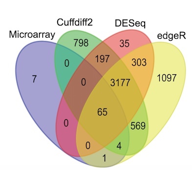
One of the maxims of computational biology is that “no two programs ever give the same result.” This is perhaps not so surprising; after all, most journals seek papers that report a significant improvement to an existing method. As a result, when developing new methods, computational biologists ensure that the results of their tools are different, specifically better (by some metric), than those of previous methods. The maxim certainly holds for RNA-Seq tools. For example, the large symmetric differences displayed in the Venn diagram below (from Zhang et al. 2014) are typical for differential expression tool benchmarks:
In a comparison of RNA-Seq quantification methods, Hayer et al. 2015 showed that methods differ even at the level of summary statistics (in Figure 7 from the paper, shown below, Pearson correlation was calculated using ground truth from a simulation):

These sort of of results are the norm in computational genomics. Finding a pair of software programs that produce identical results is about as likely as finding someone who has won the lottery… twice…. in one week. Well, it turns out there has been such a person, and here I describe the computational genomics analog of that unlikely event. Below are a pair of plots made using two different RNA-Seq quantification programs:


The two volcano plots show the log-fold change in abundance estimated for samples sequenced by Boj et al. 2015, plotted against p-values obtained with the program limma-voom. I repeat: the plots were made with quantifications from two different RNA-Seq programs. Details are described in the next section, but before reading it first try playing spot the difference.
The reveal
The top plot is reproduced from Supplementary Figure 6 in Beaulieu-Jones and Greene, 2017. The quantification program used in that paper was kallisto, an RNA-Seq quantification program based on pseudoalignment that was published in
- Near-optimal probabilistic RNA-Seq quantification by Nicolas Bray, Harold Pimentel, Páll Melsted and Lior Pachter, Nature Biotechnology 34 (2016), 525–527.
The bottom plot was made using the quantification program Salmon, and is reproduced from a GitHub repository belonging to the lead author of
- Salmon provides fast and bias-aware quantification of transcript expression by Rob Patro, Geet Duggal, Michael I. Love, Rafael A. Irizarry and Carl Kingsford, Nature Methods 14 (2017), 417–419.
Patro et al. 2017 claim that “[Salmon] achieves the same order-of-magnitude benefits in speed as kallisto and Sailfish but with greater accuracy”, however after being unable to spot any differences myself in the volcano plots shown above, I decided, with mixed feelings of amusement and annoyance, to check for myself whether the similarity between the programs was some sort of fluke. Or maybe I’d overlooked something obvious, e.g. the fact that programs may tend to give more similar results at the gene level than at the transcript level. Thus began this blog post.
In the figure below, made by quantifying RNA-Seq sample ERR188140 with the latest versions of the two programs, each point is a transcript and its coordinates are the estimated counts produced by kallisto and salmon respectively.

Strikingly, the Pearson correlation coefficient is 0.9996026. However astute readers will recognize a possible sleight of hand on my part. The correlation may be inflated by similar results for the very abundant transcripts, and the plot hides thousands of points in the lower left-hand corner. RNA-Seq analyses are notorious for such plots that appear sounds but can be misleading. However in this case I’m not hiding anything. The Pearson correlation computed with 

For context, the Spearman correlation between kallisto and a truly different RNA-Seq quantification program, RSEM, is 0.8944941. At this point I have to say… I’ve been doing computational biology for more than 20 years and I have never seen a situation where two ostensibly different programs output such similar results.
Patro and I are not alone in finding that Salmon 


or Figure 3A from Jin et al. 2017:

Just a few weeks ago, Sahraeian et al. 2017 published a comprehensive analysis of 39 RNA-Seq analysis tools and performed hierarchical clusterings of methods according to the similarity of their output. Here is one example (their Supplementary Figure 24a):

Amazingly, kallisto and Salmon-Quasi (the latest version of Salmon) are the two closest programs to each other in the entire comparison, producing output even more similar than the same program, e.g. Cufflinks or StringTie run with different alignments!
This raises the question of how, with kallisto published in May 2016 and Salmon
How not to perform a differential expression analysis
The Patro et al. 2017 paper presents a number of comparisons between kallisto and Salmon in which Salmon appears to dramatically improve on the performance of kallisto. For example Figure 1c from Patro et al. 2017 is a table showing an enormous performance difference between kallisto and Salmon:

Figure 1c from Patro et al. 2017.
At a false discovery rate of 0.01, the authors claim that in a simulation study where ground truth is known Salmon identifies 4.5 times more truly differential transcripts than kallisto!
This can explain how Salmon was published, namely the reviewers and editor believed Patro et al.’s claims that Salmon significantly improves on previous work. In one analysis Patro et al. provide a p-value to help the “significance” stick. They write that “we found that Salmon’s distribution of mean absolute relative differences was significantly smaller (Mann-Whitney U test, P=0.00017) than those of kallisto. But how can the result Salmon >> kallisto, be reconciled with the fact that everybody repeatedly finds that Salmon
A closer look reveals three things:
- In a differential expression analysis billed as “a typical downstream analysis” Patro et al. did not examine differential expression results for a typical biological experiment with a handful of replicates. Instead they examined a simulation of two conditions with eight replicates in each.
- The large number of replicates allowed them to apply the log-ratio t-test directly to abundance estimates based on transcript per million (TPM) units, rather than estimated counts which are required for methods such as their own DESeq2.
- The simulation involved generation of GC bias in an approach compatible with the inference model, with one batch of eight samples exhibiting “weak GC content dependence” while the other batch of eight exhibiting “more severe fragment-level GC bias.” Salmon was run in a GC bias correction mode.
These were unusual choices by Patro et al. What they did was allow Patro et al. to showcase the performance of their method in a way that leveraged the match between one of their inference models and the procedure for simulating the reads. The showcasing was enabled by having a confounding variable (bias) that exactly matches their condition variable, the use of TPM units to magnify the impact of that effect on their inference, simulation with a large number of replicates to enable the use of TPM, which was possible because with many replicates one could directly apply the log t-test. This complex chain of dependencies is unraveled below:
There is a reason why log-fold changes are not directly tested in standard RNA-Seq differential expression analyses. Variance estimation is challenging with few replicates and RNA-Seq methods developers understood this early on. That is why all competitive methods for differential expression analysis such as DESeq/DESeq2, edgeR, limma-voom, Cuffdiff, BitSeq, sleuth, etc. regularize variance estimates (i.e., perform shrinkage) by sharing information across transcripts/genes of similar abundance. In a careful benchmarking of differential expression tools, Shurch et al. 2016 show that log-ratio t-test is the worst method. See, e.g., their Figure 2:
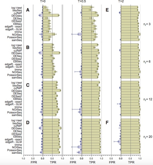
Figure 2 from Schurch et al. 2016. The four vertical panels show FPR and TPR for programs using 3,6,12 and 20 biological replicates (in yeast). Details are in the Schurch et al. 2016 paper.
The log-ratio t-test performs poorly not only when the number of replicates is small and regularization of variance estimates is essential. Schurch et al. specifically recommend DESeq2 (or edgeR) when up to 12 replicates are performed. In fact, the log-ratio t-test was so bad that it didn’t even make it into their Table 2 “summary of recommendations”.
The authors of Patro et al. 2017 are certainly well-aware of the poor performance of the log-ratio t-test. After all, one of them was specifically thanked in the Schurch et al. 2016 paper “for his assistance in identifying and correcting a bug”. Moreover, the recommended program by Schurch et. al. (DESeq2) was authored by one of the coauthors on the Patro et al. paper, who regularly and publicly advocates for the use of his programs (and not the log-ratio t-test):
This recommendation has been codified in a detailed RNA-Seq tutorial where M. Love et al. write that “This [Salmon + tximport] is our current recommended pipeline for users”.
In Soneson and Delorenzi, 2013, the authors wrote that “there is no general consensus regarding which [RNA-Seq differential expression] method performs best in a given situation” and despite the development of many methods and benchmarks since this influential review, the question of how to perform differential expression analysis continues to be debated. While it’s true that “best practices” are difficult to agree on, one thing I hope everyone can agree on is that in a “typical downstream analysis” with a handful of replicates
do not perform differential expression with a log-ratio t-test.
Turning to Patro et al.‘s choice of units, it is important to note that the requirement of shrinkage for RNA-Seq differential analysis is the reason most differential expression tools require abundances measured in counts as input, and do not use length normalized units such as Transcripts Per Million (TPM). In TPM units the abundance 


This is why, when comparing the quantification accuracy of different programs, it is important to compare abundances using estimated counts. This was highlighted in Bray et al. 2016: “Estimated counts were used rather than transcripts per million (TPM) because the latter is based on both the assignment of ambiguous reads and the estimation of effective lengths of transcripts, so a program might be penalized for having a differing notion of effective length despite accurately assigning reads.” Yet Patro et al. perform no comparisons of programs in terms of estimated counts.
A typical analysis
The choices of Patro et al. in designing their benchmarks are demystified when one examines what would have happened had they compared Salmon to kallisto on typical data with standard downstream differential analysis tools such as their own tximport and DESeq2. I took the definition of “typical” from one of the Patro et al. coauthors’ own papers (Soneson et al. 2016): “Currently, one of the most common approaches is to define a set of non-overlapping targets (typically, genes) and use the number of reads overlapping a target as a measure of its abundance, or expression level.”
The Venn diagram below shows the differences in transcripts detected as differentially expressed when kallisto and Salmon are compared using the workflow the authors recommend publicly (quantifications -> tximport -> DESeq2) on a typical biological dataset with three replicates in each of two conditions. The number of overlapping genes is shown for a false discovery rate of 0.05 on RNA-Seq data from Trapnell et al. 2014:
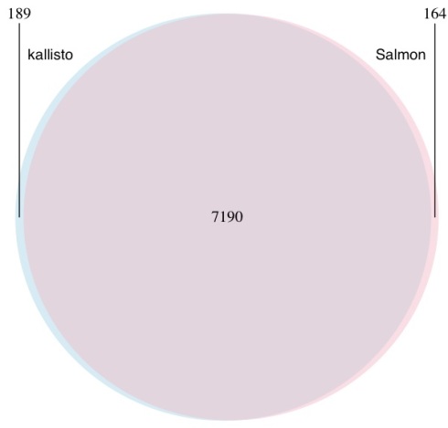
A Venn diagram showing the overlap in genes predicted to be differential expressed by kallisto (blue) and Salmon (pink). Differential expression was performed with DESeq2 using transcript-level counts estimated by kallisto and Salmon and imported to DESeq2 with tximport. Salmon was run with GC bias correction.
This example provides Salmon the benefit of the doubt- the dataset was chosen to be older (when bias was more prevalent) and Salmon was not run in default mode but rather with GC bias correction turned on (option –gcBias).
When I saw these numbers for the first time I gasped. Of course I shouldn’t have been surprised; they are consistent with repeated published experiments in which comparisons of kallisto and Salmon have revealed near identical results. And while I think it’s valuable to publish confirmation of previous work, I did wonder whether Nature Methods would have accepted the Patro et al. paper had the authors conducted an actual “typical downstream analysis”.
What about the TPM?
Patro et al. utilized TPM based comparisons for all the results in their paper, presumably to highlight the improvements in accuracy resulting from better effective length estimates. Numerous results in the paper suggest that Salmon is much more accurate than kallisto. However I had seen a figure in Majoros et al. 2017 that examined the (cumulative) distribution of both kallisto and Salmon abundances in TPM units (their Supplementary Figure 5) in which the curves literally overlapped at almost all thresholds:

The plot above was made with Salmon v0.7.2 so in fairness to Patro et al. I remade it using the ERR188140 dataset mentioned above with Salmon v0.8.2:
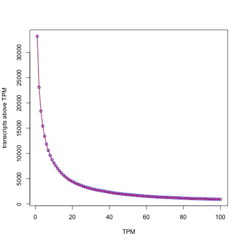
The distribution of abundances (in TPM units) as estimated by kallisto (blue circles) and Salmon (red stars).
The blue circles correspond to kallisto and the red stars inside to Salmon. With the latest version of Salmon the similarity is even higher than what Majoros et al. observed! The Spearman correlation between kallisto and Salmon with TPM units is 0.9899896.
It’s interesting to examine what this means for a (truly) typical TPM analysis. One way that TPMs are used is to filter transcripts (or genes) by some threshold, typically TPM > 1 (in another deviation from “typical”, a key table in Patro et al. 2017 – Figure 1d – is made by thresholding with TPM > 0.1). The Venn diagram below shows the differences between the programs at the typical TPM > 1 threshold:

A Venn diagram showing the overlap in transcripts predicted by kallisto and Salmon to have estimated abundance > 1 TPM.
The figures above were made with Salmon 0.8.2 run in default mode. The correlation between kallisto and Salmon (in TPM) units decreases a tiny amount, from 0.9989224 to 0.9974325 with the –gcBias option and even the Spearman correlation decreases by only 0.011 from 0.9899896 to 0.9786092.
I think it’s perfectly fine for authors to present their work in the best light possible. What is not ok is to deliberately hide important and relevant truth, which in this case is that Salmon 
A note on speed
One of the claims in Patro et al. 2017 is that “[the speed of Salmon] roughly matches the speed of the recently introduced kallisto.” The Salmon claim is based on a benchmark of an experiment (details unknown) with 600 million 75bp paired-end reads using 30 threads. Below are the results of a similar benchmark of Salmon showing time to process 19 samples from Boj et al. 2015 with variable numbers of threads:

First, Salmon with –gcBias is considerably slower than default Salmon. Furthermore, there is a rapid decrease in performance gain with increasing number of threads, something that should come as no surprise. It is well known that quantification can be I/O bound which means that at some point, extra threads don’t provide any gain as the disk starts grinding limiting access from the CPUs. So why did Patro et al. choose to benchmark runtime with 30 threads?
The figure below provides a possible answer:

In other words, not only is Salmon

Having said that, the speed differences between kallisto and Salmon should not matter much in practice and large scale projects made possible with kallisto (e.g. Vivian et al. 2017) are possible with Salmon as well. Why then did the authors not report their running time benchmarks honestly?
The first common notion
The Patro et al. 2017 paper uses the term “quasi-mapping” to describe an algorithm, published in Srivastava et al. 2016, for obtaining their (what turned out to be near identical to kallisto) results. I have written previously how “quasi-mapping” is the same as pseudoalignment as an alignment concept, even though Srivastava et al. 2016 initially implemented pseudoalignment differently than the way we described it originally in our preprint in Bray et al. 2015. However the reviewers of Patro et al. 2017 may be forgiven for assuming that “quasi-mapping” is a technical advance over pseudoalignment. The Srivastava et al. paper is dense and filled with complex technical detail. Even for an expert in alignment/RNA-Seq it is not easy to see from a superficial reading of the paper that “quasi-mapping” is an equivalent concept to kallisto’s pseudoalignment (albeit implemented with suffix arrays instead of a de Bruijn graph). Nevertheless, the key to the paper is a simple sentence: “Specifically, the algorithm [RapMap, which is now used in Salmon] reports the intersection of transcripts appearing in all hits” in the section 2.1 of the paper. That’s the essence of pseudoalignment right there. The paper acknowledges as much, “This lightweight consensus mechanism is inspired by Kallisto ( Bray et al. , 2016 ), though certain differences exist”. Well, as shown above, those differences appear to have made no difference in standard practice, except insofar as the Salmon implementation of pseudoalignment being slower than the one in Bray et al. 2016.
Srivastava et al. 2016 and Patro et al. 2017 make a fuss about the fact that their “quasi-mappings” take into account the starting positions of reads in transcripts, thereby including more information than a “pure” pseudoalignment. This is a pedantic distinction Patro et al. are trying to create. Already in the kallisto preprint (May 11, 2015), it was made clear that this information was trivially accessible via a reasonable approach to pseudoalignment: “Once the graph and contigs have been constructed, kallisto stores a hash table mapping each k-mer to the contig it is contained in, along with the position within the contig.”
In other words, Salmon is not producing near identical results to kallisto due to an unprecedented cosmic coincidence. The underlying method is the same. I leave it to the reader to apply Euclid’s first common notion:
Things which equal the same thing are also equal to each other.
Convergence
While Salmon is now producing almost identical output to kallisto and is based on the same principles and methods, this was not the case when the program was first released. The history of the Salmon program is accessible via the GitHub repository, which recorded changes to the code, and also via the bioRxiv preprint server where the authors published three versions of the Salmon preprint prior to its publication in Nature Methods.
The first preprint was published on the BioRxiv on June 27, 2015. It followed shortly on the heels of the kallisto preprint which was published on May 11, 2015. However the first Salmon preprint described a program very different from kallisto. Instead of pseudoalignment, Salmon relied on chaining SMEMs (super-maximal exact matches) between reads and transcripts to identifying what the authors called “approximately consistent co-linear chains” as proxies for alignments of reads to transcripts. The authors then compared Salmon to kallisto writing that “We also compare with the recently released method of Kallisto which employs an idea similar in some respects to (but significantly different than) our lightweight-alignment algorithm and again find that Salmon tends to produce more accurate estimates in general, and in particular is better able [to] estimate abundances for multi-isoform genes.” In other words, in 2015 Patro et al. claimed that Salmon was “better” than kallisto. If so, why did the authors of Salmon later change the underlying method of their program to pseudoalignment from SMEM alignment?
Inspired by temporal ordering analysis of expression data and single-cell pseudotime analysis, I ran all the versions of kallisto and Salmon on ERR188140, and performed PCA on the resulting transcript abundance table to be able to visualize the progression of the programs over time. The figure below shows all the points with the exception of three: Sailfish 0.6.3, kallisto 0.42.0 and Salmon 0.32.0. I removed Sailfish 0.6.3 because it is such an outlier that it caused all the remaining points to cluster together on one side of the plot (the figure is below in the next section). In fairness I also removed one Salmon point (version 0.32.0) because it differed substantially from version 0.4.0 that was released a few weeks after 0.32.0 and fixed some bugs. Similarly, I removed kallisto 0.42.0, the first release of kallisto which had some bugs that were fixed 6 days later in version 0.42.1.

Evidently kallisto output has changed little since May 12, 2015. Although some small bugs were fixed and features added, the quantifications have been very similar. The quantifications have been stable because the algorithm has been the same.
On the other hand the Salmon trajectory shows a steady convergence towards kallisto. The result everyone is finding, namely that currently Salmon

Convergence of Salmon and Sailfish to kallisto over the course of a year. The x-axis labels the time different versions of each program were released. The y-axis is PC1 from a PCA of transcript abundances of the programs.
Prestamping
The bioRxiv preprint server provides a feature by which a preprint can be linked to its final form in a journal. This feature is useful to readers of the bioRxiv, as final published papers are generally improved after preprint reader, reviewer, and editor comments have been addressed. Journal linking is also a mechanism for authors to time stamp their published work using the bioRxiv. However I’m sure the bioRxiv founders did not intend the linking feature to be abused as a “prestamping” mechanism, i.e. a way for authors to ex post facto receive a priority date for a published paper that had very little, or nothing, in common with the original preprint.
A comparison of the June 2015 preprint mentioning the Salmon program and the current Patro et al. paper reveals almost nothing in common. The initial method changed drastically in tandem with an update to the preprint on October 3, 2015 at which point the Salmon program was using “quasi mapping”, later published in Srivastava et al. 2016. Last year I met with Carl Kingsford (co-corresponding author of Patro et al. 2017) to discuss my concern that Salmon was changing from a method distinct from that of kallisto (SMEMs of May 2015) to one that was replicating all the innovations in kallisto, without properly disclosing that it was essentially a clone. Yet despite a promise that he would raise my concerns with the Salmon team, I never received a response.
At this point, the Salmon core algorithms have changed completely, the software program has changed completely, and the benchmarking has changed completely. The Salmon project of 2015 and the Salmon project of 2017 are two very different projects although the name of the program is the same. While some features have remained, for example the Salmon mode that processes transcriptome alignments (similar to eXpress) was present in 2015, and the approach to likelihood maximization has persisted, considering the programs the same is to descend into Theseus’ paradox.
Interestingly, Patro specifically asked to have the Salmon preprint linked to the journal:
The linking of preprints to journal articles is a feature that arXiv does not automate, and perhaps wisely so. If bioRxiv is to continue to automatically link preprints to journals it needs to focus not only on eliminating false negatives but also false positives, so that journal linking cannot be abused by authors seeking to use the preprint server to prestamp their work after the fact.
The fish always win?
The Sailfish program was the precursor of Salmon, and was published in Patro et al. 2014. At the time, a few students and postdocs in my group read the paper and then discussed it in our weekly journal club. It advocated a philosophy of “lightweight algorithms, which make frugal use of data, respect constant factors and effectively use concurrent hardware by working with small units of data where possible”. Indeed, two themes emerged in the journal club discussion:
1. Sailfish was much faster than other methods by virtue of being simpler.
2. The simplicity was to replace approximate alignment of reads with exact alignment of k-mers. When reads are shredded into their constituent k-mer “mini-reads”, the difficult read -> reference alignment problem in the presence of errors becomes an exact matching problem efficiently solvable with a hash table.
Despite the claim in the Sailfish abstract that “Sailfish provides quantification time…without loss of accuracy” and Figure 1 from the paper showing Sailfish to be more accurate than RSEM, we felt that the shredding of reads must lead to reduced accuracy, and we quickly checked and found that to be the case; this was later noted by others, e.g. Hensman et al. 2015, Lee et al. 2015).
After reflecting on the Sailfish paper and results, Nicolas Bray had the key idea of abandoning alignments as a requirement for RNA-Seq quantification, developed pseudoalignment, and later created kallisto (with Harold Pimentel and Páll Melsted).
I mention this because after the publication of kallisto, Sailfish started changing along with Salmon, and is now frequently discussed in the context of kallisto and Salmon as an equal. Indeed, the PCA plot above shows that (in its current form, v0.10.0) Sailfish is also nearly identical to kallisto. This is because with the release of Sailfish 0.7.0 in September 2015, Patro et al. started changing the Sailfish approach to use pseudoalignment in parallel with the conversion of Salmon to use pseudoalignment. To clarify the changes in Sailfish, I made the PCA plot below which shows where the original version of Sailfish that coincided with the publication of Patro et al. 2014 (version 0.6.3 March 2014) lies relative to the more recent versions and to Salmon:
 In other words, despite a series of confusing statements on the Sailfish GitHub page and an out-of-date description of the program on its homepage, Sailfish in its published form was substantially less accurate and slower than kallisto, and in its current form Sailfish is kallisto.
In retrospect, the results in Figure 1 of Patro et al. 2014 seem to be as problematic as the results in Figure 1 of Patro et al. 2017. Apparently crafting computational experiments via biased simulations and benchmarks to paint a distorted picture of performance is a habit of Patro et al.
Addendum [August 5, 2017]
In the post I wrote that “The history of the Salmon program is accessible via the GitHub repository, which recorded changes to the code, and also via the bioRxiv preprint server where the authors published three versions of the Salmon preprint prior to its publication in Nature Methods” Here are the details of how these support the claims I make (tl;dr https://twitter.com/yarbsalocin/status/893886707564662784):
Sailfish (current version) and Salmon implemented kallisto’s pseudoalignment algorithm using suffix arrays
First, both Sailfish and Salmon use RapMap (via `SACollector`) and call `mergeLeftRightHits()`:
Sailfish:
https://github.com/kingsfordgroup/sailfish/blob/352f9001a442549370eb39924b06fa3140666a9e/src/SailfishQuantify.cpp#L192
Salmon:
https://github.com/COMBINE-lab/salmon/commit/234cb13d67a9a1b995c86c8669d4cefc919fbc87#diff-594b6c23e3bdd02a14cc1b861c812b10R2205
The RapMap code for “quasi mapping” executes an algorithm identical to psuedoalignment, down to the detail of what happens to the k-mers in a single read:
First, `hitCollector()` calls `getSAHits_()`:
https://github.com/COMBINE-lab/RapMap/blob/bd76ec5c37bc178fd93c4d28b3dd029885dbe598/include/SACollector.hpp#L249
Here kmers are used hashed to SAintervals (Suffix Array intervals), that are then extended to see how far ahead to jump. This is the one of two key ideas in the kallisto paper, namely that not all the k-mers in a read need to be examined to pseudoalign the read. It’s much more than that though, it’s the actual exact same algorithm to the level of exactly the k-mers that are examined. kallisto performs this “skipping” using contig jumping with a different data structure (the transcriptome de Bruijn graph) but aside from data structure used what happens is identical:
https://github.com/COMBINE-lab/RapMap/blob/c1e3132a2e136615edbb91348781cb71ba4c22bd/include/SACollector.hpp#L652
makes a call to jumping and the code to compute MMP (skipping) is
https://github.com/COMBINE-lab/RapMap/blob/c1e3132a2e136615edbb91348781cb71ba4c22bd/include/SASearcher.hpp#L77
There is a different detail in the Sailfish/Salmon code which is that when skipping forward the suffix array is checked for exact matching on the skipped sequence. kallisto does not have this requirement (although it could). On error-free data these will obviously be identical; on error prone data this may make Salmon/Sailfish a bit more conservative and kallisto a bit more robust to error. Also due to the structure of suffix arrays there is a possible difference in behavior when a transcript contains a repeated k-mer. These differences affect a tiny proportion of reads, as is evident from the result that kallisto and Salmon produce near identical results.
The second key idea in kallisto of intersecting equivalence classes for a read. This exact procedure is in:
https://github.com/COMBINE-lab/RapMap/blob/bd76ec5c37bc178fd93c4d28b3dd029885dbe598/include/SACollector.hpp#L363
which calls:
https://github.com/COMBINE-lab/RapMap/blob/bd76ec5c37bc178fd93c4d28b3dd029885dbe598/src/HitManager.cpp#L599
There was a choice we had to make in kallisto of how to handle information from paired end reads (does one require consistent pseudoalignment in both? Just one suffices to pseudoalign a read?)
The code for intersection between left and right reads making the identical choices as kallisto is:
https://github.com/COMBINE-lab/RapMap/blob/bd76ec5c37bc178fd93c4d28b3dd029885dbe598/include/RapMapUtils.hpp#L810
In other words, stepping through what happens to the k-mers in a read shows that Sailfish/Salmon copied the algorithms of kallisto and implemented it with the only difference being a different data structure used to hash the kmers. This is why, when I did my run of Salmon vs. kallisto that led to this blog post I found that
kallisto pseudoaligned 69,780,930 reads
vs
salmon 69,701,169.
That’s a difference of 79,000 out of ~70 million = 0.1%.
Two additional points:
- Until the kallisto program and preprint was published Salmon used SMEMs. Only after kallisto does Salmon change to using kmer cached suffix array intervals.
- The kallisto preprint did not discuss outputting position as part of pseudoalignment because it was not central to the idea. It’s trivial to report pseudoalignment positions with either data structure and in fact both kallisto and Salmon do.
I want to make very clear here that I think there can be great value in implementing an algorithm with a different data structure. It’s a form of reproducibility that one can learn from: how to optimize, where performance gains can be made, etc. Unfortunately most funding agencies don’t give grants for projects whose goal is solely to reproduce someone else’s work. Neither do most journal publish papers that set out to do that. That’s too bad. If Patro et al. had presented their work honestly, and explained that they were implementing pseudoalignment with a different data structure to see if it’s better, I’d be a champion of their work. That’s not how they presented their work.
Salmon copied details in the quantification
The idea of using the EM algorithm for quantification with RNA-Seq goes back to Jiang and Wong, 2009, arguably even to Xing et al. 2006. I wrote up the details of the history in a review in 2011 that is on the arXiv. kallisto runs the EM algorithm on equivalence classes, an idea that originates with Nicolae et al. 2011 (or perhaps even Jiang and Wong 2009) but whose significance we understood from the Sailfish paper (Patro et al. 2014). Therefore the fact that Salmon (now) and kallisto both use the EM algorithm, in the same way, makes sense.
However Salmon did not use the EM algorithm before the kallisto preprint and program were published. It used an online variational Bayes algorithm instead. In the May 18, 2015 release of Salmon there is no mention of EM. Then, with the version 0.4 release date Salmon suddenly switches to the EM. In implementing the EM algorithm there are details that must be addressed, for example setting thresholds for when to terminate rounds of inference based on changes in the (log) likelihood (i.e. determine convergence).
For example, kallisto sets parameters
const double alpha_limit = 1e-7;
const double alpha_change_limit = 1e-2;
const double alpha_change = 1e-2;
in EMalgorithm.h
https://github.com/pachterlab/kallisto/blob/90db56ee8e37a703c368e22d08b692275126900e/src/EMAlgorithm.h
The link above shows that these kallisto parameters were set and have not changed since the release of kallisto
Also they were not always this way, see e.g. the version of April 6, 2015:
https://github.com/pachterlab/kallisto/blob/2651317188330f7199db7989b6a4dc472f5d1669/src/EMAlgorithm.h
This is because one of the things we did is explore the effects of these thresholds, and understand how setting them affects performance. This can be seen also in a legacy redundancy, we have both alpha_change and alpha_change_limit which ended up being unnecessary because they are equal in the program and used on one line.
The first versions of Salmon post-kallisto switched to the EM, but didn’t even terminate it the same way as kallisto, adopting instead a maximum iteration of 1,000. See
https://github.com/COMBINE-lab/salmon/blob/59bb9b2e45c76137abce15222509e74424629662/include/CollapsedEMOptimizer.hpp
from May 30, 2015.
This changed later first with the introduction of minAlpha (= kallisto’s alpha_limit)
https://github.com/COMBINE-lab/salmon/blob/56120af782a126c673e68c8880926f1e59cf1427/src/CollapsedEMOptimizer.cpp
and then alphaCheckCutoff (kallisto’s alpha_change_limit)
https://github.com/COMBINE-lab/salmon/blob/a3bfcf72e85ebf8b10053767b8b506280a814d9e/src/CollapsedEMOptimizer.cpp
Here are the salmon thresholds:
double minAlpha = 1e-8;
double alphaCheckCutoff = 1e-2;
double cutoff = minAlpha;
Notice that they are identical except that minAlpha = 1e-8 and not kallisto’s alpha_limit = 1e-7. However in kallisto, from the outset, the way that alpha_limit has been used is:
if (alpha_[ec] < alpha_limit/10.0) {
alpha_[ec] = 0.0;
}
In other words, alpha_limit in kallisto is really 1e-8, and has been all along.
The copying of all the details of our program have consequences for performance. In the sample I ran kallisto performed 1216 EM rounds of EM vs. 1214 EM rounds in Salmon.
Sailfish (current version) copied our sequence specific bias method
One of the things we did in kallisto is implement a sequence specific bias correction along the lines of what was done previously in Roberts et al. 2011, and later in Roberts et al. 2013. Implementing sequence specific bias correction in kallisto required working things out from scratch because of the way equivalence classes were being used with the EM algorithm, and not reads. I worked this out together with Páll Melsted during conversations that lasted about a month in the Spring of 2015. We implemented it in the code although did not release details of how it worked with the initial preprint because it was an option and not default, and we thought we might want to still change it before submitting the journal paper.
Here Rob is stating that Salmon can account for biases that kallisto cannot:
https://www.biostars.org/p/143458/#143639
This was a random forest bias correction method different from kallisto’s.
Shortly thereafter, here is the source code in Sailfish deprecating the Salmon bias correction and switching to kallisto’s method:
https://github.com/kingsfordgroup/sailfish/commit/377f6d65fe5201f7816213097e82df69e4786714#diff-fe8a1774cd7c858907112e6c9fda1e9dR76
This is the update to effective length in kallisto:
https://github.com/pachterlab/kallisto/blob/e5957cf96f029be4e899e5746edcf2f63e390609/src/weights.cpp#L184
Here is the Sailfish code:
https://github.com/kingsfordgroup/sailfish/commit/be0760edce11f95377088baabf72112f920874f9#diff-8341ac749ad4ac5cfcc8bfef0d6f1efaR796
Notice that there has been a literal copying down to the variable names:
https://github.com/kingsfordgroup/sailfish/commit/be0760edce11f95377088baabf72112f920874f9#diff-8341ac749ad4ac5cfcc8bfef0d6f1efaR796
The code written by the student of Rob was:
effLength *=alphaNormFactor/readNormFactor;
The code written by us is
efflen *= 0.5*biasAlphaNorm/biasDataNorm;
The code rewritten by Rob (editing that of the student):
effLength *= 0.5 * (txomeNormFactor / readNormFactor);
Note that since our bias correction method was not reported in our preprint, this had to have been copied directly from our codebase and was done so without any attribution.
I raised this specific issue with Carl Kingsford by email prior to our meeting in April 13 2016. We then discussed it in person. The conversation and email were prompted by a change to the Sailfish README on April 7, 2016 specifically accusing us of comparing kallisto to a “ **very old** version of Sailfish”:
https://github.com/kingsfordgroup/sailfish/commit/550cd19f7de0ea526f512a5266f77bfe07148266
What was stated is “The benchmarks in the kallisto paper *are* made against a very old version of Sailfish” not “were made against”. By the time that was written, it might well have been true. But kallisto was published in May 2015, it benchmarked with the Sailfish program described in Patro et al. 2014, and by 2016 Sailfish had changed completely implementing the pseudoalignment of kallisto.
Token attribution
Another aspect of an RNA-Seq quantification program is effective length estimation. There is an attribution to kallisto in the Sailfish code now explaining that this is from kallisto:
“Computes (and returns) new effective lengths for the transcripts based on the current abundance estimates (alphas) and the current effective lengths (effLensIn). This approach is based on the one taken in Kallisto
https://github.com/kingsfordgroup/sailfish/blob/b1657b3e8929584b13ad82aa06060ce1d5b52aed/src/SailfishUtils.cpp
This is from January 23rd, 2016, almost 9 months after kallisto was released, and 3 months before the Sailfish README accused us of not testing the latest version of Sailfish in May 2015.
The attribution for effective lengths is also in the Salmon code, from 6 months later June 2016:
https://github.com/COMBINE-lab/salmon/blob/335c34b196205c6aebe4ddcc12c380eb47f5043a/include/DistributionUtils.hpp
There is also an acknowledgement in the Salmon code that a machine floating point tolerance we use
https://github.com/pachterlab/kallisto/blob/master/src/EMAlgorithm.h#L19
was copied.
The acknowledgment in Salmon is here
https://github.com/COMBINE-lab/salmon/blob/a3bfcf72e85ebf8b10053767b8b506280a814d9e/src/CollapsedEMOptimizer.cpp
This is the same file where the kallisto thresholds for the EM were copied to.
So after copying our entire method, our core algorithm, many of our ideas, specific parameters, and numerous features… really just about everything that goes into an RNA-Seq quantification project, there is an acknowledgment that our machine tolerance threshold was “intelligently chosen”.
Recent news of James Watson’s auction of his Nobel Prize medal has unearthed a very unpleasant memory for me.
In March 2004 I attended an invitation-only genomics meeting at the famed Banbury Center at Cold Spring Harbor Laboratory. I had heard legendary stories about Banbury, and have to admit I felt honored and excited when I received the invitation. There were rumors that sometimes James Watson himself would attend meetings. The emails I received explaining the secretive policies of the Center only added to the allure. I felt that I had received an invitation to the genomics equivalent of Skull and Bones.
Although Watson did not end up attending the meeting, my high expectations were met when he did decide to drop in on dinner one evening at Robertson house. Without warning he seated himself at my table. I was in awe. The table was round with seating for six, and Honest Jim sat down right across from me. He spoke incessantly throughout dinner and we listened. Sadly though, most of the time he was spewing racist and misogynistic hate. I remember him asking rhetorically “who would want to adopt an Irish kid?” (followed by a tirade against the Irish that I later saw repeated in the news) and he made a point to disparage Rosalind Franklin referring to her derogatorily as “that woman”. No one at the table (myself included) said a word. I deeply regret that.
One of Watson’s obsessions has been to “improve” the “imperfect human” via human germline engineering. This is disturbing on many many levels. First, there is the fact that for years Watson presided over Cold Spring Harbor Laboratory which actually has a history as a center for eugenics. Then there are the numerous disparaging remarks by Watson about everyone who is not exactly like him, leaving little doubt about who he imagines the “perfect human” to be. But leaving aside creepy feelings… could he be right? Is the “perfect human” an American from Chicago of mixed Scottish/Irish ancestry? Should we look forward to a world filled with Watsons? I have recently undertaken a thought experiment along these lines that I describe below. The result of the experiment is dedicated to James Watson on the occasion of his unbirthday today.
Introduction
SNPedia is an open database of 59,593 SNPs and their associations. A SNP entry includes fields for “magnitude” (a subjective measure of significance on a scale of 0–10) and “repute” (good or bad), and allele classifications for many diseases and medical conditions. For example, the entry for a SNP (rs1799971) that associates with alcohol cravings describes the “normal” and “bad” alleles. In addition to associating with phenotypes, SNPs can also associate with populations. For example, as seen in the Geography of Genetic Variants Browser, rs1799971 allele frequencies vary greatly among Africans, Europeans and Asians. If the genotype of an individual is known at many SNPs, it is therefore possible to guess where they are from: in the case of rs1799971 someone who is A:A is a lot more likely to be African than Japanese, and with many SNPs the probabilities can narrow the location of an individual to a very specific geographic location. This is the principle behind the application of principal component analysis (PCA) to the study of populations. Together, SNPedia and PCA therefore provide a path to determining where a “perfect human” might be from:
- Create a “perfect human” in silico by setting the alleles at all SNPs so that they are “good”.
- Add the “perfect human” to a panel of genotyped individuals from across a variety of populations and perform PCA to reveal the location and population of origin of the individual.
Results
After restricting the SNP set from SNPedia to those with green painted alleles, i.e. “good”, there are 4967 SNPs with which to construct the “perfect human” (available for download here).
A dataset of genotyped individuals can be obtain from 1000 genomes including Africans, (indigenous) Americans, East Asians and Europeans.
The PCA plot (1st and 2nd components) showing all the individuals together with the “perfect human” (in pink; see arrow) is shown below:

The nearest neighbor to the “perfect human” is HG00737, a female who is… Puerto Rican. One might imagine that such a person already existed, maybe Yuiza, the only female Taino Cacique (chief) in Puerto Rico’s history:

But as the 3rd principal component shows, reifying the “perfect human” is a misleading undertaking:

Here the “perfect human” is revealed to be decidedly non-human. This is not surprising, and it reflects the fact that the alleles of the “perfect human” place it as significant outlier to the human population. In fact, this is even more evident in the case of the “worst human”, namely the individual that has the “bad” alleles at every SNPs. A projection of that individual onto any combination of principal components shows them to be far removed from any actual human. The best visualization appears in the projection onto the 2nd and 3rd principal components, where they appear as a clear outlier (point labeled DYS), and diametrically opposite to Africans:

The fact that the “worst human” does not project well onto any of the principal components whereas the “perfect human” does is not hard to understand from basic population genetics principles. It is an interesting exercise that I leave to the reader.
Conclusion
The fact that the “perfect human” is Puerto Rican makes a lot of sense. Since many disease SNPs are population specific, it makes sense that an individual homozygous for all “good” alleles should be admixed. And that is exactly what Puerto Ricans are. In a “women in the diaspora” study, Puerto Rican women born on the island but living in the United States were shown to be 53.3±2.8% European, 29.1±2.3% West African, and 17.6±2.4% Native American. In other words, to collect all the “good” alleles it is necessary to be admixed, but admixture itself is not sufficient for perfection. On a personal note, I was happy to see population genetic evidence supporting my admiration for the perennial championship Puerto Rico All Stars team:
As for Watson, it seems fitting that he should donate the proceeds of his auction to the Caribbean Genome Center at the University of Puerto Rico.
[Update: Dec. 7/8: Taras Oleksyk from the Department of Biology at the University of Puerto Rico Mayaguez has written an excellent post-publication peer review of this blog post and Rafael Irizarry from the Harvard School of Public Health has written a similar piece, Genéticamente, no hay tal cosa como la raza puertorriqueña in Spanish. Both are essential reading.]
Nature Publishing Group claims on its website that it is committed to publishing “original research” that is “of the highest quality and impact”. But when exactly is research “original”? This is a question with a complicated answer. A recent blog post by senior editor Dorothy Clyde at Nature Protocols provides insight into the difficulties Nature faces in detecting plagiarism, and identifies the issue of self plagiarism as particularly problematic. The journal tries to avoid publishing the work of authors who have previously published the same work or a minor variant thereof. I imagine this is partly in the interests of fairness, a service to the scientific community to ensure that researchers don’t have to sift through numerous variants of a single research project in the literature, and a personal interest of the journal in its aim to publish only the highest level of scholarship.
On the other hand, there is also a rationale for individual researchers to revisit their own previously published work. Sometimes results can be recast in a way that makes them accessible to different communities, and rethinking of ideas frequently leads to a better understanding, and therefore a better exposition. The mathematician Gian-Carlo Rota made the case for enlightened self-plagiarism in one of his ten lessons he wished he had been taught when he was younger:
3. Publish the same result several times
After getting my degree, I worked for a few years in functional analysis. I bought a copy of Frederick Riesz’ Collected Papers as soon as the big thick heavy oversize volume was published. However, as I began to leaf through, I could not help but notice that the pages were extra thick, almost like cardboard. Strangely, each of Riesz’ publications had been reset in exceptionally large type. I was fond of Riesz’ papers, which were invariably beautifully written and gave the reader a feeling of definitiveness.
As I looked through his Collected Papers however, another picture emerged. The editors had gone out of their way to publish every little scrap Riesz had ever published. It was clear that Riesz’ publications were few. What is more surprising is that the papers had been published several times. Riesz would publish the first rough version of an idea in some obscure Hungarian journal. A few years later, he would send a series of notes to the French Academy’s Comptes Rendus in which the same material was further elaborated. A few more years would pass, and he would publish the definitive paper, either in French or in English. Adam Koranyi, who took courses with Frederick Riesz, told me that Riesz would lecture on the same subject year after year, while meditating on the definitive version to be written. No wonder the final version was perfect.
Riesz’ example is worth following. The mathematical community is split into small groups, each one with its own customs, notation and terminology. It may soon be indispensable to present the same result in several versions, each one accessible to a specific group; the price one might have to pay otherwise is to have our work rediscovered by someone who uses a different language and notation, and who will rightly claim it as his own.
The question is: where does one draw the line?
I was recently forced to confront this question when reading an interesting paper about a statistical approach to utilizing controls in large-scale genomics experiments:
J.A. Gagnon-Bartsch and T.P. Speed, Using control genes to corrected for unwanted variation in microarray data, Biostatistics, 2012.
A cornerstone in the logic and methodology of biology is the notion of a “control”. For example, when testing the result of a drug on patients, a subset of individuals will be given a placebo. This is done to literally control for effects that might be measured in patients taking the drug, but that are not inherent to the drug itself. By examining patients on the placebo, it is possible to essentially cancel out uninteresting effects that are not specific to the drug. In modern genomics experiments that involve thousands, or even hundreds of thousands of measurements, there is a biological question of how to design suitable controls, and a statistical question of how to exploit large numbers of controls to “normalize” (i.e. remove unwanted variation) from the high-dimensional measurements.
Formally, one framework for thinking about this is a linear model for gene expression. Using the notation of Gagnon-Bartsch & Speed, we have an expression matrix 


Here X is a matrix describing various conditions (also called factors) and associated to it is the parameter matrix 


Linear models have been applied to gene expression analysis for a very long time; I can think of papers going back 15 years. But They became central to all analysis about a decade ago, specifically popularized with the Limma package for microarray data analysis. In an important paper in 2007, Leek and Storey focused explicitly on the identification of hidden factors and estimation of their influence, using a method called SVA (Surrogate Variable Analysis). Mathematically, they described a procedure for estimating k and W and the parameters
Gagnon-Bartsch and Speed refine this idea by suggesting that it is better to infer W from controls. For example, house-keeping genes that are unlikely to correlate with the conditions being tested, can be used to first estimate W, and then subsequently all the parameters of the model can be estimated by linear regression. They term this two-step process RUV-2 (acronym for Remote Unwanted Variation) where the “2” designates that the procedure is a two-step procedure. As with SVA, the key to inferring W from the controls is to perform singular value decomposition (or more generally factor analysis). This is actually clear from the probabilistic interpretation of PCA and the observation that what it means to be a in the set of “control genes” C in a setting where there are no observed factors Z, is that

That is, for such control genes the corresponding
There is a tech report and also a preprint that follow up on the Gagnon-Bartsch & Speed paper; the tech report extends RUV-2 to a four step method RUV-4 (it also provides a very clear exposition of the statistics), and separately the preprint describes an extension to RUV-2 for the case where the factor of interest is also unknown. Both of these papers build on the original paper in significant ways and are important work, that to return to the original question in the post, certainly are on the right side of “the line”
The wrong side of the line?
The development of RUV-2 and SVA occurred in the context of microarrays, and it is natural to ask whether the details are really different for RNA-Seq (spoiler: they aren’t). In a book chapter published earlier this year:
D. Risso, J. Ngai, T.P. Speed, S. Dudoit, The role of spike-in standards in the normalization of RNA-Seq, in Statistical Analysis of Next Generation Sequencing Data (2014), 169-190.
the authors replace “log expression levels” from microarrays with “log counts” from RNA-Seq and the linear regression performed with Limma for RUV-2 with a Poisson regression (this involves one different R command). They call the new method RUV, which is the same as the previously published RUV, a naming convention that makes sense since the paper has no new method. In fact, the mathematical formulas describing the method are identical (and even in almost identical notation!) with the exception that the book chapter ignores Z altogether, and replaces
To be fair, there is one added highlight in the book chapter, namely the observation that spike-ins can be used in lieu of housekeeping (or other control) genes. The method is unchanged, of course. It is just that the spike-ins are used to estimate W. Although spike-ins were not mentioned in the original Gagnon-Bartsch paper, there is no reason not to use them with arrays as well; they are standard with Affymetrix arrays.
My one critique of the chapter is that it doesn’t make sense to me that counts are used in the procedure. I think it would be better to use abundance estimates, and in fact I believe that Jeff Leek has already investigated the possibility in a preprint that appears to be an update to his original SVA work. That issue aside, the book chapter does provide concrete evidence using a Zebrafish experiment that RUV-2 is relevant and works for RNA-Seq data.
The story should end here (and this blog post would not have been written if it had) but two weeks ago, among five RNA-Seq papers published in Nature Biotechnology (I have yet to read the others), I found the following publication:
D. Risso, J. Ngai, T.P. Speed, S. Dudoit, Normalization of RNA-Seq data using factor analysis of control genes or samples, Nature Biotechnology 32 (2014), 896-902.
This paper has the same authors as the book chapter (with the exception that Sandrine Dudoit is now a co-corresponding author with Davide Risso, who was the sole corresponding author on the first publication), and, it turns out, it is basically the same paper… in fact in many parts it is the identical paper. It looks like the Nature Biotechnology paper is an edited and polished version of the book chapter, with a handful of additional figures (based on the same data) and better graphics. I thought that Nature journals publish original and reproducible research papers. I guess I didn’t realize that for some people “reproducible” means “reproduce your own previous research and republish it”.
At this point, before drawing attention to some comparisons between the papers, I’d like to point out that the book chapter was refereed. This is clear from the fact that it is described as such in both corresponding authors’ CVs.
How similar are the two papers?
Final paragraph of paper in the book:
Internal and external controls are essential for the analysis of high-throughput data and spike-in sequences have the potential to help researchers better adjust for unwanted technical effects. With the advent of single-cell sequencing [35], the role of spike-in standards should become even more important, both to account for technical variability [6] and to allow the move from relative to absolute RNA expression quantification. It is therefore essential to ensure that spike-in standards behave as expected and to develop a set of controls that are stable enough across replicate libraries and robust to both differences in library composition and library preparation protocols.
Final paragraph of paper in Nature Biotechnology:
Internal and external controls are essential for the analysis of high-throughput data and spike-in sequences have the potential to help researchers better adjust for unwanted technical factors. With the advent of single-cell sequencing27, the role of spike-in standards should become even more important, both to account for technical variability28 and to allow the move from relative to absolute RNA expression quantification. It is therefore essential to ensure that spike- in standards behave as expected and to develop a set of controls that are stable enough across replicate libraries and robust to both differences in library composition and library preparation protocols.
Abstract of paper in the book:
Normalization of RNA-seq data is essential to ensure accurate inference of expression levels, by adjusting for sequencing depth and other more complex nuisance effects, both within and between samples. Recently, the External RNA Control Consortium (ERCC) developed a set of 92 synthetic spike-in standards that are commercially available and relatively easy to add to a typical library preparation. In this chapter, we compare the performance of several state-of-the-art normalization methods, including adaptations that directly use spike-in sequences as controls. We show that although the ERCC spike-ins could in principle be valuable for assessing accuracy in RNA-seq experiments, their read counts are not stable enough to be used for normalization purposes. We propose a novel approach to normalization that can successfully make use of control sequences to remove unwanted effects and lead to accurate estimation of expression fold-changes and tests of differential expression.
Abstract of paper in Nature Biotechnology:
Normalization of RNA-sequencing (RNA-seq) data has proven essential to ensure accurate inference of expression levels. Here, we show that usual normalization approaches mostly account for sequencing depth and fail to correct for library preparation and other more complex unwanted technical effects. We evaluate the performance of the External RNA Control Consortium (ERCC) spike-in controls and investigate the possibility of using them directly for normalization. We show that the spike-ins are not reliable enough to be used in standard global-scaling or regression-based normalization procedures. We propose a normalization strategy, called remove unwanted variation (RUV), that adjusts for nuisance technical effects by performing factor analysis on suitable sets of control genes (e.g., ERCC spike-ins) or samples (e.g., replicate libraries). Our approach leads to more accurate estimates of expression fold-changes and tests of differential expression compared to state-of-the-art normalization methods. In particular, RUV promises to be valuable for large collaborative projects involving multiple laboratories, technicians, and/or sequencing platforms.
Abstract of Gagnon-Bartsch & Speed paper that already took credit for a “new” method called RUV:
Microarray expression studies suffer from the problem of batch effects and other unwanted variation. Many methods have been proposed to adjust microarray data to mitigate the problems of unwanted variation. Several of these methods rely on factor analysis to infer the unwanted variation from the data. A central problem with this approach is the difficulty in discerning the unwanted variation from the biological variation that is of interest to the researcher. We present a new method, intended for use in differential expression studies, that attempts to overcome this problem by restricting the factor analysis to negative control genes. Negative control genes are genes known a priori not to be differentially expressed with respect to the biological factor of interest. Variation in the expression levels of these genes can therefore be assumed to be unwanted variation. We name this method “Remove Unwanted Variation, 2-step” (RUV-2). We discuss various techniques for assessing the performance of an adjustment method and compare the performance of RUV-2 with that of other commonly used adjustment methods such as Combat and Surrogate Variable Analysis (SVA). We present several example studies, each concerning genes differentially expressed with respect to gender in the brain and find that RUV-2 performs as well or better than other methods. Finally, we discuss the possibility of adapting RUV-2 for use in studies not concerned with differential expression and conclude that there may be promise but substantial challenges remain.
Many figures are also the same (except one that appears to have been fixed in the Nature Biotechnology paper– I leave the discovery of the figure as an exercise to the reader). Here is Figure 9.2 in the book:

The two panels appears as (b) and (c) in Figure 4 in the Nature Biotechnology paper (albeit transformed via a 90 degree rotation and reflection from the dihedral group):

Basically the whole of the book chapter and the Nature Biotechnology paper are essentially the same, down to the math notation, which even two papers removed is just a rehashing of the RUV method of Gagnon-Bartsch & Speed. A complete diff of the papers is beyond the scope of this blog post and technically not trivial to perform, but examination by eye reveals one to be a draft of the other.
Although it is acceptable in the academic community to draw on material from published research articles for expository book chapters (with permission), and conversely to publish preprints, including conference proceedings, in journals, this case is different. (a) the book chapter was refereed, exactly like a journal publication (b) the material in the chapter is not expository; it is research, (c) it was published before the Nature Biotechnology article, and presumably prepared long before, (d) the book chapter cites the Nature Biotechnology article but not vice versa and (e) the book chapter is not a particularly innovative piece of work to begin with. The method it describes and claims to be “novel”, namely RUV, was already published by Gagnon-Bartsch & Speed.
Below is a musical rendition of what has happened here:
In the Jeopardy! game show contestants are presented with questions formulated as answers that require answers in the form questions. For example, if a contestant selects “Normality for $200” she might be shown the following clue:
“The average 
to which she would reply “What is the maximum likelihood estimate for the mean of n independent identically distributed Gaussian random variables from which samples 
The process of doing mathematics involves repeatedly playing Jeopardy! with oneself in an unending quest to understand everything just a little bit better. The purpose of this blog post is to provide an exposition of how this works for understanding principal component analysis (PCA): I present four Jeopardy clues in the “Normality” category that all share the same answer: “What is principal component analysis?” The post was motivated by a conversation I recently had with a well-known population geneticist at a conference I was attending. I mentioned to him that I would be saying something about PCA in my talk, and that he might find what I have to say interesting because I knew he had used the method in many of his papers. Without hesitation he replied that he was well aware that PCA was not a statistical method and merely a heuristic visualization tool.
The problem, of course, is that PCA does have a statistical interpretation and is not at all an ad-hoc heuristic. Unfortunately, the previously mentioned population geneticist is not alone; there is a lot of confusion about what PCA is really about. For example, in one textbook it is stated that “PCA is not a statistical method to infer parameters or test hypotheses. Instead, it provides a method to reduce a complex dataset to lower dimension to reveal sometimes hidden, simplified structure that often underlie it.” In another one finds out that “PCA is a statistical method routinely used to analyze interrelationships among large numbers of objects.” In a highly cited review on gene expression analysis PCA is described as “more useful as a visualization technique than as an analytical method” but then in a paper by Markus Ringnér titled the same as this post, i.e. What is principal component analysis? in Nature Biotechnology, 2008, the author writes that “Principal component analysis (PCA) is a mathematical algorithm that reduces the dimensionality of the data while retaining most of the variation in the data set” (the author then avoids going into the details because “understanding the details underlying PCA requires knowledge of linear algebra”). All of these statements are both correct and incorrect and confusing. A major issue is that the description by Ringnér of PCA in terms of the procedure for computing it (singular value decomposition) is common and unfortunately does not shed light on when it should be used. But knowing when to use a method is far more important than knowing how to do it.
I therefore offer four Jeopardy! clues for principal component analysis that I think help to understand both when and how to use the method:
1. An affine subspace closest to a set of points.
Suppose we are given n numbers 


This is a (straightforward) calculus problem, solved by taking the derivative of the function above and setting it equal to zero. If we let 


The right hand side of the equation is just the average of the n numbers and the optimization problem provides an interpretation of it as the number minimizing the total squared difference with the given numbers (note that one can replace squared difference by absolute value, i.e. minimization of 
Suppose that instead of n numbers, one is given n points in 


The solution for 
This is 0-dimensional PCA, i.e., PCA of a set of points onto a single point, and it is the centroid of the points. The generalization of this concept provides a definition for PCA:
Definition: Given n points in 
This definition can be thought of as a generalization of the centroid (or average) of the points. To understand this generalization, it is useful to think of the simplest case that is not 0-dimensional PCA, namely 1-dimensional PCA of a set of points in two dimensions:
 In this case the 1-dimensional PCA subspace can be thought of as the line that best represents the average of the points. The blue points are the orthogonal projections of the points onto the “average line” (see, e.g., the red point projected orthogonally), which minimizes the squared lengths of the dashed lines. In higher dimensions line is replaced by affine subspace, and the orthogonal projections are to points on that subspace. There are a few properties of the PCA affine subspaces that are worth noting:
- The set of PCA subspaces (translated to the origin) form a flag. This means that the PCA subspace of dimension k is contained in the PCA subspace of dimension k+1. For example, all PCA subspaces contain the centroid of the points (in the figure above the centroid is the green point). This follows from the fact that the PCA subspaces can be incrementally constructed by building a basis from eigenvectors of a single matrix, a point we will return to later.
- The PCA subspaces are not scale invariant. For example, if the points are scaled by multiplying one of the coordinates by a constant, then the PCA subspaces change. This is obvious because the centroid of the points will change. For this reason, when PCA is applied to data obtained from heterogeneous measurements, the units matter. One can form a “common” set of units by scaling the values in each coordinate to have the same variance.
- If the data points are represented in matrix form as an
matrix
, and the points orthogonally projected onto the PCA subspace of dimension k are represented as in the ambient p dimensional space by a matrix
, then
. That is,
is minimized. This is just a rephrasing in linear algebra of the definition of PCA given above.
At this point it is useful to mention some terminology confusion associated with PCA. Unfortunately there is no standard for describing the various parts of an analysis. What I have called the “PCA subspaces” are also sometimes called “principal axes”. The orthogonal vectors forming the flag mentioned above are called “weight vectors”, or “loadings”. Sometimes they are called “principal components”, although that term is sometimes used to refer to points projected onto a principal axis. In this post I stick to “PCA subspaces” and “PCA points” to avoid confusion.
Returning to Jeopardy!, we have “Normality for $400” with the answer “An affine subspace closest to a set of points” and the question “What is PCA?”. One question at this point is why the Jeopardy! question just asked is in the category “Normality”. After all, the normal distribution does not seem to be related to the optimization problem just discussed. The connection is as follows:
2. A generalization of linear regression in which the Gaussian noise is isotropic.
PCA has an interpretation as the maximum likelihood parameter of a linear Gaussian model, a point that is crucial in understanding the scope of its application. To explain this point of view, we begin by elaborating on the opening Jeopardy! question about Normality for $200:
The point of the question was that the average of n numbers can be interpreted as a maximum likelihood estimation of the mean of a Gaussian. The Gaussian distribution is
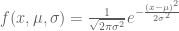


Given n points 


Theorem (Gauss-Markov): The maximum likelihood estimate for the line (the parameters m and b) in the model described above correspond to the least squares line.
The proof is analogous to the argument given for the average of numbers above so we omit it. It can be generalized to higher dimensions where it forms the basis of what is known as linear regression. In regression, the 
The statistical interpretation of least squares can be extended to a similar framework for PCA. Recall that we first considered a statistical interpretation for least squares where an unknown line

In the pPCA model there is an (unknown) line (affine space in higher dimension) on which (hidden) points (blue) are generated at random according to a Gaussian distribution (represented by gray streak in the figure above, where the mean of the Gaussian is the green point). Observed points (red) are then generated from the hidden points by addition of isotropic Gaussian noise (blue smear), meaning that the Gaussian has a diagonal covariance matrix with equal entries. Formally, in the notation of Tipping and Bishop, this is a linear Gaussian model described as follows:
Observed random variables t are given by 


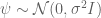

It is important to note that although the maximum likelihood estimates of 
The relationship between regression and (p)PCA is shown in the figure below:
 In the figure, points have been generated randomly according to the pPCA model. the black smear shows the affine space on which the points were generated, with the smear indicating the Gaussian distribution used. Subsequently the latent points (light blue on the gray line) were used to make observed points (red) by the addition of isotropic Gaussian noise. The green line is the maximum likelihood estimate for the space, or equivalently by the theorem of Tipping and Bishop the PCA subspace. The projection of the observed points onto the PCA subspace (blue) are the PCA points. The purple line is the least squares line, or equivalently the affine space obtained by regression (y observed as a noisy function of x). The pink line is also a regression line, except where x is observed as a noisy function of y.
A natural question to ask is why the probabilistic interpretation of PCA (pPCA) is useful or necessary? One reason it is beneficial is that maximum likelihood inference for pPCA involves hidden random variables, and therefore the EM algorithm immediately comes to mind as a solution (the strategy was suggested by both Tipping & Bishop and Roweis). I have not yet discussed how to find the PCA subspace, and the EM algorithm provides an intuitive and direct way to see how it can be done, without the need for writing down any linear algebra:

The exact version of the EM shown above is due to Roweis. In it, one begins with a random affine subspace passing through the centroid of the points. The “E” step (expectation) consists of projecting the points to the subspace. The projected points are considered fixed to the subspace. The “M” step (maximization) then consists of rotating the space so that the total squared distance of the fixed points on the subspace to the observed points is minimized. This is repeated until convergence. Roweis points out that this approach to finding the PCA subspace is equivalent to power iteration for (efficiently) finding eigenvalues of the the sample covariance matrix without computing it directly. This is our first use of the word eigenvalue in describing PCA, and we elaborate on it, and the linear algebra of computing PCA subspaces later in the post.
Another point of note is that pPCA can be viewed as a special case of factor analysis, and this connection provides an immediate starting point for thinking about generalizations of PCA. Specifically, factor analysis corresponds to the model 
A final comment about pPCA is that it provides a natural framework for thinking about hypothesis testing. The book Statistical Methods: A Geometric Approach by Saville and Wood is essentially about (the geometry of) pPCA and its connection to hypothesis testing. The authors do not use the term pPCA but their starting point is exactly the linear Gaussian model of Tipping and Bishop. The idea is to consider single samples from n independent identically distributed independent Gaussian random variables as one single sample from a high-dimensional multivariate linear Gaussian model with isotropic noise. From that point of view pPCA provides an interpretation for Bessel’s correction. The details are interesting but tangential to our focus on PCA.
We are therefore ready to return to Jeopardy!, where we have “Normality for $600” with the answer “A generalization of linear regression in which the Gaussian noise is isotropic” and the question “What is PCA?”
3. An orthogonal projection of points onto an affine space that maximizes the retained sample variance.
In the previous two interpretations of PCA, the focus was on the PCA affine subspace. However in many uses of PCA the output of interest is the projection of the given points onto the PCA affine space. The projected points have three useful related interpretations:
- As seen in in section 1, the (orthogonally) projected points (red -> blue) are those whose total squared distance to the observed points is minimized.
- What we focus on in this section, is the interpretation that the PCA subspace is the one onto which the (orthogonally) projected points maximize the retained sample variance.
- The topic of the next section, namely that the squared distances between the (orthogonally) projected points are on average (in the
metric) closest to the original distances between the points.

The sample variance of a set of points is the average squared distance from each point to the centroid. Mathematically, if the observed points are translated so that their centroid is at zero (known as zero-centering), and then represented by an 


The explanation above is informal, and uses a 1-dimensional PCA subspace in dimension 2 to make the argument. However the argument extends easily to higher dimension, which is typically the setting where PCA is used. In fact, PCA is typically used to “visualize” high dimensional points by projection into dimensions two or three, precisely because of the interpretation provided above, namely that it retains the sample variance. I put visualize in quotes because intuition in two or three dimensions does not always hold in high dimensions. However PCA can be useful for visualization, and one of my favorite examples is the evidence for genes mirroring geography in humans. This was first alluded to by Cavalli-Sforza, but definitively shown by Lao et al., 2008, who analyzed 2541 individuals and showed that PCA of the SNP matrix (approximately) recapitulates geography:

Genes mirror geography from Lao et al. 2008: (Left) PCA of the SNP matrix (2541 individuals x 309,790 SNPs) showing a density map of projected points. (Right) Map of Europe showing locations of the populations .
In the picture above, it is useful to keep in mind that the emergence of geography is occurring in that projection in which the sample variance is maximized. As far as interpretation goes, it is useful to look back at Cavalli-Sforza’s work. He and collaborators who worked on the problem in the 1970s, were unable to obtain a dense SNP matrix due to limited technology of the time. Instead, in Menozzi et al., 1978 they performed PCA of an allele-frequency matrix, i.e. a matrix indexed by populations and allele frequencies instead of individuals and genotypes. Unfortunately they fell into the trap of misinterpreting the biological meaning of the eigenvectors in PCA. Specifically, they inferred migration patterns from contour plots in geographic space obtained by plotting the relative contributions from the eigenvectors, but the effects they observed turned out to be an artifact of PCA. However as we discussed above, PCA can be used quantitatively via the stochastic process for which it solves maximum likelihood inference. It just has to be properly understood.
To conclude this section in Jeopardy! language, we have “Normality for $800” with the answer “A set of points in an affine space obtained via projection of a set of given points so that the sample variance of the projected points is maximized” and the question “What is PCA?”
4. Principal component analysis of Euclidean distance matrices.
In the preceding interpretations of PCA, I have focused on what happens to individual points when projected to a lower dimensional subspace, but it is also interesting to consider what happens to pairs of points. One thing that is clear is that if a pair of points are projected orthogonally onto a low-dimensional affine subspace then the distance between the points in the projection is smaller than the original distance between the points. This is clear because of Pythagoras’ theorem, which implies that the squared distance will shrink unless the points are parallel to the subspace in which case the distance remains the same. An interesting observation is that in fact the PCA subspace is the one with the property where the average (or total) squared distances between the points is maximized. To see this it again suffices to consider only projections onto one dimension (the general case follows by Pythagoras’ theorem). The following lemma, discussed in my previous blog post, makes the connection to the previous discussion:
Lemma: Let 
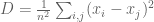


What the lemma says is that the sample variance is equal to the average squared difference between the numbers (i.e. it is a scalar multiple that does not depend on the numbers). I have already discussed that the PCA subspace maximizes the retained variance, and it therefore follows that it also maximizes the average (or total) projected squared distance between the points. Alternately, PCA can be interpreted as minimizing the total (squared) distance that is lost, i,e. if the original distances between the points are given by a distance matrix 


This interpretation of PCA leads to an interesting application of the method to (Euclidean) distance matrices rather than points. The idea is based on a theorem of Isaac Schoenberg that characterizes Euclidean distance matrices and provides a method for realizing them. The theorem is well-known to structural biologists who work with NMR, because it is one of the foundations used to reconstruct coordinates of structures from distance measurements. It requires a bit of notation: D is a distance matrix with entries 


Theorem (Schoenberg, 1938): A matrix D is a Euclidean distance matrix if and only if the matrix 

For the case when 


The procedure just described is called classic multidimensional scaling (MDS) and it returns a set of points on a Euclidean subspace with distance matrix
Now we return to Jeopardy! one final time with the final question in the category: “Normality for $1000”. The answer is “Principal component analysis of Euclidean distance matrices” and the question is “What is classic multidimensional scaling?”
An example
To illustrate the interpretations of PCA I have highlighted, I’m including an example in R inspired by an example from another blog post (all commands can be directly pasted into an R console). I’m also providing the example because missing in the discussion above is a description of how to compute PCA subspaces and the projections of points onto them. I therefore explain some of this math in the course of working out the example:
First, I generate a set of points (in 
 set.seed(2)             #sets the seed for random number generation.
 x <- 1:100              #creates a vector x with numbers from 1 to 100
 ex <- rnorm(100, 0, 30) #100 normally distributed rand. nos. w/ mean=0, s.d.=30
 ey <- rnorm(100, 0, 30) # " "
 y <- 30 + 2 * x         #sets y to be a vector that is a linear function of x
 x_obs <- x + ex         #adds "noise" to x
 y_obs <- y + ey         #adds "noise" to y
 P <- cbind(x_obs,y_obs) #places points in matrix
 plot(P,asp=1,col=1) #plot points
 points(mean(x_obs),mean(y_obs),col=3, pch=19) #show center
At this point a full PCA analysis can be undertaken in R using the command “prcomp”, but in order to illustrate the algorithm I show all the steps below:
 M <- cbind(x_obs-mean(x_obs),y_obs-mean(y_obs))#centered matrix
 MCov <- cov(M)          #creates covariance matrix
Note that the covariance matrix is proportional to the matrix $M^tM$. Next I turn to computation of the principal axes:
 eigenValues <- eigen(MCov)$values       #compute eigenvalues
 eigenVectors <- eigen(MCov)$vectors     #compute eigenvectors
The eigenvectors of the covariance matrix provide the principal axes, and the eigenvalues quantify the fraction of variance explained in each component. This math is explained in many papers and books so we omit it here, except to say that the fact that eigenvalues of the sample covariance matrix are the principal axes follows from recasting the PCA optimization problem as maximization of the Raleigh quotient. A key point is that although I’ve computed the sample covariance matrix explicitly in this example, it is not necessary to do so in practice in order to obtain its eigenvectors. In fact, it is inadvisable to do so. Instead, it is computationally more efficient, and also more stable to directly compute the singular value decomposition of M. The singular value decomposition of M decomposes it into 


 d <- svd(M)$d          #the singular values
 v <- svd(M)$v          #the right singular vectors
The right singular vectors are the eigenvectors of 
lines(x_obs,eigenVectors[2,1]/eigenVectors[1,1]*M[x]+mean(y_obs),col=8)
This shows the first principal axis. Note that it passes through the mean as expected. The ratio of the eigenvectors gives the slope of the axis. Next
lines(x_obs,eigenVectors[2,2]/eigenVectors[1,2]*M[x]+mean(y_obs),col=8)
shows the second principal axis, which is orthogonal to the first (recall that the matrix
lines(x_obs,-1/(eigenVectors[2,1]/eigenVectors[1,1])*M[x]+mean(y_obs),col=8)
as the product of orthogonal slopes is -1. Next, I plot the projections of the points onto the first principal component:
 trans <- (M%*%v[,1])%*%v[,1] #compute projections of points
 P_proj <- scale(trans, center=-cbind(mean(x_obs),mean(y_obs)), scale=FALSE)
 points(P_proj, col=4,pch=19,cex=0.5) #plot projections
 segments(x_obs,y_obs,P_proj[,1],P_proj[,2],col=4,lty=2) #connect to points
The linear algebra of the projection is simply a rotation followed by a projection (and an extra step to recenter to the coordinates of the original points). Formally, the matrix M of points is rotated by the matrix of eigenvectors W to produce 

There are many generalizations and modifications to PCA that go far beyond what has been presented here. The first step in generalizing probabilistic PCA is factor analysis, which includes estimation of variance parameters in each coordinate. Since it is rare that “noise” in data will be the same in each coordinate, factor analysis is almost always a better idea than PCA (although the numerical algorithms are more complicated). In other words, I just explained PCA in detail, now I’m saying don’t use it! There are other aspects that have been generalized and extended. For example the Gaussian assumption can be relaxed to other members of the exponential family, an important idea if the data is discrete (as in genetics). Yang et al. 2012 exploit this idea by replacing PCA with logistic PCA for analysis of genotypes. There are also many constrained and regularized versions of PCA, all improving on the basic algorithm to deal with numerous issues and difficulties. Perhaps more importantly, there are issues in using PCA that I have not discussed. A big one is how to choose the PCA dimension to project to in analysis of high-dimensional data. But I am stopping here as I am certain no one is reading at this far into the post anyway…
The take-home message about PCA? Always be thinking when using it!
Acknowledgment: The exposition of PCA in this post began with notes I compiled for my course MCB/Math 239: 14 Lessons in Computational Genomics taught in the Spring of 2013. I thank students in that class for their questions and feedback. None of the material presented in class was new, but the exposition was intended to clarify when PCA ought to be used, and how. I was inspired by the papers of Tipping, Bishop and Roweis on probabilistic PCA in the late 1990s that provided the needed statistical framework for its understanding. Following the class I taught, I benefited greatly from conversations with Nicolas Bray, Brielin Brown, Isaac Joseph and Shannon McCurdy who helped me to further frame PCA in the way presented in this post.
The Habsburg rulership of Spain ended with an inbreeding coefficient of F=0.254. The last king, Charles II (1661-1700), suffered an unenviable life. He was unable to chew. His tongue was so large he could not speak clearly, and he constantly drooled. Sadly, his mouth was the least of his problems. He suffered seizures, had intellectual disabilities, and was frequently vomiting. He was also impotent and infertile, which meant that even his death was a curse in that his lack of heirs led to a war.
None of these problems prevented him from being married (twice). His first wife, princess Henrietta of England, died at age 26 after becoming deeply depressed having being married to the man for a decade. Only a year later, he married another princess, 23 year old Maria Anna of Neuberg. To put it mildly, his wives did not end up living the charmed life of Disney princesses, nor were they presumably smitten by young Charles II who apparently aged prematurely and looked the part of his horrific homozygosity. The princesses married Charles II because they were forced to. Royals organized marriages to protect and expand their power, money and influence. Coupled to this were primogeniture rules which ensured that the sons of kings, their own flesh and blood and therefore presumably the best-suited to be in power, would indeed have the opportunity to succeed their fathers. The family tree of Charles II shows how this worked in Spain:

It is believed that the inbreeding in Charles II’s family led to two genetic disorders, combined pituitary hormone deficiency and distal renal tubular acidosis, that explained many of his physical and mental problems. In other words, genetic diversity is important, and the point of this blog post is to highlight the fact that diversity is important in education as well.
The problem of inbreeding in academia has been studied previously, albeit to a limited extent. One interesting article is Navel Grazing: Academic Inbreeding and Scientific Productivity by Horta et al published in 2010 (my own experience with an inbred academic from a department where 39% of the faculty are self-hires anecdotally confirms the claims made in the paper). But here I focus on the downsides of inbreeding of ideas rather than of faculty. For example home-schooling, the educational equivalent of primogeniture, can be fantastic if the parents happen to be good teachers, but can fail miserably if they are not. One thing that is guaranteed in a school or university setting is that learning happens by exposure to many teachers (different faculty, students, tutors, the internet, etc.) Students frequently complain when there is high variance in teaching quality, but one thing such variance ensures is that is is very unlikely that any student is exposed only to bad teachers. Diversity in teaching also helps to foster the development of new ideas. Different teachers, by virtue of insight or error, will occasionally “mutate” ideas or concepts for better or for worse. In other words, one does not have to fully embrace the theory of memes to acknowledge that there are benefits to variance in teaching styles, methods and pedagogy. Conversely, there is danger in homogeneity.
This brings me to MOOCs. One of the great things about MOOCs is that they reach millions of people. Udacity claims it has 1.6 million “users” (students?). Coursera claims 7.1 million. These companies are greatly expanding the accessibility of education. Starving children in India can now take courses in mathematical methods for quantitative finance, and for the first time in history, a president of the United States can discreetly take a freshman course on economics together with its high school algebra prerequisites (highly recommended). But when I am asked whether I would be interested in offering a MOOC I hesitate, paralyzed at the thought that any error I make would immediately be embedded in the brains of millions of innocent victims. My concern is this: MOOCs can greatly reduce the variance in education. For example, Coursera currently offers 641 courses, which means that each courses is or has been taught to over 11,000 students. Many college courses may have less than a few dozen students, and even large college courses rarely have more than a few hundred students. This means that on average, through MOOCs, individual professors reach many more (2 orders of magnitude!) students. A great lecture can end up positively impacting a large number of individuals, but at the same time, a MOOC can be a vehicle for infecting the brains of millions of people with nonsense. If that nonsense is then propagated and reaffirmed via the interactions of the people who have learned it from the same source, then the inbreeding of ideas has occurred.
I mention MOOCs because I was recently thinking about intuition behind Bessel’s correction replacing n with n-1 in the formula for sample variance. Formally, Bessel’s correction replaces the biased formula
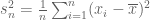
for estimating the variance of a random variable from samples

The switch from n to n-1 is a bit mysterious and surprising, and in introductory statistics classes it is frequently just presented as a “fact”. When an explanation is provided, it is usually in the form of algebraic manipulation that establishes the result. The issue came up as a result of a blog post I’m writing about principal components analysis (PCA), and I thought I would check for an intuitive explanation online. I googled “intuition sample variance” and the top link was a MOOC from the Khan Academy:
The video has over 51,000 views with over 100 “likes” and only 6 “dislikes”. Unfortunately, in this case, popularity is not a good proxy for quality. Despite the title promising “review” and “intuition” for “why we divide by n-1 for the unbiased sample variance” there is no specific reason given why n is replaced by n-1 (as opposed to another correction). Furthermore, the intuition provided has to do with the fact that 


Wikipedia is also not perfect, and this example is a good one for why teaching by humans is important. Among the three alternative derivations, I think that one stands out as “better” but one would not know by just looking at the wikipedia page. Specifically, I refer to “Alternate 1” on the wikipedia page, that is essentially explaining that variance can be rewritten as a double sum corresponding to the average squared distance between points and the diagonal terms of the sum are zero in expectation. An explanation of why this fact leads to the n-1 in the unbiased estimator is as follows:
The first step is to notice that the variance of a random variable is equal to half of the expected squared difference of two independent identically distributed random variables of that type. Specifically, the definition of variance is:


This identity motivates a rewriting of the (uncorrected) sample variance 
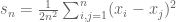
Of note is that in this summation exactly n of the terms are zero, namely the terms when i=j. These terms are zero independently of the original distribution, and remain so in expectation thereby biasing the estimate of the variance, specifically leading to an underestimate. Removing them fixes the estimate and produces

It is easy to see that this is indeed Bessel’s correction. In other words, the correction boils down to the fact that 
Why do I like this particular derivation of Bessel’s correction? There are two reasons: first, n-1 emerges naturally and obviously from the derivation. The denominator in 

In writing this blog post I pondered the irony of my call for added diversity in teaching while I preach my own idea (this post) to a large number of readers via a medium designed for maximal outreach. I can only ask that others blog as well to offer alternative points of view 🙂 and that readers inform themselves on the issues I raise by fact-checking elsewhere. As far as the statistics goes, if someone finds the post confusing, they should go and register for one of the many fantastic MOOCs on statistics! But I reiterate that in the rush to MOOCdom, providers must offer diversity in their offerings (even multiple lectures on the same topic) to ensure a healthy population of memes. This is especially true in Spain, where already inbred faculty are now inbreeding what they teach by MOOCing via Miriada X. Half of the MOOCs being offered in Spain originate from just 3 universities, while the number of potential viewers is enormous as Spanish is now the second most spoken language in the world (thanks to Charles II’s great-great-grandfather, Charles I).
May Charles II rest in peace.
Last Monday some biostatisticians/epidemiologists from Australia published a paper about a “visualization tool which may allow greater understanding of medical and epidemiological data”:
H. Wand et al., “Quilt Plots: A Simple Tool for the Visualisation of Large Epidemiological Data“, PLoS ONE 9(1): e85047.
A brief look at the “paper” reveals that the quilt plot they propose is a special case of what is commonly known as a heat map, a point the authors acknowledge, with the caveat that they claim that
” ‘heat maps’ require the specification of 21 arguments including hierarchical clustering, weights for reordering the row and columns dendrogram, which are not always easily understood unless one has an extensive programming knowledge and skills. One of the aims of our paper is to present ‘‘quilt plots’’ as a useful tool with simply formulated R-functions that can be easily understood by researchers from different scientific backgrounds without high-level programming skills.”
In other words, the quilt plot is a simplified heat map and the authors think it should be used because specifying parameters for a heat map (in R) would require a terrifying skill known as programming. This is of course all completely ridiculous. Not only does usage of R not require programming skill, there are also simplified heat map functions in many programming languages/computation environments that are as simple as the quilt plot function.
The fact that a paper like this was published in a journal is preposterous, and indeed the authors and editor of the paper have been ridiculed on social media, blogs and in comments to their paper on the PLoS One website.
BUT…
Wand et al. do have one point… those 21 parameters are not an entirely trivial matter. In fact, the majority of computational biologists (including many who have been ridiculing Wand) appear not to understand heat maps themselves, despite repeatedly (ab)using them in their own work.
What are heat maps?
In the simplest case, heat maps are just the conversion of a table of numbers into a grid with colored squares, where the colors represent the magnitude of the numbers. In the quilt plot paper that is the type of heat map considered. However in applications such as gene expression analysis, heat maps are used to visualize distances between experiments.
Heat maps have been popular for visualizing multiple gene expression datasets since the publication of the “Eisengram” (or the guilt plot?). So when my student Lorian Schaeffer and I recently needed to create a heat map from RNA-Seq abundance estimates in multiple samples we are analyzing with Ryan Forster and Dirk Hockemeyer, we assumed there would be a standard method (and software) we could use. However when starting to look at the literature we quickly found 3 papers with 4 different opinions about which similarity measure to use:
- In “The evolution of gene expression levels in mammalian organs“, Brawand et al., Nature 478 (2011), 343-348, the authors use two different distance measures for evaluating the similarity between samples. They use the measure
where
is Spearman’s rank correlation (Supplementary figure S2) and also the Euclidean distance (Supplementary figure S3).
- In “Differential expression analysis for sequence count data“, Anders and Huber, Genome Biology 11 (2010), R106, a heat map tool is provided that is based on Euclidean distance but differs from the method in Brawand et al. by first performing variance stabilization on the abundance estimates.
- In “Evolutionary Dynamics of Gene and Isoform Regulation in Mammalian Tissues“, Merkin et al., Science 338 (2012), a heat map is displayed based on the Jensen-Shannon metric.
There are also the folks who don’t worry too much and just try anything and everything (for example using the heatmap.2 function in R) hoping that some distance measure produces the figure they need for their paper. There are certainly a plethora of distance measures for them to try out. And even if none of the distance measures provide the needed figure, there is always the opportunity to play with the colors and shading to “highlight” the desired result. In other words, heat maps are great for cheating with what appears to be statistics.
We wondered… what is the “right” way to make a heat map?
Consider first the obvious choice for measuring similarity: Euclidean distance. Suppose that we are estimating the distance between abundance estimates from two RNA-Seq experiments, where for simplicity we assume that there are only three transcripts (A,B,C). The two abundance estimates can be represented by 3-tuples 


The Jensen-Shannon divergence, defined for two distributions 


where 


The 2-simplex with contour lines showing points equidistant
from the probability distribution (1/3, 1/3, 1/3) for the JSD metric.
The meaning of the JSD metric is not immediately apparent based on its definition, but a number of results provide some insight. First, the JSD metric can be approximated by Pearson’s 
In “Transcript assembly and quantification by RNA-Seq reveals unannotated transcripts and isoform switching during cell differentiation“, Trapnell et al., Nature Biotechnology 28 (2010), we used the JSD metric to examine changes to relative isoform abundances in genes (see, for example, the Minard plot in Figure 2c). This application of the JSD metric makes sense, however the JSD metric is not a panacea. Consider Figure 1 in the Merkin et al. paper mentioned above. It displays a heat map generated from 7713 genes (genes with singleton orthologs in the five species studied). Some of these genes will have higher expression, and therefore higher variance, than others. The nature of the JSD metric is such that those genes will dominate the distance function, so that the heat map is effectively generated only from the highly abundant genes. Since there is typically an (approximately) exponential distribution of transcript abundance this means that, in effect, very few genes dominate the analysis.
I started thinking about this issue with my student Nicolas Bray and we began by looking at the first obvious candidate for addressing the issue of domination by high variance genes: the Mahalanobis distance. Mahalanobis distance is an option in many heat map packages (e.g. in R), but has been used only rarely in publications (although there is some history of its use in the analyses of microarray data). Intuitively, Mahalanobis distance seeks to remedy the problem of genes with high variance among the samples dominating the distance calculation by appropriate normalization. This appears to have been the aim of the method in the Anders and Huber paper cited above, where the expression values are first normalized to obtain equal variance for each gene (the variance stabilization procedure). Mahalanobis distance goes a step further and better, by normalizing using the entire covariance matrix (as opposed to just its diagonal).
Intuitively, given a set of points in some dimension, the Mahalanobis distance is the Euclidean distance between the points after they have been transformed via a linear transformation that maps an ellipsoid fitted to the points to a sphere. Formally, I think it is best understood in the following slightly more general terms:
Given an 


When 


The Mahalanobis ellipses. In this figure the distance shown is from every point to the center (mean of the point) rather than between pairs of points. Mahalanobis distance is sometimes defined in this way. The figure is reproduced from this website. Note that the Anders-Huber heat map produces distances looking only at the variance in each direction (in this case horizontal and vertical) which assumes that the gene expression values are independent, or equivalently that the ellipse is not rotated.
It is interesting to note that D is defined even when 
The cutoff p involves ignoring the last few principal components. The reason one might want to do this is that the last few principal components presumably correspond to noise in the data. Amplifying this noise and treating it the same as the signal is not desirable. This is because as p increases the denominators 
We’re still not completely happy with Mahalanobis distance. For example, unlike the Jensen-Shannon metric, it does not provide a metric over probability distributions. In functional genomics, almost all *Seq assays produce an output which is a (discrete) probability distribution (for example in RNA-Seq the output after quantification is a probability distribution on the set of transcripts). So making heat maps for such data seems to not be entirely trivial…
Does any of this matter?
The landmark Michael Eisen et al. paper “Cluster analysis and the display of genome-wide expression patterns“, PNAS 95 (1998), 14863–14868 describing the “Eisengram” was based on correlation as the distance measure between expression vectors. This has a similar problem to the issues we discussed above, namely that abundant genes are weighted more heavily in the distance measure, and therefore they define the characteristics of the heat map. Yet the Eisengram and its variants have proven to be extremely popular and useful. It is fair to ask whether any of the issues I’ve raised matter in practice.
Depends. In many papers the heat map is a visualization tool intended for a qualitative exploration of the data. The issues discussed here touch on quantitative aspects, and in some applications changing distance measures may not change the qualitative results. Its difficult to say without reanalyzing data sets and (re)creating the heat maps with different parameters. Regardless, as expression technology continues to transition from microarrays to RNA-Seq, the demand for quantitative results is increasing. So I think it does matters how heat maps are made. Of course its easy to ridicule Handan Wand for her quilt plots, but I think those guilty of pasting ad-hoc heat maps based on arbitrary distance measures in their papers are really the ones that deserve a public spanking.
P.S. If you’re going to make your own heat map, after adhering to sound statistics, please use a colorblind-friendly palette.
P.P.S. In this post I have ignored the issue of clustering, namely how to order the rows and columns of heat maps so that similar expression profiles cluster together. This goes along with the problem of constructing meaningful dendograms, a visualization that has been a major factor in the popularization of the Eisengram. The choice of clustering algorithm is just as important as the choice of similarity measure, but I leave this for a future post.

Recent Comments