
You are currently browsing the category archive for the ‘sophistry’ category.
If you haven’t heard about Clubhouse yet… well, it’s the latest Silicon Valley unicorn, and the popular new chat hole for thought leaders. I heard about it for the first time a few months ago, and was kindly offered an invitation (Club house is invitation only!) so I could explore what it is all about. Clubhouse is an app for audio based social networking, and the content is, as far as I can tell, a mixed bag. I’ve listened to a handful of conversations hosted on the app.. topics include everything from bitcoin to Miami. It was interesting, at times, to hear the thoughts and opinions of some of the discussants. On the other hand, there is a lot of superficial rambling on Clubhouse as well. During a conversation about genetics I heard someone posit that biology has a lot to learn from the fashion industry. This was delivered in a “you are hearing something profound” manner, by someone who clearly knew nothing about either biology or the fashion industry, which is really too bad, because the fashion industry is quite interesting and I wouldn’t be surprised at all if biology has something to learn from it. Unfortunately, I never learned what that is.
One of the regulars on Clubhouse is Noor Siddiqui. You may not have heard of her; in fact she is officially “not notable”. That is to say, she used to have a Wikipedia page but it was deleted on the grounds that there is nothing about her that indicates notability, which is of course notable in and of itself… a paradox that says more about Wikipedia’s gatekeeping than Siddiqui (Russell 1903, Litt 2021). In any case, Siddiqui was recently part of a Clubhouse conversation on “convergence of genomics and reproductive technology” together with Carlos Bustamante (advisor to cryptocurrency based Luna DNA and soon to be professor of business technology at the University of Miami) and Balaji Srinivasan (bitcoin angel investor and entrepreneur). As it happens, Siddiqui is the CEO of a startup called “Orchid Health“, in the genomics and reproductive technology “space”. The company promises to harness “population genetics, statistical modeling, reproductive technologies, and the latest advances in genomic science” to “give parents the option to lower a future child’s genetic risk by creating embryos through in IVF and implanting embryos in the order that can reduce disease risk.” This “product” will be available later this year. Bustamante and Srinivasan are early “operators and investors” in the venture.
Orchid is not Siddiqui’s first startup. While she doesn’t have a Wikipedia page, she does have a website where she boasts of having (briefly) been a Thiel fellow and, together with her sister, starting a company as a teenager. The idea of the (briefly in existence) startup was apparently to help the now commercially defunct Google Glass gain acceptance by bringing the device to the medical industry. According to Siddiqui, Orchid is also not her first dive into statistical modeling or genomics. She notes on her website that she did “AI and genomics research”, specifically on “deep learning for genomics”. Such training and experience could have been put to good use but…
Polygenic risk scores and polygenic embryo selection
Orchid Health claims that it will “safely and naturally, protect your baby from diseases that run in your family” (the slogan “have healthy babies” is prominently displayed on the company’s website). The way it will do this is to utilize “advances in machine learning and artificial intelligence” to screen embryos created through in-vitro fertilization (IVF) for “breast cancer, prostate cancer, heart disease, atrial fibrillation, stroke, type 2 diabetes, type 1 diabetes, inflammatory bowel disease, schizophrenia and Alzheimer’s“. What this means in (a statistical geneticist’s) layman’s terms is that Orchid is planning to use polygenic risk scores derived from genome-wide association studies to perform polygenic embryo selection for complex diseases. This can be easily unpacked because it’s quite a simple proposition, although it’s far from a trivial one- the statistical genetics involved is deep and complicated.
First, a single-gene disorder is a health problem that is caused by a single mutation in the genome. Examples of such disorders include Tay-Sachs disease, sickle cell anaemia, Huntington’s disease, Duchenne muscular dystrophy, and many other diseases. A “complex disease”, also called a multifactorial disease, is a disease that has a genetic component, but one that involves multiple genes, i.e. it is not a single-gene disorder. Crucially, complex diseases may involve effects of environmental factors, whose role in causing disease may depend on the genetic composition of an individual. The list of diseases on Orchid’s website, including breast cancer, prostate cancer, heart disease, atrial fibrillation, stroke, type 2 diabetes, type 1 diabetes, inflammatory bowel disease, schizophrenia and Alzheimer’s disease are all examples of complex (multifactorial) diseases.
To identify genes that associate with a complex disease, researchers perform genome-wide association studies (GWAS). In such studies, researchers typically analyze several million genomic sites in a large numbers of individuals with and without a disease (used to be thousands of individuals, nowadays hundreds of thousands or millions) and perform regressions to assess the marginal effect at each locus. I italicized the word associate above, because genome-wide association studies do not, in and of themselves, point to genomic loci that cause disease. Rather, they produce, as output, lists of genomic loci that have varying degrees of association with the disease or trait of interest.
Polygenic risk scores (PRS), which the Broad Institute claims to have discovered (narrator: they were not discovered at the Broad Institute), are a way to combine the multiple genetic loci associated with a complex disease from a GWAS. Specifically, a PRS 
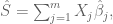
where the sum is over 


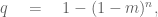
While much of the discussion around PRS applications centers on applications such as determining diagnostic testing frequency (Wald and Old 2019), polygenic embryo selection (PES) posits that polygenic risk scores should be taken a step further and evaluated for embryos to be used as a basis for discarding, or selecting, specific embryos for in vitro fertilization implantation. The idea has been widely criticized and critiqued (Karavani et al. 2019). It has been described as unethical, morally repugnant, and concerns about its use for eugenics have been voiced by many. Underlying these criticisms is the fact that the technical issues with PES using PRS are manifold.
Poor penetrance
The term “penetrance” for a disease refers to the proportion of individuals with a particular genetic variant that have the disease. Many single-gene disorders have very high penetrance. For example, F508del mutation in the CFTR gene is 100% penetrant for cystic fibrosis. That is, 100% of people who are homozygous for this variant, meaning that both copies of their DNA have a deletion of the phenylalanine amino acid in position 508 of their CFTR gene, will have cystic fibrosis. The vast majority of variants associated with complex diseases have very low penetrance. For example, in schizophrenia, the penetrance of “high risk” de novo copy number variants (in which there are variable copies of DNA at a genomic loci) was found to be between 2% and 7.4% (Vassos et al 2010). The low penetrance at large numbers of variants for complex diseases was precisely the rationale for developing polygenic risk scores in the first place, the idea being that while individual variants yield small effects, perhaps in (linear) combination they can have more predictive power. While it is true that combining variants does yield more predictive power for complex diseases, unfortunately the accuracy is, in absolute terms, very low.
The reason for low predictive power of PRS is explained well in (Wald and Old 2020) and is illustrated for coronary artery disease (CAD) in (Rotter and Lin 2020):

The issue is that while the polygenic risk score distribution may indeed be shifted for individuals with a disease, and while this shift may be statistically significant resulting in large odds ratios, i.e. much higher relative risk for individuals with higher PRS, the proportion of individuals in the tail of the distributions who will or won’t develop the disease will greatly affect the predictive power of the PRS. For example, Wald and Old note that PRS for CAD from (Khera et al. 2018) will confer a detection rate of only 15% with a false positive rate of 5%. At a 3% false positive rate the detection rate would be only 10%. This is visible in the figure above, where it is clear that control of the false positive right (i.e. thresholding at the extreme right-hand side with high PRS score) will filter out many (most) affected individuals. The same issue is raised in the excellent review on PES of (Lázaro-Muńoz et al. 2020). The authors explain that “even if a PRS in the top decile for schizophrenia conferred a nearly fivefold increased risk for a given embryo, this would still yield a >95% chance of not developing the disorder.” It is worth noting in this context, that diseases like schizophrenia are not even well defined phenotypically (Mølstrøm et al. 2020), which is another complex matter that is too involved to go into detail here.
In a recent tweet, Siddiqui describes natural conception as a genetic lottery, and suggests that Orchid Health, by performing PES, can tilt the odds in customers’ favor. To do so the false positive rate must be low, or else too many embryos will be discarded. But a 15% sensitivity is highly problematic considering the risks inherent with IVF in the first place (Kamphuis et al. 2014):

To be concrete, an odds ratio of 2.8 for cerebral palsy needs to be balanced against the fact that in the Khera et al. study, only 8% of individuals had an odds ratio >3.0 for CAD. Other diseases are even worse, in this sense, than CAD. In atrial fibrillation (one of the diseases on Orchid Health’s list), only 9.3% of the individuals in the top 0.44% of the atrial fibrillation PRS actually had atrial fibrillation (Choi et al 2019).As one starts to think carefully about the practical aspects and tradeoffs in performing PES, other issues, resulting from the low penetrance of complex disease variants, come into play as well. (Lencz et al. 2020) examine these tradeoffs in detail, and conclude that “the differential performance of PES across selection strategies and risk reduction metrics may be difficult to communicate to couples seeking assisted reproductive technologies… These difficulties are expected to exacerbate the already profound ethical issues raised by PES… which include stigmatization, autonomy (including “choice overload”, and equity. In addition, the ever-present specter of eugenics may be especially salient in the context of the LRP (lowest-risk prioritization) strategy.” They go on to “call for urgent deliberations amongst key stakeholders (including researchers, clinicians, and patients) to address governance of PES and for the development of policy statements by professional societies.”
Pleiotropy predicaments
I remember a conversation I had with Nicolas Bray several years ago shortly after the exciting discovery of CRISPR/Cas9 for genome editing, on the implications of the technology for improving human health. Nick pointed out that the development of genomics had been curiously “backwards”. Thirty years ago, when human genome sequencing was beginning in earnest, the hope was that with the sequence at hand we would be able to start figuring out the function of genes, and even individual base pairs in the genome. At the time, the human genome project was billed as being able to “help scientists search for genes associated with human disease” and it was imagined that “greater understanding of the genetic errors that cause disease should pave the way for new strategies in diagnosis, therapy, and disease prevention.” Instead, what happened is that genome editing technology has arrived well before we have any idea of what the vast majority of the genome does, let alone the implications of edits to it. Similarly, while the coupling of IVF and genome sequencing makes it possible to select embryos based on genetic variants today, the reality is that we have no idea how the genome functions, or what the vast majority of genes or variants actually do.

One thing that is known about the genome is that it is chock full of pleiotropy. This is statistical genetics jargon for the fact that variation at a single locus in the genome can affect many traits simultaneously. Whereas one might think naïvely that there are distinct genes affecting individual traits, in reality the genome is a complex web of interactions among its constituent parts, leading to extensive pleiotropy. In some cases pleiotropy can be antagonistic, which means that a genomic variant may simultaneously be harmful and beneficial. A famous example of this is the mutation to the beta globin gene that confers malaria resistance to heterozygotes (individuals with just one of their DNA copies carrying the mutation) and sickle cell anemia to homozygotes (individuals with both copies of their DNA carrying the mutation).
In the case of complex diseases we don’t really know enough, or anything, about the genome to be able to truly assess pleiotropy risks (or benefits). But there are some worries already. For example, HLA Class II genes are associated with Type I and non-insulin treated Type 2 diabetes (Jacobi et al 2020), Parkinson’s disease (e.g. James and Georgopolous 2020, which also describes an association with dementia) and Alzheimer’s (Wang and Xing 2020). PES that results in selection against the variants associated with these diseases could very well lead to population susceptibility to infectious disease. Having said that, it is worth repeating that we don’t really know if the danger is serious, because we don’t have any idea what the vast majority of the genome does, nor the nature of antagonistic pleiotropy present in it. Almost certainly by selecting for one trait according to PRS, embryos will also be selected for a host of other unknown traits.
Thus, what can be said is that while Orchid Health is trying to convince potential customers to not “roll the dice“, by ignoring the complexities of pleiotropy and its implications for embryo selection, what the company is actually doing is in fact rolling the dice for its customers (for a fee).

Population problems
One of Orchid Health’s selling points is that unlike other tests that “look at 2% of only one partner’s genome…Orchid sequences 100% of both partner’s genomes” resulting in “6 billion data points”. This refers to the “couples report”, which is a companion product of sorts to the polygenic embryo screening. The couples report is assembled by using the sequenced genomes of parents to simulate the genomes of potential babies, each of which is evaluated for PRS’ to provide a range of (PRS based) disease predictions for the couples potential children. Sequencing a whole genome is a lot more expensive that just assessing single nucleotide polymorphisms (SNPs) in a panel. That may be one reason that most direct-to-consumer genetics is based on polymorphism panels rather than sequencing. There is another: the vast majority of variation in the genome occurs at a known polymorphic sites (there are a few million out of the approximately 3 billion base pairs in the genome), and to the extent that a variant might associate with a disease, it is likely that a neighboring common variant, which will be inherited together with the causal one, can serve as a proxy. There are rare variants that have been shown to associate with disease, but whether or not they explain can explain a large fraction of (genetic) disease burden is still an open question (Young 2019). So what has Siddiqui, who touts the benefits of whole-genome sequencing in a recent interview, discovered that others such as 23andme have missed?
It turns out there is value to whole-genome sequencing for polygenic risk score analysis, but it is when one is performing the genome-wide association studies on which the PRS are based. The reason is a bit subtle, and has to do with differences in genetics between populations. Specifically, as explained in (De La Vega and Bustamante, 2018), variants that associate with a disease in one population may be different than variants that associate with the disease in another population, and whole-genome sequencing across populations can help to mitigate biases that result when restricting to SNP panels. Unfortunately, as De La Vega and Bustamante note, whole-genome sequencing for GWAS “would increase costs by orders of magnitude”. In any case, the value of whole-genome sequencing for PRS lies mainly in identifying relevant variants, not in assessing risk in individuals.
The issue of population structure affecting PRS unfortunately transcends considerations about whole-genome sequencing. (Curtis 2018) shows that PRS for schizophrenia is more strongly associated with ancestry than with the disease. Specifically, he shows that “The PRS for schizophrenia varied significantly between ancestral groups and was much higher in African than European HapMap subjects. The mean difference between these groups was 10 times as high as the mean difference between European schizophrenia cases and controls. The distributions of scores for African and European subjects hardly overlapped.” The figure from Curtis’ paper showing the distribution of PRS for schizophrenia across populations is displayed below (the three letter codes at the bottom are abbreviations for different population groups; CEU stands for Northern Europeans from Utah and is the lowest).

The dependence of PRS on population is a problem that is compounded by a general problem with GWAS, namely that Europeans and individuals of European descent have been significantly oversampled in GWAS. Furthermore, even within a single ancestry group, the prediction accuracy of PRS can depend on confounding factors such as socio-economic status (Mostafavi et al. 2020). Practically speaking, the implications for PES are beyond troubling. The PRS scores in the reports customers of Orchid Health may be inaccurate or meaningless due to not only the genetic background or admixture of the parents involved, but also other unaccounted for factors. Embryo selection on the basis of such data becomes worse than just throwing dice, it can potentially lead to unintended consequences in the genomes of the selected embryos. (Martin et al. 2019) show unequivocally that clinical use of polygenic risk scores may exacerbate health disparities.
People pathos
The fact that Silicon Valley entrepreneurs are jumping aboard a technically incoherent venture and are willing to set aside serious ethical and moral concerns is not very surprising. See, e.g. Theranos, which was supported by its investors despite concerns being raised about the technical foundations of the company. After a critical story appeared in the Wall Street Journal, the company put out a statement that
“[Bad stories]…come along when you threaten to change things, seeded by entrenched interests that will do anything to prevent change, but in the end nothing will deter us from making our tests the best and of the highest integrity for the people we serve, and continuing to fight for transformative change in health care.”
While this did bother a few investors at the time, many stayed the course for a while longer. Siddiqui uses similar language, brushing off criticism by complaining about paternalism in the health care industry and gatekeeping, while stating that
“We’re in an age of seismic change in biotech – the ability to sequence genomes, the ability to edit genomes, and now the unprecedented ability to impact the health of a future child.”
Her investors, many of whom got rich from cryptocurrency trading or bitcoin, cheer her on. One of her investors is Brian Armstrong, CEO of Coinbase, who believes “[Orchid is] a step towards where we need to go in medicine.” I think I can understand some of the ego and money incentives of Silicon Valley that drive such sentiment. But one thing that disappoints me is that scientists I personally held in high regard, such as Jan Liphardt (associate professor of Bioengineering at Stanford) who is on the scientific advisory board and Carlos Bustamante (co-author of the paper about population structure associated biases in PRS mentioned above) who is an investor in Orchid Health, have associated themselves with the company. It’s also very disturbing that Anne Wojcicki, the CEO of 23andme whose team of statistical geneticists understand the subtleties of PRS, still went ahead and invested in the company.
Conclusion
Orchid Health’s polygenic embryo selection, which it will be offering later this year, is unethical and morally repugnant. My suggestion is to think twice before sending them three years of tax returns to try to get a discount on their product.

Steven Miller is a math professor at Williams College who specializes in number theory and theoretical probability theory. A few days ago he published a “declaration” in which he performs an “analysis” of phone bank data of registered Republicans in Pennsylvania. The data was provided to him by Matt Braynyard, who led Trump’s data team during the 2016. Miller frames his “analysis” as an attempt to “estimate the number of fraudulent ballots in Pennsylvania”, and his analysis of the data leads him to conclude that
“almost surely…the number of ballots requested by someone other than the registered Republican is between 37,001 and 58,914, and almost surely the number of ballots requested by registered Republicans and returned but not counted is in the range from 38,910 to 56,483.”
A review of Miller’s “analysis” leads me to conclude that his estimates are fundamentally flawed and that the data as presented provide no evidence of voter fraud.
This conclusion is easy to arrive at. The declaration claims (without a reference) that there were 165,412 mail-in ballots requested by registered Republicans in PA, but that “had not arrived to be counted” as of November 16th, 2020. The data Miller analyzed was based on an attempt to call some of these registered Republicans by phone to assess what happened to their ballots. The number of phone calls made, according to the declaration, is 23,184 = 17,000 + 3,500 + 2,684. The number 17,000 consists of phone calls that did not provide information either because an answering machine picked up instead of a person, or a person picked up and summarily hung up. 3,500 numbers were characterized as “bad numbers / language barrier”, and 2,684 individuals answered the phone. Curiously, Miller writes that “Almost 20,000 people were called”, when in fact 23,184 > 20,000.
In any case, clearly many of the phone numbers dialed were simply wrong numbers, as evident by the number of “bad” calls: 3,500. It’s easy to imagine how this can happen: confusion because some individuals share a name, phone numbers have changed, people move, the phone call bank makes an error when dialing etc. Let 

Solving for 
The fraction of bad calls derived translates to about 1,700 bad numbers out of the 2,684 people that were reached. This easily explains not only the 556 individuals who said they did not request a ballot, but also the 463 individuals who said that they mailed back their ballots. In the case of the latter there is no irregularity; the number of bad calls suggests that all those individuals were reached in error and their ballots were legitimately counted so they weren’t part of the 165,412. It also explains the 544 individuals who said they voted in person.
That’s it. The data don’t point to any fraud or irregularity, just a poorly design poll with poor response rates and lots of erroneous information due to bad phone numbers. There is nothing to explain. Miller, on the other hand, has some things to explain.
First, I note that his declaration begins with a signed page asserting various facts about Steven Miller and the analysis he performed. Notably absent from the page, or anywhere else in the document, is a disclosure of funding source for the work and of conflicts of interest. On his work webpage, Miller specifically states that one should always acknowledge funding support.
Second, if Miller really wanted to understand the reason why some ballots were requested for mail-in, but had not yet arrived to be counted, he would also obtain data from Democrats. That would provide a control on various aspects of the analysis, and help to establish whether irregularities, if they were to be detected, were of a partisan nature. Why did Miller not include an analysis of such data?
Third, one might wonder why Steven Miller chose to publish this “declaration”. Surely a professor who has taught probability and statistics for 15 years (as Miller claims he has) must understand that his own “analysis” is fundamentally flawed, right? Then again, I’ve previously found that excellent pure mathematicians are prone to falling into a data analysis trap, i.e. a situation where their lack of experience analyzing real-world datasets leads them to believe naïve analysis that is deeply flawed. To better understand whether this might be the case with Miller, I examined his publication record, which he has shared publicly via Google Scholar, to see whether he has worked with data. The first thing I noticed was that he has published more than 700 articles (!) and has an h-index of 47 for a total of 8,634 citations… an incredible record for any professor, and especially for a mathematician. A Google search for his name displays this impressive number of citations:

As it turns out, his impressive publication record is a mirage. When I took a closer look and found that many of the papers he lists on his Google Scholar page are not his, but rather articles published by other authors with the name S Miller. “His” most cited article was published in 1955, a year that transpired well before he was born. Miller’s own most cited paper is a short unpublished tutorial on least squares (I was curious and reviewed it as well only to find some inaccuracies but hey, I don’t work for this guy).
I will note that in creating his Google Scholar page, Miller did not just enter his name and email address (required). He went to the effort of customizing the page, including the addition of keywords and a link to his homepage, and in doing so followed his own general advice to curate one’s CV (strangely, he also dispenses advice on job interviews, including about shaving- I guess only women interview for jobs?). But I digress: the question is, why is his Google Scholar page display massively inflated publication statistics based on papers that are not his? I’ve seen this before, and in one case where I had hard evidence that it was done deliberately to mislead I reported it as fraud. Regardless of Miller’s motivations, by looking at his actual publications I confirmed what I suspected, namely that he has hardly any experience analyzing real world data. I’m willing to chalk up his embarrassing “declaration” to statistics illiteracy and naïveté.
In summary, Steven Miller’s declaration provides no evidence whatsoever of voter fraud in Pennsylvania.
Lior Pachter
Division of Biology and Biological Engineering &
Department of Computing and Mathematical Sciences California Institute of Technology
Abstract
A recently published pilot study on the efficacy of 25-hydroxyvitamin D3 (calcifediol) in reducing ICU admission of hospitalized COVID-19 patients, concluded that the treatment “seems able to reduce the severity of disease, but larger trials with groups properly matched will be required go show a definitive answer”. In a follow-up paper, Jungreis and Kellis re-examine this so-called “Córdoba study” and argue that the authors of the study have undersold their results. Based on a reanalysis of the data in a manner they describe as “rigorous” and using “well established statistical techniques”, they urge the medical community to “consider testing the vitamin D levels of all hospitalized COVID-19 patients, and taking remedial action for those who are deficient.” Their recommendation is based on two claims: in an examination of unevenness in the distribution of one of the comorbidities between cases and controls, they conclude that there is “no evidence of incorrect randomization”, and they present a “mathematical theorem” to make the case that the effect size in the Córdoba study is significant to the extent that “they can be confident that if assignment to the treatment group had no effect, we would not have observed these results simply due to chance.”
Unfortunately, the “mathematical analysis” of Jungreis and Kellis is deeply flawed, and their “theorem” is vacuous. Their analysis cannot be used to conclude that the Córdoba study shows that calcifediol significantly reduces ICU admission of hospitalized COVID- 19 patients. Moreover, the Córdoba study is fundamentally flawed, and therefore there is nothing to learn from it.
The Córdoba study
The Córdoba study, described by the authors as a pilot, was ostensibly a randomized controlled trial, designed to determine the efficacy of 25-hydroxyvitamin D3 in reducing ICU admission of hospitalized COVID-19 patients. The study consisted of 76 patients hospitalized for COVID-19 symptoms, with 50 of the patients treated with calcifediol, and 26 not receiving treatment. Patients were administered “standard care”, which according to the authors consisted of “a combination of hydroxychloroquine, azithromycin, and for patients with pneumonia and NEWS score 5, a broad spectrum antibiotic”. Crucially, admission to the ICU was determined by a “Selection Committee” consisting of intensivists, pulmonologists, internists, and members of an ethics committee. The Selection Committee based ICU admission decisions on the evaluation of several criteria, including presence of comorbidities, and the level of dependence of patients according to their needs and clinical criteria.
The result of the Córdoba trial was that only 1/50 of the treated patients was admitted to the ICU, whereas 13/26 of the untreated patients were admitted (p-value = 7.7 ∗ 10−7 by Fisher’s exact test). This is a minuscule p-value but it is meaningless. Since there is no record of the Selection Committee deliberations, it impossible to know whether the ICU admission of the 13 untreated patients was due to their previous high blood pressure comorbidity. Perhaps the 11 treated patients with the comorbidity were not admitted to the ICU because they were older, and the Selection Committee considered their previous higher blood pressure to be more “normal” (14/50 treatment patients were over the age of 60, versus only 5/26 of the untreated patients).

Figure 1: Table 2 from [1] showing the comorbidities of patients. It is reproduced by virtue of [1] being published open access under the CC-BY license.
The fact that admission to the ICU could be decided in part based on the presence of co-morbidities, and that there was a significant imbalance in one of the comorbidities, immediately renders the study results meaningless. There are several other problems with it that potentially confound the results: the study did not examine the Vitamin D levels of the treated patients, nor was the untreated group administered a placebo. Most importantly, the study numbers were tiny, with only 76 patients examined. Small studies are notoriously problematic, and are known to produce large effect sizes [9]. Furthermore, sloppiness in the study does not lead to confidence in the results. The authors state that the “rigorous protocol” for determining patient admission to the ICU is available as Supplementary Material, but there is no Supplementary Material distributed with the paper. There is also an embarrassing typo: Fisher’s exact test is referred to twice as “Fischer’s test”. To err once in describing this classical statistical test may be regarded as misfortune; to do it twice looks like carelessness.
A pointless statistics exercise
The Córdoba study has not received much attention, which is not surprising considering that by the authors’ own admission it was a pilot that at best only motivates a properly matched and powered randomized controlled trial. Indeed, the authors mention that such a trial (the COVIDIOL trial), with data being collected from 15 hospitals in Spain, is underway. Nevertheless, Jungreis and Kellis [3], apparently mesmerized by the 7.7 ∗ 10−7 p-value for ICU admission upon treatment, felt the need to “rescue” the study with what amounts to faux statistical gravitas. They argue for immediate consideration of testing Vitamin D levels of hospitalized patients, so that “deficient” patients can be administered some form of Vitamin D “to the extent it can be done safely”. Their message has been noticed; only a few days after [3] appeared the authors’ tweet to promote it has been retweeted more than 50 times [8].
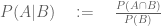
Jungreis and Kellis claim that the p-value for the effect of calcifediol on patients is so significant, that in and of itself it merits belief that administration of calcifediol does, in fact, prevent admission of patients to ICUs. To make their case, Jungreis and Kellis begin by acknowledging that imbalance between the treated and untreated groups in the previous high blood pressure comorbidity may be a problem, but claim that there is “no evidence of incorrect randomization.” Their argument is as follows: they note that while the p-value for the imbalance in the previous high blood pressure comorbidity is 0.0023, it should be adjusted for the fact that there are 15 distinct comorbidities, and that just by chance, when computing so many p-values, one might be small. First, an examination of Table 2 in [1] (Figure 1) shows that there were only 14 comorbidities assessed, as none of the patients had previous chronic kidney disease. Thus, the number 15 is incorrect. Second, Jungreis and Kellis argue that a Bonferroni correction should be applied, and that this correction should be based on 30 tests (=15 × 2). The reason for the factor of 2 is that they claim that when testing for imbalance, one should test for imbalance in both directions. By applying the Bonferroni correction to the p-values, they derive a “corrected” p-value for previous high blood pressure being imbalanced between groups of 0.069. They are wrong on several counts in deriving this number. To illustrate the problems we work through the calculation step-by-step:
The question we want to answer is as follows: given that there are multiple comorbidities, is there is a significant imbalance in at least one comorbidity. There are several ways to test for this, with the simplest being Šidák’s correction [10] given by
where m is the minimum p-value among the comorbidities, and n is the number of tests. Plugging in m = 0.0023 (the smallest p-value in Table 2 of [1]) and n = 14 (the number of comorbidities) one gets 0.032 (note that the Bonferroni correction used by Jungreis And Kellis is the Taylor approximation to the Šidák correction when m is small). The Šidák correction is based on an assumption that the tests are independent. However, that is certainly not the case in the Córdoba study. For example, having at least one prognostic factor is one of the comorbidities tabulated. In other words, the p-value obtained is conservative. The calculation above uses n = 14, but Jungreis and Kellis reason that the number of tests is 30 = 15 × 2, to take into account an imbalance in either the treated or untreated direction. Here they are assuming two things: that two-sided tests for each comorbidity will produce double the p-value of a one-sided test, and that two sided tests are the “correct” tests to perform. They are wrong on both counts. First, the two-sided Fisher exact test does not, in general produce a p-value that is double the 1-sided test. The study result is a good example: 1/49 treated patients admitted to the ICU vs. 13/26 untreated patients produces a p-value of 7.7 ∗ 10−7 for both the 1-sided and 2-sided tests. Jungreis and Kellis do not seem to know this can happen, nor understand why; they go to great lengths to explain the importance of conducting a 1-sided test for the study result. Second, there is a strong case to be made that a 1-sided test is the correct test to perform for the comorbidities. The concern is not whether there was an imbalance of any sort, but whether the imbalance would skew results by virtue of the study including too many untreated individuals with comorbidities. In any case, if one were to give Jungreis and Kellis the benefit of the doubt, and perform a two sided test, the corrected p-value for the previous high blood pressure comorbidity is 0.06 and not 0.069.
The most serious mistake that Jungreis and Kellis make, however, is in claiming that one can accept the null hypothesis of a hypothesis test when the p-value is greater than 0.05. The p-value they obtain is 0.069 which, even if it is taken at face value, is not grounds for claiming, as Jungreis and Kellis do, that “this is not significant evidence that the assignment was not random” and reason to conclude that there is “no evidence of incorrect randomization”. That is not how p-values work. A p-value less than 0.05 allows one to reject the null hypothesis (assuming 0.05 is the threshold chosen), but a p-value above the chosen threshold is not grounds for accepting the null. Moreover, the corrected p-value is 0.032 which is certainly grounds for rejecting the null hypothesis that the randomization was random.
Correction of the incorrect Jungreis and Kellis statistics may be a productive exercise in introductory undergraduate statistics for some, but it is pointless insofar as assessing the Córdoba study. While the extreme imbalance in the previous high blood pressure comorbidity is problematic because patients with the comorbidity may be more likely to get sick and require ICU admission, the study was so flawed that the exact p-value for the imbalance is a moot point. Given that the presence of comorbidities, not just their effect on patients, was a factor in determining which patients were admitted to the ICU, the extreme imbalance in the previous high blood pressure comorbidity renders the result of the study meaningless ex facie.
A definition is not a theorem is not proof of efficacy
In an effort to fend off criticism that the comorbidities of patients were improperly balanced in the study, Jungreis and Kellis go further and present a “theorem” they claim shows that there was a minuscule chance that an uneven distribution of comorbidities could render the study results not significant. The “theorem” is stated twice in their paper, and I’ve copied both theorem statements verbatim from their paper:
Theorem 1 In a randomized study, let p be the p-value of the study results, and let q be the probability that the randomization assigns patients to the control group in such a way that the values of Pprognostic(Patient) are sufficiently unevenly distributed between the treatment and control groups that the result of the study would no longer be statistically significant at the 95% level after p controlling for the prognostic risk factors. Then 
According to Jungreis and Kellis, Pprognostic(Patient) is the following: “There can be any number of prognostic risk factors, but if we knew what all of them were, and their effect sizes, and the interactions among them, we could combine their effects into a single number for each patient, which is the probability, based on all known and yet-to-be discovered risk factors at the time of hospital admission, that the patient will require ICU care if not given the calcifediol treatment. Call this (unknown) probability Pprognostic(Patient).”
The theorem is restated in the Methods section of Jungreis and Kellis paper as follows:
Theorem 2 In a randomized controlled study, let p be the p-value of the study outcome, and let q be the probability that the randomization distributes all prognostic risk factors combined sufficiently unevenly between the treatment and control groups that when controlling for these prognostic risk p factors the outcome would no longer be statistically significant at the 95% level. Then
While it is difficult to decipher the language the “theorem” is written in, let alone its meaning (note Theorem 1 and Theorem 2 are supposedly the same theorem), I was able to glean something about its content from reading the “proof”. The mathematical content of whatever the theorem is supposed to mean, is the definition of conditional probability, namely that if A and B are events with 
To be fair to Jungreis and Kellis, the “theorem” includes the observation that

This is not, by any stretch of the imagination, a “theorem”; it is literally the definition of conditional probability followed by an elementary inequality. The most generous interpretation of what Jungreis and Kellis were trying to do with this “theorem”, is that they were showing that the p-value for the study is so small, that it is small even after being multiplied by 20. There are less generous interpretations.
Does Vitamin D intake reduce ICU admission?
There has been a lot of interest in Vitamin D and its effects on human health over the past decade [2], and much speculation about its relevance for COVID-19 susceptibility and disease severity. One interesting result on disease susceptibility was published recently: in a study of 489 patients, it was found that the relative risk of testing positive for COVID-19 was 1.77 times greater for patients with likely deficient vitamin D status compared with patients with likely sufficient vitamin D status [7]. However, definitive results on Vitamin D and its relationship to COVID- 19 will have to await larger trials. One such trial, a large randomized clinical trial with 2,700 individuals sponsored by Brigham and Women’s Hospital, is currently underway [4]. While this study might shed some light on Vitamin D and COVID-19, it is prudent to keep in mind that the outcome is not certain. Vitamin D levels are confounded with many socioeconomic factors, making the identification of causal links difficult. In the meantime, it has been suggested that it makes sense for individuals to maintain reference nutrient intakes of Vitamin D [6]. Such a public health recommendation is not controversial.
As for Vitamin D administration to hospitalized COVID-19 patients reducing ICU admission, the best one can say about the Córdoba study is that nothing can be learned from it. Unfortunately, the poor study design, small sample size, availability of only summary statistics for the comorbidities, and imbalanced comorbidities among treated and untreated patients render the data useless. While it may be true that calcifediol administration to hospital patients reduces subsequent ICU admission, it may also not be true. Thus, the follow-up by Jungreis and Kellis is pointless at best. At worst, it is irresponsible propaganda, advocating for potentially dangerous treatment on the basis of shoddy arguments masked as “rigorous and well established statistical techniques”. It is surprising to see Jungreis and Kellis argue that it may be unethical to conduct a placebo randomized controlled trial, which is one of the most powerful tools in the development of safe and effective medical treatments. They write “the ethics of giving a placebo rather than treatment to a vitamin D deficient patient with this potentially fatal disease would need to be evaluated.” The evidence for such a policy is currently non-existent. On the other hand, there are plenty of known risks associated with excess Vitamin D [5].
References
- Marta Entrenas Castillo, Luis Manuel Entrenas Costa, José Manuel Vaquero Barrios, Juan Francisco Alcalá Díaz, José López Miranda, Roger Bouillon, and José Manuel Quesada Gomez. Effect of calcifediol treatment and best available therapy versus best available therapy on intensive care unit admission and mortality among patients hospitalized for COVID-19: A pilot randomized clinical study. The Journal of steroid biochemistry and molecular biology, 203:105751, 2020.
- Michael F Holick. Vitamin D deficiency. New England Journal of Medicine, 357(3):266–281, 2007.
- Irwin Jungreis and Manolis Kellis. Mathematical analysis of Córdoba calcifediol trial suggests strong role for Vitamin D in reducing ICU admissions of hospitalized COVID-19 patients. medRxiv, 2020.
- JoAnn E Manson. https://clinicaltrials.gov/ct2/show/nct04536298.
- Ewa Marcinowska-Suchowierska, Małgorzata Kupisz-Urbańska, Jacek Łukaszkiewicz, Paweł Płudowski, and Glenville Jones. Vitamin D toxicity–a clinical perspective. Frontiers in endocrinology, 9:550, 2018
- Adrian R Martineau and Nita G Forouhi. Vitamin D for COVID-19: a case to answer? The Lancet Diabetes & Endocrinology, 8(9):735–736, 2020.
- David O Meltzer, Thomas J Best, Hui Zhang, Tamara Vokes, Vineet Arora, and Julian Solway. Association of vitamin D status and other clinical characteristics with COVID-19 test results. JAMA network open, 3(9):e2019722–e2019722, 2020.
- Vivien Shotwell. https://tweetstamp.org/1327281999137091586.
- Robert Slavin and Dewi Smith. The relationship between sample sizes and effect sizes in systematic reviews in education. Educational evaluation and policy analysis, 31(4):500–506, 2009.
- Lynn Yi, Harold Pimentel, Nicolas L Bray, and Lior Pachter. Gene-level differential analysis at transcript-level resolution. Genome biology, 19(1):53, 2018.
“It is not easy when people start listening to all the nonsense you talk. Suddenly, there are many more opportunities and enticements than one can ever manage.”
– Michael Levitt, Nobel Prize in Chemistry, 2013
In 1990 Glendon McGregor, a restaurant waiter in Pretoria, South Africa, set up an elaborate hoax in which he posed as the crown prince of Liechtenstein to organize for himself a state visit to his own country. Amazingly, the ruse lasted for two weeks, and during that time McGregor was wined and dined by numerous South African dignitaries. He had a blast in his home town, living it up in a posh hotel, and enjoying a trip to see the Blue Bulls in Loftus Versfeld stadium. The story is the subject of the 1993 Afrikaans film “Die Prins van Pretoria” (The Prince of Pretoria). Now, another Pretorian is at it, except this time not for two weeks but for several months. And, unlike McGregor’s hoax, this one does not just embarrass a government and leave it with a handful of hotel and restaurant bills. This hoax risks lives.
Michael Levitt, a Stanford University Professor of structural biology and winner of the Nobel Prize in Chemistry in 2013, wants you to believe the COVID-19 pandemic is over in the US. He claimed it ended on August 22nd, with a total of 170,000 deaths (there are now over 200,000 with hundreds of deaths per day). He claims those 170,000 deaths weren’t even COVID-19 deaths, and since the virus is not very dangerous, he suggests you infect yourself. How? He proposes you set sail on a COVID-19 cruise.
Levitt’s lunacy began with an attempt to save the world from epidemiologists. Levitt presumably figured this would not be a difficult undertaking, because, he has noted, “epidemiologists see their job not as getting things correct“. I guess he figured that he could do better than that. On February 25th of this year, at a time when there had already been 2,663 deaths due to the SARS-CoV-2 virus in China but before the World Health Organization had declared the COVID-19 outbreak a pandemic, he delivered what sounded like good news. He predicted that the virus had almost run its course, and that the final death toll in China would be 3,250. This turned out to be a somewhat optimistic prediction. As of the writing of this post (September 21, 2020), there have been 4,634 reported COVID-19 deaths in China, and there is reason to believe that the actual number of deaths has been far higher (see, e.g. He et al., 2020, Tsang et al., 2020, Wadham and Jacobs, 2020).
Instead of publishing his methods or waiting to evaluate the veracity of his claims, Levitt signed up for multiple media interviews. Emboldened by “interest in his work” (who doesn’t want to interview a Nobel laureate?), he started making more predictions of the form “COVID-19 is not a threat and the pandemic is over”. On March 20th he said that “he will be surprised if the number of deaths in Israel surpasses 10“. Unfortunately, there have been 1,256 COVID-19 deaths in Israel so far with a massive increase in cases over the past few weeks and no end to the pandemic in sight. On March 28th, when Switzerland had 197 deaths, he predicted the pandemic was almost over and would end with 250. Switzerland are now seen 1,762 deaths and a recent dramatic increase in cases has overwhelmed hospitals in some regions leading to new lockdown measures. Levitt’s predictions have come loose and fast. On June 28th he predicted deaths in Brazil would plateau at 98,000. There have been over 137,000 deaths in Brazil with hundreds of people dying every day now. In Italy he predicted on March 28th that the pandemic was past its midpoint and deaths would end at 17,000 – 20,000. There have now been 35,707 deaths in Italy. The way he described the situation in the country at the time, when crematoria were overwhelmed, was “normal”.
I became aware of Levitt’s predictions via an email list of the Fellows of the International Society of Computational Biology on March 14th. I’ve been a Fellow for 3 years, and during this time I’ve received hardly any mail, except during Fellow nomination season. It was therefore somewhat of a surprise to start receiving emails from Michael Levitt regarding COVID-19, but it was a time when scientists were scrambling to figure out how they could help with the pandemic and I was excited at the prospect of all of us learning from each other and possibly helping out. Levitt began by sending around a PDF via a Dropbox link and asked for feedback. I wrote back right away suggesting he distribute the code used to make the figures, make clear the exact versions of data he was scraping to get the results (with dates and copies so the work could be replicated), suggested he add references and noted there were several typos (e.g. the formula 

The initial correspondence rapidly turned into a flurry of email on the ISCB Fellows list. Levitt was full of advice. He suggested everyone wear a mask and I and others pushed back noting, as Dr. Anthony Fauci did at the time, that there was a severe shortage of masks and they should go to doctors first. Several exchanges centered on who to blame for the pandemic (one Fellow suggested immigrants in Italy). Among all of this, there was one constant: Levitt’s COVID-19 advice and predictions kept on coming, and without reflection or response to the well-meaning critiques. After Levitt said he’d be surprised if there were more than 10 deaths in Israel, and after he refused to send code reproducing his analyses, or post a preprint, I urged my fellow Fellows in ISCB to release a statement distancing our organization from his opinions, and emphasizing the need for rigorous, reproducible work. I was admonished by two colleagues and told, in so many words, to shut up.
Meanwhile, Levitt did not shut up. In March, after talking to Israeli newspapers about how he would be surprised if there were more than 10 deaths, he spoke directly to Israeli Prime Minister Benjamin Netanyahu to deliver his message that Israel was overreacting to the virus (he tried to speak to US president Donald Trump as well). Israel is now in a very dangerous situation with COVID-19 out of control. It has the highest number of cases per capita in the world. Did Levitt play a role in this by helping to convince Netanyahu to ease restrictions in the country in May? We may never know. There were likely many factors contributing to Israel’s current tragedy but Levitt, by virtue of speaking directly to Netanyahu, should be scrutinized for his actions. What we do know is that at the time, he was making predictions about the nature and expected course of the virus with unpublished methods (i.e. not even preprinted), poorly documented data, and without any possibility for anyone to reproduce any of his work. His disgraceful scholarship has not improved in the subsequent months. He did, eventually post a preprint, but the data tab states “all data to be made available” and there is the following paragraph relating to availability of code:
We would like to make the computer codes we use available to all but these are currently written in a variety of languages that few would want to use. While Dr. Scaiewicz uses clean self-documenting Jupyter Python notebook code, Dr. Levitt still develops in a FORTRAN dialect call Mortran (Mortran 1975) that he has used since 1980. The Mortran preprocessor produces Fortran that is then converted to C-code using f2c. This code is at least a hundred-fold faster than Python code. His other favorite language is more modern, but involves the use of the now deprecated language Perl and Unix shell scripts.
Nevertheless, the methods proposed here are simple; they are easily and quickly implemented by a skilled programmer. Should there be interest, we would be happy to help others develop the code and test them against ours. We also realize that there is ample room for code optimization. Some of the things that we have considered are pre-calculating sums of terms to convert computation of the correlation coefficient from a sum over N terms to the difference of two sums. Another way to speed the code would be to use hierarchical step sizes in a binary search to find the value of lnN that gives the best straight line.
Our study involving as it did a small group working in different time zones and under extreme time pressure revealed that scientific computation nowadays faces a Babel of computer languages. In some ways this is good as we generally re-coded things rather than struggle with the favorite language of others. Still, we worry about the future of science when so many different tools are used. In this work we used Python for data wrangling and some plotting, Perl and Unix shell tools for data manipulation, Mortran (effectively C++) for the main calculations, xmgrace and gnuplot for other plotting, Excel (and Openoffice) for playing with data. And this diversity is for a group of three!
tl;dr, there is no code. I’ve asked Michael Levitt repeatedly for the code to reproduce the figures in his paper and have not received it. I can’t reproduce his plots.
Levitt now lies when confronted about his misguided and wrong prediction about COVID-19 in Israel. He claims it is a “red herring”, and that he was talking about “excess deaths”. I guess he figures he can hide behind Hebrew. There is a recording where anyone can hear him being asked directly if he is saying he will be surprised with more than 10 COVID-19 deaths in Israel, and his answers is very clear: “I will be very surprised”. It is profoundly demoralizing to discover that a person you respected is a liar, a demagogue or worse. Sadly, this has happened to me before.
Levitt continues to put people’s lives at risk by spewing lethal nonsense. He is suggesting that we should let COVID-19 spread in the population so it will mutate to be less harmful. This is nonsense. He is promoting anti-vax conspiracy theories that are nonsense. He is promoting nonsense conspiracy theories about scientists. And yet, he continues to have a prominent voice. It’s not hard to see why. The article, similar to all the others where he is interviewed, begins with “Nobel Prize winner…”
In the Talmud, in Mishnah Sanhedrin 4:9, it is written “Whoever destroys a soul, it is considered as if he destroyed an entire world”. I thought of this when listening to an interview with Michael Levitt that took place in May, where he said:
I am a real baby-boomer, I was born in 1947, and I think we’ve really screwed up. We cause pollution, we allowed the world’s population to increase three-fold, we’ve caused the problems of global warming, we’ve left your generation with a real mess in order to save a really small number of very old people. If I was a young person now, I would say, “now you guys are gonna pay for this.”
Rapid testing has been a powerful tool to control COVID-19 outbreaks around the world (see Iceland, Germany, …). While many countries support testing through government sponsored healthcare infrastructure, in the United States COVID-19 testing has largely been organized and provided by for-profit businesses. While financial incentives coupled with social commitment have motivated many scientists and engineers at companies and universities to work hard around the clock to facilitate testing, there are also many individuals who have succumbed to greed. Opportunism has bubbled to the surface and scams, swindles, rackets, misdirection and fraud abound. This is happening at a time when workplaces are in desperate need of testing, and demands for testing are likely to increase as schools, colleges and universities start opening up in the next month. Here are some examples of what is going on:
- First and foremost there is your basic fraud. In July, a company called “Fillakit”, which had been awarded a $10.5 million federal contract to make COVID-19 test kits, was shipping unusable, contaminated, soda bottles. This “business”, started by some law and real estate guy called Paul Wexler, who has been repeatedly accused of fraud, went under two months after it launched amidst a slew of investigations and complaints from former workers. Oh, BTW, Michigan ordered 322,000 Fillakit tubes which went straight to the trash (as a result they could not do a week worth of tests).
- Not all fraud is large scale. Some former VP at now defunct “Cure Cannabis Solutions” ordered 100 COVID-19 test kits that do who-knows-what at a price of 50c a kit. The Feds seized it. These kits, which were not FDA approved, were sourced from “Anhui DeepBlue Medical” in Hefei, China.
- To be fair, the Cannabis guy was small fry. In Laredo Texas, some guy called Robert Castañeda received assistance from a congressman to purchase $500,000 of kits from the same place! Anhui DeepBlue Medical sent Castańeda 20,000 kits ($25 a test). Apparently the tests had 20% accuracy. To his credit, the Cannabis guy paid 1/50th the price for this junk.
- Let’s not forget who is really raking in the bucks though. Quest Diagnostics and LabCorp are the primary testing outfits in the US right now; each is processing around 150,000 tests a day. These are for-profit companies and indeed they are making a profit. The economics is simple: insurance companies reimburse LabCorp and Quest Diagnostics for the tests. The rates are basically determined by the amount that Medicare will pay, i.e. the government price point. Intiially, the reimbursement was set at $51, and well… at that price LabCorp and Quest Diagnostics just weren’t that interested. I mean, people have to put food on the table, right? (Adam Schechter, CEO of LabCorp makes $4.9 million a year; Steve Rusckowski, CEO of Quest Diagnostics, makes $9.9 million a year). So the Medicare reimbursement rate was raised to $100. The thing is, LabCorp and Quest Diagnostics get paid regardless of how long it takes to return test results. Some people are currently waiting 15 days to get results (narrator: such tests results are useless).
- Perhaps a silver lining lies in the stock price of these companies. The title of this post is “$ How to Profit From COVID-19 Testing $”. I guess being able to take a week or two to return a test result and still get paid $100 for something that cost $30 lifts the stock price… and you can profit!

- Let’s not forget the tech bros! A bunch of dudes in Utah from companies like Nomi, Domo and Qualtrics signed a two-month contract with the state of Utah to provide 3,000 tests a day. One of the tech executives pushing the initiative, called TestUtah, was a 37-year old founder (of Nomi Health) by the name of Mark Newman. He admitted that “none of us knew anything about lab testing at the start of the effort”. Didn’t stop Newman et al. from signing more than $50 million in agreements with several states to provide testing. tl;dr: the tests had a poor limit of detection, samples were mishandled, throughput was much lower than promised etc. etc. and as a result they weren’t finding positive cases at rates similar to other testing facilities. The significance is summarized poignantly in a New Yorker piece about the debacle:
“I might be sick, but I want to go see my grandma, who’s ninety-five. So I go to a TestUtah site, and I get tested. TestUtah tells me I’m negative. I go see grandma, and she gets sick from me because my result was wrong, because TestUtah ran an unvalidated test.”
P.S. There has been a disturbing TestUtah hydroxycholorquine story going on behind the scenes. I include this fact because no post on fraud and COVID-19 would be complete without a mention of hydroxycholoroquine.
- Maybe though, the tech bros will save the day. The recently launched $5 million COVID-19 X-prize is supposed to incentivize the development of “Frequent. Fast. Cheap. Easy.” COVID-19 testing. The goal is nothing less than to “radically change the world.” I’m hopeful, but I just hope they don’t cancel it like they did the genome prize. After all, their goal of “500 tests per week with 12 hour turnaround from sample to result” is likely to be outpaced by innovation just like what happened with genome sequencing. So in terms of making money from COVID-19 testing don’t hold your breath with this prize.
- As is evident from the examples above, one of the obstacles to quick riches with COVID-19 testing in the USA is the FDA. The thing about COVID-19 testing is that lying to the FDA on applications, or providing unauthorized tests, can lead to unpleasantries, e.g. jail. So some play it straight and narrow. Consider, for example, SeqOnce, which has developed the Azureseq SARS-CoV-2 RT-qPCR kit. These guys have an “EUA-FDA validated test”:

This is exactly what you want! You can click on “Order Now” and pay $3,000 for a kit that can be used to test several hundred samples (great price!) and the site has all the necessary information: IFUs (these are “instructions for use” that come with FDA authorized tests), validation results etc. If you look carefully you’ll see that administration of the test requires FDA approval. The company is upfront about this. Except the test is not FDA authorized; this is easy to confirm by examining the FDA Coronavirus EUA site. One can infer from a press release that they have submitted an EUA (Emergency Use Authorization) but while they claim it has been validated, nowhere does it say it has been authorized.Clever eh? Authorized, validated, authorized, validated, authorized, .. and here I was just about to spend $3,000 for a bunch of tests that cannot be currently legally administered. Whew!At least this is not fraud. Maybe it’s better called… I don’t know… a game? Other companies are playing similar games. Gingko Bioworks is advertising “testing at scale, supporting schools and businesses” with an “Easy to use FDA-authorized test” but again this seems to be a product that has “launched“, not one that, you know, actually exists; I could find no Gingko Bioworks test that works at scale that is authorized on the FDA Coronavirus EUA website, and it turns out that what they mean by FDA authorized is an RT-PCR test that they have outsourced to others. Fingers crossed though- maybe the marketing helped CEO Jason Kelly raise the $70 million his company has received for the effort; I certainly hope it works (soon)! - By the way, I mentioned that the SeqOnce operation is a bunch of “guys”. I meant this literally; this is their “team”:

Just one sec… what is up with biotech startups and 100% men leadership teams? See Epinomics, Insight Genetics, Ocean Genomics, Kailos Genetics, Circulogene, etc. etc.)… And what’s up with the black and white thing? Is that to try to hide that there are no people of color?
I mention the 100% male team because if you look at all the people mentioned in this post, all of them are guys (except the person in the next sentence), and I didn’t plan that, it just how it worked out. Look, I’m not casting shade on the former CEO of Theranos. I’m just saying that there is a strong correlation here.Sorry, back to the regular programming…
- Speaking of swindlers and scammers, this post would not be complete without a mention of the COVID-19 testing czar, Jared Kushner. His secret testing plan for the United States went “poof into thin air“! I felt that the 1 million contaminated and unusable Chinese test kits that he ordered for $52 million deserved the final mention in this post. Sadly, these failed kits appear to be the main thrust of the federal response to COVID-19 testing needs so far, and consistent with Trump’s recent call to, “slow the testing down” (he wasn’t kidding). Let’s see what turns up today at the hearings of the U.S. House Select Subcommittee on Coronavirus, whose agenda is “The Urgent Need for a National Plan to Contain the Coronavirus”.
Five years ago on this day, Nicolas Bray and I wrote a blog post on The network nonsense of Manolis Kellis in which we described the paper Feizi et al. 2013 from the Kellis lab as dishonest and fraudulent. Specifically, we explained that:
“Feizi et al. have written a paper that appears to be about inference of edges in networks based on a theoretically justifiable model but
- the method used to obtain the results in the paper is completely different than the idealized version sold in the main text of the paper and
- the method actually used has parameters that need to be set, yet no approach to setting them is provided. Even worse,
- the authors appear to have deliberately tried to hide the existence of the parameters. It looks like
- the reason for covering up the existence of parameters is that the parameters were tuned to obtain the results. Moreover,
- the results are not reproducible. The provided data and software is not enough to replicate even a single figure in the paper. This is disturbing because
- the performance of the method on the simplest of all examples, a correlation matrix arising from a Gaussian graphical model, is poor.”
A second point we made is that the justification for the method, which the authors called “network deconvolution” was nonsense. For example, the authors wrote that “The model assumes that networks are “linear time-invariant flow-preserving operators.” Perhaps I take things too literally when I read papers but I have to admit that five years later I still don’t understand the sentence. However just because a method is ad-hoc, heuristic, or perhaps poorly explained, doesn’t mean it won’t work well in practice. In the blog post we compared network deconvolution to regularized partial correlation on simulated data, and found network deconvolution performed poorly. But in a responding comment, Kellis noted that “in our experience, partial correlation performed very poorly in practice.” He added that “We have heard very positive feedback from many other scientists using our software successfully in diverse applications.”
Fortunately we can now evaluate Kellis’ claims in light of an independent analysis in Wang, Pourshafeie, Zitnik et al. 2018, a paper from the groups of Serafim Batzoglou and Jure Leskovec (in collaboration with Carlos Bustamante) at Stanford University. There are three main results presented in Wang, Pourshafeie and Zitnik et al. 2018 that summarize the benchmarking of network deconvolution and other methods, and I reproduce figures showing the results below. The first shows the performance of network deconvolution and some other network denoising methods on a problem of butterfly species identification (network deconvolution is abbreviated ND and is shown in green). RAW (in blue) is the original unprocessed network. Network deconvolution is much worse than RAW:
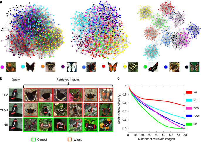
The second illustrates the performance of network denoising methods on Hi-C data. The performance metric in this case is normalized mutual information (NMI) which Wang, Pourshafeie, Zitnik et al. described as “a fair representation of overall performance”. Network deconvolution (ND, dark green) is again worse than RAW (dark blue):
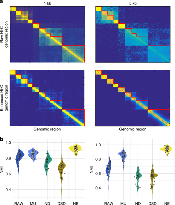
Finally, in an analysis of gene function from tissue-specific gene interaction networks, ND (blue) does perform better than RAW (pink) although barely. In four cases out of eight shown it is the worst of the four methods benchmarked:

Network deconvolution was claimed to be applicable to any network when it was published. At the time, Feizi stated that “We applied it to gene networks, protein folding, and co-authorship social networks, but our method is general and applicable to many other network science problems.” A promising claim, but in reality it is difficult to beat the nonsense law: Nonsense methods tend to produce nonsense results.
The Feizi et al. 2013 paper now has 178 citations, most of them drive by citations. Interestingly this number, 178 is exactly the number of citations of the Barzel et al. 2013 network nonsense paper, which was published in the same issue of Nature Biotechnology. Presumably this reflects the fact that authors citing one paper feel obliged to cite the other. These pair of papers were thus an impact factor win for the journal. For the first authors on the papers, the network deconvolution/silencing work is their most highly cited first author papers respectively. Barzel is an assistant professor at Bar-Ilan University where he links to an article about his network nonsense on his “media page”. Feizi is an assistant professor at the University of Maryland where he lists Feizi et al. 2013 among his “selected publications“. Kellis teaches the “network deconvolution” and its associated nonsense in his computational biology course at MIT. And why not? These days truth seems to matter less and less in every domain. A statement doesn’t have to be true, it just has to work well on YouTube, Twitter, Facebook, or some webpage, and as long as some people believe it long enough, say until the next grant cycle, promotion evaluation, or election, then what harm is done? A win-win for everyone. Except science.
Six years ago I received an email from a colleague in the mathematics department at UC Berkeley asking me whether he should participate in a study that involved “collecting DNA from the brightest minds in the fields of theoretical physics and mathematics.” I later learned that the codename for the study was “Project Einstein“, an initiative of entrepreneur Jonathan Rothberg with the goal of finding the genetic basis for “math genius”. After replying to my colleague I received an inquiry from another professor in the department, and then another and another… All were clearly flattered that they were selected for their “brightest mind”, and curious to understand the genetic secret of their brilliance.
I counseled my colleagues not to participate in this ill-advised genome-wide association study. The phenotype was ill-defined and in any case the study would be underpowered (only 400 “geniuses” were solicited), but I believe many of them sent in their samples. As far as I know their DNA now languishes in one of Jonathan Rothberg’s freezers. No result has ever emerged from “Project Einstein”, and I’d pretty much forgotten about the ego-driven inquiries I had received years ago. Then, last week, I remembered them when reading a series of blog posts and associated commentary on evolutionary biology by some of the most distinguished mathematicians in the world.
1. Sir Timothy Gowers is blogging about evolutionary biology?
It turns out that mathematicians such as Timothy Gowers and Terence Tao are hosting discussions about evolutionary biology (see On the recently removed paper from the New York Journal of Mathematics, Has an uncomfortable truth been suppressed, Additional thoughts on the Ted Hill paper) because some mathematician wrote a paper titled “An Evolutionary Theory for the Variability Hypothesis“, and an ensuing publication kerfuffle has the mathematics community up in arms. I’ll get to that in a moment, but first I want to focus on the scientific discourse in these elite math blogs. If you scroll to the bottom of the blog posts you’ll see hundreds of comments, many written by eminent mathematicians who are engaged in pseudoscientific speculation littered with sexist tropes. The number of inane comments is astonishing. For example, in a comment on Timothy Gowers’ blog, Gabriel Nivasch, a lecturer at Ariel University writes
“It’s also ironic that what causes so much controversy is not humans having descended from apes, which since Darwin people sort-of managed to swallow, but rather the relatively minor issue of differences between the sexes.”
This person’s understanding of the theory of evolution is where the Victorian public was at in England ca. 1871:

In mathematics, just a year later in 1872, Karl Weierstrass published what at the time was considered another monstrosity, one that threw the entire mathematics community into disarray. The result was just as counterintuitive for mathematics as Darwin’s theory of evolution was for biology. Weierstrass had constructed a function that is uniformly continuous on the real line, but not differentiable on any interval:

Not only does this construction remain valid today as it was back then, but lots of mathematics has been developed in its wake. What is certain is that if one doesn’t understand the first thing about Weierstrass’ construction, e.g. one doesn’t know what a derivative is, one won’t be able to contribute meaningfully to modern research in analysis. With that in mind consider the level of ignorance of someone who does not even understand the notion of common ancestor in evolutionary biology, and who presumes that biologists have been idle and have learned nothing during the last 150 years. Imagine the hubris of mathematicians spewing incoherent theories about sexual selection when they literally don’t know anything about human genetics or evolutionary biology, and haven’t read any of the relevant scientific literature about the subject they are rambling about. You don’t have to imagine. Just go and read the Tao and Gowers blogs and the hundreds of comments they have accrued over the past few days.
2. Hijacking a journal
To understand what is going on requires an introduction to Igor Rivin, a professor of mathematics at Temple University and, of relevance in this mathematics matter, an editor of the New York Journal of Mathematics (NYJM) [Update November 21, 2018: Igor Rivin is no longer an editor of NYJM]. Last year Rivin invited the author of a paper on the variability hypothesis to submit his work to NYJM. He solicited two reviews and published it in the journal. For a mathematics paper such a process is standard practice at NYJM, but in this case the facts point to Igor Rivin hijacking the editorial process to advance a sexist agenda. To wit:
- The paper in question, “An Evolutionary Theory for the Variability Hypothesis” is not a mathematics or biology paper but rather a sexist opinion piece. As such it was not suitable for publication in any mathematics or biology journal, let alone in the NYJM which is a venue for publication of pure mathematics.
- Editor Igor Rivin did not understand the topic and therefore had no business soliciting or handling review of the paper.
- The “reviewers” of the paper were not experts in the relevant mathematics or biology.
To elaborate on these points I begin with a brief history of the variability hypothesis. Its origin is Darwin’s 1875 book on “The Descent of Man and Selection in Relation to Sex” which was ostensibly the beginning of the study of sexual selection. However as explained in Stephanie Shields’ excellent review, while the variability hypothesis started out as a hypothesis about variance in physical and intellectual traits, at the turn of 20th century it morphed to a specific statement about sex differences in intelligence. I will not, in this blog post, attempt to review the entire field of sexual selection nor will I discuss in detail the breadth of work on the variability hypothesis. But there are three important points to glean from the Shields review: 1. The variability hypothesis is about intellectual differences between men and women and in fact this is what “An evolutionary theory for the variability hypothesis” tries really hard to get across. Specifically, that the best mathematicians are males because of biology. 2. There has been dispute for over a century about the extent of differences, should they even exist, and 3. Naïve attempts at modeling sexual selection are seriously flawed and completely unrealistic. For example naïve models that assume the same genetic mechanism produces both high IQ and mental deficits are ignoring ample evidence to the contrary.
Insofar as modeling of sexual selection is concerned, there was already statistical work in the area by Karl Pearson in 1895 (see “Note on regression and inheritance in the case of two parents“). In the paper Pearson explicitly considers the sex-specific variance of traits and the relationship of said variance to heritability. However as with much of population genetics, it was Ronald Fisher, first in the 1930s (Fisher’s principle) and then later in important work from 1958 what is now referred to as Darwin-Fisher theory (see, e.g. Kirkpatrick, Price and Arnold 1990) who significantly advanced the theory of sexual selection. Amazingly, despite including 51 citations in the final arXiv version of “An Evolutionary Theory for the Variability Hypothesis”, there isn’t a single reference to prior work in the area. I believe the author was completely unaware of the 150 years of work by biologists, statisticians, and mathematical biologists in the field.
What is cited in “An Evolutionary Theory for the Variability Hypothesis”? There is an inordinate amount of cherry picking of quotes from papers to bolster the message the author is intent on getting across: that there are sex-differences in variance of intelligence (whatever that means), specifically males are more variable. The arXiv posting has undergone eight revisions, and somewhere among these revisions there is even a brief cameo by Lawrence Summers and a regurgitation of his infamous sexist remarks. One of the thorough papers reviewing evidence for such claims is “The science of sex differences in science and mathematics” by Halpern et al. 2007. The author cherry picks a quote from the abstract of that paper, namely that “the reasons why males are often more variable remain elusive.” and follows it with a question posed by statistician Howard Wainer that implicitly makes a claim: “Why was our genetic structure built to yield greater variation among males than females?” An actual reading of the Halpern et al. paper reveals that the excess of males in the top tail of the distribution of quantitative reasoning has dramatically decreased during the last few decades, an observation that cannot be explained by genetics. Furthermore, females have a greater variability in reading and writing than males. They point out that these findings “run counter to the usual conclusion that males are more variable in all cognitive ability domains”. The author of “An Evolutionary Theory for the Variability Hypothesis” conveniently omits this from a very short section titled “Primary Analyses Inconsistent with the Greater Male Variability Hypothesis.” This is serious amateur time.
One of the commenters on Terence Tao’s blog explained that the mathematical theory in “An Evolutionary Theory for the Variability Hypothesis” is “obviously true”, and explained its premise for the layman:
It’s assumed that women only pick the “best” – according to some quantity X percent of men as partners where X is (much) smaller than 50, let’s assume. On the contrary, men are OK to date women from the best Y percent where Y is above 50 or at least greater than X.
Let’s go with this for a second, but think about how this premise would have to change to be consistent with results for reading and writing (where variance is higher in females). Then we must go with the following premise for everything to work out:
It’s assumed that men only pick the “best” – according to some quantity X percent of women as partners where X is (much) smaller than 50, let’s assume. On the contrary, women are OK to date men from the best Y percent where Y is above 50 or at least greater than X.
Perhaps I should write up this up (citing only studies on reading and writing) and send it to Igor Rivin, editor at the New York Journal of Mathematics as my explanation for my greater variability hypothesis?
Actually, I hope that will not be possible. Igor Rivin should be immediately removed from the editorial board of the New York Journal of Mathematics. I looked up Rivin’s credentials in terms of handling a paper in mathematical biology. Rivin has an impressive publication list, mostly in geometry but also a handful of publications in other areas. He, and separately Mary Rees, are known for showing that the number of simple closed geodesics of length at most L grows polynomially in L (this result was the beginning of some of the impressive results of Maryam Mirzakhani who went much further and subsequently won the Fields Medal for her work). Nowhere among Rivin’s publications, or in many of his talks which are online, or in his extensive online writings (on Twitter, Facebook etc.) is there any evidence that he has a shred of knowledge about evolutionary biology. The fact that he accepted a paper that is completely untethered from the field in which it purports to make an advance is further evidence of his ignorance.
Ignorance is one thing but hijacking a journal for a sexist agenda is another. Last year I encountered a Facebook thread on which Rivin had commented in response to a BuzzFeed article titled A Former Student Says UC Berkeley’s Star Philosophy Professor Groped Her and Watched Porn at Work. It discussed a lawsuit alleging that John Searle had sexually harassed, assaulted and retaliated against a former student and employee. While working for Searle the student was paid $1,000 a month with an additional $3,000 for being his assistant. On the Facebook thread Igor Rivin wrote

Here is an editor of the NYJM suggesting that a student should have effectively known that if she was paid $36K/year for work as an assistant of a professor (not a high salary for such work), she ought to expect sexual harassment and sexual assault as part of her job. Her LinkedIn profile (which he linked to) showed her to have worked a summer in litigation. So he was essentially saying that this victim prostituted herself with the intent of benefiting financially via suing John Searle. Below is, thankfully, a quick and stern rebuke from a professor of mathematics at Indiana University:

I mention this because it shows that Igor Rivin has a documented history of misogyny. Thus his acceptance of a paper providing a “theory” for “higher general intelligence” in males, a paper in an area he knows nothing about to a journal in pure mathematics is nothing other than hijacking the editorial process of the journal to further a sexist agenda.
How did he actually do it? He solicited a paper that had been rejected elsewhere, and sent it out for review to two reviewers who turned it around in 3 weeks. I mentioned above that the “reviewers” of the paper were not experts in the relevant mathematics or biology. This is clear from an examination of the version of the paper that the NYJM accepted. The 51 references were reduced to 11 (one of them is to the author’s preprint). None of the remaining 10 references cite any relevant prior work in evolutionary biology on sexual selection. The fundamental flaws of the paper remain unaddressed. The entire content of the reviews was presumably something along the lines of “please tone down some of the blatant sexism in the paper by removing 40 gratuitous references”. In defending the three week turnaround Rivin wrote (on Gowers’ blog) “Three weeks: I assume you have read the paper, if so, you will have found that it is quite short and does not require a huge amount of background.” Since when does a mathematician judge the complexity of reviewing a paper by its length? I took a look at Rivin’s publications; many of them are very short. Consider for example “On geometry of convex ideal polyhedra in hyperbolic 3-space”. The paper is 5 pages with 3 references. It was received 15 October 1990 and in revised form 27 January 1992. Also excuse me, but if one thinks that a mathematical biology paper “does not require a huge amount of background” then one simply doesn’t know any mathematical biology.
3. Time for mathematicians to wet their paws
The irony of mathematicians who believe they are in the high end tail of some ill-specified distribution of intelligence demonstrating en masse that they are idiots is not lost on those of us who actually work in mathematics and biology. Gian-Carlo Rota’s ghost can be heard screaming from Vigevano “The lack of real contact between mathematics and biology is either a tragedy, a scandal, or a challenge, it is hard to decide which!!” I’ve spent the past 15 years of my career focusing on Rota’s call to address the challenge of making more contacts between mathematics and biology. The two cultures are sometimes far apart but the potential for both fields, if there is real contact, is tremendous. Not only can mathematics lead to breakthroughs in biology, biology can also lead to new theorems in mathematics. In response to incoherent rambling about genetics on Gowers’ blog, Noah Snyder, a math professor at Indiana University gave sage advice:
I really wish you wouldn’t do this. A bunch of mathematicians speculating about stuff they know nothing about is not a good way to get to the truth. If you really want to do some modeling of evolutionary biology, then find some experts to collaborate or at least spend a year learning some background.
What he is saying is די קאַץ האָט ליב פֿיש אָבער זי װיל ניט די פֿיס אײַננעצן (the cat likes fish but she doesn’t want to wet her paws). If you’re a mathematician who is interested in questions of evolutionary biology, great! But first you must get your paws wet. If you refuse to do so then you can do real harm. It might be tempting to imagine that mathematics is divorced from reality and has no impact or influence on the world, but nothing could be farther from the truth. Mathematics matters. In the case discussed in this blog post, the underlying subtext is pervasive sexism and misogyny in the mathematics profession, and if this sham paper on the variance hypothesis had gotten the stamp of approval of a journal as respected as NYJM, real harm to women in mathematics and women who in the future may have chosen to study mathematics could have been done. It’s no different than the case of Andrew Wakefield‘s paper in The Lancet implying a link between vaccinations and autism. By the time of the retraction (twelve years after publication of the article, in 2010), the paper had significantly damaged public health, and even today its effects, namely death as a result of reduced vaccination, continue to be felt. It’s not good enough to say:
“Once the rockets are up,
who cares where they come down?
That’s not my department,”
says Wernher von Braun.
In a previous post I wrote about How not to perform a differential expression analysis. In response to my post, Rob Patro, Geet Duggal, Michael I Love, Rafael Irizarry and Carl Kingsford wrote a detailed response. Below is my point-by-point rebuttal to their response (the figures and results in this blog post can be generated using the scripts in the Bits of DNA GitHub repository):
1. In Figure 1 of their response, Patro et al. show an MA plot and state that “if it were true that these methods are ‘very very’ similar one would see most log-ratios close to 0 (within the red lines).” This is true. Below is the MA plot for kallisto with default parameters and Salmon with the –gcBias flag:

96.6% of the points lie within the red lines. Since this constitutes most of the points, it seems reasonable to conclude that the methods are indeed very very similar. When both programs are run in default mode, as I did in my blog post, 98.9% of the points lie within the red lines. Thus, using the criterion of Patro et al., the programs have very very similar, or near identical, output. These numbers are conservative, computed by omitting transcripts where both kallisto and Salmon determine that a transcript has zero abundance.
2. Furthermore, Patro et al. explain that their MA plot in Figure 1 “demonstrate[s] how deceiving count scatter plots can be in this particular context.” There is, superficially, some merit to this claim. The MA plot above looks like a smudge of points and seems at odds with the fact that 96.6% of the points lie within the red lines. However the plot displays 198,457 points corresponding to 198,457 quantified transcripts, and as a result many points obfuscate each other. The alpha parameter in ggplot2 sets the opacity/transparency of points, and should be used in such a case to reveal the density of points (see, e.g. Supplementary Figure 19 of Love et al. 2016). Below is a plot of the exact same points with alpha=0.01:

An R animation that interpolates between the two MA plots above shows the same points, with varying opacity parameters (alpha=1 -> 0.01) and helps to demonstrate how deceiving MA plots can be in this particular context:

3. The Patro et al. response fails to distinguish between two different comparisons I made in my blog post: (1) comparisons of default kallisto to default Salmon, and (2) default kallisto to Salmon with the –gcBias option. Comparisons of the programs with default options is important because with those options their output is near identical, and, as I explain in my blog post, this is not some cosmic coincidence but a result of Salmon directly implementing the key ideas of pseudoalignment. The Patro et al. 2017 paper is also not just about GC bias correction, as the authors claim in their response, but rather it is also “the Salmon paper” a descriptor that Patro et al. use 24 times in their response. Furthermore, when Patro et al. are asked about how to run Salmon they recommend running it with default options (see e.g. the epilogue below or the way Patro et al. run Salmon for analysis of the Bealieau-Jones-Greene described in #5) so that a comparison of the programs in default mode is of direct relevance to users.
In regards to the GC bias correction, Patro et al. 2017 claim in their abstract that “[GC bias correction] substantially improves the accuracy of abundance estimates and the sensitivity of subsequence differential expression analysis”. This is a general statement, not one about the sort of niche use-cases they describe in their response. The question then is whether Patro et al. provides support for this general statement and my argument has always been that it does not.
4. Patro et al. criticize my use of the ERR188140 sample to demonstrate how similar Salmon is to kallisto. They write that “the blog post author selected a single sample…”(boldface theirs) to claim that Salmon and kallisto produce output with “very very strong similarity (≃)” and raise the possibility that it was cherry picked, noting that “this particular sample has less GC-content bias” and marking it in a plot. I used ERR188140 because it was our sample of choice for many of the demonstrative analyses in the Bray et al. 2016 paper (see the kallisto paper analysis Github repository where the sample is mentioned since February 2016) and for that paper we had already generated the RSEM quantifications (and the alignments required for running the program), thus saving time in making the PCA analysis for my blogpost. ERR188140 was chosen for Bray et al. 2016 because it was the most deeply sequenced sample in the GEUVADIS dataset.
5. Contrary to the claim by Patro et al. in their response that I examined only one dataset, I also included in my post links with references to specific figures from four other papers that independently found that kallisto is near identical to Salmon. The fairest example for consideration is the additional analysis I mentioned of Beaulieu-Jones and Greene, and separately Patro, of the RNA-Seq dataset from Boj et al. 2015. With that analysis, there can be no claims of cherry-picking. The dataset was chosen by the authors of Beaulieu-Jones and Greene 2017, kallisto quantifications were produced by Beaulieu-Jones and Greene, and Salmon quantifications were prepared by Patro. Presumably the main author of the Salmon program ran Salmon with the best settings possible for the experiment. The fact that different individuals ran the programs is highlighted by the fact that they are not even based on identical annotations. They used different versions of RefSeq: Beaulieu-Jones and Greene quantified with 35,026 transcripts and Patro, who quantified later, used an annotation with 35,882 transcripts. There are eight samples in the analysis and MA plots, made by restricting the analysis to the transcripts in common, all look alike. As an example, the MA plot for SRR1654626 is:

The fraction of points within the red lines, calculated as before by omitting points at (0,0), is 98.6%. The Patro analysis of Bealieau-Greene was performed on March 8, 2017 with version 0.8.1 of Salmon, well after the –gcBias option was implemented, the Salmon (version 3 preprint describing the GC correction) published, and the paper submitted. The dates are verifiable in the GitHub repository with the Salmon results.
6. In arguing that kallisto and Salmon are different Patro et al. provide an interesting formula for the correlation for two random variables X and X+Y where X and Y are independent but its use in this context is a sleight of hand. The formula, which is a simple exercise for the reader to derive from the definition of correlation, is

It follows by Taylor series expansion that this is approximately

and if sd(X) is about 3.4 and sd(Y) about 0.5 (Patro et al.‘s numbers), then by inspection cor(X,X+Y) will be 0.99. In sample SRR1654626 shown above, when ignoring transcripts where both programs output 0, sd(X)=3.5 and sd(Y) = 0.43 which are fairly close to Patro et al.‘s numbers. However Patro et al. proceed with a non sequitur, writing that “this means that a substantial difference of 25% between reported counts is typical”. While the correlation formula makes no distributional assumptions, the 25% difference seems to be based on an assumption that Y is normally distributed. Specifically, if Y is normally distributed with mean 0 and standard deviation 0.5 then |Y| is half-normally distributed and a typical percent difference based on the median is

However the differences between kallisto and Salmon quantifications are far from normally distributed. The plot below shows the distribution of the differences between log2 counts of kallisto and salmon (again excluding cases where both programs output 0):

The blue vertical line is positioned at the median, which is at 0.001433093. This means that the typical difference between reported counts is not 25% but rather 0.1%.
7. In their response, Patro et al. highlight the recent Zhang et al. 2017 paper that benchmarked a number of RNA-Seq programs, including kallisto and Salmon. Patro et al. comment on a high correlation between a mode of Salmon that quantifies based with transcriptome alignments and RSEM. First, the correlations reported by Zhang et al. are Pearson correlations, and not Spearman correlations that I focused on in my blog post. Second, the alignment mode of Salmon has nothing to do with pseudoalignment, in that read alignments (in the case of Zhang et al. 2017 produced with STAR) are quantified directly, in a workflow the same as that of RSEM. Investigation of the similarities between alignment Salmon and RSEM that led to the high correlation is beyond the scope of this post. Finally, in discussing the similarities between programs the authors (Zhang et al.) write “Salmon, Sailfish and Kallisto, cluster tightly together with R 2 > 0.96.”
8. In regards to the EM algorithm, Patro et al. acknowledge that Salmon uses kallisto’s termination criteria and have updated their code to reflect this fact. I thank them for doing so, however this portion of their response is bizarre:
“What if Salmon executed more iterations of its offline phase and outperformed kallisto? Then its improvement could be attributed to the extra iterations instead of the different model, bias correction, or online phase. By using the same termination criteria for the offline phase of Salmon, we eliminate a confounding variable in the analysis.”
If Salmon could perform better by executing more iterations of the EM algorithm it should certainly do so. This is because parameters hard-wired in the code should be set in a way that provides users with the best possible performance.
9. At one point in their response Patro et al. write that “It is expected that Salmon, without the GC bias correction feature, will be similar to kallisto”, essentially conceding that default Salmon 
As explained in my post on How not to perform a differential expression analysis the reason that Love et al. recommend a DESeq2 workflow instead of a t-test for differential expression is because of the importance of regularizing variance estimates. This is made clear by repeating Patro et al.‘s GEUVADIS experiment with a typical three replicates per condition instead of eight:

With the t-test of transcripts Salmon cannot even achieve an FDR of less than 0.05.
10. Patro et al. find that switching to their recommended workflow (i.e. replacing the t-test with their own DESeq2) alters the difference between kallisto and Salmon at an FDR of 0.01 from 353% to 32%. Patro et al. describe this difference, in boldface, as “The results remain similar to the original published results when run using the accuser’s suggested pipeline.” Note that Patro et al. refer to a typical difference of 0.1% between counts generated by kallisto and Salmon as “not very very similar” (point #6) while insisting that 353% and 32% are “similar.”
11. The reanalysis of the GEUVADIS differential expression experiment by Patro et al. also fails to address one of the most important critiques in my blogpost, namely that a typical experimental design will not deliberately confound bias with condition. The plot below shows the difference between kallisto and Salmon in a typical experiment (3 replicates in each condition) followed by Love et al.’s recommended workflow (tximport -> DESeq2):

There is no apparent difference between kallisto and Salmon. Note that the samples in this experiment have the same GC bias as in Patro et al. 2017, the only difference being that samples are chosen randomly in a way that they are not confounded by batch. The lack of any observed difference in results between default kallisto and Salmon with the –gcBias option are the same with an 8×8 analysis:

There is no apparent difference between kallisto and Salmon, even though the simulation includes the same GC bias levels as in Patro et al. 2017 (just not confounded with condition) .
12. It is interesting to compare the 8×8 unconfounded experiment with the 8×8 confounded experiment.
While Salmon does improve on kallisto (although as discussed in point #10 the improvement is not 353% but rather 32% at an FDR of 0.01), the improvement in accuracy when performing an unconfounded experiment highlights why confounded experiments should not be performed in the first place.
13. Patro et al. claim that despite best intentions, “confounding of technical artifacts such as GC dependence with the biological comparison of interest does occur” and cite Gilad and Mizrahi-Man 2015. However the message of the Gilad and Mizrahi-Man paper is not that we must do our best to analyze confounded experiments. Rather, it is that with confounded experiments one may learn nothing at all. What they say is “In summary, we believe that our reanalysis indicates that the conclusions of the Mouse ENCODE Consortium papers pertaining to the clustering of the comparative gene expression data are unwarranted.” In other words, confounding of batch effect with variables of interest can render experiments worthless.
14. In response to my claim that GC bias has been reduced during the past 5 years, Patro et al. state:
A more informed assumption is that GC bias in sequencing data originates with PCR amplification and depends on thermocycler ramp speed (see, for example, Aird (2011) or t’ Hoen (2013)), and not from sequencing machines or reverse transcription protocols which may have improved in the past 5 years.
This statement is curious in that it seems to assume that, unlike sequencing machines or reverse transcription protocols, PCR amplification and thermocycler technology could not have improved in the past 5 years. As an example to the contrary, consider that just months before the publication of the GEUVADIS data, New England Biolabs released a new polymerase which claimed to address this very issue. GC bias is a ubiquitous issue in molecular biology and of course there are ongoing efforts to address it in the wet lab. Furthermore, continued research and benchmarking aimed at reducing GC bias, (see e.g. Thorner et al. 2014) have led to marked improvements in library quality and standardization of experiments across labs. Anyone who performs bulk RNA-Seq, as we do in my lab, knows that RNA-Seq is no longer an ad hoc experiment.
15. Patro et al. write that
The point of the simulation was to demonstrate that, while modeling fragment sequence bias reduces gross mis-estimation (false reports of isoform switching across labs in real data — see for example Salmon Supplementary Figure 5 showing GEUVADIS data), the bias modeling does not lead to overall loss of signal. Consider that one could reduce false positives simply by attenuating signal or adding noise to all transcript abundances.
However none of the simulations or results in Patro et al. 2017 address the question of whether bias modeling leads to overall loss of signal. To answer it would require examining the true and false positives in a comparison of default Salmon and Salmon with –gcBias. Not only did Patro et al. not do the relevant intra-program comparisons, they did inter-program comparisons instead which clearly bear no relevance to the point they now claim they were making.
16. I want to make very clear that I believe that GC bias correction during RNA-Seq quantification is valuable and I agree with Patro et al. that it can be important for meta-analyses, especially of the kind that take place by large genome consortia. One of the interesting results in Patro et al. is the SEQC analysis (Supplementary Figure 4) which shows that that Salmon is more consistent in intra-center quantification in one sample (HBRR). However in a second experiment (UHRR) the programs are near identical in their quantification differences within and between centers and based on the results shown above I don’t believe that Patro et al. 2017 achieves its stated aim of showing that GC correction has an effect on typical differential analyses experiments that utilize typical downstream analyses.
17. I showed the results of running kallisto in default mode and Salmon with GC bias correction on a well-studied dataset from Trapnell et al. 2013. Patro et al. claim they were unable to reproduce my results, but that is because they performed a transcript level analysis despite the fact that I made it very clear in my post that I performed a gene level analysis. I chose to show results at the gene level to draw a contrast with Figure 3c of Trapnell et al. 2013. The results of Patro et al. at the transcript level show that even then the extent of overlap is remarkable. These results are consistent with the simulation results (see point #11).
18. The Salmon authors double down on their runtime analysis by claiming that “The running time discussion presented in the Salmon paper is accurate.” This is difficult to reconcile with two facts
(a) According to Patro et al.’s rebuttal “kallisto is faster when using a small number of threads” yet this was not presented in Patro et al. 2017.
(b) According to Patro et al. (see, e.g., the Salmon program GitHub), when running kallisto or Salmon with 30 threads what is being benchmarked is disk I/O and not the runtime of the programs.
If Patro et al. agree that to benchmark the speed of a program one must use a small number of threads, and Patro et al. agree that with a small number of threads kallisto is faster, then the only possible conclusion is that the running time discussion presented in the Salmon paper is not accurate.
19. The Patro et al. response has an entire section (3.1) devoted to explaining why quasimapping (used by Salmon) is distinct from pseudoalignment (introduced in the kallisto paper). Patro et al. describe quasimapping as “a different algorithm, different data structure, and computes different results.” Furthermore, in a blog post, Patro explained that RapMap (on which Salmon is based) implements both quasimapping and pseudoalignment, and that these are distinct concepts. He writes specifically that in contrast to the first algorithm provided by RapMap (pseudoalignment), “the second algorithm provided by RapMap — quasi-mapping — is a novel one”.
One of the reviewers of the Salmon paper recently published his review, which begins with the sentence “The authors present salmon, a new RNAseq quantification tool that uses pseudoalignment…” This directly contradicts the assertion of Patro et al. that quasimapping is “a different algorithm, different data structure” or that quasimapping is novel. In my blog post I provided a detailed walk-through that affirms that the reviewer is right. I showed how the quasimapping underlying Salmon is literally acting in identical ways on the k-mers in reads. Moreover, the results above show that Salmon, using quasimapping, does not “compute different results”. Unsurprisingly, its output is near identical to kallisto.
20. Patro et al. write that “The title of Sailfish paper contains the words ‘alignment-free’, which indicates that it was Sailfish that first presented the key idea of abandoning alignment. The term alignment-free has a long history in genomics and is used to describe methods in which the information inherent in a complete read is discarded in favor of the direct use of it’s substrings. Sailfish is indeed an alignment-free method because it shreds reads into constituent k-mers, and those are then operated on without regard to which read they originated from. The paper is aptly titled. The concept of pseudoalignment is distinct in that complete reads are associated to targets, even if base-pair alignments are not described.
21. Patro et al. write that “Salmon, including many of its main ideas, was widely known in the field prior to the kallisto preprint.” and mention that Zhang et al. 2015 included a brief description of Salmon. Zhang et al. 2015 was published on June 5, 2015, a month after the kallisto preprint was published, and its description of Salmon, though brief, was the first available for the program. Nowhere else, prior to the Zhang et al. publication, was there any description of what Salmon does or how it works, even at a high-level.
Notably, the paragraph on Salmon of Zhang et al. shows that Salmon, in its initial form, had nothing to do with pseudoalignment:
“Salmon is based on a novel lightweight alignment model that uses chains of maximal exact matches between sequencing fragments and reference transcripts to determine the potential origin of RNA‐seq reads.”
This is consistent with the PCA plot of my blog post which shows that initial versions of Salmon were very different from kallisto, and that Salmon
22. My blogpost elicited an intense discussion in the comments and on social media of whether Patro et al. adequately attributed key ideas of Salmon to kallisto. Patro et al. They did not.
Patro et al. reference numerous citations to kallisto in Patro et al. 2017 which I’ve reproduced below

Only two of these references attribute any aspect of Salmon to kallisto. One of them, the Salmon bootstrap, is described as “inspired by kallisto” (in fact it is identical to that of kallisto). There is only one citation in Salmon to the key idea that has made it near identical to kallisto, namely the use of pseudoalignment, and that is to the RapMap paper from the Patro group (Srivastava et al. 2016).
Despite boasting of a commitment to open source principles and embracing preprints, Patro et al. conveniently ignore the RapMap preprints (Srivastava et al. 2015). Despite many mentions of kallisto, none of the four versions of the preprint acknowledge the direct use of the ideas in Bray et al. 2016 in any way, shape or form. The intent of Srivastava et al. is very clear. In the journal version the authors still do not acknowledge that “quasi mapping” is just pseudoalignment implemented with a suffix array, instead using words such as “inspired” and “motivated” to obfuscate the truth. Wording matters.
Epilogue
Discussion of the Zhang et al. 2017 paper by Patro et al., along with a tweet by Lappalainen about programs not giving identical results lead me to look more deeply into the Zhang et al. 2017 paper.
The exploration turned out to be interesting. On the one hand, some figures in Zhang et al. 2017 contradict Lappalainen’s claim that “none of the methods seem to give identical results…”. For example, Figure S4 from the paper shows quantifications for four genes where kallisto and Salmon produce near identical results.
On the other hand, Figure 7 from the paper is an example from a simulation on a single gene where kallisto performed very differently from Salmon:

I contacted the authors to find out how they ran kallisto and Salmon. It turns out that for all the results in the paper with the exception of Figure 7, the programs were run as follows:
· kallisto quant -i $KAL_INDEX –fr-stranded –plaintext $DATADIR/${f}_1.fq $DATADIR/${f}_2.fq -t 8 -o ./kallisto/
· salmon quant -i $SALMON_INDEX -l ISF -1 $DATADIR/${f}_1.fq -2 $DATADIR/${f}_2.fq -p 8 -o salmon_em –incompatPrior 0
We then exchanged some further emails, after which they sent the data (reads) for the figure, we ran kallisto on our end and found discordant results with what was reported in the paper, they re-ran kallisto on their end, and after these exchanges we converged to an updated (and corrected) figure which shows Sailfish
Note that kallisto is near identical in performance to Sailfish, which I explained in my blog post about Salmon has also converged to kallisto. However Salmon is different.
It turned out that for this one figure, Salmon was run with a non-standard set of options, specifically with the additional option –numPreAuxModelSamples 0 (although notably Patro did not recommend using the –gcBias option). The recommendation to run with this option was made by Patro to Zhang et al. after they contacted him early in January 2017 to ask for the best way to run Salmon for the experiment. What the flag does is turn off the online phase of Salmon (hence the 0 in –numPreAuxModelSamples 0) that is used to initially estimate the fragment length distribution. There is a good rationale for using the flag, namely the very small number of reads in the simulation makes it impossible to accurately learn auxiliary parameters as one might with a full dataset. However on January 13th, Patro changed the behavior of the option in a way that allowed Salmon to optimize for the specific experiment at hand. The default fragment length distribution in Salmon had been set the same as that in Cufflinks (mean 200, standard deviation 80). These settings match typical experimental data, and were chosen by Cole Trapnell and myself after examining numerous biological datasets. Setting –numPreAuxModelSamples to 0 forced Salmon to use those parameters. However on January 13th Patro changed the defaults in Salmon to mean = 250 and standard deviation = 25. The numbers 250 and 25 are precisely the defaults for the polyester program that simulates reads. Polyester (with default parameters) is what Zhang et al. 2017 used to simulate reads for Figure 7.
Zhang et al. also contacted me on January 9th and I did not reply to their email. I had just moved institutions (from UC Berkeley to Caltech) on January 1st, and did not have the time to investigate in detail the issues they raised. I thank them for being forthcoming and helpful in reviewing Figure 7 post publication.
Returning to Lappalainen’s comment, it is true that Salmon results are different from kallisto in Figure 7 and one reason may be that Patro hard wired parameters for a flag that was used to match the parameters of the simulation. With the exception of that figure, throughout the paper Salmon
[September 2, 2017: A response to this post has been posted by the authors of Patro et al. 2017, and I have replied to them with a rebuttal]
Spot the difference
One of the maxims of computational biology is that “no two programs ever give the same result.” This is perhaps not so surprising; after all, most journals seek papers that report a significant improvement to an existing method. As a result, when developing new methods, computational biologists ensure that the results of their tools are different, specifically better (by some metric), than those of previous methods. The maxim certainly holds for RNA-Seq tools. For example, the large symmetric differences displayed in the Venn diagram below (from Zhang et al. 2014) are typical for differential expression tool benchmarks:

In a comparison of RNA-Seq quantification methods, Hayer et al. 2015 showed that methods differ even at the level of summary statistics (in Figure 7 from the paper, shown below, Pearson correlation was calculated using ground truth from a simulation):

These sort of of results are the norm in computational genomics. Finding a pair of software programs that produce identical results is about as likely as finding someone who has won the lottery… twice…. in one week. Well, it turns out there has been such a person, and here I describe the computational genomics analog of that unlikely event. Below are a pair of plots made using two different RNA-Seq quantification programs:


The two volcano plots show the log-fold change in abundance estimated for samples sequenced by Boj et al. 2015, plotted against p-values obtained with the program limma-voom. I repeat: the plots were made with quantifications from two different RNA-Seq programs. Details are described in the next section, but before reading it first try playing spot the difference.
The reveal
The top plot is reproduced from Supplementary Figure 6 in Beaulieu-Jones and Greene, 2017. The quantification program used in that paper was kallisto, an RNA-Seq quantification program based on pseudoalignment that was published in
- Near-optimal probabilistic RNA-Seq quantification by Nicolas Bray, Harold Pimentel, Páll Melsted and Lior Pachter, Nature Biotechnology 34 (2016), 525–527.
The bottom plot was made using the quantification program Salmon, and is reproduced from a GitHub repository belonging to the lead author of
- Salmon provides fast and bias-aware quantification of transcript expression by Rob Patro, Geet Duggal, Michael I. Love, Rafael A. Irizarry and Carl Kingsford, Nature Methods 14 (2017), 417–419.
Patro et al. 2017 claim that “[Salmon] achieves the same order-of-magnitude benefits in speed as kallisto and Sailfish but with greater accuracy”, however after being unable to spot any differences myself in the volcano plots shown above, I decided, with mixed feelings of amusement and annoyance, to check for myself whether the similarity between the programs was some sort of fluke. Or maybe I’d overlooked something obvious, e.g. the fact that programs may tend to give more similar results at the gene level than at the transcript level. Thus began this blog post.
In the figure below, made by quantifying RNA-Seq sample ERR188140 with the latest versions of the two programs, each point is a transcript and its coordinates are the estimated counts produced by kallisto and salmon respectively.

Strikingly, the Pearson correlation coefficient is 0.9996026. However astute readers will recognize a possible sleight of hand on my part. The correlation may be inflated by similar results for the very abundant transcripts, and the plot hides thousands of points in the lower left-hand corner. RNA-Seq analyses are notorious for such plots that appear sounds but can be misleading. However in this case I’m not hiding anything. The Pearson correlation computed with 

For context, the Spearman correlation between kallisto and a truly different RNA-Seq quantification program, RSEM, is 0.8944941. At this point I have to say… I’ve been doing computational biology for more than 20 years and I have never seen a situation where two ostensibly different programs output such similar results.
Patro and I are not alone in finding that Salmon 

or Figure 3A from Jin et al. 2017:

Just a few weeks ago, Sahraeian et al. 2017 published a comprehensive analysis of 39 RNA-Seq analysis tools and performed hierarchical clusterings of methods according to the similarity of their output. Here is one example (their Supplementary Figure 24a):

Amazingly, kallisto and Salmon-Quasi (the latest version of Salmon) are the two closest programs to each other in the entire comparison, producing output even more similar than the same program, e.g. Cufflinks or StringTie run with different alignments!
This raises the question of how, with kallisto published in May 2016 and Salmon
How not to perform a differential expression analysis
The Patro et al. 2017 paper presents a number of comparisons between kallisto and Salmon in which Salmon appears to dramatically improve on the performance of kallisto. For example Figure 1c from Patro et al. 2017 is a table showing an enormous performance difference between kallisto and Salmon:

Figure 1c from Patro et al. 2017.
At a false discovery rate of 0.01, the authors claim that in a simulation study where ground truth is known Salmon identifies 4.5 times more truly differential transcripts than kallisto!
This can explain how Salmon was published, namely the reviewers and editor believed Patro et al.’s claims that Salmon significantly improves on previous work. In one analysis Patro et al. provide a p-value to help the “significance” stick. They write that “we found that Salmon’s distribution of mean absolute relative differences was significantly smaller (Mann-Whitney U test, P=0.00017) than those of kallisto. But how can the result Salmon >> kallisto, be reconciled with the fact that everybody repeatedly finds that Salmon
A closer look reveals three things:
- In a differential expression analysis billed as “a typical downstream analysis” Patro et al. did not examine differential expression results for a typical biological experiment with a handful of replicates. Instead they examined a simulation of two conditions with eight replicates in each.
- The large number of replicates allowed them to apply the log-ratio t-test directly to abundance estimates based on transcript per million (TPM) units, rather than estimated counts which are required for methods such as their own DESeq2.
- The simulation involved generation of GC bias in an approach compatible with the inference model, with one batch of eight samples exhibiting “weak GC content dependence” while the other batch of eight exhibiting “more severe fragment-level GC bias.” Salmon was run in a GC bias correction mode.
These were unusual choices by Patro et al. What they did was allow Patro et al. to showcase the performance of their method in a way that leveraged the match between one of their inference models and the procedure for simulating the reads. The showcasing was enabled by having a confounding variable (bias) that exactly matches their condition variable, the use of TPM units to magnify the impact of that effect on their inference, simulation with a large number of replicates to enable the use of TPM, which was possible because with many replicates one could directly apply the log t-test. This complex chain of dependencies is unraveled below:
There is a reason why log-fold changes are not directly tested in standard RNA-Seq differential expression analyses. Variance estimation is challenging with few replicates and RNA-Seq methods developers understood this early on. That is why all competitive methods for differential expression analysis such as DESeq/DESeq2, edgeR, limma-voom, Cuffdiff, BitSeq, sleuth, etc. regularize variance estimates (i.e., perform shrinkage) by sharing information across transcripts/genes of similar abundance. In a careful benchmarking of differential expression tools, Shurch et al. 2016 show that log-ratio t-test is the worst method. See, e.g., their Figure 2:

Figure 2 from Schurch et al. 2016. The four vertical panels show FPR and TPR for programs using 3,6,12 and 20 biological replicates (in yeast). Details are in the Schurch et al. 2016 paper.
The log-ratio t-test performs poorly not only when the number of replicates is small and regularization of variance estimates is essential. Schurch et al. specifically recommend DESeq2 (or edgeR) when up to 12 replicates are performed. In fact, the log-ratio t-test was so bad that it didn’t even make it into their Table 2 “summary of recommendations”.
The authors of Patro et al. 2017 are certainly well-aware of the poor performance of the log-ratio t-test. After all, one of them was specifically thanked in the Schurch et al. 2016 paper “for his assistance in identifying and correcting a bug”. Moreover, the recommended program by Schurch et. al. (DESeq2) was authored by one of the coauthors on the Patro et al. paper, who regularly and publicly advocates for the use of his programs (and not the log-ratio t-test):
This recommendation has been codified in a detailed RNA-Seq tutorial where M. Love et al. write that “This [Salmon + tximport] is our current recommended pipeline for users”.
In Soneson and Delorenzi, 2013, the authors wrote that “there is no general consensus regarding which [RNA-Seq differential expression] method performs best in a given situation” and despite the development of many methods and benchmarks since this influential review, the question of how to perform differential expression analysis continues to be debated. While it’s true that “best practices” are difficult to agree on, one thing I hope everyone can agree on is that in a “typical downstream analysis” with a handful of replicates
do not perform differential expression with a log-ratio t-test.
Turning to Patro et al.‘s choice of units, it is important to note that the requirement of shrinkage for RNA-Seq differential analysis is the reason most differential expression tools require abundances measured in counts as input, and do not use length normalized units such as Transcripts Per Million (TPM). In TPM units the abundance 


This is why, when comparing the quantification accuracy of different programs, it is important to compare abundances using estimated counts. This was highlighted in Bray et al. 2016: “Estimated counts were used rather than transcripts per million (TPM) because the latter is based on both the assignment of ambiguous reads and the estimation of effective lengths of transcripts, so a program might be penalized for having a differing notion of effective length despite accurately assigning reads.” Yet Patro et al. perform no comparisons of programs in terms of estimated counts.
A typical analysis
The choices of Patro et al. in designing their benchmarks are demystified when one examines what would have happened had they compared Salmon to kallisto on typical data with standard downstream differential analysis tools such as their own tximport and DESeq2. I took the definition of “typical” from one of the Patro et al. coauthors’ own papers (Soneson et al. 2016): “Currently, one of the most common approaches is to define a set of non-overlapping targets (typically, genes) and use the number of reads overlapping a target as a measure of its abundance, or expression level.”
The Venn diagram below shows the differences in transcripts detected as differentially expressed when kallisto and Salmon are compared using the workflow the authors recommend publicly (quantifications -> tximport -> DESeq2) on a typical biological dataset with three replicates in each of two conditions. The number of overlapping genes is shown for a false discovery rate of 0.05 on RNA-Seq data from Trapnell et al. 2014:

A Venn diagram showing the overlap in genes predicted to be differential expressed by kallisto (blue) and Salmon (pink). Differential expression was performed with DESeq2 using transcript-level counts estimated by kallisto and Salmon and imported to DESeq2 with tximport. Salmon was run with GC bias correction.
This example provides Salmon the benefit of the doubt- the dataset was chosen to be older (when bias was more prevalent) and Salmon was not run in default mode but rather with GC bias correction turned on (option –gcBias).
When I saw these numbers for the first time I gasped. Of course I shouldn’t have been surprised; they are consistent with repeated published experiments in which comparisons of kallisto and Salmon have revealed near identical results. And while I think it’s valuable to publish confirmation of previous work, I did wonder whether Nature Methods would have accepted the Patro et al. paper had the authors conducted an actual “typical downstream analysis”.
What about the TPM?
Patro et al. utilized TPM based comparisons for all the results in their paper, presumably to highlight the improvements in accuracy resulting from better effective length estimates. Numerous results in the paper suggest that Salmon is much more accurate than kallisto. However I had seen a figure in Majoros et al. 2017 that examined the (cumulative) distribution of both kallisto and Salmon abundances in TPM units (their Supplementary Figure 5) in which the curves literally overlapped at almost all thresholds:

The plot above was made with Salmon v0.7.2 so in fairness to Patro et al. I remade it using the ERR188140 dataset mentioned above with Salmon v0.8.2:
The distribution of abundances (in TPM units) as estimated by kallisto (blue circles) and Salmon (red stars).
The blue circles correspond to kallisto and the red stars inside to Salmon. With the latest version of Salmon the similarity is even higher than what Majoros et al. observed! The Spearman correlation between kallisto and Salmon with TPM units is 0.9899896.
It’s interesting to examine what this means for a (truly) typical TPM analysis. One way that TPMs are used is to filter transcripts (or genes) by some threshold, typically TPM > 1 (in another deviation from “typical”, a key table in Patro et al. 2017 – Figure 1d – is made by thresholding with TPM > 0.1). The Venn diagram below shows the differences between the programs at the typical TPM > 1 threshold:

A Venn diagram showing the overlap in transcripts predicted by kallisto and Salmon to have estimated abundance > 1 TPM.
The figures above were made with Salmon 0.8.2 run in default mode. The correlation between kallisto and Salmon (in TPM) units decreases a tiny amount, from 0.9989224 to 0.9974325 with the –gcBias option and even the Spearman correlation decreases by only 0.011 from 0.9899896 to 0.9786092.
I think it’s perfectly fine for authors to present their work in the best light possible. What is not ok is to deliberately hide important and relevant truth, which in this case is that Salmon 
A note on speed
One of the claims in Patro et al. 2017 is that “[the speed of Salmon] roughly matches the speed of the recently introduced kallisto.” The Salmon claim is based on a benchmark of an experiment (details unknown) with 600 million 75bp paired-end reads using 30 threads. Below are the results of a similar benchmark of Salmon showing time to process 19 samples from Boj et al. 2015 with variable numbers of threads:

First, Salmon with –gcBias is considerably slower than default Salmon. Furthermore, there is a rapid decrease in performance gain with increasing number of threads, something that should come as no surprise. It is well known that quantification can be I/O bound which means that at some point, extra threads don’t provide any gain as the disk starts grinding limiting access from the CPUs. So why did Patro et al. choose to benchmark runtime with 30 threads?
The figure below provides a possible answer:

In other words, not only is Salmon

Having said that, the speed differences between kallisto and Salmon should not matter much in practice and large scale projects made possible with kallisto (e.g. Vivian et al. 2017) are possible with Salmon as well. Why then did the authors not report their running time benchmarks honestly?
The first common notion
The Patro et al. 2017 paper uses the term “quasi-mapping” to describe an algorithm, published in Srivastava et al. 2016, for obtaining their (what turned out to be near identical to kallisto) results. I have written previously how “quasi-mapping” is the same as pseudoalignment as an alignment concept, even though Srivastava et al. 2016 initially implemented pseudoalignment differently than the way we described it originally in our preprint in Bray et al. 2015. However the reviewers of Patro et al. 2017 may be forgiven for assuming that “quasi-mapping” is a technical advance over pseudoalignment. The Srivastava et al. paper is dense and filled with complex technical detail. Even for an expert in alignment/RNA-Seq it is not easy to see from a superficial reading of the paper that “quasi-mapping” is an equivalent concept to kallisto’s pseudoalignment (albeit implemented with suffix arrays instead of a de Bruijn graph). Nevertheless, the key to the paper is a simple sentence: “Specifically, the algorithm [RapMap, which is now used in Salmon] reports the intersection of transcripts appearing in all hits” in the section 2.1 of the paper. That’s the essence of pseudoalignment right there. The paper acknowledges as much, “This lightweight consensus mechanism is inspired by Kallisto ( Bray et al. , 2016 ), though certain differences exist”. Well, as shown above, those differences appear to have made no difference in standard practice, except insofar as the Salmon implementation of pseudoalignment being slower than the one in Bray et al. 2016.
Srivastava et al. 2016 and Patro et al. 2017 make a fuss about the fact that their “quasi-mappings” take into account the starting positions of reads in transcripts, thereby including more information than a “pure” pseudoalignment. This is a pedantic distinction Patro et al. are trying to create. Already in the kallisto preprint (May 11, 2015), it was made clear that this information was trivially accessible via a reasonable approach to pseudoalignment: “Once the graph and contigs have been constructed, kallisto stores a hash table mapping each k-mer to the contig it is contained in, along with the position within the contig.”
In other words, Salmon is not producing near identical results to kallisto due to an unprecedented cosmic coincidence. The underlying method is the same. I leave it to the reader to apply Euclid’s first common notion:
Things which equal the same thing are also equal to each other.
Convergence
While Salmon is now producing almost identical output to kallisto and is based on the same principles and methods, this was not the case when the program was first released. The history of the Salmon program is accessible via the GitHub repository, which recorded changes to the code, and also via the bioRxiv preprint server where the authors published three versions of the Salmon preprint prior to its publication in Nature Methods.
The first preprint was published on the BioRxiv on June 27, 2015. It followed shortly on the heels of the kallisto preprint which was published on May 11, 2015. However the first Salmon preprint described a program very different from kallisto. Instead of pseudoalignment, Salmon relied on chaining SMEMs (super-maximal exact matches) between reads and transcripts to identifying what the authors called “approximately consistent co-linear chains” as proxies for alignments of reads to transcripts. The authors then compared Salmon to kallisto writing that “We also compare with the recently released method of Kallisto which employs an idea similar in some respects to (but significantly different than) our lightweight-alignment algorithm and again find that Salmon tends to produce more accurate estimates in general, and in particular is better able [to] estimate abundances for multi-isoform genes.” In other words, in 2015 Patro et al. claimed that Salmon was “better” than kallisto. If so, why did the authors of Salmon later change the underlying method of their program to pseudoalignment from SMEM alignment?
Inspired by temporal ordering analysis of expression data and single-cell pseudotime analysis, I ran all the versions of kallisto and Salmon on ERR188140, and performed PCA on the resulting transcript abundance table to be able to visualize the progression of the programs over time. The figure below shows all the points with the exception of three: Sailfish 0.6.3, kallisto 0.42.0 and Salmon 0.32.0. I removed Sailfish 0.6.3 because it is such an outlier that it caused all the remaining points to cluster together on one side of the plot (the figure is below in the next section). In fairness I also removed one Salmon point (version 0.32.0) because it differed substantially from version 0.4.0 that was released a few weeks after 0.32.0 and fixed some bugs. Similarly, I removed kallisto 0.42.0, the first release of kallisto which had some bugs that were fixed 6 days later in version 0.42.1.

Evidently kallisto output has changed little since May 12, 2015. Although some small bugs were fixed and features added, the quantifications have been very similar. The quantifications have been stable because the algorithm has been the same.
On the other hand the Salmon trajectory shows a steady convergence towards kallisto. The result everyone is finding, namely that currently Salmon

Convergence of Salmon and Sailfish to kallisto over the course of a year. The x-axis labels the time different versions of each program were released. The y-axis is PC1 from a PCA of transcript abundances of the programs.
Prestamping
The bioRxiv preprint server provides a feature by which a preprint can be linked to its final form in a journal. This feature is useful to readers of the bioRxiv, as final published papers are generally improved after preprint reader, reviewer, and editor comments have been addressed. Journal linking is also a mechanism for authors to time stamp their published work using the bioRxiv. However I’m sure the bioRxiv founders did not intend the linking feature to be abused as a “prestamping” mechanism, i.e. a way for authors to ex post facto receive a priority date for a published paper that had very little, or nothing, in common with the original preprint.
A comparison of the June 2015 preprint mentioning the Salmon program and the current Patro et al. paper reveals almost nothing in common. The initial method changed drastically in tandem with an update to the preprint on October 3, 2015 at which point the Salmon program was using “quasi mapping”, later published in Srivastava et al. 2016. Last year I met with Carl Kingsford (co-corresponding author of Patro et al. 2017) to discuss my concern that Salmon was changing from a method distinct from that of kallisto (SMEMs of May 2015) to one that was replicating all the innovations in kallisto, without properly disclosing that it was essentially a clone. Yet despite a promise that he would raise my concerns with the Salmon team, I never received a response.
At this point, the Salmon core algorithms have changed completely, the software program has changed completely, and the benchmarking has changed completely. The Salmon project of 2015 and the Salmon project of 2017 are two very different projects although the name of the program is the same. While some features have remained, for example the Salmon mode that processes transcriptome alignments (similar to eXpress) was present in 2015, and the approach to likelihood maximization has persisted, considering the programs the same is to descend into Theseus’ paradox.
Interestingly, Patro specifically asked to have the Salmon preprint linked to the journal:
The linking of preprints to journal articles is a feature that arXiv does not automate, and perhaps wisely so. If bioRxiv is to continue to automatically link preprints to journals it needs to focus not only on eliminating false negatives but also false positives, so that journal linking cannot be abused by authors seeking to use the preprint server to prestamp their work after the fact.
The fish always win?
The Sailfish program was the precursor of Salmon, and was published in Patro et al. 2014. At the time, a few students and postdocs in my group read the paper and then discussed it in our weekly journal club. It advocated a philosophy of “lightweight algorithms, which make frugal use of data, respect constant factors and effectively use concurrent hardware by working with small units of data where possible”. Indeed, two themes emerged in the journal club discussion:
1. Sailfish was much faster than other methods by virtue of being simpler.
2. The simplicity was to replace approximate alignment of reads with exact alignment of k-mers. When reads are shredded into their constituent k-mer “mini-reads”, the difficult read -> reference alignment problem in the presence of errors becomes an exact matching problem efficiently solvable with a hash table.
Despite the claim in the Sailfish abstract that “Sailfish provides quantification time…without loss of accuracy” and Figure 1 from the paper showing Sailfish to be more accurate than RSEM, we felt that the shredding of reads must lead to reduced accuracy, and we quickly checked and found that to be the case; this was later noted by others, e.g. Hensman et al. 2015, Lee et al. 2015).
After reflecting on the Sailfish paper and results, Nicolas Bray had the key idea of abandoning alignments as a requirement for RNA-Seq quantification, developed pseudoalignment, and later created kallisto (with Harold Pimentel and Páll Melsted).
I mention this because after the publication of kallisto, Sailfish started changing along with Salmon, and is now frequently discussed in the context of kallisto and Salmon as an equal. Indeed, the PCA plot above shows that (in its current form, v0.10.0) Sailfish is also nearly identical to kallisto. This is because with the release of Sailfish 0.7.0 in September 2015, Patro et al. started changing the Sailfish approach to use pseudoalignment in parallel with the conversion of Salmon to use pseudoalignment. To clarify the changes in Sailfish, I made the PCA plot below which shows where the original version of Sailfish that coincided with the publication of Patro et al. 2014 (version 0.6.3 March 2014) lies relative to the more recent versions and to Salmon:
 In other words, despite a series of confusing statements on the Sailfish GitHub page and an out-of-date description of the program on its homepage, Sailfish in its published form was substantially less accurate and slower than kallisto, and in its current form Sailfish is kallisto.
In retrospect, the results in Figure 1 of Patro et al. 2014 seem to be as problematic as the results in Figure 1 of Patro et al. 2017. Apparently crafting computational experiments via biased simulations and benchmarks to paint a distorted picture of performance is a habit of Patro et al.
Addendum [August 5, 2017]
In the post I wrote that “The history of the Salmon program is accessible via the GitHub repository, which recorded changes to the code, and also via the bioRxiv preprint server where the authors published three versions of the Salmon preprint prior to its publication in Nature Methods” Here are the details of how these support the claims I make (tl;dr https://twitter.com/yarbsalocin/status/893886707564662784):
Sailfish (current version) and Salmon implemented kallisto’s pseudoalignment algorithm using suffix arrays
First, both Sailfish and Salmon use RapMap (via `SACollector`) and call `mergeLeftRightHits()`:
Sailfish:
https://github.com/kingsfordgroup/sailfish/blob/352f9001a442549370eb39924b06fa3140666a9e/src/SailfishQuantify.cpp#L192
Salmon:
https://github.com/COMBINE-lab/salmon/commit/234cb13d67a9a1b995c86c8669d4cefc919fbc87#diff-594b6c23e3bdd02a14cc1b861c812b10R2205
The RapMap code for “quasi mapping” executes an algorithm identical to psuedoalignment, down to the detail of what happens to the k-mers in a single read:
First, `hitCollector()` calls `getSAHits_()`:
https://github.com/COMBINE-lab/RapMap/blob/bd76ec5c37bc178fd93c4d28b3dd029885dbe598/include/SACollector.hpp#L249
Here kmers are used hashed to SAintervals (Suffix Array intervals), that are then extended to see how far ahead to jump. This is the one of two key ideas in the kallisto paper, namely that not all the k-mers in a read need to be examined to pseudoalign the read. It’s much more than that though, it’s the actual exact same algorithm to the level of exactly the k-mers that are examined. kallisto performs this “skipping” using contig jumping with a different data structure (the transcriptome de Bruijn graph) but aside from data structure used what happens is identical:
https://github.com/COMBINE-lab/RapMap/blob/c1e3132a2e136615edbb91348781cb71ba4c22bd/include/SACollector.hpp#L652
makes a call to jumping and the code to compute MMP (skipping) is
https://github.com/COMBINE-lab/RapMap/blob/c1e3132a2e136615edbb91348781cb71ba4c22bd/include/SASearcher.hpp#L77
There is a different detail in the Sailfish/Salmon code which is that when skipping forward the suffix array is checked for exact matching on the skipped sequence. kallisto does not have this requirement (although it could). On error-free data these will obviously be identical; on error prone data this may make Salmon/Sailfish a bit more conservative and kallisto a bit more robust to error. Also due to the structure of suffix arrays there is a possible difference in behavior when a transcript contains a repeated k-mer. These differences affect a tiny proportion of reads, as is evident from the result that kallisto and Salmon produce near identical results.
The second key idea in kallisto of intersecting equivalence classes for a read. This exact procedure is in:
https://github.com/COMBINE-lab/RapMap/blob/bd76ec5c37bc178fd93c4d28b3dd029885dbe598/include/SACollector.hpp#L363
which calls:
https://github.com/COMBINE-lab/RapMap/blob/bd76ec5c37bc178fd93c4d28b3dd029885dbe598/src/HitManager.cpp#L599
There was a choice we had to make in kallisto of how to handle information from paired end reads (does one require consistent pseudoalignment in both? Just one suffices to pseudoalign a read?)
The code for intersection between left and right reads making the identical choices as kallisto is:
https://github.com/COMBINE-lab/RapMap/blob/bd76ec5c37bc178fd93c4d28b3dd029885dbe598/include/RapMapUtils.hpp#L810
In other words, stepping through what happens to the k-mers in a read shows that Sailfish/Salmon copied the algorithms of kallisto and implemented it with the only difference being a different data structure used to hash the kmers. This is why, when I did my run of Salmon vs. kallisto that led to this blog post I found that
kallisto pseudoaligned 69,780,930 reads
vs
salmon 69,701,169.
That’s a difference of 79,000 out of ~70 million = 0.1%.
Two additional points:
- Until the kallisto program and preprint was published Salmon used SMEMs. Only after kallisto does Salmon change to using kmer cached suffix array intervals.
- The kallisto preprint did not discuss outputting position as part of pseudoalignment because it was not central to the idea. It’s trivial to report pseudoalignment positions with either data structure and in fact both kallisto and Salmon do.
I want to make very clear here that I think there can be great value in implementing an algorithm with a different data structure. It’s a form of reproducibility that one can learn from: how to optimize, where performance gains can be made, etc. Unfortunately most funding agencies don’t give grants for projects whose goal is solely to reproduce someone else’s work. Neither do most journal publish papers that set out to do that. That’s too bad. If Patro et al. had presented their work honestly, and explained that they were implementing pseudoalignment with a different data structure to see if it’s better, I’d be a champion of their work. That’s not how they presented their work.
Salmon copied details in the quantification
The idea of using the EM algorithm for quantification with RNA-Seq goes back to Jiang and Wong, 2009, arguably even to Xing et al. 2006. I wrote up the details of the history in a review in 2011 that is on the arXiv. kallisto runs the EM algorithm on equivalence classes, an idea that originates with Nicolae et al. 2011 (or perhaps even Jiang and Wong 2009) but whose significance we understood from the Sailfish paper (Patro et al. 2014). Therefore the fact that Salmon (now) and kallisto both use the EM algorithm, in the same way, makes sense.
However Salmon did not use the EM algorithm before the kallisto preprint and program were published. It used an online variational Bayes algorithm instead. In the May 18, 2015 release of Salmon there is no mention of EM. Then, with the version 0.4 release date Salmon suddenly switches to the EM. In implementing the EM algorithm there are details that must be addressed, for example setting thresholds for when to terminate rounds of inference based on changes in the (log) likelihood (i.e. determine convergence).
For example, kallisto sets parameters
const double alpha_limit = 1e-7;
const double alpha_change_limit = 1e-2;
const double alpha_change = 1e-2;
in EMalgorithm.h
https://github.com/pachterlab/kallisto/blob/90db56ee8e37a703c368e22d08b692275126900e/src/EMAlgorithm.h
The link above shows that these kallisto parameters were set and have not changed since the release of kallisto
Also they were not always this way, see e.g. the version of April 6, 2015:
https://github.com/pachterlab/kallisto/blob/2651317188330f7199db7989b6a4dc472f5d1669/src/EMAlgorithm.h
This is because one of the things we did is explore the effects of these thresholds, and understand how setting them affects performance. This can be seen also in a legacy redundancy, we have both alpha_change and alpha_change_limit which ended up being unnecessary because they are equal in the program and used on one line.
The first versions of Salmon post-kallisto switched to the EM, but didn’t even terminate it the same way as kallisto, adopting instead a maximum iteration of 1,000. See
https://github.com/COMBINE-lab/salmon/blob/59bb9b2e45c76137abce15222509e74424629662/include/CollapsedEMOptimizer.hpp
from May 30, 2015.
This changed later first with the introduction of minAlpha (= kallisto’s alpha_limit)
https://github.com/COMBINE-lab/salmon/blob/56120af782a126c673e68c8880926f1e59cf1427/src/CollapsedEMOptimizer.cpp
and then alphaCheckCutoff (kallisto’s alpha_change_limit)
https://github.com/COMBINE-lab/salmon/blob/a3bfcf72e85ebf8b10053767b8b506280a814d9e/src/CollapsedEMOptimizer.cpp
Here are the salmon thresholds:
double minAlpha = 1e-8;
double alphaCheckCutoff = 1e-2;
double cutoff = minAlpha;
Notice that they are identical except that minAlpha = 1e-8 and not kallisto’s alpha_limit = 1e-7. However in kallisto, from the outset, the way that alpha_limit has been used is:
if (alpha_[ec] < alpha_limit/10.0) {
alpha_[ec] = 0.0;
}
In other words, alpha_limit in kallisto is really 1e-8, and has been all along.
The copying of all the details of our program have consequences for performance. In the sample I ran kallisto performed 1216 EM rounds of EM vs. 1214 EM rounds in Salmon.
Sailfish (current version) copied our sequence specific bias method
One of the things we did in kallisto is implement a sequence specific bias correction along the lines of what was done previously in Roberts et al. 2011, and later in Roberts et al. 2013. Implementing sequence specific bias correction in kallisto required working things out from scratch because of the way equivalence classes were being used with the EM algorithm, and not reads. I worked this out together with Páll Melsted during conversations that lasted about a month in the Spring of 2015. We implemented it in the code although did not release details of how it worked with the initial preprint because it was an option and not default, and we thought we might want to still change it before submitting the journal paper.
Here Rob is stating that Salmon can account for biases that kallisto cannot:
https://www.biostars.org/p/143458/#143639
This was a random forest bias correction method different from kallisto’s.
Shortly thereafter, here is the source code in Sailfish deprecating the Salmon bias correction and switching to kallisto’s method:
https://github.com/kingsfordgroup/sailfish/commit/377f6d65fe5201f7816213097e82df69e4786714#diff-fe8a1774cd7c858907112e6c9fda1e9dR76
This is the update to effective length in kallisto:
https://github.com/pachterlab/kallisto/blob/e5957cf96f029be4e899e5746edcf2f63e390609/src/weights.cpp#L184
Here is the Sailfish code:
https://github.com/kingsfordgroup/sailfish/commit/be0760edce11f95377088baabf72112f920874f9#diff-8341ac749ad4ac5cfcc8bfef0d6f1efaR796
Notice that there has been a literal copying down to the variable names:
https://github.com/kingsfordgroup/sailfish/commit/be0760edce11f95377088baabf72112f920874f9#diff-8341ac749ad4ac5cfcc8bfef0d6f1efaR796
The code written by the student of Rob was:
effLength *=alphaNormFactor/readNormFactor;
The code written by us is
efflen *= 0.5*biasAlphaNorm/biasDataNorm;
The code rewritten by Rob (editing that of the student):
effLength *= 0.5 * (txomeNormFactor / readNormFactor);
Note that since our bias correction method was not reported in our preprint, this had to have been copied directly from our codebase and was done so without any attribution.
I raised this specific issue with Carl Kingsford by email prior to our meeting in April 13 2016. We then discussed it in person. The conversation and email were prompted by a change to the Sailfish README on April 7, 2016 specifically accusing us of comparing kallisto to a “ **very old** version of Sailfish”:
https://github.com/kingsfordgroup/sailfish/commit/550cd19f7de0ea526f512a5266f77bfe07148266
What was stated is “The benchmarks in the kallisto paper *are* made against a very old version of Sailfish” not “were made against”. By the time that was written, it might well have been true. But kallisto was published in May 2015, it benchmarked with the Sailfish program described in Patro et al. 2014, and by 2016 Sailfish had changed completely implementing the pseudoalignment of kallisto.
Token attribution
Another aspect of an RNA-Seq quantification program is effective length estimation. There is an attribution to kallisto in the Sailfish code now explaining that this is from kallisto:
“Computes (and returns) new effective lengths for the transcripts based on the current abundance estimates (alphas) and the current effective lengths (effLensIn). This approach is based on the one taken in Kallisto
https://github.com/kingsfordgroup/sailfish/blob/b1657b3e8929584b13ad82aa06060ce1d5b52aed/src/SailfishUtils.cpp
This is from January 23rd, 2016, almost 9 months after kallisto was released, and 3 months before the Sailfish README accused us of not testing the latest version of Sailfish in May 2015.
The attribution for effective lengths is also in the Salmon code, from 6 months later June 2016:
https://github.com/COMBINE-lab/salmon/blob/335c34b196205c6aebe4ddcc12c380eb47f5043a/include/DistributionUtils.hpp
There is also an acknowledgement in the Salmon code that a machine floating point tolerance we use
https://github.com/pachterlab/kallisto/blob/master/src/EMAlgorithm.h#L19
was copied.
The acknowledgment in Salmon is here
https://github.com/COMBINE-lab/salmon/blob/a3bfcf72e85ebf8b10053767b8b506280a814d9e/src/CollapsedEMOptimizer.cpp
This is the same file where the kallisto thresholds for the EM were copied to.
So after copying our entire method, our core algorithm, many of our ideas, specific parameters, and numerous features… really just about everything that goes into an RNA-Seq quantification project, there is an acknowledgment that our machine tolerance threshold was “intelligently chosen”.
During my third year of undergraduate study I took a course taught by David Gabai in which tests were negatively graded. This meant that points were subtracted for every incorrect statement made in a proof. As proofs could, in principle, contain an unbounded number of false statements, there was essentially no lower bound on the grade one could receive on a test (course grades was bounded below by “F”). Although painful on occasion, I grew to love the class and the transcendent lessons that it taught. These memories came flooding back this past week, when a colleague brought to my attention the paper A simple and fast algorithm for K-medoids clustering by Hae-Sang Park and Chi-Hyuck Jun.
The Park-Jun paper introduces a K-means like method for K-medoid clustering. K-medoid clustering is a clustering formulation based on a generalization of (a relative of) the median rather than the mean, and is useful for the same robustness reasons that make the median preferable to the mean. The medoid is defined as follows: given n points 


The K-medoid problem is to partition the points into k disjoint subsets 


For comparison, K-means clustering is the problem of finding

where the 

The most widely used approach for finding a (hopefully good) solution to the K-medoids problem has been a greedy clustering algorithm called PAM by Kaufman and Rousseeuw (partitioning around medoids). To understand the Park-Jun contribution it is helpful to briefly review PAM first. The method works as follows:
- Initialize by selecting k distinguished points from the set of points.
- Identify, for each point, the distinguished point it is closest to. This identification partitions the points into k sets and a “cost” can be associated to the partition, namely the sum of the distances from each point to its associated distinguished point (note that the distinguished points may not yet be the medoids of their respective partitions).
- For each distinguished point d, and each non-distingsuished point x repeat the assignment and cost calculation of step 2 with d and x swapped so that x becomes distinguished and d returns to undistinguished status. Choose the swap that minimizes the total cost. If no swap reduces the cost then output the partition and the distinguished points.
- Repeat step 3 until termination.
It’s easy to see that when the PAM algorithm terminates the distinguished points must be medoids for the partitions associated to them.
The running time of PAM is 

To speed-up the PAM method, Park and Jun introduced in their paper an analogy of the K-means algorithm, with mean replaced by median:
- Initialize by selecting k distinguished points from the set of points.
- Identify, for each point, the distinguished point it is closest to. This identification partitions the points into k sets in the same way as the PAM algorithm.
- Compute the medoid for each partition. Repeat step 2 until the cost no longer decreases.
Park-Jun claim that their method has run time complexity “

Step 3 of the algorithm is also quadratic. The medoid of a set of m points is computed in time 


Quadratic functions are not linear. If they were, it would mean that, with 


Assuming that a is positive and plugging in 


When reading the paper, it was upon noticing this “result” that negative grading came to mind. With a proof that 0=1 we are at, say, a score of -10 for the paper. Turning to the discussion of Fig. 3 of the paper we read that “…the proposed method takes about constant time near zero regardless of the number of objects.”

I suppose a generous reading of this statement is that it is an allusion to Taylor expansion of the polynomial 

It seems the authors may have truly believed that their algorithm was linear because in the abstract they begin with “This paper proposes a new algorithm for K-medoids clustering which runs like the K-means algorithm”. It seems possible that the authors thought they had bypassed what they viewed as the underlying cause for quadratic running time of the PAM algorithm, namely the quadratic swap. The K-means algorithm (Lloyd’s algorithm) is indeed linear, because the computation of the mean of a set of points is linear in the number of points (the values for each coordinate can be averaged separately). However the computation of a medoid is not the same as computation of the mean. -5, now a running total of –20. The actual running time of the Park-Jun algorithm is shown below:

Replicates on different instances are crucial, because absent from running time complexity calculations are the stopping times which are data dependent. A replicate of Figure 3 is shown below (using the parameters in Table 5 and implementations in MATLAB). The Park-Jun method is called as “small” in MATLAB.

Interestingly, the MATLAB implementation of PAM has been sped up considerably. Also, the “constant time near zero” behavior described by Park and Jun is clearly no such thing. For this lack of replication of Figure 3 another deduction of 5 points for a total of -25.
There is not much more to the Park and Jun paper, but unfortunately there is some. Table 6 shows a comparison of K-means, PAM and the Park-Jun method with true clusters based on a simulation:

The Rand index is a measure of concordance between clusters, and the higher the Rand index the greater the concordance. It seems that the Park-Jun method is slightly better than PAM, which are both superior to K-means in the experiment. However the performance of K-means is a lot better in this experiment than suggested by Figure 2 which was clearly (rotten) cherry picked (Fig2b):

For this I deduct yet another 5 points for a total of -30.
Amazingly, the Park and Jun paper has been cited 479 times. Many of the citations propagate the false claims in the paper, e.g. in referring to Park and Jun, Zadegan et al. write “in each iteration the new set of medoids is selected with running time O(N), where N is the number of objects in the dataset”. The question is, how many negative points is the repetition of false claims from a paper that is filled with false claims worth?

Recent Comments