
I was recently reading the latest ENCODE paper published in PNAS when a sentence in the caption of Figure 2 caught my attention:
“Depending on the total amount of RNA in a cell, one transcript copy per cell corresponds to between 0.5 and 5 FPKM in PolyA+ whole-cell samples according to current estimates (with the upper end of that range corresponding to small cells with little RNA and vice versa).”
Although very few people actually care about ENCODE, many people do care about the interpretation of RNA-Seq FPKM measurements and to them this is likely to be a sentence of interest. In fact, there have been a number of attempts to provide intuitive meaning for RPKM (and FPKM) in terms of copy numbers of transcripts per cell. Even though the ENCODE PNAS paper provides no citation for the statement (or methods section explaining the derivation), I believe its source is the RNA-Seq paper by Mortazavi et al. In that paper, the authors write that
“…absolute transcript levels per cell can also be calculated. For example, on the basis of literature values for the mRNA content of a liver cell [Galau et al. 1977] and the RNA standards, we estimated that 3 RPKM corresponds to about one transcript per liver cell. For C2C12 tissue culture cells, for which we know the starting cell number and RNA preparation yields needed to make the calculation, a transcript of 1 RPKM corresponds to approximately one transcript per cell. “
This statement has been picked up on in a number of publications (e.g., Hebenstreit et al., 2011, van Bakel et al., 2011). However the inference of transcript copies per cell directly from RPKM or FPKM estimates is not possible and conversion factors such as 1 RPKM = 1 transcript per cell are incoherent. At the same time, the estimates of Mortazavi et al. and the range provided in the ENCODE PNAS paper are informative. The “incoherence” stems from a subtle issue in the normalization of RPKM/FPKM that I have discussed in a talk I gave at CSHL, and is the reason why TPM is a better unit for RNA abundance. Still, the estimates turn out to be “informative”, in the sense that the effect of (lack of) normalization appears to be smaller than variability in the amount of RNA per cell. I explain these issues below:
Why is the sentence incoherent?
RNA-Seq can be used to estimate transcript abundances in an RNA sample. Formally, a sample consists of n distinct types of transcripts, and each occurs with different multiplicity (copy number), so that transcript i appears 


RPKM stands for “reads per kilobase of transcript per million reads mapped” and FPKM is the same except with “fragment” replacing read (initially reads were not paired-end, but with the advent of paired-end sequencing it makes more sense to speak of fragments, and hence FPKM). As a unit of measurement for an estimate, what FPKM really refers to is the expected number of fragments per kilboase of transcript per million reads. Formally, if we let 

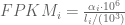
The term in the denominator can be considered a kind of normalization factor, that while identical for each transcript, depends on the abundances of each transcript (unless all lengths are equal). It is in essence an average of lengths of transcripts weighted by abundance. Moreover, the length of each transcript should be taken to be taken to be its “effective” length, i.e. the length with respect to fragment lengths, or equivalently, the number of positions where fragments can start.
The implication for finding a relationship between FPKM and relative abundance constituting one transcript copy per cell is that one cannot. Mathematically, the latter is equivalent to setting 

The argument above makes clear that it does not make sense to estimate transcript copy counts per cell in terms of RPKM or FPKM. Measurements in RPKM or FPKM units depend on the abundances of transcripts in the specific sample being considered, and therefore the connection to copy counts is incoherent. The obvious and correct solution is to work directly with the
Why is the sentence informative?
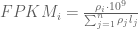
Even though incoherent, it turns out there is some truth to the ranges and estimates of copy count per cell in terms of RPKM and FPKM that have been circulated. To understand why requires noting that there are in fact two factors that come into play in estimating the FPKM corresponding to abundance of one transcript copy per cell. First, is M as defined above to be the total number of transcripts in a cell. This depends on the amount of RNA in a cell. Second are the relative abundances of all transcripts and their contribution to the denominator in the
The best paper to date on the connection between transcript copy numbers and RNA-Seq measurements is the careful work of Marinov et al. in “From single-cell to cell-pool transcriptomes: stochasticity in gene expression and RNA splicing” published in Genome Research earlier this year. First of all, the paper describes careful estimates of RNA quantities in different cells, and concludes that (at least for the cells studied in the paper) amounts vary by approximately one order of magnitude. Incidentally, the estimates in Marinov et al. confirm and are consistent with rough estimates of Galau et al. from 1977, of 300,000 transcripts per cell. Marinov et al. also use spike-in measurements are used to conclude that in “GM12878 single cells, one transcript copy corresponds to ∼10 FPKM on average.”. The main value of the paper lies in its confirmation that RNA quantities can vary by an order of magnitude, and I am guessing this factor of 10 is the basis for the range provided in the ENCODE PNAS paper (0.5 to 5 FPKM).
In order to determine the relative importance of the denominator in
One consequence of all of the above discussion is that while differential analysis of experiments can be performed based on FPKM units (as done for example in Cufflinks, where the normalization factors are appropriately accounted for), it does not make sense to compare raw FPKM values across experiments. This is precisely what is done in Figure 2 of the ENCODE PNAS paper. What the analysis above shows, is that actual abundances may be off by amounts much larger than the differences shown in the figure. In other words, while the caption turns out to contain an interesting comment the overall figure doesn’t really make sense. Specifically, I’m not sure the relative RPKM values shown in the figure deliver the correct relative amounts, an issue that ENCODE can and should check. Which brings me to the last part of this post…
What is ENCODE doing?
Having realized the possible issue with RPKM comparisons in Figure 2, I took a look at Figure 3 to try to understand whether there were potential implications for it as well. That exercise took me to a whole other level of ENCODEness. To begin with, I was trying to make sense of the x-axis, which is labeled “biochemical signal strength (log10)” when I realized that the different curves on the plot all come from different, completely unrelated x-axes. If this sounds confusing, it is. The green curves are showing graphs of functions whose domain is in log 10 RPKM units. However the histone modification curves are in log (-10 log p), where p is a p-value that has been computed. I’ve never seen anyone plot log(log(p-values)); what does it mean?! Nor do I understand how such graphs can be placed on a common x-axis (?!). What is “biochemical signal strength” (?) Why in the bottom panel is the grey H3K9me3 showing %nucleotides conserved decreasing as “biochemical strength” is increasing (?!) Why is the green RNA curves showing conservation below genome average for low expressed transcripts (?!) and why in the top panel is the red H3K4me3 an “M” shape (?!) What does any of this mean (?!) What I’m supposed to understand from it, or frankly, what is going on at all ??? I know many of the authors of this ENCODE PNAS paper and I simply cannot believe they saw and approved this figure. It is truly beyond belief… see below:

All of these figures are of course to support the main point of the paper. Which is that even though 80% of the genome is functional it is also true that this is not what was meant to be said , and that what is true is that “survey of biochemical activity led to a significant increase in genome coverage and thus accentuated the discrepancy between biochemical and evolutionary estimates… where function is ascertained independently of cellular state but is dependent on environment and evolutionary niche therefore resulting in estimates that differ widely in their false-positive and false-negative rates and the resolution with which elements can be defined… [unlike] genetic approaches that rely on sequence alterations to establish the biological relevance of a DNA segment and are often considered a gold standard for defining function.”
The ENCODE PNAS paper was first published behind a paywall. However after some public criticism, the authors relented and paid for it to be open access. This was a mistake. Had it remained behind a paywall not only would the consortium have saved money, I and others might have been spared the experience of reading the paper. I hope the consortium will afford me the courtesy of paywall next time.

64 comments
Comments feed for this article
April 30, 2014 at 6:08 am
Georgi Marinov
Thank you for your comments, here are a few from me:
1) You are absolutely correct to point out the issues with FPKMs and how they can and cannot be compared between samples. No disagreement there. But there was no practical way to do a proper comparison because for Figure 2 we worked with the elements generated in the previous round of ENCODE, and those were RNA contigs with FPKMs attached. Sure, we could have done a reanalysis of all the data with better tools, but there are historical reasons having to do with the way this was put together that did not make this a truly viable alternative (though we did do an updated element calling for the histone mark peak calls but those really needed it).
2) The main point of the figure is the distribution of the signal – it is still apparent irrespective of what the precise values are.
3) When we said 0.5 to 5FPKM equals 1 copy per cell, that was not intended to be a precise estimate but a rough guide that serves more to emphasize the uncertainty rather than anything else. Ideally, we would be measuring these things by running 10,000 single cells in parallel from each sample, with very high single molecule capture efficiency (we don’t want to just know what the average copy per cell is, we would also like to know whether something expressed at on average 1 copy per cell is really present in 1 copy in each cell, 2 copies in half of the cells or 100 copies in 1% of the cells, etc.), but we’re still very far from that.
4) The more important point, one that contributes to differences that matter more in the bigger scheme of things is that an FPKM unit in a subcellular fraction is not the same as an FPKM unit in whole cell extract PolyA+. We have some estimates for what the latter corresponds to, but none that I am aware for the fractions. So I am speaking fact-free here, but from first principles it makes sense that the difference between how many copies per cell 1FPKM in Nucleus PolyA+ corresponds to and how many copies 1FPKM in Cell PolyA+ does is much bigger than the difference between 1FPKM in two PolyA+ samples from different cell lines. And the difference is in the direction of fewer copies per cell for 1FPKM in Nucleus because Nucleus PolyA+ is a subset of Cell PolyA+. One can argue that in PolyA- it might be the other way around (because PolyA- is a separate set) but in all likelihood it goes in the same direction, based on the same old school experiments from the 70s and 80s. Of course, the same reasoning applies to TPMs.
5) There was in fact a lot of concern and discussion about the $log(log p)$ scale, but that was necessitated by having to fit things on the same scale and in the same figure – unfortunately, space was limited. Because the $p$-values for different types of data came from different region calling algorithms, their distributions were very different. It sure is odd, but it does not change the results in the figure as it is still a monotonic transformation. The question asked there was whether there is a correlation between signal and conservation, and its answer is not affected by it.
6) That H3K9me3 exhibits an inverse correlation with conservation makes sense. H3K9me3 is the classic heterochromatin mark. It is used for silencing transposable elements, and is also highly enriched in centromeric and telomeric regions. So I would expect it to show that kind of correlation – transposons evolve largely neutrally so their average conservation is below the genomic average, more recent TE insertions might be more heavily repressed than older ones (and more recent insertions are by definition less conserved across all mammals), plus I am not sure what exactly the conservation scores are measuring around centromeres and telomeres as this depends on the completeness of assemblies, etc. (I am not speaking as an expert here but I can see how there might be a bias).
7) Given how much of the genome is covered by RNA contigs, I think it is natural that the low-level ones will be below the genomic average for conservation. After all, most of the genome is..
8) As far as I know, the paper was intended to be OA from the very beginning, but something went wrong and it got paywalled initially.
April 30, 2014 at 6:24 am
Lior Pachter
Dear Georgi,
Thanks for your comments. I’d just like to note a few things (using your numbering):
1. As my post points out, there is no need to recompute anything. All you would have to do is to convert FPKMs to units direction proportional to the abundances. This can be done, for example, by simply computing TPM_i = (FPKM_i / (sum_j FPKM_j)) * 10^6. So I am not sure why you think this is not possible to do with the current FPKM output ENCODE has generated.
2. I don’t understand what you mean here by “distribution of signal”. The point of putting bars next to each other is to compare them. If heights change, the plot will be different.
3. I appreciate your estimate of 0.5 to 5 FPKM was just a rough estimate. The point of my post is that it actually turns out that it is probably reasonable. I’m just saying that it makes no mathematical sense to make such a comparison, and it should be made with respect to TPM instead. Also, the “rough guide” could be very misleading to naive researchers who may use your estimate on other samples, where different abundances will change the answer.
4. I certainly agree that if there is more RNA, there are likely to be more copies of every transcript.
5. First of all, the reason people put multiple graphs on a single figure is to compare them to each other. That is exactly what I did when I first looked at it. I made conclusions about the extent to which nucleotides are conserved at fixed levels of “biochemical signal”. But the way the plot was made my naive interpretation of it (which I think any reasonable person would also adopt) was completely meaningless and wrong, and it took me a while to figure out that the x-axes were all incomparable. Second, with all due respect, when you say plotting the x-axis for histone marks as log(-logp) “doesn’t change the results in the figure”, what are you talking about? The reason people use p-values, or log p-values, is that they mean something. You could have also plotted cos(sqrt(logp))on the x axis. You could have squared the values on the y-axis. What are we talking about here? A final point (recommendation) I’d like to make, is that if space is a problem for the consortium, it could publish in PLoS One.
6. I understand your point, but many of the qualitative aspects of the figure make no sense to me (as I pointed out in the post). Since you are not the expert, could you point my blog post to the experts in the ENCODE consortium who could answer all my questions about the plot? I think I and others would appreciate a response on the comments section here.
7. The statements that “the majority of the genome is covered by RNA contains” along with the plot showing very few are in fact beneath the average are together inconsistent, unless I am missing something.
8. Please see my comments about PLoS One. With that journal you won’t have any accidents with respect to OA.
April 30, 2014 at 6:45 am
Georgi Marinov
1) That is true – we could have done it, but again, keep in mind that these are not transcripts but contigs, and that the initial desire was to work from the original files that the 2012 paper was based on. It was only after the RNA analysis was done that it was decided to redo the peak calling for the histone marks. Also:
2) By “distribution of signal” I mean how much of the genome is in each FPKM/p-value bin – generally, a smaller fraction will have high values and a larger fraction will have low values. The precise percentages are going to change if one adds a few more cell types/datasets, but the overall shape will remain the same, That point is more important than whether is in the
  to
to  FPKM bin or
  is in the
  to
to  TPM bin. You are correct in principle, but it does not change the significant conclusions one would draw.
3 & 5) I don’t disagree.
6) When I said I am not an expert, I meant that I am not an expert on multiple genome alignments. The statement that H3K9me3 makes sense I stand behind
7) I don’t understand – the majority of the genome is covered in RNA. Most of the it is slightly below the genomic average for conservation, because most of the genome is slightly below the genomic average for conservation. Where is the contradiction?
8) I don’t disagree there either. BTW, ENCODE has done that before, the ENCODE 101 paper was published in PLoS:
http://www.ncbi.nlm.nih.gov/pubmed/21526222
April 30, 2014 at 6:47 am
Georgi Marinov
Formula does not parse was intended to be . Am I doing something wrong or indeed there is no post preview option?
May 1, 2014 at 11:36 pm
Marc RobinsonRechavi (@marc_rr)
Concerning point 1, do I understand well that members of the ENCODE consortium found it too complicated to re-analyse ENCODE data for a PNAS paper? Weren’t we told that whatever the interpretation, availability and re-usability of the data were the main point? So how re-usable is this data in fact?
May 1, 2014 at 11:59 pm
Anshul Kundaje
Like Georgi said – we tried to keep the data analysis methods as similar to the 2012 paper as possible. Hope that clarifies your question.
How reusable is the data. Here is how reusable it is http://genome.ucsc.edu/ENCODE/pubsOther.html
May 2, 2014 at 12:43 am
Marc RobinsonRechavi (@marc_rr)
@Anshul Kundaje Thanks for the rapid reply. It’s difficult to know how many of these citations using ENCODE data used the processed data, and how many used the raw data and reprocessed it according to the standards needed in some other study. I know that when we wanted to use RNA-seq data from ENCODE in my lab, it was not easy getting the raw data with proper annotations. From my interactions with the group managing data in ENCODE 3, this is improving.
Still, the reply from Georgi Marinov was worrying. If the idea was to perform a sub-optimal analysis to stay consistent with 2012, maybe this should be explicitely stated. What he wrote was:
So you confirm that if you had wanted to analyse the data differently, it would have been “a viable alternative”?
May 2, 2014 at 7:37 am
Georgi Marinov
Still, the reply from Georgi Marinov was worrying. If the idea was to perform a sub-optimal analysis to stay consistent with 2012, maybe this should be explicitely stated. What he wrote was:
We used the data from the 2012 paper because those were the publicly released files on which that paper was based and we wanted to be consistent and transparent. The analysis is by no means sup-optimal for the purposes of the current paper as I already explained above – reprocessing everything would not have changed any of the conclusions one would draw from the figures. The data will be reprocessed and reanalyzed in the future, but the exact pipelines are currently in development.
If you really think this is so important at this moment, you can reanalyze the data using your favored tools, the BAM files are publicly available, Or at least tell me which of the figures in the paper you think would be substantially affected by such reprocessing. Remember that the exact percentages shown are actually of not that much significance – this is a summary derived from datasets from
  cell iines. We already have plenty of additional data so if we are to rerun the same analysis including
  datasets from
  cell lines , the numbers will change slightly, and if we are to rerun it a year from now, they will change a little bit again, and so on. It is really not important whether the size of some bar in Figure 2 is 10.5% or 10.8% of the genome. The two important questions that are relevant to the subject of the paper are:
1) Does most of the genome consist of what we would call “junk” DNA? This is important because it affects how we think about the genome in general
2) The precise identity and significance of functional elements in the genome, i.e. gene X has 10 enhancers, 3 of them are important for its expression in muscle cells, 2 of them are redundant with each other, etc.This is important because it is what is most directly relevant to the practice of most biologists.
The rest is in my personal opinion largely irrelevant.
Finally, as I write this I come to the realization that if the data had in fact been reanalyzed, instead of explaining why we did not reprocess the data, I could be now replying to comments in the spirit of “Ah, so the 2012 analysis was garbage and they had to redo it to fix it” (that’s not necessarily directed at you personally, but is based on all the reactions that I have seen over the last week).
May 2, 2014 at 8:27 am
Marc RobinsonRechavi (@marc_rr)
@Georgi Marinov Thank you for your answer. It’s clarified now as far as I am concerned. The comment which got me worried seems to have been a misunderstanding, which can readily happen when writing blog post comments.
I did not have a specific concern for the figures in this paper, but you might agree that if analyzing ENCODE data had been a real hurdle for ENCODE members, then this would have been a worrying situation.
In conclusion: re-analyzing ENCODE data is not in fact an issue for the ENCODE consortium, worry averted.
April 30, 2014 at 8:29 am
Sarah
Dear Lior,
Thanks for the interesting blog post. I don’t know enough about RNA-seq to add much on that topic, but I’ve been trying to understand normalization methods better, so I appreciate the thorough explanation.
However, I don’t think you’re giving that graph a fair chance. I do agree with you on some points – combining all of the different units of “signal strength” into one x-axis was a very strange choice, one that appears to have been motivated by editorial reasons. I think it would have been much better to display a graph for each type of data separately, as it would have avoided the axis confusion and made it easier for the reader to tell what was going on (as it is, it suffers from visual overload). Also, to me it would have been more intuitive to bin nucleotides and plot them against signal, rather than the other way around.
Nonetheless, if you try to compare the same type of data in the top and bottom panels, you start to see some interesting trends that make sense. Take the example of RNA PolyA+ (light green). The plots don’t actually show that very few fragments have below-genome-average conservation. In the top panel, you can see that the bins with the greatest number of nucleotides – e.g. covering the highest proportion of the genome – are those with a signal score from around -1 to -0.5. These same bins have a slightly lower than average conservation, whereas the bins with a higher than average conservation have less nucleotides in them, meaning that there are fewer fragments with high signal and high conservation, and more fragments with low signal and low conservation.
Now if you look at H3K9me3, the top plot is basically telling us that it has a fairly narrow distribution of signal scores (although this is difficult to interpret due to the multiple-unit-x-axis problem), and the bins with the most nucleotides fall right around the genome-wide average for conservation. So within H3K9me3 regions, most of them have a conservation around or slightly above average, while some (those with a higher signal strength) have a conservation below average. As Georgi pointed out, this makes sense given H3K9me3’s role.
On the other hand, if you look at the DNase plot, which has a similar shape on the top panel but an opposite one on the bottom panel, most of the regions have a conservation around average, while some (those with a higher signal strength) have conservation above average. You see a similar pattern for TFBS. This makes sense to me because for both DNase sites and TFBS, you would expect stronger sites to be more conserved, but you wouldn’t necessarily expect all – or even the majority – of sites to be highly conserved compared to the genome-wide average.
One last observation is that all of the plots in the top panel peak at some point (with the exception of H3K4me3 and its odd M shape) and then decrease with increasing signal strength. This makes sense because generally with these types of data, the very highest peaks only cover a small fraction of the genome. Also, thinking about it, histone mark ChIP signals tend to be broader, which might explain why most of their curves are flatter than the DNase curve (except for H3K9me3).
Those are my thoughts, as a neutral observer – feel free to disagree, but maybe they’ll help some people make more sense of it.
April 30, 2014 at 8:37 am
Lior Pachter
Even restricting analysis to the histone marks, the x axis is log (-log p-value). I just don’t understand how this is biochemical signal. Maybe if they had used effect size meaningful biological interpretation would be possible. But p-values say something about confidence in predictions. I am truly confused.
April 30, 2014 at 8:44 am
Georgi Marinov
But the p-values generally correlate very strongly with signal – after all, high read density is the primary thing that peak callers are looking for. We could have plotted RPMs, but one can also make an argument that the p-values represent a better metric as they also account for the signal in the input sample (and supposedly do that better than mere RPM subtraction or some other simple approach of the sort).
So p-value may not be exactly the same as signal but is still very close.
April 30, 2014 at 10:53 am
Malarkey
P-values may correlate with “signal” but they have a completely different distribution to “signal” – and making them both log10 won’t make them comparable either.
That apart I don’t understand why you didn’t standardise the units (div by SD) of the actual signals so that stuff is – sort of – on the same scale. I really don’t know how to read that Fig at all.
April 30, 2014 at 6:09 pm
Anshul Kundaje
@Malarkey: Firstly, signal values for ChIP-seq by which I assume you mean effect size i.e. fold-enrichment of ChIP relative to input are largely monotonically related with -log10(Poisson p-values). So yes they do have very different distributions but the ranks are largely identical. And infact the p-value is a better measure for ranking and thresholding signal (enrichment) than the fold-change and is the most commonly used measure for thresholding and ranking peaks for ChIP-seq. You can confirm this by investigating any of the popular and vetted ChIP-seq peak calling algorithms. What we care about in the figure is how the 2 y-axes behave as we go from low to high signal for each data type. We did not want or intend for the different data types to be compared head to head. Whether you perform standardization or not, there is no way to make them comparable. They are fundamentally different. I totally agree that the different data types should have been in separate panels. It is what we started off with. Had to mash it together to save space. Our apologies! However, it does not change the trends in any way and does not affect the conclusions (which have been clarified very nicely by Georgi and Sarah above).
April 30, 2014 at 9:55 am
Vince
Thanks for this post! Very informative discussion of FPKM. It’s also good to know that I (https://twitter.com/vsbuffalo/status/458441163733618688) wasn’t the only one confused by this figure.
April 30, 2014 at 10:26 am
Anshul Kundaje
I want to second what Georgi said – that the Poisson p-values are almost perfectly monotonically related to fold-enrichment (ChIP signal relative to input DNA control). This is a totally standard way of ranking peaks/regions of enrichment from ChIP-seq data (most of the popular peak callers use the p-value significance to threshold peaks). So not sure exactly what the problem is. Also, your point is taken about mashing the different units together on the same axis. The second log is simply to compress the axis. Yes we could have used asinh or any other transformation. It would not change the trends. As we tried to clarify, we wanted to use separate panels for each data type comparing % nucleotide coverage and % conserved. Putting all the axes together was a choice we eventually ended up with due to lack of space.
April 30, 2014 at 10:28 am
Anshul Kundaje
Sorry in my first sentence I meant “-log10(Poisson p-values) are almost perfectly monotonically related to fold-enrichment”
April 30, 2014 at 10:30 am
Tuuli Lappalainen
Hi Lior,
I enjoyed reading the your summary of RNA-seq quantification measures. I also agree (with you and apparently with many of the authors) that merging different data type in that figure is not the best choice. The log(log(p)) measure does seem odd although I don’t know enough of ChIP-seq quantification to make a judgement of how odd this really is.
But what I really wanted to comment on is your “Why in the bottom panel is the grey H3K9me3 showing %nucleotides conserved decreasing as “biochemical strength” is increasing (?!) Why is the green RNA curves showing conservation below genome average for low expressed transcripts (?!) and why in the top panel is the red H3K4me3 an “M” shape (?!) What does any of this mean (?!) What I’m supposed to understand from it, or frankly, what is going on at all ???”
These are fair questions, but your tone is indicating that since there are trends without obvious biological interpretation in the text or intuitively clear to you, the data/analysis must be wrong and the authors are incompetent/sloppy. As you see from the comments above, some of the trends actually make perfect biological sense – that you apparently weren’t aware of. Not every single point can be included in the paper or our papers would be 100 pages each.
Even more importantly, I want to make a general point that in biology there are plenty of results that we can’t explain fully. We don’t necessarily have an answer to every single “why”, and that’s absolutely fine. Biology is complicated, our understanding if it is incomplete, and our measurements are not perfect either. Obviously we need to be critical about our results, technical variation, and analysis methods (and discuss caveats/inconsistencies in papers), but if you’re measuring 10 things of which 9 make biological sense and 1 doesn’t even after detailed scrutiny, what are you supposed to do? Throw everything in the bin? Where would biology be if everyone did that? Some of the unexplainable inconsistencies will be answered by later research, and reporting them can help to discover interesting new phenomena.
In math, you can achieve perfection and inconsistencies are a sign of problems. But biology isn’t math. It is noisy and sometimes inconsistent by its very nature.
April 30, 2014 at 2:32 pm
es
“Although very few people actually care about ENCODE”
Unfortunately, I’m afraid that this is incorrect.
According to google scholar, the main Encode paper,
published in 2012, has close to 1,400 citations. Many people cite Encode,
and often use their data in papers. Whether or not the people citing Encode like the studies/their conclusion, and produce any valuable science based on Encode’s data, Encode had a huge (possibly negative) impact on genomics in the last couple of years (not to mention the distortion in distribution of funding due to such a big project).
April 30, 2014 at 3:51 pm
Anshul Kundaje
I can give you ample evidence of a positive impact of ENCODE data on several people’s work including those outside the consortium. Here is a non exhaustive list to begin with http://genome.ucsc.edu/ENCODE/pubsOther.html.
Here are 2 cherry picked papers that focus on disease and evolution that I found quite fascinating, written by non-ENCODE authors and could very likely not have been done without the scale and uniformity of ENCODE data.
http://www.biorxiv.org/content/early/2014/04/20/004309
http://arxiv.org/abs/1308.4951
Can you support the hypothesized claims that ENCODE has had a negative impact on Science. Any large project would draw funds away from smaller projects. Does that by itself mean that the project should not be undertaken? There is absolutely no proof that ENCODE has had a negative impact on Science. If there is I would love to see it and so would many others including the NIH.
May 1, 2014 at 7:04 am
Claudiu Bandea
Generating data and observations is only half of the scientific process; the other half is their interpretation and integration into the existing body of knowledge. Paradoxically, the leaders of the ENCODE project, which was intended and funded primarily to generate data, decided instead to emphasize and focus, at least in the public arena, on the broad interpretation of the acquired data, which apparently overstepped their expertise, or was deliberately used to mislead the public opinion about the significance of the project.
Therefore, when evaluating the ENCODE project, or for that matter any project in science, the two aspects of the scientific process need to be distinctly addressed. Obviously, generating any data, as long as it is not artifact, is beneficial to Science, but the question is how beneficial compared to other types of data; and, in this respect, the value of ENCODE data is yet to be fully evaluated. However, it appear that ENCODE’s interpretation of the data is meaningless, which discredits Science.
May 1, 2014 at 7:09 am
Lior Pachter
Thanks for this comment. I completely agree and made a similar point in my reply (posted this morning) to the consortium members who have commented on this thread. I would only amend your statement slightly by saying that data generation and analysis are not really 50/50. In terms of funding the data generation is much cheaper, and I suspect that in the ENCODE case is a minor part of the total funding allocated. The breakdown is also not 50/50 in terms of time. Data generation is a big effort, but analysis of ENCODE data has taken the consortium much longer than its generation.
May 1, 2014 at 10:10 am
Anshul Kundaje
Claudia – Clearly you have not read the 40 companion papers that came alongside the ENCODE main paper. Besides 1 sentence in the main paper and maybe a paragraph or two that talks about 80% of the genome being “biochemically functional”, pretty much none of the other 40 papers have anything to do with this statistic or definition of function. You are judging an entire body of scientific analysis based on one statement/paragraph in the main ENCODE and the massive media hype (which I personally also agree was unnecessary and misdirected … this is my personal view). Criticize the media hype and the way the project was advertised as much as you like. I personally think that is absolutely justified. But, using that to discredit the scientific analyses presented in the ~ 40 other companion papers that have ABSOLUTELY NOTHING to do with “80% of the genome is functional” to me is totally ridiculous. Can you justify you statement that say 80-90% of the scientific analyses in the main paper and the companion papers is nonsense? If so I will agree with you that ENCODE was a waste of money.
May 1, 2014 at 12:44 pm
Anshul Kundaje
ENCODE data has always released as soon as it was generated. The publications took time but there was no delay in releasing the raw data.
May 2, 2014 at 6:36 am
Claudiu Bandea
Anshul,
Indeed, I have not read “the 40 companion papers that came alongside the ENCODE main paper,” only some of them.
However, you have misread my comment, in which I specifically referred to the broad interpretation of the ENCODE’s results by its leaders and propagandists, not to individual studies. And, if you and some of your ENCODE colleagues consider this broad interpretation and propaganda as “unnecessary and misdirected” and feel that our critique is “absolutely justified,” it would make sense to publish a clear statement reflecting your discontent with the way some of your reckless leaders compromised your hard work and scientific contribution; after all, you reputation is at stake.
Moreover, in evaluating ENCODE, it is important we focus on the role of the funding agencies. The ENCODE fiasco has highlighted a huge weakness in the funding system, which should be unacceptable for a national research agency of NIH caliber. Specifically, it make little sense, if any, to spend hundreds of millions of dollars on a project directed at understanding the human genome, without consulting and employing a strong coalition of researchers and scholars from the fields of genome biology and evolution. For example, how many experts on the evolution of genome size, or on the origin and evolution of retroviral elements, which constitute half or more of the human genome, have been funded as part of the ENCODE project? How many scholars with track record of addressing complex issues in biology and bioinformatics have been consulted and employed, not only in planning and directing the ENCODE project, but in thinking about and making biological sense of the vast amounts of raw and processed data? Can we start funding scientists for their expertise in critical thinking? Can the next-generation ENCODE projects hire Dan Graur, Ford Doolittle, Sean Eddy and our host Lior Pachter [with the pre-condition that DG and SE share an office, :)] to set them up on solid scientific grounds that make biological and evolutionary sense?
May 2, 2014 at 12:14 pm
Anshul Kundaje
@Claudiu: I’d like to preface by saying these are my personal views and do not in any way reflect the consensus or diversity of opinions in the consortium.
The fact is the ENCODE grants were through open RFAs. All the folks you mention had the opportunity to apply for these grants (I dont know if they did) and their applications would be peer reviewed. If you or others have a problem with the funding process, you should take it up with the NIH. Don’t misdirect your anger towards the consortium and start mixing the science with funding issues and other unrelated agendas. Also, you are mistaken if you or others think that current folks in the consortium don’t understand evolution or statistics or anything for that matter. That is an “opinion” that some of you share. Feel free to have that opinion. It doesn’t make it fact.
And the facts should be based on statements made in the ENCODE paper and the 40 companion papers and not those in press releases, interviews and blog posts. I want to reiterate that what you call the ENCODE fiasco is all about this one statement that “80% of the genome is functional” and the press releases about the death of “junk DNA”. Going back to scientific content – the first statement appears in 1 line and at most a paragraph in the main paper and pretty much NO other paper has anything to do with this. AFAIK, the word “junk DNA” does not appear in any ENCODE paper. So I dont understand this. You are calling all of ENCODE a disaster of epic proportions based on nothing but issues with press releases.
Anyway, I am personally done with this particular thread of conversation since it really has nothing to do with ENCODE science or me. We can agree to disagree. I’d much rather discuss the science. If you have specific scientific questions feel free to ask and we will do what we can to clarify your doubts. Thanks!
April 30, 2014 at 9:05 pm
anti-MIT-EECS
Wow, Manoli Kelli and his peers in the spotlight again? =))
April 30, 2014 at 9:07 pm
AndrewJ
Perhaps I am missing one of your posts that addresses this ; but which sequence of papers would you recommend a newcomer to RNAseq read if they want to most efficiently get up to speed on best practices? The literature is pretty overwhelming by this point in time.
May 1, 2014 at 6:54 am
Lior Pachter
This is an excellent question. I’d like to take a bit of time to think this through carefully before just putting up a bunch of references… I promise to get back to you soon.
May 1, 2014 at 6:47 am
Marcin Cieslik
“Why in the bottom panel is the grey H3K9me3 showing %nucleotides conserved decreasing as “biochemical strength” is increasing (?!)”
This is not surprising, well at least not “?!” surprising. At the somatic level differences in mutation rates are associated with chromatin marks and “H3K9me3—can account for more than 40% of mutation-rate variation”
Chromatin organization is a major influence on regional mutation rates in human cancer cells http://www.nature.com/nature/journal/v488/n7412/full/nature11273.html
Accordingly, H3K9me3 is negatively correlated.
May 1, 2014 at 6:53 am
Lior Pachter
Thanks. Your comment (and others) have indeed partly explained this question mark. However I am still confused as to why the support is so much smaller than the other marks (i.e. why the x-axis values are so much narrower. I also have still to yet hear any explanation for my other questions, especially the funky “M” and what it means.
May 1, 2014 at 7:03 am
Marcin Cieslik
In my experience chromatin marks have widely different signal levels and variances, pointed marks are high signal – high variance, broad marks are low signal – low variance. This means that enrichment p-values cannot be compared between marks (you get much lower p-values for pointed marks), and probably should not be put on the same X-axis.
I would scale the levels of different marks as log(Z-score(FPKM)) or my favorite double sigmoid function http://www.sciencedirect.com/science/article/pii/S0031320305000592.
May 1, 2014 at 6:51 am
Lior Pachter
I’d like to thank the ENCODE consortium members who have taken the time to comment on this post. However I am troubled by many of the statements made, to the extent that the comments thread on this post has left me much more concerned about ENCODE than ever before.
First, in the interests of full disclosure, I’d like to explain that
1) I was a member of the ENCODE pilot project (and coauthor of the resulting paper). My group participated in the multiple alignment sub-consortium, which also resulted in a companion Genome Research paper (Margulies et al., 2007). At the time, I felt that although we benefited greatly from the exchange of ideas with the ENCODE alignment groups, the paper(s) ended up written with too many non-scientific agendas in mind. I ultimately decided not to continue working with ENCODE because I was not comfortable doing research that way.
2) Although I was not involved directly in the subsequent “main” ENCODE project, my group did benefit from the creation of large amounts of RNA-Seq data. Specifically, we developed Cufflinks in collaboration with the Wold group and Ali Mortazavi, and their access to, and involvement with ENCODE provided us with very useful RNA-Seq datasets for methods development. Although other RNA-Seq data were available at the time, the scale and scope of ENCODE, especially its organization and standardization multiple datasets with different types of library prep was very helpful.
One of the issues that have come up in this thread is the utility of ENCODE data. As I’ve explained above, I’ve personally found some of it useful for methods development, and others have found it useful for generating and/or testing hypotheses. Many have argued that the ENCODE money could have generated (better?) R01 data instead and I think there are good arguments to be made in that direction as well. Either way, I don’t think the issue of the utility of ENCODE data has anything to do with this thread, nor do I think we will resolve that debate here. The most recent ENCODE PNAS paper is an *analysis* paper, and the funding of the majority of ENCODE was not for data generation, but for its processing and analysis for the community. My criticisms in this post are directed at what I think is by now a very harmful ENCODE culture of performing very poor analyses that are wasting resources, confusing biologists and the public, and frankly impeding progress in genomics instead of promoting it.
Turning to the replies made by ENCODE members, I’d first like to address Figure 3. The issue and your defense of the use of log(-log p-values) for the histone marks is very troubling. Your own paper on “ChIP-seq guidelines and practices of the ENCODE and modENCODE consortia”, Landt et al. 2012, a paper that I think is very useful, makes clear that although p-values are used to rank predictions according to statistical significance, that the issue of statistical significance of a prediction is separate from its effect size. This very paper explains why FRiP is therefore used to measure effect size. The paper goes on to explain that normalized strand coefficient (NSC) and the ratio between the fragment-length peak and the read-length peak (RSC) are alternate ways to measure effect size and are correlated with FRiP. There is actually a table in the paper making this all very clear:
Point source peaks
For point source peaks (e.g. experiments with antibodies to sequence-specific transcription factors), common features that are reported by ENCODE researchers include:
• Peak position, defined as a single base pair.
• Start and end positions, defined as specific base pairs.
• Signal value (e.g., fold enrichment) using an algorithm chosen by the submitter.
• Significance/accuracy measures:
◦ ○ P-value determined using a method chosen by the submitter.
◦ ○ Q-value (false discovery rate correction) determined using a method chosen by the submitter.
• Metadata, including peak caller approach and genome reference used, plus methods for determining signal values, P-values, and Q-values, as applicable.
Broad regions
• Start and end positions, defined as specific base pairs.
• Signal value (e.g., fold enrichment) using an algorithm chosen by the submitter.
• Significance/accuracy measures:
◦ ○ P-value determined using a method chosen by the submitter.
◦ ○ Q-value (false discovery rate correction) determined using a method chosen by the submitter.
• Metadata, including peak caller approach and genome reference used, plus methods for determining signal values, P-values, and Q-values, as applicable.
• Point-source peaks can be called in addition to broad regions (i.e., one can have “peaks” and potentially “valleys” within “regions”).
The investigator should determine whether their data best fits the broad region/point source peak data or both.
I repeat, even though they might be correlated, *signal value* and *signal significance* are two vey different things. But let us even assume for a moment, that p-values are somehow a reasonable proxy for effect in this case. Even then, plotting log(-log p-value) is not a reasonable thing to do. There is a meaning to x-axes in plots.. the little tick marks and numbers are used to actually examine and study the function. When I see “1” vs “2” or “2” vs “3” I assign meaning to that. A p-value twice as large means something. In log scale, the difference is multiplicative instead of additive. But using log (-log p) makes it impossible to draw any intuitive or reasonable meaning from the plots. I think your argument in defense of the measure is that it helped to save space, and that it didn’t matter anyway because you are just trying to show some general trend. If so, why even bother showing the data in this way. Just to confuse the reader?
This brings me to a much bigger problem with the figure that I already made in the post. What is the point? What does it mean? Usually, in a biology paper, a figure supports the narrative. It is definitely not appropriate to just take the data, mess with it (take logs, logs again, maybe cosine, square root and division by pi) just to make it look like interesting art, and then put it up as a pretty picture. In this case, there is no narrative at all provided in the paper. The only mention of the figure is the sentence “Regions with higher signals generally exhibit higher levels of evolutionarily conservation”. The lack of narrative has been attributed to biological complexity and difficulty in interpreting the data. I beg to differ. The figure is just a mess, and there has been no effort made to really examine carefully what is going on. That, I thought, was exactly what ENCODE researchers were being funded to do. This does not look to me like “best practice”. Is this a model for methods development and data interpretation for the community? The paper goes on to mash three different figures onto one with completely different x-axes. The excuse that there were “space constraints” rings hollow. ENCODE’s mission is not to publish in PNAS with its page limit, but to publish correct results, proper analysis and meaningful interpretation. Mashing figures *is* confusing and misleading to researchers. Does ENCODE believe that all figures should just be mashed into a single one… because that would save even more space? What exactly is being optimized here?
I think all of this really matters. There is now a new term “biochemical signal strength” that will undoubtedly crop up in future ENCODE papers, and is yet another meaningless notion, ill-defined, literally just made up without any thought as to its definition or interpretation. Even in this single paper, its now not one, but three different units all under the same name, none of which are clearly interpretable as “signal strength”. My negative comments on ENCODE in this post reflect my aversion to this approach to computational biology: make up some arbitrary notions to describe data, give them names using words without meaning… and then mash it all up into figures that look pretty but have no substance. I get that biology is not math and that math is not biology. But ENCODE can’t be pretending to the biologists that its doing math, and to the mathematicians that its doing biology, when in fact it is (at least in this case) squandering valuable computational biology research dollars.
May 1, 2014 at 9:23 am
Anshul Kundaje
1. “Your own paper on “ChIP-seq guidelines and practices of the ENCODE and modENCODE consortia”, Landt et al. 2012, a paper that I think is very useful, makes clear that although p-values are used to rank predictions according to statistical significance, that the issue of statistical significance of a prediction is separate from its effect size. This very paper explains why FRiP is therefore used to measure effect size. The paper goes on to explain that normalized strand coefficient (NSC) and the ratio between the fragment-length peak and the read-length peak (RSC) are alternate ways to measure effect size and are correlated with FRiP. There is actually a table in the paper making this all very clear”
Lior – Unfortunate you are completely wrong here in that FRiP, NSC and RSC are measures of data quality for an ENTIRE ChIP-seq dataset and not a measure of enrichment, ranking or effect size for each peak or region which is what we need here. The measures of enrichment for a peak or region would either be a fold enrichment (of ChIP to input) which translates monotonically to a Poisson p-value significance for the MACS peak caller. The rationale for using the p-value scale is that with the MACS peak caller and in general for ChIP-seq analysis p-values or q-values are used to decide whether a particular peak is likely signal or noise (not fold change). Fold change is highly misleading. For example for broad marks (e.g. H3K9me3) a 3 fold enrichment is very significant whereas for narrow marks (e.g. H3K27ac) a 3 fold enrichment is very much on the border of noise. The p-values (or -log10( pvalues) are a better indicator of signal vs noise and its “relatively” easier to set a common threshold for what one considers noise. The distributions are totally different between different marks whether one uses fold enrichments or pvalues.
We should not have added in the second log just for compressing the axis. We conceded that the main problem with interpretation of that figure has arisen because the different panels are on the same plot. Internally we did have a lot of debate about this figure in terms of the putting all the panels together or just showing a select few.
But using p-value or -log10(p-value) as a measure to rank histone ChIP-seq peaks from noise to signal is totally justified.
For your convenience and for the rest of the readers who were confused by the mashing of the panels, we apologize. We will replot this figure with each data type in a different panel and remove the additional log that was used to compress the axis for the histone marks. We will try to add it as a comment or an addendum to the paper and also send it to you so you can post it on the blog.
2. “The only mention of the figure is the sentence “Regions with higher signals generally exhibit higher levels of evolutionarily conservation”. The lack of narrative has been attributed to biological complexity and difficulty in interpreting the data.”
“Regions with higher signals generally exhibit higher levels of evolutionarily conservation” – this was the main message we wanted the readers to take from this figure. We could have written an entire paper on just this one figure. But the paper was not all about this one figure. At the end of the day the paper was written to address the overall definition of function and not specifically to dive deep into this figure. What we include in a paper and the theme that we would like to focus on is a choice we are allowed to make. There are pieces in every paper I read that I do not understand and that the authors have not exposed fully. That does not mean the authors dont know whats going on or that it is sloppy of them not to fully expose every figure in the paper.
I dont know who said that the lack of narrative is due to biological complexity and difficulty of interpreting data. It was certainly not Georgi or me. I want to clarify that the authors of the paper do understand the figure and several of your questions have already been answered not just by us but by other readers. If you have additional questions feel free to ask.
3. This does not look to me like “best practice”. Is this a model for methods development and data interpretation for the community?
Lets not try to confuse your readers. Our best practices paper is a solid paper on recommended methods to generate and analyze different types of *-seq data. This paper is a commentary on the complexity of the definition of function. It has nothing to do with our best practices.
4. There is now a new term “biochemical signal strength” that will undoubtedly crop up in future ENCODE papers, and is yet another meaningless notion, ill-defined, literally just made up without any thought as to its definition or interpretation. Even in this single paper, its now not one, but three different units all under the same name, none of which are clearly interpretable as “signal strength”.
There is no single definition of biochemical strength. Each data type is fundamentally different with its own characteristics.
For ChIP-seq data different there are a variety of different measures to score and rank peaks e.g. ChIP-signal – input *(input subtraction), log(ChIP/input) i.e. log fold enrichment, some of the scores included penalties for peak shape which is very useful (e.g. the SPP peak caller that we used for TF ChIP-seq), Poisson or negative binomial p-values, and corrected q-values.
Histone ChIP-seq has very different characteristics than TF ChIP-seq (regions being broader with interesting patterns of dips and valleys). Narrow and broad histone marks have very different characteristics (in terms of breadth of signal and signal to noise ratios). RNA-seq (which you are an expert on) is obviously a totally different beast as well. FPKM is the most commonly used unit for signal. Hence, we used it. Your post was very informative about TPM and the FPKM thresholds. So thanks for that.
All of these are biochemical events and they need their different units to best describe their strength. So it is natural to use different units to measure each type of data. There is no single measure of biochemical signal strength or confidence of signal. And we did not attempt to even try to generate such a measure because it would be pure nonsense. This is why we stuck to using the native measures for ranking signal for each data type. It is why we did not try to renormalize/standardize the completely different ranking measures cuz we did not want to give the reader a notion that they are comparable. What we really should not have done is mashed them up into one figure which actually naturally induces a reader to compare the different data types.
However, it still does not take away from the main message that “Regions with higher signals generally exhibit higher levels of evolutionarily conservation”.
May 2, 2014 at 6:16 am
Lior Pachter
I appreciate your commitment to remake the figures in different panels and to use -logp for the histone marks instead of log(-logp). When you post the correction for the paper I will also add the revised figures to this blog post.
However I’d like to ask you, again, to reconsider your attachment to replacing effect size with p-value. Of course p-values are monotonic with effect size. But *different* tests can result in a different ordering between p-values and effect sizes. Please see my previous post on magnitude of effect vs. statistical significance. This is why FRiP uses magnitude of effect for its calculation and not p-value (obviously I understand that its typically reported as an average over the genome but it is an effect measurement at every binding site). Furthermore, your claim that ChIP-Seq studies use p-value as a proxy for strength of binding is simply not true. Almost every paper I’m aware of that in any way associated signal strength to mapping data (whether it be ChIP-Seq, or other assays measuring binding) uses read density. Even ENCODE consortium members all use enrichment (fold change) rather than p-value for “signal strength” in their papers (I’m referring, for example, to the work of Ernst/Kellis on ChromHMM, or ChIP-Seq papers from the Gerstein lab, etc. etc.). You are right that using effect will produce different figures than significance. Therefore please make them as well.
May 2, 2014 at 1:17 pm
Anshul Kundaje
Hi Lior. I understand your point about the difference between signal strength and signal significance or confidence. I should have clarified that p-value is the common significance measure that is used to rank and threshold peaks/regions as signal vs. noise rather than fold-enrichment since it tends to do a much better job filtering signal from noise and the p-value thresholds are reasonably comparable across different histone marks or TFs. Also, we and others have noticed that if you generate genome-wide signal tracks using the per base -log10(p-value) as the signal “score” (e.g. the MACS2 peak caller generates these), you get significantly cleaner and more comparable signal tracks across datasets than you do if you use fold-enrichment signal scores. There is a better signal vs. noise filtering for a fixed threshold as well (e.g. p-value threshold of 1e-3) as compared to a fixed fold enrichment threshold. This is what motivated me to use the p-values as a measure for ranking the peaks. I understand that it is not equivalent to the actual signal strength/effect size which the fold-enrichment or input subtraction captures more faithfully with the drawback that it is less discriminative between signal and noise atleast without additional transformations. Also, as Georgi mentioned the x-axis was simply supposed to reflect ranking of peaks which is the same as the ranking of peaks based on significance. As we go from the worst to best peaks we see a corresponding improvement in conservation. That was the main take home message we were trying to convey. I understand your opposition to use the p-value as a measure of signal strength since it is a measure of significance. But I hope we clarified our rationale for using the -log10(pvalue) as a ranking measure for the peaks.
May 7, 2014 at 3:02 am
Erik van Nimwegen
Dear Anshul,
Let me say that I hugely appreciate your (and also Georgi’s) extensive replies and explanations. It demonstrates that you guys are serious and very well intentioned in your efforts.
But that said, I am also astounded to see that there can be such extensive discussions about points that are really very straight forward.
For example, significance and signal strength are simply not the same thing. You cannot plot one and say that you are plotting the other. I don’t see how there can be a long discussion about this. It’s like if I were to plot distributions of different phenotypic observables in populations of humans as a function of their weight on the x-axis, and then write in the caption that ‘weight’ means logarithm of the person’s length. Imagine somebody would call me out and say: Hey, weight and length are not the same thing! What would you think if I then started arguing: Oh, but weight and length are very well correlated so it doesn’t really matter. We chose length because it is more comparable across different populations. For example, Americans tend to be consistently heavier then Africans of the same length so it is better to use length. And we logged length just to make the range shorter (I am making stuff up of course, but you get my point).
In any case, I gather from all the replies I read in this thread that you guys are really only concerned with the ORDER of the signal strength across the genome and that the only purpose of the figure is to show the extent to which different signals correlate with evolutionary conservation. But why didn’t you then just sort all regions by their signal strength and show PERCENTILES on the x-axis? This is both invariant under monotic transformations, simple, and meaningfully comparable across different signals, i.e. the conservation of regions that are top 10% of signal x show conservation y.
This does not a seem a very complicated idea to me.
What I find most depressing about reading this post and thread is that it confirms that people apparently don’t care to be precise and careful about these things. You guys actually agree with essentially all of the complaints about that figure (shouldn’t have been in one plot, shouldn’t have called significance signal strength, shouldn’t have taken double logs). But a large collection of eminent authors nonetheless allowed this be published is a reputed journal. I hope you agree that that’s a depressing observation for our field.
PS. p-value of enrichment assuming Poisson statistics and ChIP/background are NOT strictly monotonically related unless the background is strictly constant, i.e. 200/100 is more significant than 20/10 in a Poisson because standard-deviation scales as square-root(n).
August 9, 2018 at 9:51 pm
Anonymous
I’m a PhD student in comp bio, and some of my colleagues were recently discussing how we strongly dislike this field because of what we perceive as a hostile culture. This four-year-old blog post came up. While we are completely ok with criticism of major issues (e.g. not correcting for batch effects, using deceptive negative sets, etc.), we thought this post was an example of criticism that was more motivated by ego than by genuine scientific concern. A culture of constructive criticism is fine. The culture of mockery, exaggeration and unrestrained condescension that is apparent in this blog post is not fine. Since Anshul dropped off the thread (and presumably got back to doing productive things with his life), Erik van Nimwegen let me clarify why I think there was “such extensive discussions about points that are really very straight forward”.
Yes, everyone agrees that statistical significance != effect size. Why the “extensive discussion”? Because the tone in Pachter’s blog (“what is going on at all ???”, “had it remained behind a paywall, I and others might have been spared the experience of reading the paper”, “very few people actually care about ENCODE”, linking to the “We Had No Laxative” blog post) implied that this was some enormous transgression, when in fact (1) it did not change the general trend (2) everything they did was documented in the legend (3) they collapsed the figures to satisfy editorial constraints and (4) having done so, they were faced with the question of how to label the x-axis and went with “biochemical signal strength” when the only appropriate label was perhaps “the thing we used for ranking”.
For this, the authors get roundly derided in a public forum? On a level comparable to Lior’s trashing of papers that seemed to have *much* more significant problems? And when the authors respond, they’re met with more histrionics, much of it from Lior himself? “The comments thread on this post has left me much more concerned about ENCODE than ever before”, repeated implications that the authors don’t know the difference between signal confidence and signal strength, “ENCODE’s interpretation of the data is meaningless”, phrases like “ENCODE fiasco” – are you surprised that four years down the line, students are talking about wanting to ***leave computational biology because they fear their minor errors will be roundly derided in a blog post like this***?
Could the authors have used a percentile-based visualization? Probably. Hindsight is 20/20. The botching of the axis label is clearly considered forgivable, or my colleagues (all of whom are objectively talented) wouldn’t be talking about quitting the field because of blog posts like this.
And to put it in context, I’ve heard more women express a dislike of this field because of ego jousting than I have heard express concerns about sexual harassment. So. The effect size is pretty big.
August 12, 2018 at 10:57 am
Lior Pachter
Thank you for your comment. This post was written more than four years ago so I’ve taken the time, in light of your remarks, to re-read the paper the post is about, the post itself, and the comments that were made following it.
First, I noticed that at the time one of the authors promised that “For your convenience and for the rest of the readers who were confused by the mashing of the panels, we apologize. We will replot this figure with each data type in a different panel and remove the additional log that was used to compress the axis for the histone marks. We will try to add it as a comment or an addendum to the paper and also send it to you so you can post it on the blog.”
FYI: The paper was never corrected, an addendum was never made, and I never received a revised figure to post on my blog.
Second, I respectfully disagree with your suggestion that this post was about the botching of some axis labeling on a plot. Figure 3 is, as I said at the time, incoherent nonsense. As I wrote in the post, there were other problems with the paper as well. I don’t think I have anything to add now beyond what is written on these pages, but I will highlight that context is important. The ENCODE consortium authors, and I mean every single one of those whose name was on this paper, had a responsibility to read the manuscript and approve it. Apparently they did (see comments, where it is claimed there was extensive discussion specifically about Figure 3 prior to publication). Here is the author contribution section:
“Author contributions: M.K., B.W., M.P.S., B.E.B., and R.C.H. designed research; M.K., B.W., M.P.S., B.E.B., A.K., G.K.M., L.D.W., and R.C.H. performed research; A.K., G.K.M., and L.D.W. contributed computational analysis and tools; M.K., B.W., M.P.S., B.E.B., E.B., G.E.C., J.D., I.D., L.L.E., P.J.F., E.A.F., M.G., M.C.G., D.M.G., T.R.G., E.D.G., R.G., T.H., J.K., J.D.L., R.M.M., M.J.P., B.R., J.A.S., Z.W., K.P.W., and R.C.H. contributed to manuscript discussions and ideas; and M.K., B.W., M.P.S., B.E.B., and R.C.H. wrote the paper.”
I find it astonishing that such a distinguished group could publish something like this. The fact that it followed controversy surrounding the “80% of the genome is functional” claim that preceded the publication makes it even worse. Note that I am not the only one who felt this way, in fact there was a formal comment on the paper as well, and as I pointed out in the blog post, other blogs about and commentary about it.
Third, you suggested I was playing some form of “ego jousting”. With all due respect, I don’t think this is an apt metaphor for what this post is. A joust is a military “game” between two horsemen, riding with lances. In this post I called out the work published in a high profile paper by many individuals who comprise some of the most important people in my field (not just distinguished colleagues but also, in some cases, friends). Among the authors were program officers at the NIH from whom I obtain funding (some of the authors have directly overseen my grants). Here is a list of just some of them who were senior at the time and their positions:
Manolis Kellis (Professor, MIT)
Barbara Wold (Professor, Caltech)
Michael P. Snyder (Professor, Stanford)
Bradley E. Bernstein (Professor, Harvard)
Ewan Birney (Director EMBL-EBI)
Job Dekker (Professor at UMass, HHMI)
Ian Dunham (Scientific Director, EMBL-EMI)
Laura L. Elnitski (Senior Investigator, NHGRI)
Peggy J. Farnham (Professor, USC)
Elise A. Feingold (Program Director, NIH)
Mark Gerstein (Professor, Yale)
Thomas R. Gingeras (Professor, CSHL)
Eric D. Green (Director, NHGRI)
Roderic Guigo (Group leader CGR Barcelona)
Tim Hubbard (Professor Kings College)
Jim Kent (Research Scientist USC)
Jason D. Lieb (Professor, Princeton at the time)
Richard M. Myers (President, Hudson Alpha)
Michael J. Pazin (Program Director, NIH)
Bing Ren (Professor, UCSD)
John A. Stamatoyannopoulos (Professor, University of Washington)
Zhiping Weng (Professor Harvard)
Kevin P. White (Professor, University of Chicago)
Ross C. Hardison (Professor, Penn State)
My blog is therefore not some spat with a colleague where I try to obtain the upper hand by name calling. I did what I thought was the right thing to do in the face of incoherent nonsense published by a distinguished list of authors in a PNAS paper, and blogged it, paying attention to include substantive detail about my concerns.
Finally, I am sad to hear you and some of your colleagues are turned off by the field. I can tell you that I have personally been discouraged by a some aspects of academia as well, but on the other hand I love computational biology for the intellectual challenges it presents and for joy in participating in work that can have immediate impact on biology and biomedicine. Most of all, I love interacting with many colleagues and students- the majority of people I meet are brilliant, creative and honest. Practically, I’ve never understood the worry you mention that “minor errors will be derided in a blog post”. Anyone can blog, anyone can tweet, anyone can gossip at conferences and say what they will about your work but if their comments are superficial, wrong, or malicious without substance those who malign will look the worse for their actions, not you. So if, as you say, you and your colleagues are objectively talented, blogs critiquing minor errors should not be a worry for you. This blog was not about trivial matters. I’d love to discuss more but unfortunately, without knowing your name I cannot engage in more substantive discussion with you on these issues.
May 1, 2014 at 2:09 pm
homolog.us
I do not know what kind of scientific standards allow an advertisement to be published as a paper, but that is what I thought of the ENCODE paper in PNAS.
“Debunking ENCODE’s Latest Propaganda Piece Para by Para”
http://www.homolog.us/blogs/blog/2014/04/23/debunking-encodes-latest-propaganda-piece-para-by-para/
May 1, 2014 at 2:20 pm
homolog.us
If small private businesses are required to disclose their financial interests at the end of papers, why is it legitimate for ENCODE authors to claim ‘no financial interest’? Mike Snyder, along with a number of other ENCODE authors, got huge grants from California government based on their ENCODE ‘success’ and connections.
http://www.stanforddaily.com/2014/02/12/stanford-to-establish-new-center-for-excellence-in-stem-cell-genomics/
Even worse, Ewan Birney got elected to royal society for his ENCODE work, while Ford Doolittle gave a talk at “hype in science” conference giving Birney’s first-authored paper as an example of hype.
http://www.cell.com/current-biology/fulltext/S0960-9822%2814%2900320-0
Connect the dots and you either conclude that (i) Ford Doolittle does not know what he is talking about (wrong conclusion), or (ii) use hype and BS and you will be rewarded (right conclusion).
May 2, 2014 at 7:45 pm
Nikolay
Anshul was very lucky that he had job interviews before Manolis’ got spot on the stage. If he went for interview these days, it would be extremely hard to find any position (except for industry)
May 3, 2014 at 10:04 am
homolog.us
In a mid-2013 presentation to NHGRI, ENCODE leader Michael Snyder declared conflicts with Personalis, Genapsys and Illumina.
Yet, in the latest PNAS paper, the authors declare no conflict of interest.
That is puzzling, to say the least. What changed?
http://www.homolog.us/blogs/blog/2014/05/03/encode-conflict-of-interest-personalis-genapsys-illumina/
May 8, 2014 at 6:48 am
Inigo
Dear Lior,
Thank you for interesting posts and irreverence. I am new to RNA-seq and after reading the post and hearing your talk it seems clear that FPKM is not the correct unit to compare across different RNA-seq datasets.
I am working with particular data where the common assumption that most genes aren’t differentially expressed does not hold. We know and expect many changes to occur and that’s exactly what we are interested in…
Since neither Cufflinks/diff/norm currently export TPM values, would you advice comparisons to be done using say cufflinks/norm FPKMs and then convert to TPM using TPM_i = (FPKM_i / (sum_j FPKM_j)) * 10^6 as you suggested above? (and only after use z-scores, clustering and heatmaps on these to obtain genes up/down-regulated in specific cell types…)
Thanks!
Inigo
May 8, 2014 at 7:10 am
Lior Pachter
I think its a good idea to report TPMs in figures/plots, and the conversion you mentioned is exactly the one. As far as Cufflinks goes, in its internal workings it is performing the correct normalizations/transformations so that you don’t need to worry about it in terms of differential analysis. I believe that TPM output is on the Cufflinks to do list as well.
June 5, 2014 at 8:18 pm
psychic powers
Wow, wonderful blog layout! How long have you been blogging
for? you made blogging look easy. The overall look of your site is excellent, let alone the
content!
September 23, 2014 at 8:30 am
Joe Burns
Hi Lior,
Thanks for this blog, it’s very helpful. When you say that Cufflinks “in its internal workings it is performing the correct normalizations/transformations so that you don’t need to worry about it in terms of differential analysis,” does this apply to samples that have been run through the Cufflinks pipeline separately? E.g. if I want to compare 100 single cell RNA-Seq samples with hierarchical clustering, would it be ok to generate FPKMs for 50 of the cells on one Cufflinks/quant/norm run, and then generate FPKMs for the other 50 on a separate run? Looking at the FPKMs from different Cuffnorm runs we have performed using different numbers of cells (some of them the same), it appears to me that we would have to run all cells that we want to compare on the same Cufflinks run if we want to use FPKMs as our units. If I am understanding this correctly, it could get very computationally intensive as our number of cells increases. So if we have a lot of cells, would it be better to run a reasonable number through Cufflinks in separate jobs, convert FPKMs to TPMs as you suggest, then do the comparisons?
Thanks,
Joe
September 23, 2014 at 3:18 pm
Lior Pachter
The issue of how to pool (or not) single cell experiments is a complex one. I discussed it briefly in my Genome Informatics talk last year. See my post about it here:
and the talk here:
We have been working on the software and I hope to be able to provide an update later this year.
June 17, 2015 at 9:10 pm
anon
oh my god, does it ever end? lior pachter, i don’t know you nor manolis kellis, but you waste so much time on such tiny little details. you harass these poor authors for labeling the axis as “biochemical signal” when what they mean is clearly defined in the figure legend. if you don’t like it, fine. not everybody has to do research the way you want it done. if it doesn’t make sense to you, maybe it’s more of a problem with your narrow anal retentive mindset than the authors. i understood the figure immediately. it’s really not that difficult. i also realize the axis and axis title doesn’t make sense, but anyone who’s ever had to use lateral thinking in their life can figure out that this doesn’t really matter. you treat scientific authorship like everything should be perfect, but people publish crazy things all the time. get over yourself. pretty soon, you are going to be correcting people’s spelling and grammar and getting into arguments over the optimal wording of sentences. all of your points are valid, but completely inconsequential to the overall work.
June 17, 2015 at 11:07 pm
Lior Pachter
Hi Anon,
Can you post under “Anon from MIT”, to contrast you with other “anon” postings on the site? Or can you choose another handle if you comment again please? It’s sometimes useful to keep track of which comments are from the same person.
Thanks,
Lior
December 9, 2015 at 10:51 am
Ruolin Liu
In my humble opinion, even if you know all the rhos you still can not convert TPM to FPKM. Because the number of mapped read is cancelled in the TPM formula. However, the vice versa is true. One can get TPM from FPKM. So the only displayed equation in this post should be a “proportional sign” instead of a “equal sign”. Also I noticed that Cufflinks reports FPKM and fractions. I would assume fraction mean TPM or more accurately rho. However when I do the math to convert between them, i.e. fraction of isoform i is the fraction of FPKM for that i, the result doesn’t show me these two things are equivalent.
January 4, 2016 at 10:46 pm
haroldpimentel
In order to convert TPM to FPKM, you need to know the effective length of each transcript as well as the total number of reads. Then the computation is trivial. Some of this is covered in: https://haroldpimentel.wordpress.com/2014/05/08/what-the-fpkm-a-review-rna-seq-expression-units/ but the details can be found in http://arxiv.org/abs/1104.3889 What you are looking for is the conversion from “rho” to “alpha” (which can then be converted to FPKM).
November 28, 2019 at 1:05 am
Lior Pachter
I did not know when I wrote this blog post in 2014 that the 5th, 6th and 7th authors were the “primary” authors of the paper. I learned this today (2019) from one of those authors, who explained on twitter that they “padded [themselves] with senior authors on both sides” to protect themselves from criticism. I don’t understand this logic for authorship, nor does it seem ethical, and furthermore it is inconsistent with the author contribution section which states that “A.K., G.K.M., and L.D.W. [authors 5, 6 and 7] contributed computational analysis and tools” whereas it was “M.K., B.W., M.P.S., B.E.B., and R.C.H. [who] designed research [and] M.K., B.W., M.P.S., B.E.B., A.K., G.K.M., L.D.W., and R.C.H. [who] performed research”
November 28, 2019 at 7:18 am
Anshul Kundaje
“Primary junior authors” who contributed equally as stated in the paper ie. the ones who performed analyses under the close and direct guidance of the senior authors who contributed equally to the design. Good luck trying to get any traction on “unethical” author order. Hahaha. Do try to approach the journal with this. I look forward to their response.
November 28, 2019 at 7:34 am
Anshul Kundaje
I also said nothing about protecting ourselves from criticism. We are very open to scientific critique. I responded to the scientific components of your critique all the way back in 2014 as did Georgi. I specifically said we wanted to protect ourselves from “people like you” ie. Trolls and bullies who twist words, conveniently leave out words, add words (all of which you just did) in order to accuse, intimidate and accuse. Thanks for making my point. Keep going.
November 28, 2019 at 8:05 am
Lior Pachter
1. In my comment there is a link displaying exactly your own words so there is no ambiguity whatsoever about what you said.
2. In terms of responding to the critique, back in 2014, five years ago, you wrote “For your convenience and for the rest of the readers who were confused by the mashing of the panels, we apologize. We will replot this figure with each data type in a different panel and remove the additional log that was used to compress the axis for the histone marks. We will try to add it as a comment or an addendum to the paper and also send it to you so you can post it on the blog.” Other than another critique, there is no comment/addendum on the journal website, nor have you sent me a revision to post on my blog.
November 28, 2019 at 8:28 am
Anshul Kundaje
FYI, I did not make the figure you criticized for having an extra log on the axis. But as one of the primary junior authors on the paper I took responsibility for it. I agreed with your scientific critique that the extra log was a strange and unnecessary transformation and that separating the panels would make the figure much clearer. I said I would TRY to issue a correction. I discussed with the other authors and the consensus was that it was not necessary to issue a change since it was mostly aesthetic and the point was clear from the figure as is. I cannot unilaterally make changes to papers.
BUT, you are changing the subject and deflecting. Nice try. Stay on point. You made another accusation. “Unethical author order”. Let’s stick to that shall we?
November 28, 2019 at 8:18 am
Anshul Kundaje
My words were “I, Georgi and Luke were primary JUNIOR authors on the paper. We padded ourselves with senior authors on both sides to PROTECT OURSELVES FROM PEOPLE LIKE YOU”.
You dropped the word Junior to claim that we were the only primary authors.
You added the word criticism which I never used and was not referring to at all. I was referring to you and you accusations and intimidation.
Is it clear now to you?
And will you admit that you are lying and twisting words?
Also, can you point me to an official definition of an ethical order.
November 28, 2019 at 8:23 am
Lior Pachter
Sure. See, for example, this essay on the ethics of manuscript authorship. As for what you did or didn’t say: again, I could think of no better source for your words than you, which is why I linked directly to the text you wrote and included the entire text.
November 28, 2019 at 8:34 am
Anshul Kundaje
Oh I am well aware of ICMJE authorship ethics. Can you point me where they specifically talk about an ethical author order. We have very clear justification for the addition of each of the authors to the PNAS paper. The issue you seem to be having is with the order of the authors. I’d like you to point me to a section in the ICMJE guidelines, which can prove that the author order in our paper was unethical.
November 28, 2019 at 8:37 am
Anshul Kundaje
Yes and I just direct quoted my tweet and showed how you dropped words, added words and extrapolated to make yet another ridiculous accusation. It can’t be clearer than that can it?
November 28, 2019 at 8:40 am
Lior Pachter
The guideline has a section on “Authorship order” which states that “In many disciplines, the author order indicates the magnitude of contribution, with the first author adding the most value and the last author representing the most senior, predominantly supervisory role.”
This discipline is certainly one where author order indicates the magnitude of contribution.
November 28, 2019 at 9:18 am
Anshul Kundaje
The magnitude of authorship of the primary senior authors listed before me was as much or more than the 3 primary junior authors for this paper. ICJME also states that the authors of the paper should come to a mutual agreement on author order. That’s what we did. Case closed.
August 29, 2022 at 11:24 pm
petrick zag
Very nice article. Thank you for this.