
You are currently browsing the category archive for the ‘expository’ category.
Bi/BE/CS183 is a computational biology class at Caltech with a mix of undergraduate and graduate students. Matt Thomson and I are co-teaching the class this quarter with help from teaching assistants Eduardo Beltrame, Dongyi (Lambda) Lu and Jialong Jiang. The class has a focus on the computational biology of single-cell RNA-seq analysis, and as such we recently taught an introduction to single-cell RNA-seq technologies. We thought the slides used would be useful to others so we have published them on figshare:
Eduardo Beltrame, Jase Gehring, Valentine Svensson, Dongyi Lu, Jialong Jiang, Matt Thomson and Lior Pachter, Introduction to single-cell RNA-seq technologies, 2019. doi.org/10.6084/m9.figshare.7704659.v1
Thanks to Eduardo Beltrame, Jase Gehring and Valentine Svensson for many extensive and helpful discussions that clarified many of the key concepts. Eduardo Beltrame and Valentine Svensson performed new analysis (slide 28) and Jase Gehring resolved the tangle of “doublet” literature (slides 17–25). The 31 slides were presented in a 1.5 hour lecture. Some accompanying notes that might be helpful to anyone interested in using them are included for reference (numbered according to slide) below:
- The first (title) slide makes the point that single-cell RNA-seq is sufficiently complicated that a deep understanding of the details of the technologies, and methods for analysis, is required. The #methodsmatter.
- The second slide presents an overview of attributes associated with what one might imagine would constitute an ideal single-cell RNA-seq experiment. We tried to be careful about terminology and jargon, and therefore widely used terms are italicized and boldfaced.
- This slide presents Figure 1 from Svensson et al. 2018. This is an excellent perspective that highlights key technological developments that have spurred the growth in popularity of single-cell RNA-seq. At this time (February 2019) the largest single-cell RNA-seq dataset that has been published consists of 690,000 Drop-seq adult mouse brain cells (Saunders, Macosko et al. 2018). Notably, the size and complexity of this dataset rivals that of a large-scale genome project that until recently would be undertaken by hundreds of researchers. The rapid adoption of single-cell RNA-seq is evident in the growth of records in public sequence databases.
- The Chen et al. 2018 review on single-cell RNA-seq is an exceptionally useful and thorough review that is essential reading in the field. The slide shows Figure 2 which is rich in information and summarizes some of the technical aspects of single-cell RNA-seq technologies. Understanding of the details of individual protocols is essential to evaluating and assessing the strengths and weaknesses of different technologies for specific applications.
- Current single-cell RNA-seq technologies can be broadly classified into two groups: well-based and droplet-based technologies. The Papalexi and Satija 2017 review provides a useful high-level overview and this slide shows a part of Figure 1 from the review.
- The details of the SMART-Seq2 protocol are crucial for understanding the technology. SMART is a clever acronym for Switching Mechanism At the 5′ end of the RNA Transcript. It allows the addition of an arbitrary primer sequence at the 5′ end of a cDNA strand, and thus makes full length cDNA PCR possible. It relies on the peculiar properties of the reverse transcriptase from the Moloney murine leukemia virus (MMLV), which, upon reaching the 5’ end of the template, will add a few extra nucleotides (usually Cytosines). The resultant overhang is a binding site for the “template switch oligo”, which contains three riboguanines (rGrGrG). Upon annealing, the reverse transcriptase “switches” templates, and continues transcribing the DNA oligo, thus adding a constant sequence to the 5’ end of the cDNA. After a few cycles of PCR, the full length cDNA generated is too long for Illumina sequencing (where a maximum length of 800bp is desirable). To chop it up into smaller fragments of appropriate size while simultaneously adding the necessary Illumina adapter sequences, one can can use the Illumina tagmentation Nextera™ kits based on Tn5 tagmentation. The SMART template switching idea is also used in the Drop-seq and 10x genomics technologies.
- While it is difficult to rate technologies exactly on specific metrics, it is possible to identify strengths and weaknesses of distinct approaches. The SMART-Seq2 technology has a major advantage in that it produces reads from across transcripts, thereby providing “full-length” information that can be used to quantify individual isoforms of genes. However this superior isoform resolution requires more sequencing, and as a result makes the method less cost effective. Well-based methods, in general, are not as scalable as droplet methods in terms of numbers of cells assayed. Nevertheless, the tradeoffs are complex. For example robotics technologies can be used to parallelize well-based technologies, thereby increasing throughput.
- The cost of a single-cell technology is difficult to quantify. Costs depend on number of cells assayed as well as number of reads sequenced, and different technologies have differing needs in terms of reagents and library preparation costs. Ziegenhain et al. 2017 provide an in-depth discussion of how to assess cost in terms of accuracy and power, and the table shown in the slide is reproduced from part of Table 1 in the paper.
- A major determinant of single-cell RNA-seq cost is sequencing cost. This slide shows sequencing costs at the UC Davis Genome Center and its purpose is to illustrate numerous tradeoffs, relating to throughput, cost per base, and cost per fragment that must be considered when selecting which sequencing machine to use. In addition, sequencing time frequently depends on core facilities or 3rd party providers multiplexing samples on machines, and some sequencing choices are likely to face more delay than others.
- Turning to droplet technologies based on microfluidics, two key papers are the Drop-seq and inDrops papers which were published in the same issue of a single journal in 2015. The papers went to great lengths to document the respective technologies, and to provide numerous text and video tutorials to facilitate adoption by biologists. Arguably, this emphasis on usability (and not just reproducibility) played a major role in the rapid adoption of single-cell RNA-seq by many labs over the past three years. Two other references on the slide point to pioneering microfluidics work by Rustem Ismagilov, David Weitz and their collaborators that made possible the numerous microfluidic single-cell applications that have since been developed.
- This slide displays a figure showing a monodispersed emulsion from the recently posted preprint “Design principles for open source bioinstrumentation: the poseidon syringe pump system as an example” by Booeshaghi et al., 2019. The generation of such emulsions is a prerequisite for successful droplet-based single-cell RNA-seq. In droplet based single-cell RNA-seq, emulsions act as “parallelizing agents”, essentially making use of droplets to parallelize the biochemical reactions needed to capture transcriptomic (or other) information from single-cells.
- The three objects that are central to droplet based single-cell RNA-seq are beads, cells and droplets. The relevance of emulsions in connection to these objects is that the basis of droplet methods for single-cell RNA-seq is the encapsulation of single cells together with single beads in the emulsion droplest. The beads are “barcode” delivery vectors. Barcodes are DNA sequences that are associated to transcripts, which are accessible after cell lysis in droplets. Therefore, beads must be manufactured in a way that ensures that each bead is coated with the same barcodes, but that the barcodes associated with two distinct beads are different from each other.
- The inDrops approach to single-cell RNA-seq serves as a useful model for droplet based single-cell RNA-seq methods. The figure in the slide is from a protocol paper by Zilionis et al. 2017 and provides a useful overview of inDrops. In panel (a) one sees a zoom-in of droplets being generated in a microfluidic device, with channels delivering cells and beads highlighted. Panel (b) illustrates how inDrops hydrogel beads are used once inside droplets: barcodes (DNA oligos together with appropriate priming sequences) are released from the hydrogel beads and allow for cell barcoded cDNA synthesis. Finally, panel (c) shows the sequence construct of oligos on the beads.
- This slide is analogous to slide 6, and shows an overview of the protocols that need to be followed both to make the hydrogel beads used for inDrops, and the inDrops protocol itself. In a clever dual use of microfluidics, inDrops makes the hydrogel beads in an emulsion. Of note in the inDrops protocol itself is the fact that it is what is termed a “3′ protocol”. This means that the library, in addition to containing barcode and other auxiliary sequence, contains sequence only from 3′ ends of transcripts (seen in grey in the figure). This is the case also with other droplet based single-cell RNA-seq technologies such as Drop-seq or 10X Genomics technology.
- The significance of 3′ protocols it is difficult to quantify individual isoforms of genes from the data they produce. This is because many transcripts, while differing in internal exon structure, will share a 3′ UTR. Nevertheless, in exploratory work aimed at investigating the information content delivered by 3′ protocols, Ntranos et al. 2019 show that there is a much greater diversity of 3′ UTRs in the genome than is currently annotated, and this can be taken advantage of to (sometimes) measure isoform dynamics with 3′ protocols.
- To analyze the various performance metrics of a technology such as inDrops it is necessary to understand some of the underlying statistics and combinatorics of beads, cells and drops. Two simple modeling assumptions that can be made is that the number of cells and beads in droplets are each Poisson distributed (albeit with different rate parameters). Specifically, we assume that
and
. These assumptions are reasonable for the Drop-seq technology. Adjustment of concentrations and flow rates of beads and cells and oil allows for controlling the rate parameters of these distributions and as a result allow for controlling numerous tradeoffs which are discussed next.
- The cell capture rate of a technology is the fraction of input cells that are assayed in an experiment. Droplets that contain one or more cells but no beads will result in a lost cells whose transcriptome is not measured. The probability that a droplet has no beads is
and therefore the probability that a droplet has at least one bead is
. To raise the capture rate it is therefore desirable to increase the Poisson rate
which is equal to the average number of beads in a droplet. However increasing
(which happens to be equivalent to a calculation of the probability that we are alone in the universe). The tradeoff, shown quantitatively as capture rate vs. duplication rate, is shown in a figure I made for the slide.
- One way to circumvent the capture-duplication tradeoff is to load beads into droplets in a way that reduces the variance of beads per droplet. One way to do this is to use hydrogel beads instead of polystyrene beads, which are used in Drop-seq. The slide shows hydrogel beads being being captured in droplets at a reduced variance due to the ability to pack hydrogel beads tightly together. Hydrogel beads are used with inDrops. The term Sub-poisson loading refers generally to the goal of placing exactly one bead in each droplet in a droplet based single-cell RNA-seq method.
- This slide shows a comparison of bead technologies. In addition to inDrops, 10x Genomics single-cell RNA-seq technology also uses hydrogel beads. There are numerous technical details associated with beads including whether or not barcodes are released (and how).
- Barcode collisions arise when two cells are separately encapsulated with beads that contain identical barcodes. The slide shows the barcode collision rate formula, which is
. This formula is derived as follows: Let
. The probability that a barcodes is associated with k cells is given by the binomial formula
. Thus, the probability that a barcode is associated to exactly one cell is
. Therefore the expected number of cells with a unique barcode is
and the barcode collision rate is
. This is approximately
. The term synthetic doublet is used to refer to the situation when two or more different cells appear to be a single cell due to barcode collision.
- In the notation of the previous slide, the barcode diversity is
, which is an important number in that it determines the barcode collision rate. Since barcodes are encoded in sequence, a natural question is what sequence length is needed to ensure a desired level of barcode diversity. This slide provides a lower bound on the sequence length.
- Technical doublets are multiple cells that are captured in a single droplet, barcoded with the same sequence, and thus the transcripts that are recorded from them appear to originate from a single-cell. The technical doublet rate can be estimated using a calculation analogous to the one used for the cell duplication rate (slide 17), except that it is a function of the Poisson rate
and not
- One way to estimate the technical doublet rate is via pooled experiments of cells from different species. The resulting data can be viewed in what has become known as a “Barnyard” plot, a term originating from the Macosko et al. 2015 Drop-seq paper. Despite the authors’ original intention to pool mouse, chicken, cow and pig cells, typical validation of single-cell technology now proceeds with a mixture of human and mouse cells. Doublets are readily identifiable in barnyard plots as points (corresponding to droplets) that display transcript sequence from two different species. The only way for this to happen is via the capture of a doublet of cells (one from each species) in a single droplet. Thus, validation of single-cell RNA-seq rigs via a pooled experiment, and assessment of the resultant barnyard plot, has become standard for ensuring that the data is indeed single cell.
- It is important to note that while points on the diagonal of barnyard plots do correspond to technical doublets, pooled experiments, say of human and mouse cells, will also result in human-human and mouse-mouse doublets that are not evident in barnyard plots. To estimate such within species technical doublets from a “barnyard analysis”, Bloom 2018 developed a simple procedure that is described in this slide. The “Bloom correction” is important to perform in order to estimate doublet rate from mixed species experiments.
- Biological doublets arise when two cells form a discrete unit that does not break apart during disruption to form a suspension. Such doublets are by definition from the same species, and therefore will not be detected in barnyard plots. One way to avoid biological doublets is via single nucleus RNA-seq (see, Habib et al. 2017). Single nuclear RNA-seq has proved to be important for experiments involving cells that are difficult to dissociate, e.g. human brain cells. In fact, the formation of suspensions is a major bottleneck in the adoption of single-cell RNA-seq technology, as techniques vary by tissue and organism, and there is no general strategy. On the other hand, in a recent interesting paper, Halpern et al. 2018 show that biological doublets can sometimes be considered a feature rather than a bug. In any case, doublets are more complicated than initially appears, and we have by now seen that there are three types of doublets: synthetic doublets, technical doublets, and biological doublets .
- Unique molecular identifiers (UMIs) are part of the oligo constructs for beads in droplet single-cell RNA-seq technologies. They are used to identify reads that originated from the same molecule, so that double counting of such molecules can be avoided. UMIs are generally much shorter than cell barcodes, and estimates of required numbers (and corresponding sequence lengths) proceed analogously to the calculations for cell barcodes.
- The sensitivity of a single-cell RNA-seq technology (also called transcript capture rate) is the fraction of transcripts captured per cell. Crucially, the sensitivity of a technology is dependent on the amount sequenced, and the plot in this slide (made by Eduardo Beltrame and Valentine Svensson by analysis of data from Svensson et al. 2017) shows that dependency. The dots in the figure are cells from different datasets that included spike-ins, whose capture is being measured (y-axis). Every technology displays an approximately linear relationship between number of reads sequenced and transcripts captured, however each line is describe by two parameters: a slope and an intercept. In other words, specification of sensitivity for a technology requires reporting two numbers, not one.
- Having surveyed the different attributes of droplet technologies, this slide summarizes some of the pros and cons of inDrops similarly to slide 7 for SMART-Seq2.
- While individual aspects of single-cell RNA-seq technologies can be readily understood via careful modeling coupled to straightforward quality control experiments, a comprehensive assessment of whether a technology is “good” or “bad” is meaningless. The figure in this slide, from Zhang et al. 2019, provides a useful overview of some of the important technical attributes.
- In terms of the practical question “which technology should I choose for my experiment?”, the best that can be done is to offer very general decision workflows. The flowchart shown on this slide, also from Zhang et al. 2019, is not very specific but does provide some simple to understand checkpoints to think about. A major challenge in comparing and contrasting technologies for single-cell RNA-seq is that they are all changing very rapidly as numerous ideas and improvements are now published weekly.
- The technologies reviewed in the slides are strictly transcriptomics methods (single-cell RNA-seq). During the past few years there has been a proliferation of novel multi-modal technologies that simultaneously measures the transcriptome of single cells along with other modalities. Such technologies are reviewed in Packer and Trapnell 2018 and the slide mentions a few of them.
The encapsulation of beads together with cells in droplets is the basis of microfluidic based single-cell RNA-seq technologies. Ideally droplets contain exactly one bead and one cell, however in practice the number of beads and cells in droplets is stochastic and encapsulation of cells in droplets produces an approximately Poisson distribution of number of cells per droplet:
Specifically, the probability of observing k cells in a droplet is approximated by

The rate parameter
Along with cells, beads must also be captured in droplets, and when plastic beads are used the occupancy statistics follow a Poisson distribution as well. This means that with technologies such as Drop-seq (Macosko et al. 2015), which uses polystyrene beads, many droplets are either empty, contain a bead and no cell, or a cell and no bead. The latter situation (cell and no bead) leads to a low “capture rate”, i.e. not many of the cells are assayed in an experiment.
One of the advantages of the inDrops method (Klein et al. 2015) over other single-cell RNA-seq methods is that it uses hydrogel beads which allow for a reduction in the variance of the number of beads per cell. In an important paper Abate et al. 2009 showed that close packing of hydrogel beads allows for an almost degenerate distribution where the number of beads per droplet is exactly one 98% of the time. The video below shows how close to degeneracy the distribution can be squeezed (in the example two beads are being encapsulated per droplet):
A discrete distribution defined over the non-negative integers with variance less than the mean is called sub-Poisson. Similarly, a discrete distribution defined over the non-negative integers with variance greater than the mean is called super-Poisson. This terminology dates back to at least the 1940s (e.g., Berkson et al. 1942) and is standard in many fields from physics (e.g. Rodionov and Cherkin 2004) to biology (e.g. Pitchiaya et al. 2014 ).

Figure 5.26 from Adrian Jeantet, Cavity quantum electrodynamics with carbon nanotubes, 2017.
Using this terminology, the close packing of hydrogel beads can be said to enable sub-Poisson loading of beads into droplets because the variance of beads per droplet is reduced in comparison to the Poisson statistics of plastic beads.
Unfortunately, in a 2015 paper, Bose et al. used the term “super-Poisson” instead of “sub-Poisson” in discussing an approach to reducing bead occupancy variance in the single-cell RNA-seq context. This sign error in terminology has subsequently been propagated and recently appeared in a single- cell RNA-seq review (Zhang et al. 2018) and in 10x Genomics advertising materials.
When it comes to single-cell RNA-seq we already have people referring to the number of reads sequenced as “the library size” and calling trees “one-dimensional manifolds“. Now sub-Poisson is mistaken for super-Poisson. Before you know it we’ll have professors teaching students that cell clusters obtained by k-means clustering are “cell types“…

Supper poisson (not to be confused with super-Poisson (not to be confused with sub-Poisson)).
Continuous-time Markov chain models for DNA mutations on a phylogenetic tree (e.g. the Jukes-Cantor model, the Kimura models, and more generally models of the Felsenstein hierarchy) have the simple and convenient property of multiplicativity. Specifically, if Q is a rate matrix then the associated substitution matrices are multiplicative in the following sense:

This follows directly from the fact that the matrices 


This means that substitutions over a time period 2t are equivalently described as substitutions occurring over a time period t, followed by substitutions occurring afterwards over another time period t.
But what if over the course of time the rate matrix changes? For example, suppose that for a period of time t mutations proceed according to a rate matrix Q, and following that, for another period of time t, mutations proceed according to a rate matrix R? Is it true that the substitutions after time 2t will behave as if mutations occurred for a time 2t according to the (average) rate matrix 
If Q and R commute the answer will be yes, as Qt and Rt will also be commutative and the multiplicativity property will hold. But what if Q and R don’t commute? Is there any relationship at all between 


This week I visited Yale University to give a talk in the Center for Biomedical Data Science seminar series. I was invited by Smita Krishnaswamy, who organized a wonderful visit that included many interesting conversations not only in computational biology, but also applied math, computer science and statistics (Yale has strong programs in applied mathematics, statistics and data science, computer science and biostatistics). At dinner I learned from Dan Spielman of the Golden-Thompson inequality which provides a beautiful answer to the question above in the case where Q and R are symmetric. The theorem is a trace inequality for Hermitian matrices A and B:

This inequality is well known in statistical mechanics and random matrix theory but I don’t believe it is known in the phylogenetics community, hence this post. The phylogenetic interpretation of the pieces of the Golden-Thompson inequality (replacing A with Qt and B with Rt) is straightforward:
- The matrices
- The product
is the substitution matrix corresponding to mutations occurring with rate matrix Q for time t followed by rate matrix R for time t.
- The matrix
is the substitution matrix for mutations occurring with rate
- Since the trace of a substitution matrix is the probability that there is no transition, or equivalently the probability that a change in nucleotide does not occur, the Golden-Thompson inequality states that for two symmetric rate matrices Q and R, the probability of a substitution after time 2t is higher when mutations occur first at rate Q for time t and then at rate R for time t, than if they occur at rate
In other words, rate changes decrease the expected number of substitutions in comparison to what one would see if rates are constant.
The Golden-Thompson inequality was discovered independently by Sidney Golden and Colin Thompson in 1965. A proof is explained in an expository blog post by Terence Tao who heard of the Golden-Thompson inequality only eight years ago, which makes me feel a little bit better about not having heard of it until this week! It would be nice if there was a really simple proof but that appears not to be the case (there is a purported one page proof in a paper titled Golden-Thompson from Davis, however what is proved there is the different inequality 
There is considerable interest in evolutionary biology in models that allow for time-varying rates of mutation, as there is substantial evidence of such variation. The Golden-Thompson inequality provides an additional insight for how mutation rate changes over time can affect naïve estimates based on homogeneity assumptions.

The Felsenstein hierarchy (from Algebraic Statistics for Computational Biology).
I recently published a paper on the bioRxiv together with Vasilis Ntranos, Lynn Yi and Páll Melsted on Identification of transcriptional signatures for cell types from single-cell RNA-Seq. The contributions of the paper can be summed up as:
- The simple technique of logistic regression, by taking advantage of the large number of cells assayed in single-cell RNA-Seq experiments, is much more effective than current approaches at identifying marker genes for clusters of cells.
- The simplest single-cell RNA-Seq data, namely 3′ single-end reads produced by technologies such as Drop-Seq or 10X, can distinguish isoforms of genes.
- The simple idea of GDE provides a unified perspective on DGE, DTU and DTE.
These simple, simple and simple ideas are so obvious that of course anyone could have discovered them, and one might be tempted to go so far as to say that even if people didn’t explicitly write them down, they were basically already known. After all, logistic regression was published by David Cox in 1958, and who didn’t know that there are many 3′ unannotated UTRs in the human genome? As for DGE, DTU and DTE (and DTE->G and DTE+G) I mean who doesn’t get these basic concepts? Indeed, after reading our paper someone remarked that one of the key results “was already known“, presumably because the successful application of logistic regression as a gene differential expression method for single-cell RNA-Seq follows from the fact that Šidák aggregation fails for differential gene expression in bulk RNA-Seq.
The “was already known” comment reminded me of a recent blog post about the dirty secret of mathematics. In the post, the author begins with the following math problem: Without taking your pencil off the paper/screen, can you draw four straight lines that go through the middle of all of the dots?

The problem may not yield immediately (try it!) but the solution is obvious once presented. This is a case of the solution requiring a bit of out-of-the-box thinking, leading to a perspective on the problem that is obvious in retrospect. In the Ntranos, Yi et al. paper, the change in perspective was the realization that “Instead of the traditional approach of using the cell labels as covariates for gene expression, logistic regression incorporates transcript quantifications as covariates for cell labels”. It’s no surprise the “was already known” reaction reared it’s head in this case. It’s easy to convince oneself, after the fact, that the “obvious” idea was in one’s head all along.
The egg of Columbus is an apocryphal tale about ideas that seem trivial after the fact. The story originates from the book “History of the New World” by Girolamo Benzoni, who wrote that Columbus, upon upon being told that his journey to the West Indies was unremarkable and that Spain “would not have been devoid of a man who would have attempted the same” had he not undertaken the journey, replied
“Gentlemen, I will lay a wager with any of you, that you will not make this egg stand up as I will, naked and without anything at all.” They all tried, and no one succeeded in making it stand up. When the egg came round to the hands of Columbus, by beating it down on the table he fixed it, having thus crushed a little of one end”

The story makes a good point. Discovery of the Caribbean in the 6th millennium BC was certainly not a trivial accomplishment even if it was obvious after the fact. The egg trick, which Columbus would have learned from the Amerindians who first brought chickens to the Americas, is a good metaphor for the discovery.
There are many Amerindian eggs in mathematics, which has its own apocryphal story to make the point: A professor proving a theorem during a lecture pauses to remark that “it is obvious that…”, upon which she is interrupted by a student asking if that’s truly the case. The professor runs out of the classroom to a nearby office, returning after several minutes with a notepad filled with equations to exclaim “Why yes, it is obvious!” But even first-rate mathematicians can struggle to accept Amerindian eggs as worthy contributions, frequently succumbing to the temptation of dismissing others’ work as obvious. One of my former graduate school mentors was G.W. Peck, a math professor who created a pseudonym for the express purpose of publishing his Ameridian eggs in a way that would reduce unintended embarrassment for those whose work he was improving on in in “trivial ways”. G.W. Peck has an impressive publication record.
Bioinformatics is not very different from mathematics; the literature is populated with many Amerindian eggs. My favorite example is the Smith-Waterman algorithm, an algorithm for local alignment published by Temple Smith and Michael Waterman in 1981. The Smith-Waterman algorithm is a simple modification of the Needleman-Wunsch algorithm:

The table above shows the differences. That’s it! This table made for a (highly cited) paper. Just initialize the Needleman-Wunsch algorithm with zeroes instead of a gap penalty, set negative scores to 0, trace back from the highest score. In fact, it’s such a minor modification that when I first learned the details of the algorithm I thought “This is obvious! After all, it’s just the Needleman-Wunsch algorithm. Why does it even have a name?! Smith and Waterman got a highly cited paper?! For this?!” My skepticism lasted only as long as it took me to discover and read Peter Sellers’ 1980 paper attempting to solve the same problem. It’s a lot more complicated, relying on the idea of “inductive steps”, and requires untangling mysterious diagrams such as:

The Smith-Waterman solution was clever, simple and obvious (after the fact). Such ideas are a hallmark of Michael Waterman’s distinguished career. Consider the Lander-Waterman model, which is a formula for the expected number of contigs in a shotgun sequencing experiment:

Here N is the number of reads sequenced and R=NL/G is the “redundancy” (reads * fragment length / genome length). At first glance the Lander-Waterman “model” is just a formula arising from the Poisson distribution! It was obvious… immediately after they published it. The Pevzner-Tang-Waterman approach to DNA assembly is another good example. It is no coincidence that all of these foundational, important and impactful ideas have Waterman in their name.
Looking back at my own career, some of the most satisfying projects have been Amerindian eggs, projects where I was lucky to participate in collaborations leading to ideas that were obvious (after the fact). Nowadays I know I’ve hit the mark when I receive the most authentic of compliments: “your work is trivial!” or “was widely known in the field“, as I did recently after blogging about plagiarism of key ideas from kallisto. However I’m still waiting to hear the ultimate compliment: “everything you do is obvious and was already known!”
(Click “read the rest of this entry” to see the solution to the 9 dot problem.)
The development of microarray technology two decades ago heralded genome-wide comparative studies of gene expression in human, but it was the widespread adoption of RNA-Seq that has led to differential expression analysis becoming a staple of molecular biology studies. RNA-Seq provides measurements of transcript abundance, making possible not only gene-level analyses, but also differential analysis of isoforms of genes. As such, its use has necessitated refinements of the term “differential expression”, and new terms such as “differential transcript expression” have emerged alongside “differential gene expression”. A difficulty with these concepts is that they are used to describe biology, statistical hypotheses, and sometimes to describe types of methods. The aims of this post are to provide a unifying framework for thinking about the various concepts, to clarify their meaning, and to describe connections between them.
To illustrate the different concepts associated to differential expression, I’ll use the following example, consisting of a comparison of a single two-isoform gene in two conditions (the figure is Supplementary Figure 1 in Ntranos, Yi et al. Identification of transcriptional signatures for cell types from single-cell RNA-Seq, 2018):

The isoforms are labeled primary and secondary, and the two conditions are called “A” and “B”. The black dots labeled conditions A and B have x-coordinates 


Biology
Below is a list of terms used to characterize changes in expression:
Differential transcript expression (DTE) is change in one of the isoforms. In the figure, this is represented (conceptually) by the two red lines along the x- and y-axes respectively. Algebraically, one might compute the change in the primary isoform by 

Differential gene expression (DGE) is the change in the overall output of the gene. Change in the overall output of a gene is change in the direction of the line 


Differential transcript usage (DTU) is the change in relative expression between the primary and secondary isoforms. This can be interpreted geometrically as the angle between the two points, or alternatively as the length (as given by some norm) of the green line labeled DTU. As with DTE and DGE, DTU is also a term used to describe a certain kind of difference in expression between two conditions, one in which the line joining the two points has a slope of -1. DTU events are most likely controlled by post-transcriptional regulation.
Gene differential expression (GDE) is represented by the red line. It is the amount of change in expression along in the direction of line joining the two points. GDE is a notion that, for reasons explained below, is not typically tested for, and there are few methods that consider it. However GDE is biologically meaningful, in that it generalizes the notions of DGE, DTU and DTE, allowing for change in any direction. A gene that exhibits some change in expression between conditions is GDE regardless of the direction of change. GDE can represent complex changes in expression driven by a combination of transcriptional and post-transcriptional regulation. Note that DGE, DTU and DTE are all special cases of GDE.
If the 

Statistics
The terms DTE, DGE, DTU and GDE have an intuitive biological meaning, but they are also used in genomics as descriptors of certain null hypotheses for statistical testing of differential expression.
The differential transcript expression (DTE) null hypothesis for an isoform is that it did not change between conditions, i.e. 

The differential gene expresión (DGE) null hypothesis is that there is no change in overall expression of the gene, i.e. 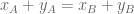
The differential transcript usage (DTU) null hypothesis is that there is no change in the difference in expression of isoforms, i.e. 
The gene differential expression (GDE) null hypothesis is that there is no change in expression in any direction, i.e. for all constants 

The union differential transcript expression (UDTE) null hypothesis is that there is no change in expression of any isoform. That is, that 


Not that 


This is clear because if 


Methods
The terms DGE, DTE, DTU and GDE also used to describe methods for differential analysis.
A differential gene expression method is one whose goal is to identify changes in overall gene expression. Because DGE depends on the projection of the points (representing gene abundances) to the line y=x, DGE methods typically take as input gene counts or abundances computed by summing transcript abundances
A differential transcript expression method is one whose goal is to identify individual transcripts that have undergone DTE. Early methods for DTE were Cufflinks (now Cuffdiff2) and MISO, and more recently sleuth, which improves DTE accuracy by modeling uncertainty in transcript quantifications. A key issue with DTE is that there are many more transcripts than genes, so that rejecting DTE null hypotheses is harder than rejecting DGE null hypotheses. On the other hand, DTE provides differential analysis at the highest resolution possible, pinpointing specific isoforms that change and opening a window to study post-transcriptional regulation. A number of recent examples highlight the importance of DTE in biomedicine (see, e.g., Vitting-Seerup and Sandelin 2017). Unfortunately DTE results do not always translate to testable hypotheses, as it is difficult to knock out individual isoforms of genes.
A differential transcript usage method is one whose goal is to identify genes whose overall expression is constant, but where isoform switching leads to changes in relative isoform abundances. Cufflinks implemented a DTU test using Jensen-Shannon divergence, and more recently RATs is a method specialized for DTU.
As discussed in the previous section, none of null hypotheses DGE, DTE and DTU imply any other, so users have to choose, prior to performing an analysis, which type of test they will perform. There are differing opinions on the “right” approach to choosing between DGE, DTU and DTE. Sonseson et al. 2016 suggest that while DTE and DTU may be appropriate in certain niche applications, generally it’s better to choose DGE, and they therefore advise not to bother with transcript-level analysis. In Trapnell et al. 2010, an argument was made for focusing on DTE and DTU, with the conclusion to the paper speculating that “differential RNA level isoform regulation…suggests functional specialization of the isoforms in many genes.” Van den Berge et al. 2017 advocate for a middle ground: performing a gene-level analysis but saving some “FDR budget” for identifying DTE in genes for which the UDTE null hypothesis has been rejected.
There are two alternatives that have been proposed to get around the difficulty of having to choose, prior to analysis, whether to perform DGE, DTU or DTE:
A differential transcript expression aggregation (DTE->G) method is a method that first performs DTE on all isoforms of every gene, and then aggregates the resulting p-values (by gene) to obtain gene-level p-values. The “aggregation” relies on the observation that under the null hypothesis, p-values are uniformly distributed. There are a number of different tests (e.g. Fisher’s method) for testing whether (independent) p-values are uniformly distributed. Applying such tests to isoform p-values per gene provides gene-level p-values and the ability to reject UDTE. A DTE->G method was tested in Soneson et al. 2016 (based on Šidák aggregation) and the stageR method (Van den Berge et al. 2017) uses the same method as a first step. Unfortunately, naïve DTE->G methods perform poorly when genes change by DGE, as shown in Yi et al. 2017. The same paper shows that Lancaster aggregation is a DTE->G method that achieves the best of both the DGE and DTU worlds. One major drawback of DTE->G methods is that they are non-constructive, i.e. the rejection of UDTE by a DTE->G method provides no information about which transcripts were differential and how. The stageR method averts this problem but requires sacrificing some power to reject UDTE in favor of the interpretability provided by subsequent DTE.
A gene differential expression method is a method for gene-level analysis that tests for differences in the direction of change identified between conditions. For a GDE method to be successful, it must be able to identify the direction of change, and that is not possible with bulk RNA-Seq data. This is because of the one in ten rule that states that approximately one predictive variable can be estimated from ten events. In bulk RNA-Seq, the number of replicates in standard experiments is three, and the number of isoforms in multi-isoform genes is at least two, and sometimes much more than that.
In Ntranos, Yi et al. 2018, it is shown that single-cell RNA-Seq provides enough “replicates” in the form of cells, that logistic regression can be used to predict condition based on expression, effectively identifying the direction of change. As such, it provides an alternative to DTE->G for rejecting UDTE. The Ntranos and Yi GDE methods is extremely powerful: by identifying the direction of change it is a DGE methods when the change is DGE, it is a DTU method when the change is DTU, and it is a DTE method when the change is DTE. Interpretability is provided in the prediction step: it is the estimated direction of change.
Remarks
The discussion in this post is based on an example consisting of a gene with two isoforms, however the concepts discussed are easy to generalize to multi-isoform genes with more than two transcripts. I have not discussed differential exon usage (DEU), which is the focus of the DEXSeq method because of the complexities arising in genes which don’t have well-defined shared exons. Nevertheless, the DEXSeq approach to rejecting UDTE is similar to DTE->G, with DTE replaced by DEU. There are many programs for DTE, DTU and (especially) DGE that I haven’t mentioned; the ones cited are intended merely to serve as illustrative examples. This is not a comprehensive review of RNA-Seq differential expression methods.
Acknowledgments
The blog post was motivated by questions of Charlotte Soneson and Mark Robinson arising from an initial draft of the Ntranos, Yi et al. 2018 paper. The exposition was developed with Vasilis Ntranos and Lynn Yi. Valentine Svensson provided valuable comments and feedback.
In 1997 physicist Roger Penrose sued Kimberly-Clark Corporation for infringing on his “Penrose patent” with their Kleenex-Quilted toilet paper. He won the lawsuit but fortunately for lavaphiles the patent has expired leaving much room for aperiodic creativity in the bathroom.
Math is involved in many aspects of house design (two years ago I wrote about how math is even related to something as mundane as the roof), but it is especially important in the design of bathroom floors. The most examined floors in houses are those of bathrooms, as they are stared at for hours on end by pensive thinkers sitting on toilet seats. The best bathroom floors present beautiful tessellations not as mathematical artifact but mathematical artwork, and with this in mind I designed a three colored Penrose tiling for our bathroom a few years ago. This is its story:
Roger Penrose published a series of aperiodic tilings of the plane in the 1970s, famously describing a triplet of related tilings now termed P1, P2 and P3. These tilings turn out to be closely related to tilings in medieval islamic architecture and thus perhaps ought to be called “Iranian tilings” but to be consistent with convention I have decided to stick with the standard “Penrose tilings” in this post.
The tiling P3 is made from two types of rhombic tiles, matched together as desired according to the matching rules (indicated by the colors, or triangle/circle bumps) below:

The result is an aperiodic tiling of the plane, i.e. one without translation symmetry (for those interested, a formal definition is provided here). Such tilings have many interesting and beautiful properties, although a not so-well-known one is that they are 3-colorable. What this means is that each tile can be colored with one of three colors, so that any two adjacent tiles are always colored differently. The proof of the theorem, by Tom Sibley and Stan Wagon, doesn’t really have much to do with the aperiodicity of the rhombic Penrose tiling, but rather with the fact that it is constructed from parallelograms that are arranged so that any pair meet either at a point or along an edge (they call such tilings “tidy”). In fact, they prove that any tidy plane map whose countries are parallelograms is 3-colorable.
The theorem is illustrated below:

This photo is from our guest bathroom. I designed the tiling and the coloring to fit the bathroom space and sent a plan in the form of a figure to Hank Saxe and Cynthia Patterson from Saxe-Patterson Inc. in Taos New Mexico who cut and baked the tiles:

Hank and Cynthia mailed me the tiles in groups of “super-tiles”. These were groups of tiles glued together to an easily removable mat to simplify the installation. The tiles were then installed by my friend Robert Kertsman (at the time a general contractor) and his crew.
The final result is a bathroom for thought:

Three years ago Nicolas Bray and I published a post-publication review of the paper “Network link prediction by global silencing of indirect correlations” (Barzel and Barabási, Nature Biotechnology, 2013). Despite our less than positive review of the work, the paper has gone on to garner 95 citations since its publication (source: Google Scholar). In fact, in just this past year the paper has paper has been cited 44 times, an impressive feat with the result that the paper has become the first author’s most cited work.
Ultimate impact
In another Barabási paper (with Wang and Song) titled Quantifying Long-Term Scientific Impact (Science, 2013), the authors provide a formula for estimating the total number of citations a paper will acquire during its lifetime. The estimate is

where 


Drive by citations
Now that three years had passed since the publication of the press release and with the ultimate impact revealed, I was curious to see inside the 95 black boxes opened with global silencing, and to examine the 95 wiring diagrams that were thus precisely figured out.
So I delved into the citation list and examined, paper-by-paper, to what end the global silencing method had been used. Strikingly, I did not find, as I expected, precise wiring diagrams, or even black boxes. A typical example of what I did find is illustrated in the paper Global and portioned reconstructions of undirected complex networks by Xu et al. (European Journal Of Physics B, 2016) where the authors mention the Barzel-Barabási paper only once, in the following sentence of the introduction:
“To address this inverse problem, many methods have been proposed and they usually show robust and high performance with appropriate observations [9,10,11, 12,13,14,15,16,17,18,19,20,21].”
(Barzel-Barabási is reference [16]).
Andrew Perrin has coined the term drive by citations for “references to a work that make a very quick appearance, extract a very small, specific point from the work, and move on without really considering the existence or depth of connection [to] the cited work.” While its tempting to characterize the Xu et al. reference of Barzel-Barabási as a drive by citation the term seems overly generous, as Xu et al. have literally extracted nothing from Barzel-Barabási at all. It turns out that almost all of the 95 citations of Barzel-Barabási are of this type. Or not even that. In some cases I found no logical connection at all to the paper. Consider, for example, the Ph.D. thesis Dysbiosis in Inflammatory Bowel Disease, where Barzel-Barabási, as well as the Feizi et al. paper which Nicolas Bray and I also reviewed, are cited as follows:
The Ribosomal Database Project (RDP) is a web resource of curated reference sequences of bacterial, archeal, and fungal rRNAs. This service also facilitates the data analysis by providing the tools to build rRNA-derived phylogenetic trees, as well as aligned and annotated rRNA sequences (Barzel and Barabasi 2013; Feizi, Marbach et al. 2013).
(Neither papers has anything to do with building rRNA-derived phylogenetic trees or aligning rRNA sequences).
While this was probably an accidental error, some of the drive by citations were more sinister. For example, WenJun Zhang is an author who has cited Barzel-Barabási as
We may use an incomplete network to predict missing interactions (links) (Clauset et al., 2008; Guimera and Sales-Pardo, 2009; Barzel and Barabási, 2013; Lü et al., 2015; Zhang, 2015d, 2016a, 2016d; Zhang and Li, 2015).
in exactly the same way in three papers titled Network Informatics: A new science, Network pharmacology: A further description and Network toxicology: a new science. In fact this author has cited the work in exactly the same way in several other papers which appear to be copies of each other for a total of 7 citations all of which are placed in dubious “papers”. I suppose one may call this sort of thing hit and run citation.
I also found among the 95 citations one paper strongly criticizing the Barzel-Barabási paper in a letter to Nature Biotechnology (the title is Silence on the relevant literature and errors in implementation) , as well as the (to me unintelligible) response by the authors.
In any case, after carefully examining each of the 95 references citing Barzel and Barabási I was able to find only one paper that actually applied global silencing to biological data, and two others that benchmarked it. There are other ways a paper could impact derivative work, for example by virtue of the models or mathematics developed, be of use, but I could not find any other instance where Barzel and Barabási’s work was used meaningfully other than the three citations just mentioned.
When a citation is a citation
As mentioned, two papers have benchmarked global silencing (and also network deconvolution, from Feizi et al.). One was a paper by Nie et al. on Minimum Partial Correlation: An Accurate and Parameter-Free Measure of Functional Connectivity in fMRI. Table 1 from the paper shows the results of global silencing, network deconvolution and other methods on a series of simulations using the measure of c-sensitivity for accuracy:

Table 1 from Nie et al. showing performance of methods for “network cleanup”.
EPC is the “Elastic PC-algorithm” developed by the authors, which they argue is the best method. Interestingly, however, global silencing (GS) is equal to or worse than simply choosing the top entries from the partial correlation matrix (FP) in 19/28 cases- that’s 67% of the time! This is consistent with the results we published in Bray & Pachter 2013. In these simulations network deconvolution performs better than partial correlation, but still only 2/3 of the time. However in another benchmark of global silencing and network deconvolution published by Izadi et al. 2016 (A comparative analytical assay of gene regulatory networks inferred using microarray and RNA-seq datasets) network deconvolution underperformed global silencing. Also network deconvolution was examined in the paper Graph reconstruction Using covariance-based methods by Sulaimanov and Koeppl 2016 who show, with specific examples, that the scaling parameter we criticized in Bray & Pachter 2013 is indeed problematic:
The scaling parameter α is introduced in [Feizi et al. 2013] to improve network deconvolution. However, we show with simple examples that particular choices for α can lead to unwanted elimination of direct edges.
It’s therefore difficult to decide which is worse, network deconvolution or global silencing, however in either case it’s fair to consider the two papers that actually tested global silencing as legitimately citing the paper the method was described in.
The single paper I found that used global silencing to analyze a biological network for biological purposes is A Transcriptional and Metabolic Framework for Secondary Wall Formation in Arabidopsis by Li et al. in Plant Physiology, 2016. In fact the paper combined the results of network deconvolution and global silencing as follows:
First, for the given data set, we calculated the Pearson correlation coefficients matrix Sg×g. Given g1 regulators and g2 nonregulators, with g = g1+g2, the correlation matrix can be modified as
where O denotes the zero matrix, to include biological roles (TF and non-TF genes). We extracted the regulatory genes (TFs) from different databases, such as AGRIS (Palaniswamy et al., 2006), PlnTFDB (Pérez-Rodríguez et al., 2010), and DATF (Guo et al., 2005). We then applied the network deconvolution and global silencing methods to the modified correlation matrix S′. However, global silencing depends on finding the inverse of the correlation matrix that is rank deficient in the case p » n, where p is the number of genes and n is the number of features, as with the data analyzed here. Since finding an inverse for a rank-deficient matrix is an ill-posed problem, we resolved it by adding a noise term that renders the matrix positive definite. We then selected the best result, with respect to a match with experimentally verified regulatory interactions, from 10 runs of the procedure as a final outcome. The resulting distribution of weighted matrices for the regulatory interactions obtained by each method was decomposed into the mixture of two Gaussian distributions, and the value at which the two distributions intersect was taken as a cutoff for filtering the resulting interaction weight matrices. The latter was conducted to avoid arbitrary selection of a threshold value and prompted by the bimodality of the regulatory interaction weight matrices resulting from these methods. Finally, the gene regulatory network is attained by taking the shared regulatory interactions between the resulting filtered regulatory interactions obtained by the two approaches. The edges were rescored based on the geometric mean of the scores obtained by the two approaches.

In light of the benchmarks of global silencing and network deconvolution, and in the absence of analysis of the ad hoc method combining their results, it is difficult to believe that this methodology resulted in a meaningful network. However its citation of the relevant papers is certainly legitimate. Still, the results of the paper, which constitute a crude analysis of the resulting networks, are a far cry from revealing the “precise wiring diagram of the system”. The authors acknowledge this writing
From the cluster-based networks, it is clear that a wide variety of ontology terms are associated with each network, and it is difficult to directly associate a distinct process with a certain transcript profile.
The factor of use correction
The analysis of the Barzel and Barabási citations suggests that, because a citation is not always a citation (thanks to Nicolas Bray for suggesting the title for the post), to reflect the ultimate impact of a paper the quantity

where C is the total number of citations of a paper and 


For now I decided to compute the factor of use correction for the Barzel-Barabási paper by generously estimating that 

What are confusion matrices?
In the 1904 book Mathematical Contributions to the Theory of Evolution, Karl Pearson introduced the notion of contingency tables. Sometime around the 1950s the term “confusion matrix” started to be used for such tables, specifically for 2×2 tables arising in the evaluation of algorithms for binary classification.
Example: Suppose there are 11 items labeled A,B,C,D,E,F,G,H,I,J,K four of which are of the category blue (also to be called “positive”) and eight of which are of the category red (also to be called “negative”). An algorithm called BEST receives as input the objects without their category labels, i.e. just A,B,C,D,E,F,G,H,I,J,K and must rank them so that the top of the ranking is enriched, as much as possible, for blue items. Suppose BEST produces as output the ranking:
- C
- E
- A
- B
- F
- K
- G
- D
- I
- H
- J
How good is BEST at distinguishing the blue (positive) from the red (negative) items, i.e. how enriched are they at the top of the list? The confusion matrix provides a way to organize the assessment. We explain by example: if we declare the top 6 predictions of BEST blue and classify the remainder as red
========
Blue
- C
- E
- A
- B
- F
- K
========
Red - G
- D
- I
- H
- J
then the confusion matrix is:
|
Predicted category |
|||
| Blue | Red | ||
|
True category |
Blue |
3 |
1 |
| Red |
3 |
4 |
|
The matrix shows the number of predictions that are correct (3) as well as the number of blue items that are missing (1). Similarly, it shows the number of red items that were incorrectly predicted to be blue (3), as well as the number of red items correctly predicted to be red (4). The four numbers have names (true positives, false negatives, false positives and true negatives) and various other numbers can be derived from them that shed light on the quality of the prediction:

The table and the terminology are trivial. All that is involved is simple counting of successes and failures in a binary classification experiment, and computation of derived measures that are obtained by elementary arithmetic. But here is a little secret that I’ve always felt embarrassed to admit… I can never remember the details. For example I find myself forgetting whether “positive predictive value” is really “precision” or how that relates to “specificity”. For many years I thought I was the only one. I had what you might call “confusion syndrome”… But I’ve slowly come to realize that I am not alone.
Confused people
I became confused about confusion matrices from the moment I first encountered them when I started studying computational biology in the mid 1990s. One of the first papers I read at the time was a landmark review by Burset and Guigó (1996) on the evaluation of gene structure prediction programs (the review has now been cited over 800 times). I have highlighted some text from the paper, where the authors explain what “specificity” means.

Not only are there two definitions for specificity on the same page, there is also a typo in Figure 1 (specificity is abbreviated Sn instead of Sp) adding to the confusion.
Burset and Guigó are of course not to blame for the non-standard use of specificity in gene finding. They were merely describing deviant behavior by computational biologists working on gene finding who had apparently decided to redefine a term widely used in statistics and computer science. However lacking context at the time when I was first learning of these terms, I remained confused for years about whether I was supposed to use specificity or the term “precision” for what the gene finding people were computing.
Simple confusion about terms is not the only problem with the confusion matrix. It is filled with (abbreviated) jargon that can be overwhelming. Who can remember TP,TN,FP,FN,TPR,FPR,SN,SP,FDR,PPV,FOR,NPV,FDR,FNR,TNR,SPC,ACC,LR+,LR- etc. etc. etc. ? Even harder is keeping track of the many formulas relating the quantities, e.g. FDR = 1 – PPV or FPR = 1 – SPC. And how is one supposed to gain intuition about a formula described as ACC = (TP + TN) / (TP + FP + FN + TN)?
Confusion matrix confusion remains a problem in computational biology. Consider the recent preprint Creating a universal SNP and small indel variant caller with deep neural networks by Poplin et al. published on December 14, 2016. The paper, from Google/Verily, shows how a deep convolutional neural network can be used to call genetic variation by learning from images of read pileups. This is fascinating and potentially deep innovation. However the authors, experts in machine learning, were confused in the caption of their Figure 2A, incorrectly describing the FDR-Sensitivity plot as a ROC curve. This in turn caused confusion for readers expecting a ROC curve to be a function.
https://twitter.com/jaypykw/status/810145005813764096
While an FPR-Sensitivity plot is a function an FDR-Sensitivity plot doesn’t have to be. I was confused by this subtlety myself until an author of Poplin et al. kindly sorted me out.
Hence this post, a note for myself to avoid further confusion by utilizing elementary
ROC curves
The quality of the BEST prediction in the example above can be encoded in a picture as follows:
Figure 1: A false-positive / true-positive plot.
The grid is 4 lines high and 8 lines wide because there are 4 blue objects and 7 red ones. The BEST ranking is a path from the lower left hand corner of the grid (0,0) to the top right hand corner (7,4). The BEST predictions can be “read off” by following the path. Starting with the top ranked object, the path moves one step up if the object is (in truth) blue, and one step to the right if it is (in truth) red. For example, the first prediction of BEST is C which is blue, and therefore the first step is up. Continuing in this way one eventually arrives at (7,4) because each object is somewhere (only once) on BEST’s list. A BEST confusion matrix corresponds to a point in the plot. The confusion matrix discussed in the introduction thresholding after 6 predictions corresponds to the green point which is the location after 6 steps from (0,0).
The path corresponding to the BEST ranking, when scaled to the unit square, is called a ROC curve. This stands for receiver operator curve (the terminology originates from WWII). Again, each thresholding of the ranking, e.g. the top six as discussed above (green point), corresponds to a single point on the path:
Figure 2: A ROC plot.
In the ROC plot the x-axis is the false positive rate (FPR = # false positives / total number of true negatives) and the y-axis the sensitivity (Sn = #true positives / total number of true positives).
Taxicab geometry
At this point it is useful to think about taxicab geometry (formally known as 
Figure 3: Taxicab confusion.
The terms associated to the confusion matrix can now be understood using taxicab trigonometry as follow:


Fortunately trigonometry identities are easy in this geometry. Instead of the usual 


Revisiting Figure 2A from Poplin et al. we see that FDR is best interpreted as 1 – PPV. PPV is also known as “precision”. The y-axis, sensitivity, is also called “recall”. Thus the curve is a precision-recall curve, although precision-recall curves are typically shown with recall on the x-axis.
Aside from helping to sort out identities, taxicab trigonometry is appealing in other ways. For example the angle 


No longer confused by confusion matrices? Show that

Probabilistic interpretation
While I think the geometric view of confusion matrices is useful for keeping track of the big picture, there is a probabilistic interpretation of many of the concepts involved that is useful to keep in mind.
For example, the precision associated to a confusion matrix can be interpreted as the probability that a prediction is correct. The identity FDR + PPV = 1 can therefore be thought of probabilistically, with FDR being the probability that a prediction is incorrect.
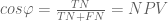
Most useful among such probabilistic interpretations is the area under a ROC curve (AUROC), which is frequently computed in biology papers. It is the probability that a randomly selected “positive” object is ranked higher than a randomly selected “negative” object by the classifier being evaluated. For example, in the red/blue/BEST example given above, the AUROC (= 
Computational biologists do not all recognize the Kalman filter by name, but they know it in the form of the hidden Markov model (the Kalman filter is a hidden Markov model with continuous latent variables and Gaussian observed variables). I mention this because while hidden Markov models, and more generally graphical models, have had an extraordinary impact on the tools and techniques of high-throughput biology, one of their primary conceptual sources, the Kalman filter, is rarely credited as such by computational biologists.

Illustration of the Kalman filter (from Wikipedia).
Where the Kalman filter has received high acclaim is in engineering, especially electrical and aeronautical engineering via its applications in control theory and where it has long been a mainstay of the fields. But it was not always so. The original papers, written in the early 1960s by Rudolf Kálmán and colleagues, were published in relatively obscure mechanical engineering journals rather than the mainstream electrical engineering journals of the time. This was because Kálmán’s ideas were initially scoffed at and rejected… literally. Kálmán second paper on the topic, New Results in Linear Filtering and Prediction Theory (with almost 6,000 citations), was rejected at first with a referee writing that “it cannot possibly be true”. The story is told in Grewal and Andrews’ book Kalman Filtering: Theory and Practice Using MATLAB. Of course not only was the Kalman filter theory correct, the underlying ideas were, in modern parlance, transformative and disruptive. In 2009 Rudolf Kálmán received the National Medal of Science from Barack Obama for his contribution. This is worth keeping in mind not only when receiving rejections for submitted papers, but also when writing reviews.
Rudolf Kálmán passed away at the age of 86 on Saturday July 2nd 2016.
In the 1930s the pseudonym Nicolas Bourbaki was adopted by a group of French mathematicians who sought to axiomatize and formalize mathematics in a rigorous manner. Their project greatly influenced mathematics in the 20th century and contributed to its present “definition -> theorem -> proof” format (Bourbaki went a bit overboard with abstraction and generality and eventually the movement petered out).
In biology definitions seem to be hardly worth the trouble. For example, the botanist Willhelm Johannsen coined the term “gene” in 1909 but there is still no universal agreement on a “definition”. How could there be? Words associated with biological processes or phenomena that are being understood in a piecemeal fashion naturally change their meaning over time (the philosopher Joseph Woodger did try to axiomatize biology in his 1938 book “The Axiomatic Method in Biology” but his attempt, with 53 axioms, was ill fated).
Bioinformatics occupies a sort of murky middle-ground as far as definitions go. On the one hand, mathematics underlies many of the algorithms and statistical models that are used so there is a natural tendency to formalize concepts, but just when things seem neat and tidy and the lecture begins with “Let the biological sequence S be a string on an alphabet 
In some cases things have really gotten out of hand. The words “alignment” and “mapping” appear, superficially, to refer to precise objects and procedures, but they probably have more meanings than the verb “run” (which is in the hundreds). To just list the meanings would be a monumental (impossible?) task. I will never attempt it. However I recently came across some twitter requests for clarification of read alignment and mapping, and I thought explaining those terms was perhaps a more tractable problem.
Here is my attempt at a chronological clarification:
1998: The first use of the term “read alignment” in a paper (in the context of genomics) is, to my knowledge, in “Consed: A Graphical Tool for Sequence Finishing” by D. Gordon, C. Abajian and P. Green. The term “read alignment” in the paper was used in the context of the program phrap, and referred to the multiple alignment of reads to a sequence assembled from the reads, so as to generate a consensus sequence with reduced error. The output looked something like this:

Figure 1 from the Consed paper.
To obtain multiple alignments phrap required a “model”. Roughly speaking, a model is an objective scoring function along with parameters, and, although not discussed in the Consed paper, that model was crucial to the functionality and performance of phrap. The phrap model included not just mismatches of bases but also insertions and deletions. Although phrap was designed to work with Sanger reads, there is conceptually not much difference between the way “read alignment” was used in the Consed paper and the way it is sometimes used now with “next-generation” reads. In fact, the paper “Correcting errors in short reads by multiple alignments” by L. Salmela and J. Schröder, 2011 does much of the same thing (it would have been nice if they cited phrap, although in their defense phrap was never published; Consed was about the visualization tool).
For the purposes of defining “read alignment” it is worthwhile to consider what I think were the four key ingredients of phrap:
- An underlying notion of what a read alignment is. Without being overly formal I think its useful to consider the form of the phrap input/output . This is my own take on it. First, there was a set of reads
with each read
consisting of a sequence so that
is an ordered set
(for simplicity I make the assumption that the reads were single end, each read was of the same length l, and each sequence element
, and of course I’ve ignored the reverse strand; these assumptions and restrictions can and should be relaxed but I work with them here for simplicity). Next, there was a set of target sequences (contigs, to be precise) that I denote by
with
. These each consisted of a sequence, again an ordered set,
. A “read alignment” in phrap consisted of a pair of maps: first
specifying for each read the contig it maps to (or the mapping to
denoting an unaligned read), and also a set of additional maps
assigning to each base in each read a corresponding base (or gap in the case of
) in the contig the read mapped to.
- A model: Given the notion of read alignment, a model was needed to be able to choose between different alignments. In phrap, the multiple alignments depended on scores for mismatches and gaps (the defaults were a score of 11 for a match, -2 for a mismatch, -4 for initiating a gap, -3 for extending a gap). In general, a model provides an approach to distinguishing and choosing between the read alignments as (roughly) defined above.
- An algorithm for read alignment. Given a model there was a need for an algorithm to actually find high scoring alignments. In phrap the algorithm consisted of performing a banded Smith-Waterman alignment using the model (roughly) specified above. The Smith-Waterman algorithm produced alignments
that were global, i.e. order preserving between the elements of
.
- Data structures for enabling efficient alignment. With large numbers of targets and many reads, there was a need for phrap to efficiently prune the search for read alignments. Running the banded Smith-Waterman alignment algorithm on all possible places a read could align to would have been intractable. To address this problem, phrap made use of a hash to quickly find exact matches from parts of the read to targets, and then ran the Smith-Waterman banded alignment only on the resulting credible locations. Statistically, this could be viewed as a filter for very low probability alignments.
The four parts of phrap are present in most read alignment programs today. But the details can be very different. More on this in a moment.
2004: Six years after Consed paper the term “read alignment” shows up again in the paper “Comparative genome assembly” by Pop et al. In the paper the term “read alignment” was not defined but rather described via a process. Reads from obtained via shotgun sequencing of the genome of one organism were “aligned” to a reference genome from another closely related organism using a program called MUMmer (the goal being to use proximity of alignments to assist in assembly). In other words, the “alignments” were the output of MUMmer, followed by a post-processing with a series of heuristics to deal with ambiguous alignments. It is instructive to compare the alignments to those of phrap in terms of the four parts discussed above. First, in the formulation of Pop et al. the alignments were between a single read and a genome, not multiple alignments of sets of reads to numerous contigs. In the language above the map 
Another development in the year 2004 was the appearance of the term “read mapping”. In the paper “Pash: efficient genome-scale anchoring by positional hashing” by Kalafus et al., hashing of k-mers was used to “anchor” reads. The word “anchoring” was and still is somewhat ambiguous as to its meaning, but in the Pash context it referred to the identification of positions of exact matching k-mers within a read on a target sequence. In other words, Pash could be considered to provide only partial alignments, because some bases within the read would not be aligned at all. Formally, one would say that the functions 

2006: The first sequencer manufactured by Solexa, the Genome Analyzer was launched, and following it the ELAND program for “read alignment” was provided to customers buying the machine. This was, in my opinion, a landmark even in “read alignment” because with next-generation sequencing and ELAND read alignment became mainstream, a task to be performed in the hands of individual users, rather than just a step among many in complex genome sequencing pipelines manufactured in large genome sequencing centers. In the initial release of ELAND, the program performed “ungapped read alignment”, which in the language of this post means that the maps 
2009: With two programs published back-to-back in the same year, BWA (“Fast and accurate alignment with the Burrows-Wheeler transform“, Heng Li and Richard Durbin) and Bowtie (“Ultrafast and memory-efficient alignment of short DNA sequences to the human genome” by Ben Langmead, Cole Trapnell, Mihai Pop and Steven L Salzberg) read alignment took a big step forward with the use of more sophisticated data structures for rapid string matching. BWA and Bowtie were based on the Burrows-Wheeler transform, and specifically innovations with the way it was used, to speed up read alignment. In the case of Bowtie, the alignments were ungapped just as originally with ELAND, although Bowtie2 published in 2012 incorporated gaps into the model.
Also of note is that by this time the terms “read alignment” and “read mapping” had become interchangeable. The BWA and Bowtie papers both used both terms, as did many other papers. Moreover, the terms started to take on a specific meaning in terms of the notion of “alignment”. They were referring to alignment of reads to a target genome, and moreover alignment of individual bases to specific positions in the target genome (i.e. the maps
Finally, 2009 was the year the notion that “spliced read alignment” was introduced. “Spliced alignment” was a concept around since the mid 90s (see, e.g. “Gene recognition by spliced alignment” by MS Gelfand, AA Mironov and PA Pevzner). The idea was to align cDNAs to a genome, requiring alignments allowing for long gaps (for the introns). In the paper “Optimal spliced alignments of short sequencing reads” by Fabio De Bona et al. the authors introduced the tool QPalma for this purpose, building on a spliced alignment tool from the group called Palma. Here the idea was to extend “spliced alignment” to reads, and while QPalma was never widely adopted, other programs such as TopHat, GSNAP, Star, etc. have becomes staples of RNA-Seq. Going back to the formalism I provided with the description of phrap, what spliced alignment did was to extend the models used for read alignment to allow for long gaps.
In the following years, there was what I think is fair to characterize as an explosion in the number of read alignment papers and tools. Models were tweaked and new indexing methods introduced, but the fundamental notion of “read alignment” (by now routinely also called “read mapping”) remained the same.
2014: In his Ph.D. thesis published in December of last year, my former student Nicolas Bray had the idea of entirely dropping the requirement for a read alignment to include the maps
Of course there is not much to writing down a new definition, and there wouldn’t be much of a point to pseudoalignment it if not for two things: Nick’s realized that pseudoalignments could be obtained much faster than standard read alignments and second, that the large imprints of alignment files needed for the vast amounts of sequence that was being produced were becoming a major bottleneck in genomics. Working on RNA-Seq projects with collaborators, this is how we felt on a regular basis:

Pseudoalignment offered a reprieve from what was becoming an unbearable task, and (I believe) it is going to turn out to be a useful and widely applicable concept.
2015: Earlier this year we posted a preprint to the arXiv detailing a method for performing pseudoalignment based on the ideas in Nick’s thesis, with the additional idea of Páll Melsted to use a new type of indexing scheme based on a de Bruijn graph of the target sequences. The program implementing these ideas is called kallisto. Looking back at phrap, kallisto can be seen to consist of a different notion of read alignment (pseudoalignment), a novel data structure (the target sequence de Bruijn graph), and a new fast algorithm for finding pseudoalignments (based on intersecting sets of k-mer matches). Although we did not discuss the model explicitly in our paper, it is implicit via the algorithm used to find pseudoalignments. One useful thing to keep in mind is that the nature of the index of kallisto allows for extracting more than a pseudoalignment. If desired, one can obtain positions within the targets for some k-mers contained in a query read, or even strand information, and in fact such data is used in some parts of kallisto. When such information is extracted, what kallisto is performing is no longer a pure pseudoalignment, but rather what the Pash authors called a read mapping (although that term is unsuitable because as mentioned it has become synonyms with read alignment). It turns out there is now another word for exactly that concept.
Following the publication of kallisto on the arXiv another preprint was posted on the bioRxiv introducing a program called Salmon and a new term called “lightweight alignment” (Salmon: Accurate, Versatile and Ultrafast Quantification from RNA-Seq Data Using Lightweight-Alignment by Rob Patro, Geet Duggal and Carl Kingsford) . Lightweight alignment as a notion of alignment is exactly what was just referred to: the notion of read mapping in Pash. Utilizing an index and software by Heng Li called the FMD index, Salmon determines “lightweight alignment” chains of what are called maximal exact matches and super-maximal exact matches (not to be confused with the maximal unique matches, or MUMs discuss above). These provide partial alignment information for the sequences in each read, i.e. just like with Pash one obtains maps 
Recently (just last week) a new read alignment related term was introduced in a bioRxiv preprint. A paper describing a new program called RapMap uses the term quasi-mapping for the procedure implemented in the software. RapMap finds pseudoalignments in the sense described above, with the only difference being the type of index that is used (instead of the target de Bruijn graph, it utilizes a generalized suffix array together with a hash table related to the array). This time I think the introduction of new terminology was unfortunate. Just as with kallisto, RapMap can be used to extract more information than just a pseudoalignment from the index (i.e. a lightweight alignment), and indeed the program does so. But also like kallisto, the speed of RapMap is derived from the idea of efficiently finding pseudoalignments by intersecting sets of k-mer matches. In other words, quasi-mapping is a procedure and not a concept; what the procedure outputs is a lightweight alignment via a pseudoalignment.
tl;dr
Read alignment is what you think it means.
A read mapping is a read alignment.
Lightweight alignment is “partial” read alignment (it should have been called read mapping but that was taken). Some, but not necessarily all bases in a read are aligned to specific bases among target sequences.
Pseudoalignment is read assignment to target sequences without any base-level sequence alignment.
Read alignment, lightweight alignment and pseudoalignment are concepts, not algorithms.
Quasi-mapping is a procedure and not a concept. The procedure outputs a lightweight alignment via a pseudoalignment.
Disclaimer: I’ve almost certainly gotten some dates wrong, missed some papers I should have cited, and omitted some crucial developments in read alignment that I should have included. Please let me know if you think that is the case by commenting and I’ll update the post as needed.

Recent Comments