In a Tablet Magazine article titled “How the Gaza Ministry of Health Fakes Casualty Numbers” posted on March 6, 2024, Professor of Statistics and Data Science Abraham Wyner from the Wharton School at the University of Pennsylvania argues that statistical analysis of the casualty numbers reported by the Gaza Ministry of Health is “highly suggestive that a process unconnected or loosely connected to reality was used to report the numbers”.
In the post, he shows the following plot
which he describes as revealing “an extremely regular increase in casualties over the period” and from which he concludes that “this regularity is almost surely not real.”
Wyner’s plot shows cumulative reported deaths over a period of 15 days from October 26, 2023 to November 10, 2023. The individual reported deaths per day are plotted below. These numbers have a mean of 270 and a standard deviation of 42.25:
The coefficient of determination for the points in this plot is R2 = 0.233. However, the coefficient of determination for the points shown in Wyner’s plot is R2 = 0.999. Why does the same data look “extremely regular” one way, and much less regular another way?
If we denote the deaths per day by , then the plot Wyner shows is of the cumulative deaths . The coefficient of determination R2, which is the proportion of variation in the dependent variable (reported deaths) predictable from the independent variable (day), is formally defined as where is the sum of squares of the residuals and and is the variance of the dependent variable. Intuitively, R2 is a numerical proxy for what one perceives as “regular increase”.
In the plots above, the are roughly the same, however is much, much, higher for the yi in comparison to the xi. This is always true when transforming data into cumulative sums, and is such a strong effect, that simulating reported deaths with a mean of 270 but increasing the variance ten-fold to 17,850, still yields an “extremely regular increase”, with R2 = 0.99:
The All of Us Research Program, whose mission is to “to accelerate health research and medical breakthroughs, enabling individualized prevention, treatment, and care for all of us”, recently published a flagship paper in Nature on “Genomic Data in the All of Us Research Program“. This is a review of Figure 2 from the paper (referred to below as AoURFig2).
Background
The first U.S. Census that commenced on August 2, 1790 included a record of the race of individuals. It used three categories: “free whites”, “all other free persons”, and “slaves”. Since that time, racial categories as defined for the U.S. Census have been a recurring controversial topic, with categories changing many times over the years. The category “Mulatto”, which was introduced in 1850, shockingly remained in place until 1930. Mulatto, which comes from the Spanish word for mule (the hybrid offspring of a horse and a donkey), was used for multiracial individuals of African and European descent. In the most recent decennial census in 2020, the race categories used were determined by the Office of Management and Budget (OMB) and were “White”, “Black or African American”, “American Indian or Alaska Native”, “Asian”, “Native Hawaiian” or “Other Pacific Islander”, and a sixth category “Some Other Race” for people who do not identify with any of the aforementioned five races. Separately, the 2020 census included standards for ethnicity which were first introduced in 1977 as part of OMB Directive No. 15. Two ethnicity categories were introduced: “Hispanic or Latino” and “Not Hispanic or Latino”. The OMB was specific that race and ethnicity are distinct concepts: an ethnically Hispanic or Latino person can be of any race.
While race and ethnicity are social constructs, ancestry is defined in terms of geography, genealogy, or genetics. The relationship between these three types of ancestry is complex, and can be nonintuitive. Graham Coop has a great series of blog posts illustrating the subtleties around the different types of ancestry. For example, in “How many genetic ancestors do I have?” he illustrates the distinction between the number of genetic vs. genealogical ancestors:
AoURFig2 utilizes the concept of genetic ancestry groups. These do not have a precise accepted definition, but analysis of how the term is used reveals that genetic ancestries labels such as “European” are based on genetic similarity between present day individuals. This is explained carefully and clearly in an important paper by Coop: Genetic similarity versus genetic ancestry groups in as sample descriptors in human genetics.
In AoURFig2 the ancestry groups used are “African”, “East Asian”, “South Asian”, “West Asian”, “European” and “American”. In their Methods section, the authors claim these are based on labels used for the Human Genome Diversity Project, and 1000 Genomes, which specifically they explain in the methods are: African, East Asian, European, Middle Eastern, Latino/admixed American and South Asian (in the figure legend they have renamed “Latino/admixed American” as “American” and “Middle Eastern” as “West Asian”). For each of these labels, obtained via self identified race and ethnicity by participants in the 1000 genomes project, the authors collated their genetic data to obtain genetic ancestry groups. Inherent in these groupings is an assumption of homogeneity, which is of course not true, because the individuals may vary in their genetics and their self identified race and ethnicity may be based on genealogy or geography, which could be at odds with their genetic relatedness to other individuals in their artificially constructed “genetic ancestry group”. Coop makes this point eloquently in his summarizing a key point of his paper:
In summary, there are three notions crucial to understanding AoURFig2: race, ethnicity, and genetic ancestry, each of which is distinct from the others. Individuals who self identify with a particular ethnicity, for example Hispanic or Latino, can self identify with any race. Individuals self identifying with a specific race, e.g. “Black or African American” can be genetically related to a different extent with the six groups of genetic ancestry, and a genetic ancestry group is neither a race nor an ethnicity, but rather a genetic average computed over a set of (mostly genetically similar but also somewhat arbitrarily defined) individuals.
AoURFig2 is shown below. In the following sections we discuss each of the panels in detail.
The figure legend
We begin with the figure legend, which lists Race, Ethnicity and Ancestry. Race and Ethnicity refer to the self identified race choices for participants (based on the OMB categories). Ancestry refers to the genetic ancestry groups discussed above. While these three concepts are distinct, the Ancestry colors are the same as some of the Race and Ethnicity colors:
This is problematic because the coloring suggests a 1-1 identification between certain races and ethnicities, and genetic ancestry groups. In reality, there is no such clear cut relationship, as shown in the admixture panels in AoURFig2 (more on this below). Ideally, the distinct nature of the concepts of race, ethnicity, and genetic ancestry, would be represented by distinct color palettes. The authors may have been confused on this point, because in the paper they write “Of the participants with genomic data in All of Us, 45.92% self-identified as a non-European race or ethnicity.” This makes no sense, because none of the race categories are “European”, and “European” is also not an ethnicity category. Therefore “non-European” does not make sense as either a race or ethnicity category. The authors seem to have assumed that White = European as indicated by their color scheme, and therefore “non-European race” is non-“White”. But by that logic “Hispanic or Latino” = “American” would mean that “Hispanic or Latino” is not “European” which implies that “Hispanic or Latino” is not White, contradicting the specific definition of race and ethnicity categories by the OMB. An individual’s ethnic self identification is independent of their race self identification, and someone may self identify as White and Hispanic or Latino. Clearly the authors would benefit from reading the NASEM report on the use of population descriptors in genetics and genomics research and the NIH style guide on race and national origin.
The ancestry analysis
Panel c) of AoURFig2 presents an ancestry analysis consisting of running a program called Rye on to assign, to each individual, a fraction of each of the genetic ancestry groups. The panel with its subfigures is shown below:
There are several problems with this figure. First, it has no x- or y- axes. The caption describes it as showing “Proportion of genetic ancestry per individual in six distinct and coherent ancestry groups defined by Human Genome Diversity Project and 1000 Genomes samples” from which it can be inferred that each row in each panel corresponds to an individual, and the horizontal axis divides an interval (width of the plot) into proportions of the six ancestry groups. In principle the panels could be in the transpose, with columns corresponding to individuals, but a clue that this is not the case is, for example, the ancestry assignment for Black or African American individuals, presumably none of which turn out to have an assignment 100% to European. That’s just a guess though. It’s best to label axes.
A second problem with the figure is that the height of each panel is the same, thereby not reflecting the number of individuals of each self-reported race and ethnicity. For instance, there are only 237 Native Hawaiian or Other Pacific Islander individuals versus 125,843 Whites. The numbers are there, but the height of the panels suggest otherwise. Below is a bar plot showing the number of people self identifying with each race in the data used for panel c) of AoURFig2:
The All of Us Research Program (henceforth referred to as All of Us) lists as a Diversity and Inclusion goal: “Health care is more effective when people from all backgrounds are part of health research. All of Us is committed to recruiting a diverse participant pool that includes members of groups that have been left out of research in the past.” That is an admirable goal, and while All of Us is to be commended on the relatively large number of self identifying Black or African American participants recruited in comparison to previous cohorts, it’s worth noting that in this analysis White still wins (by a lot).
A third problem with the figure is the placement of the “Hispanic or Latino” ethnicity in the middle of panels assigning ancestry groups to individuals by race. As discussed previously, self identification of ethnicity is orthogonal to race. There is therefore ambiguity in the figure, namely it is unclear whether some of the individuals represented in the Hispanic or Latino plot appear in other panels corresponding to race. The juxtaposition of an ethnicity category with race categories also muddles the distinction between the two.
The ancestry analysis is based on a program called Rye, which was published in Conley et al., 2023. The point of Rye is runtime performance: unlike previous tools, the software scales to UK Biobank sized projects. Indeed, it’s runtime performance is impressive when compared to the standard in the field, the program ADMIXTURE:
However, while Rye is faster than ADMIXTURE, its results differ considerably from those of ADMIXTURE, as shown in Supplementary Figure S5 of the paper:
I haven’t benchmarked these programs myself, but geneticists have some experience with ADMIXTURE which was published in 2009 and has been cited more than 7,000 times. The Rye program, from two groups associated with All of Us, has been cited twice (both times by the authors of Rye who are members of the All of Us consortium; one of the two citations is the paper being discussed here). Of course, one shouldn’t judge the quality of a paper by the number of citations. A paper cited twice could be describing a method superior to a paper cited more than 7,000 times. But I was discomfited by the repeated appearance of a p-value = 0 in the paper (see below for one example among many). It reminded me of pondering p-values before breakfast.
Also R2 is the wrong measure here. The correct assessment is to examine the concordance correlation coefficient. Finally, and importantly, the Rye paper describes results based on inference not with the high-dimensional datatypes but rather a projection to the first 20 principal components. Notably the All of Us paper, and in particular the results reported in AoURFig2, use 16 principal components. There is no justification provided for the use of 16 principal components, no description of how results may differ when using 20 principal components, nor is there a general analysis describing robustness of results to this parameter.
In any case, setting aside feelings of being left Rye and dry and taking the admixture results at face value, it is evident that individuals self reporting ethnicity as “Hispanic or Latino” are highly admixed between European and American (the latter label meaning Latino/Admixed American). This stands in contrast to the coloring scheme chosen, with Hispanic or Latino colored purely “American” implying individuals self identifying with that ethnicity are not European. It also is at odds with the UMAP displays in panels a) and b) of AoURFig2.
UMAP nonsense
The AoURFig2 presents two UMAP figures, shown below. The UMAP is the same in both figures; in the top subplot (a) it is colored by race, and in the bottom subplot (b) it is colored by ethnicity.
The first thing to note about this plot is that it has axes when it shouldn’t. There is no meaning to UMAP 1 and UMAP 2, and the tick marks (-20, -10, 0, 10, 20) on the y axis and (-10, 0, 10, 20) on the x-axis are meaningless because UMAP arbitrarily distorts distances. Somehow the authors managed to put axes on plots which shouldn’t have them, and omitted axes on plots that should. Furthermore, by virtue of plotting points by color resulting in an overlay of one color over another, it’s difficult to see mixture of colors where it exists. This can be very misleading as to the nature of the data.
More concerning than the axes (which really just show that the authors don’t understand UMAP), are the plots themselves. The UMAP transform distorts distances, and in particular, as a result of this distortion, is terrible at representing admixture. The following illustrative example was constructed by Sasha Gusev:
But one doesn’t have to examine simulations to see the issue. This problem is evident in panel c) of AoURFig2. Consider, for example, the Hispanic or Latino ancestry assignments shown below:
The admixture stands in start contrast to the UMAP in b), which suggests that the Hispanic or Latino ethnicity is almost completely disjoint from European (which the authors identify with White via the color scheme). This shows that UMAP can and does collapse admixed individuals onto populations, while creating a hallucination of separation where it doesn’t exist.
I recently published a paper with Tara Chari on UMAP titled “The specious art of single-cell genomics“. It methodically examines UMAP and shows that the transform distorts distances, local structure (via different definitions), and global structure (again via several definitions). There is no theory associated to the UMAP method. No guarantees of performance of any kind. No understanding of what it is doing, or why. Our paper is one of several demonstrating these shortcomings of the UMAP heuristic (Wang, Sontag and Lauffenberger, 2023). It is therefore unclear to me why the All of Us consortium chose to use UMAP, especially considering that they (in particular one of the authors of Rye and a member of the All of Us consortium) were warned of the shortcomings of UMAP a year ago.
Scientific racism
The misuse of the concepts of race, ethnicity and genetic ancestry, and the misrepresentation of genetic data to create a false narrative, is a serious matter. I say this because such misrepresentations have been linked to terror. The Buffalo terrorist who murdered 10 black people in a racist rampage in 2022 wrote that
Included in his manifesto, from which this text is excerpted, was the following figure:
This plot is eerily similar to one made by Razib Khan, in which he used the term “Quadroon-Jews” (Khan’s figure was published in the Unz Review, which is a website published by far-right activist and holocaust denier Ron Unz). The term “Quadroon” appeared in the 1890 U.S. Census as a refinement of “Mulatto” (see the first at the top of the post).
These plots show the projection of genotypes to two dimensions via principal component analysis (PCA), a procedure that unlike UMAP provides an image that is interpretable. The two-dimensional PCA projections maximize the retained variance in the data. However PCA, and its associated interpretability, is not a panacea. While theory provides an understanding of the PCA projection, and therefore the limitations of interpretability of the projection, the potential for misuse makes it imperative to include with such plots the rationale for showing them, and appropriate caveats. One of the main reasons not to use UMAP is that it is impossible to explain what the heuristic transform achieves and what it doesn’t, since there is no understanding of the properties of the transform, only empirical evidence that it can and does routinely fail to achieve what it claims to do.
The pseudoscientific belief that humans can be genetically separated into distinct racial groups is part of scientific racism. Such pseudoscience, and its spawn of racist policy, has roots in many places, but it must be acknowledged that some of them are in academia. A few years ago I wrote about the depravity of James Watson’s scientific racism, but while his (scientific) racism has been publicly documented due to his fame, scientific racism is omnipresent and frequently overlooked. The ideas that the Buffalo terrorist and that Watson promulgated are reinforced by sloppy use of terms such as “race” and “ethnicity” in academia, along with misrepresentations of the genetic similarity between individuals. Many of the concepts in population genetics today are problematic. Coop’s eloquent critique of genetic ancestry groups is but one example. The concept of admixture is also rooted in racism and relies on unscientific notions of purity. With this in mind, I believe it is insufficient to merely relegate AoURFig2 to Karl Broman’s list of worst graphs. The numerous implications of AoURFig2, among them the authors’ claim that individuals identifying ethnically as Hispanic or Latino are genetically not European and therefore not racially White (see section on ancestry analysis above for an explanation of why this is incorrect), are scientific racism. The All of Us authors should therefore immediately post a correction to AoURFig2 that includes a clarification of its purpose, and corrections to the text so the paper properly utilizes terms such as race, ethnicity and ancestry. All of us need to work harder to sharpen the rigor in human genetics, and to develop sound ways to interpret and represent genetic data.
The following describes harassment experienced by a woman who is a professor of mathematics, whose words I’m posting here (anonymously and with names changed) with her permission.
=============
In November 2023, I visited a Mathematics Department at a respected research university in the USA at the invitation of a professor (I will be calling him Zacharia) who works there. We initially met at a conference where we were both invited as plenary speakers by my former colleague and collaborator Mung. Zacharia appeared to be very interested in my talk and to share my research interests. However, the visit turned out to be uncomfortable and ultimately unproductive from a scientific or networking standpoint.
During my visit, I persistently felt like a prey that is being pursued. In my detailed account below, I write about the insistence from my host, the continuous balancing on confrontation at the risk of displeasing him, the tension and the going against my wishes when I clearly and repeatedly indicated that all I wanted was to discuss mathematics.
Following the visit, feeling disheartened and upset, I reached out to Mung for moral support. We had previously discussed the situation of women in mathematics, and I hoped to share my recent experience as a concrete example. His answer and lack of support was not what I expected. It was particularly surprising to me given our history of collaboration and what I thought was a friendship.
Below, I include the email I sent to Mung as well as his response. I believe this exchange sheds light on the realities that women in mathematics face, despite the ubiquitous rhetoric of support for diversity in the STEM fields, the need to combat bias, to raise awareness, to address harassment, maintain professional atmosphere, etc. etc.
This was not the first time I found myself in such a situation, and it always left me feeling drained and disheartened, and questioning whether I should leave academia. When I was younger I blamed myself and agonized if there might have been anything in me that prompted the unwanted behavior: maybe I smile too much, maybe I am too enthusiastic, maybe I should not wear a skirt (and I only wear the below the knee skirts). But now I am older and I know that it was not my fault at all. Still, despite my secure professional position, the aftermath of the visit left me drained and depressed. As I wrote to Mung, the visit basically incapacitated me for three days after my return. And, the lack of support from him, whom I considered a friend, doubled the distress.
I wish to make this correspondence public so that other women who have similar experiences know that they are not alone and that it is not just “their fault”.
For my own protection, I have edited out or changed personal details such as names, university names, and specific fields of mathematics.
From: Me Sent: Monday, November 2023 10:18 PM To: Prof Mung
Dear Mung,
I hope you are doing well.
I wanted to give you an account of my visit to Zacharia in the University of Pella last week. This is going to be a long email. In the past, we talked about my situation, also in the general context of women in mathematics, so my account below is meant as a quite concrete example of what I was trying to explain to you before.
Best wishes,
Anna
========
On November 9-10 I visited the math department of the University of Pella to give a seminar, by the invitation of Zacharia. The visit was so awful that if I could have foreseen even a part of it, I wouldn’t have accepted to come. Let me start by saying that I was really looking forward to that visit. I thought that Pella is a great department with many very good [field of math] experts whom I was hoping to meet. I cancelled my two classes in [my university], revamped my talk slides, and did some preliminary calculations about a possible approach to [a concrete research project] hoping to discuss and try to establish a collaboration with Zacharia. I also looked through Zacharia’s published papers which convinced me that he is an expert on [a particular topic related to that project].
On Wednesday, I took an evening flight and arrived to Pella at approx 8:30pm. In our prior email exchanges, Zacharia insisted on picking me up from the airport. I was arriving late, and it is a 40min drive one way, so I wrote him that I am perfectly comfortable with taking a taxi to my hotel and then we meet in his office the next morning. But he really insisted. So, I thought that he is just friendly and polite and agreed. But after he picked me up, the weirdness begun: he told me that we go and visit places then at night – he brought me to a sightseeing spot to look at some lake, drove to show me “nice houses” around, then downtown to see “interesting architecture”. It was completely dark and cold and past midnight in my time zone. He made me leave the car each time and walk with him despite I was repeatedly saying that all I wanted is just to go to my hotel and retire for the night. He completely disregarded my requests and was set on “entertaining me” in a pushy way, claiming that I am “young” and for sure not “this much tired” and that he knows that I will love the view, and that it is just for “a moment” etc. Well, each “moment” was another 30 minutes. He almost brought me to a fancy-looking restaurant “just to eat a little” but then I protested strongly and he dropped it. Along the way he kept telling me how many plans he has for us for these coming two days, including taking a boat ride, hiking (he will bring me the hiking shoes), going to restaurants with a panoramic view and downtown and “just wherever I want”. I said that all I want is to discuss math, to which he playfully replied that we may discuss and exchange ideas while doing all these other things.
When we arrived at the hotel it was past 11pm. I did not feel comfortable that he definitely leaned to see my room number, but I did not want to be confrontational as I have just arrived and he is my host and colleague and I really want to discuss math with him. We said goodbye and agreed to meet in the hotel lobby the next day at 10am; I suggested that I come directly to his office but again he didn’t want that.
Thursday was my talk day. Before I describe the day, let me anticipate that the audience at my talk turned out to be minimal: Zacharia, one other faculty (not in my field of maths), two random grad students and one undergraduate. Nobody followed what I was talking about, or showed any interest so it felt like lecturing to a wall. Earlier, when I asked Zacharia about my itinerary and whom I am meeting during my visit, his answer was “you can do whatever you want”. So I checked the seminar list for that day and found one other talk which looked interesting. Zacharia clearly tried to discourage me from attending it because “we have to go to a restaurant downtown”.
In the morning that day I basically forced Zacharia to talk math and I presented my calculations regarding the [project I envisioned] on the board, explained the angle of approach and asked if he was interested in working on this together. He seemed surprised and sort of teased me that “I work too much”. He said “yes of course we will write a paper together” and we talked, but without depth or interest on his side, just superficial and general. We then went for lunch – he again wanted to drive somewhere but I convinced him that we just go to a cafeteria on campus. During that lunch I felt uncomfortable because all he wanted to talk about was gossips about other mathematicians, listing names of people and asking “who is good” and “who is not good” in my opinion, and what is my connection with them.
After my talk he refused to talk math again, as he wanted to take me out to dinner. We drove to some restaurant and he said we wait there 1.5 hrs to be seated, so we can “spend time together”. I refused and pushed him that we eat in my hotel’s restaurant. At that time it already started weighing heavily on me that I had to fight with him all the time because otherwise who knows where he will be bringing me and at what time. At the dinner, consistently with what I felt before, he was just gathering information about me: bombarding me with questions about my family, and if I have friends and who they are (he asked me to show him a photo of a girl friend of mine on my phone, out of the blue), and if I really “love” shopping or hiking or sleeping, what kind of movies make me “excited” and so on. He kept calling me “poor Anna”, touching my arm repeatedly etc.
I was miserable because of my talk, and all this pushing and insisting and essentially no math. To add to the injury, after the dinner he wanted to walk me to my hotel room, on the basis that he is interested to see it because he did not know if they had a microwave for guests. He even took the elevator with me to my floor but at that point I asserted myself and just said good night. He again insisted that he comes to pick me up the following morning.
On Friday he was late for our meeting in the hotel lobby. When he arrived, he asked “what are we doing and where are we driving that day”. He was displeased when I told him that I wanted to go to the office. He teased me as before that “all he sees in me is just work” to which I then very clearly replied that indeed this is a professional visit and that I am busy with many things, so in as much as I am happy to discuss math with him, in case he prefers to do something else then this is completely fine with me and I will just go to the office or stay at the hotel and work on my own.
We went to his office but that day “discussion” went bad. He was like upset and uninterested, spoke with a raised voice. I also felt he was condescending to me and attacking in mathematics, not listening to what I had to say, cutting me all the time and asking random and irrelevant questions – he has no clue about [a particular technique that I know well] but acted as if he knew it. I was patiently answering for some longer time but then asked if I please could show him the calculations that I prepared. Then it was bad – at some point he yelled at me that “if you just do calculations extending other people’s results then when nobody comes to your talk then don’t complain and take it”. What?? He also said some other things implying that he has quite low opinion on everything I am working on (though I am sure that he has no clue what it is). It was unpleasant and insulting. Still, to clear the air, I agreed to go to lunch and again all he wanted to talk about was what I think about other mathematicians and do I know this or that person.
After lunch I stayed in my office for one hour as I had an online meeting. Then he came for me and I managed to show him some calculations on the board; I felt that he sort of “gave up” and was just staring at me, without being involved. Finally, he said that surely I must be tired because it is quite late so let’s go to dinner – it was 5pm then and I remembered how he had no problem dragging me around at 10pm two days before, no question about my tiredness then. Since I was worried that again we will drive who knows where, during my online meeting I checked that there was a restaurant 10 min from my hotel. I told Zacharia that I really wanted to go there and I called and made a reservation myself.
Dinner was homeomorphic to lunches and the dinner before. Afterwards he wanted to go for a walk around the restaurant and I really had no force to fight with him so we went, including looking at shops and buying things in the supermarket. He wanted to bring me to the airport the following morning but I firmly refused and said I will take Uber. He finally did not fight with me on that.
Overall, I hated every minute of my visit. It was utmost unprofessional and disrespectful to me as a mathematician. I was thinking to confront Zacharia and suggest that in the future he hires an escort service instead of being cheap and using the departmental money to bring himself a companion on the pretense of inviting her to give a talk. In the effect, that visit made me so depressed that I was unable to do anything for three days after my return to [my university]. The last time when I felt that way was while visiting [another mathematician] – the insistence, the constant balancing on confrontation at the risk of displeasing my host, the dragging me in his car to places he chose, on account of “me going to love them” when I clearly indicated that I don’t. Only that [that person] was brilliant and happy to talk math all the time. He also respected me as a mathematician and when I told him a theorem while driving in his car, or walking or in a restaurant, he would listen attentively, make smart comments, ask questions and give me literature tips. He would also introduce me to people and bring them to my talk.
My visit with Zacharia on the other hand, was a complete waste of time from every angle.
I appreciate that you shared your experience with me but will not make any comments. I treasure my friendship with you and also with Zacharia. Both of you are my collaborators whom I admire profoundly, and in a small group of people I can call friends at both the personal and professional levels.
My wife and I came to Europe a week ago. After landing, we came to [there follows a paragraph of unrelated description of his leisure travel plans].
Following an investigation by the University of the Ryukyus, which revealed that figures that appeared within this paper had also been used in other papers without appropriate attribution or explanation (a pattern repeated over a number of publications in different journals), the Editorial Board of the Biochemical Journal retract this paper. The last author, Naoki Mori, takes full responsibility for the misrepresentation of data in this paper.
Retraction for “Hypoxia-inducible factors mediate coordinated RhoA-ROCK1 expression and signaling in breast cancer cells,” by Daniele M. Gilkes, Lisha Xiang, Sun Joo Lee, Pallavi Chaturvedi, Maimon E. Hubbi, Denis Wirtz, and Gregg L. Semenza, which was first published December 9, 2013; 10.1073/pnas.1321510111 (Proc. Natl. Acad. Sci. U.S.A.111, E384–E393).
The undersigned authors note, “We are retracting this article due to concerns with several of the published figures. Details of the concerns include: Possible duplication of data between lanes 1–2, 4, and 5–7 of the HIF2α panel of Figure 1D and lanes 1–2, 3, and 4–6 of the HIF2α panel of Figure 3B, respectively. In Figure 2B: possible duplication of data between lanes 8 and 10 of the HIF1α panel; possible splicing between lanes 8 and 9 of the RhoA panel; and possible duplication of data between lanes 6 and 9, and between lanes 8 and 10 of the ROCK1 panel. Possible duplication of data between the full ROCK1 panel of Figure 2B and the full pFAK panel of Figure 5D. Possible duplication of data between the full Actin panel of Figure 3B and the full Actin panel of Figure S3E. Additionally, possible duplication of data between lanes 2–5 of these panels and lanes 1–4 of the Actin panel of Figure S3D. Possible duplication of data between lanes 1 and 2 of the HIF1α panel of Figure 5C. Possible duplication of data between lanes 1 and 4 of the Total FAK panel of Figure 6A, including an unusual oval shape around the band in lane 4. Possible obscuring of data in the shEV 1% O2 stiff panel and in the sh1/2α 20% O2 stiff panel of Figure 6E. We believe that the overall conclusions of the paper remain valid, but we are retracting the work due to these underlying concerns about the figures. We apologize for the inconvenience.”
Lisha Xiang, Pallavi Chaturvedi, Denis Wirtz and Gregg L. Semenza
Retraction for “Mutual antagonism between hypoxia-inducible factors 1α and 2α regulates oxygen sensing and cardio-respiratory homeostasis,” by Guoxiang Yuan, Ying-Jie Peng, Vaddi Damodara Reddy, Vladislav V. Makarenko, Jayasri Nanduri, Shakil A. Khan, Joseph A. Garcia, Ganesh K. Kumar, Gregg L. Semenza, and Nanduri R. Prabhakar, which was first published April 22, 2013; 10.1073/pnas.1305961110 (Proc. Natl. Acad. Sci. U.S.A.110, E1788–E1796).
The authors note, “We are retracting this article due to concerns with Figure 5. In Figure 5A, there is a concern that the first and second lanes of the HIF-2α panel show the same data, and that the first and second lanes of the HIF-1α panel show the same data, despite all being labeled as unique data. In Figure 5D, there is a concern that the second and third lanes of the HIF-1β panel show the same data despite being labeled as unique data. We believe that the overall conclusions of the paper remain valid, but we are retracting the work due to these underlying concerns about the figure. Confirmatory experimentation has now been performed and the results can be found in a preprint article posted on bioRxiv, ‘Homeostatic responses to hypoxia by the carotid body and adrenal medulla are based on mutual antagonism between HIF-1α and HIF-2α’ (https://doi.org/10.1101/2022.07.11.499380). We apologize for the inconvenience.”
Retraction for “Anthracycline chemotherapy inhibits HIF-1 transcriptional activity and tumor-induced mobilization of circulating angiogenic cells,” by KangAe Lee, David Z. Qian, Sergio Rey, Hong Wei, Jun O. Liu, and Gregg L. Semenza, which was first published February 17, 2009; 10.1073/pnas.0812801106 (Proc. Natl. Acad. Sci. U.S.A.106, 2353–2358).
The undersigned authors note, “We are retracting this article due to concerns with Figure 2. There is a concern of possible duplication and reflection of the bands in the VEGF Promoter input panel between the left and right halves of the panel. We believe that the overall conclusions of the paper remain valid, but we are retracting the work due to this underlying concern about the figure. Confirmatory experimentation has now been performed and the results can be found in a preprint article posted on bioRxiv, ‘Daily administration of low-dose daunorubicin or doxorubicin inhibits hypoxia-inducible factor 1 and tumor vascularization’ (https://doi.org/10.1101/2022.06.15.492526). We apologize for the inconvenience.”
David Z. Qian, Sergio Rey, Jun O. Liu, and Gregg L. Semenza
Retraction for “Hypoxia-inducible factors are required for chemotherapy resistance of breast cancer stem cells,” by Debangshu Samanta, Daniele M. Gilkes, Pallavi Chaturvedi, Lisha Xiang, and Gregg L. Semenza, which was first published December 1, 2014; 10.1073/pnas.1421438111 (Proc. Natl. Acad. Sci. U.S.A.111, E5429–E5438).
The authors note, “We are retracting this article due to concerns with several of the published figures, which we believe to be the result of the wrong images having been selected during construction of the figures. Details of the concerns include: Possible duplication of data between the Pac + IL8 nAb panel of Figure 3E and the Vehicle panel of Figure 5F. Possible splicing between the first and second lanes of the HIF-1α panel of Figure 4. Possible duplication of data between the full SUM-159 Actin panel of Figure 6C and lanes 2–5 of the MDA-231 Actin panel of Figure 8A. Possible duplication of data between the Digoxin and the Gemcitabine + Digoxin panels of Figure S5A. Possible duplication of data between the Actin panels of Figure S6C and S6E. The correct images were identified and no new experimentation was required to correct the issues noted above. These updated figures can be found in a preprint article posted on bioRxiv, ‘Enrichment of breast cancer stem cells following cytotoxic chemotherapy is mediated by hypoxia-inducible factors’ (https://doi.org/10.1101/2022.06.27.497729). We believe that the overall conclusions of the paper remain valid, but we are retracting the work due to these underlying concerns about the figures. We apologize for the inconvenience.”
Retraction of “Acriflavine inhibits HIF-1 dimerization, tumor growth, and vascularization,” by KangAe Lee, Huafeng Zhang, David Z. Qian, Sergio Rey, Jun O. Liu, and Gregg L. Semenza, which was first published October 20, 2009; 10.1073/pnas.0909353106 (Proc. Natl. Acad. Sci. U.S.A.106, 17910–17915).
The undersigned authors note, “We are retracting this article due to issues regarding the bottom panel of Figure 2D. Visible in this blot are the GST-HIF-1β band of interest at the top, a faint doublet in the middle, and a strong band migrating just above GST at the bottom, which is likely a degradation product of GST-HIF-1β. It appears that in the middle doublet, lanes 2, 5, and 8 are duplicate images; lanes 3, 6, and 9 are duplicate images; and lanes 4 and 7 are duplicate images. There is also concern of possible manipulation of the data shown across the bottom band. We believe that the overall conclusions of the paper remain valid, but we are retracting the work due to these underlying concerns about the figure. We apologize for the inconvenience.”
David Z. Qian, Sergio Rey, Jun O. Liu, and Gregg L. Semenza
The authors have retracted this article as multiple image irregularities have been noted within this article, specifically:
Figure 1A, upper panel (HIF-1a blot), lanes five and seven appear to be duplicates.
Figure 6B, lower panel (b-actin blot), the first six lanes appear to be identical to Fig. 6G, lower panel (b-actin blot).
Figure 3G, the image of the third mouse in the D10 Saline group is identical to the image of the third mouse in the D21 Digoxin group.
G Semenza, CC Wong, P Korangath, L Schito, J Chen, B Krishnamachary, V Raman and S Sukumar agree to this retraction. D Gilkes does not agree to this retraction. H Zhang and W Mitzner have not responded to any correspondence from the editor about this retraction. The editor was not able to obtain current email addresses for H Wei, P Chaturvedi, L Zhen and PT Winnard.
This article (1) has been retracted at the request of the authors. The authors found that lanes 4, 5, and 6 of the HIF-1α immunoblot in Fig. 3A are identical images. An internal review corroborated the authors’ claim, and the editors agreed with the authors’ retraction request. The authors apologize to the scientific community and deeply regret any inconveniences or challenges resulting from the publication and subsequent retraction of this article.
A copy of this Retraction Notice was sent to the last known email addresses for all authors. Four authors (Denis Wirtz, Carmen C. Wong, Daniele M. Gilkes, and Gregg L. Semenza) agreed to the retraction; the 3 remaining authors could not be located.
The UC Davis Young Scholars Program is a summer residential program that provides high school students the opportunity to work one-on-one with research faculty in state-of-the-art labs for six weeks. One of the faculty mentors that the program recently showcased on its Facebook page is Chemistry Professor Ting Guo, who has been a faculty mentor in the program for many years.
Professor Guo, who was the chairman of the UC Davis Chemistry Department from 2016-2018, has been mentoring high school students for over a decade. Already in 2010, he was awarded the Chancellor’s Achievement Award for Diversity and Community by then Chancellor Linda Katehi. In January of that year, he started mentoring a high school student, who had written to him asking whether she could shadow him at work for an assignment from her AP Chemistry teacher. She had written to several professors and he was the first to reply affirmatively.
Warning: what follows contains descriptions of violence, sexual assault, and other traumatic events. You can read a summary by skipping to “The end“.
In 2018, the high school student from 2010 who had shadowed Professor Guo for an AP Chemistry assignment, and was by then at UC Santa Barbara, contacted a USCB Police Department detective to report that she had been repeatedly sexually assaulted by Professor Guo in 2010. This is detailed in a lawsuit (CV2020-1704) filed by the student against Professor Guo and the Board of Regents of the University of California, Davis. The filing describes an alleged incident on August 7, 2010, where the high school student (now the plaintiff) presented Professor Guo with some gifts (per her cultural custom) and offered to help him carry them home. At his house he allegedly offered her beer (which she declined because she was underage), and they apparently talked about Star Wars and his complete collection of the movies. Below is an excerpt from her statement to the UCSB police that is reproduced in the filing:
The plaintiff alleges that a few months later, by September 2010, she had been sexually assaulted three times:
The details are painful and poignant. After the second assault he allegedly offered her $60: “She refused and felt disrespected. But then he said to give it to her mom.” And as is often the case when massive power differentials are at play, the victim “carried on like normal- like nothing strange had happened because she did not want to face it or deal with it or process it. The plaintiff didn’t want to believe that Professor Guo was that kind of person.”
I was heartbroken reading the following passage describing the plaintiff’s frame of mind after the first sexual assault:
The plaintiff was also scared:
The allegation that “he had spanked her in the past” is elaborated on in the filing:
According to the filing, the report that was filed with police at UCSB followed therapy sessions and a meeting with a CARE counselor at UCSB. It included not only a statement by the victim, but text messages with friends about the events when they happened. The UCSB police forwarded the report to police at UC Davis, who spoke to Professor Guo. He denied anything had happened.
Turning a blind eye
You might think, that UC Davis, which became aware of the allegations in 2018 when the UCSB police report was forwarded to the UC Davis police, and which certainly reviewed the allegations in the lawsuit filed in 2020, would at least protecthigh school students by not allowing Professor Guo to interact with them until the truth, or falsehood, of the allegations against him could be established. At universities, investigations of allegations against a professor can take a long time, and it is understandable that a university would afford professors a presumption of innocence until determination of guilt or innocence is complete (although to be clear, the timescale of investigations is frequently not reasonable at all). In any case, the possibility of guilt in a case where serious allegations of violence and sexual assault are alleged, demand protection of students in the interim. Protection, at a minimum, would entail not allowing Professor Guo to mentor high school students and refuse him the privilege of serving as a mentor in the Young Scholars Program. This would be a limitation, but not one that is very restrictive for a professor. Of course, one would hope that UC Davis would also protect undergraduate students, graduate students and postdocs, but again, at least, one would hope, UC Davis would protect high school students. However, UC Davis allowed Professor Guo to continue mentoring high school students up until 2021, as the Facebook post shown at the top of this post demonstrates. In fact, Professor Guo mentored a high school student by the name of Jonathan Ma in 2019, after UC Davis knew about the allegations against Professor Guo. Below is an excerpt from an article in the the St. Louis Post-Dispatch dated July 22, 2019 about the student and his summer experience in Professor Ting Guo’s lab:
Tampering with evidence
In 2019 California changed the statute of limitations for adult survivors of sexual abuse from 3 years to 10 years. Assaults that occurred before January 1, 2019, can be held to the three-year limit. For this reason, the court sustained demurrers by Ting Guo and the Board of Regents of the University of California against the plaintiff in the CV2020-1704 lawsuit. There will be no trial to establish the truth or falsehood of the allegations.
Now suppose you were an administrator at UC Davis, and you believed that the allegations against Professor Ting Guo were FALSE. Suppose you believed that Professor Ting Guo was INNOCENT. Why would you tamper with websites simply showing that Professor Guo regularly mentored high school students via the UC Davis Youth Scholars Program? After all, you would believe him to be an INNOCENT man… so what would there be to hide? Well…it turns out that recently websites of the Youth Scholars Program were tampered with to remove all evidence of Professor Ting Guo’s involvement with the program 👀
For example, consider student Sean Wu who participated in the Youth Scholars Program in 2018, and was mentored by Professor Ting Guo:
The project by Sean Wu in Professor Ting Guo’s lab has simply been… deleted.
On another Youth Scholars Program website, the project is still listed, but the mentor has been changed from Professor Guo to Jennifer Lien, who is a postdoc in the Guo lab (she was formerly a graduate student in the lab and has been there 11 years):
Several other Youth Scholars Program high school students who worked in Professor Guo’s lab, and that had previously listed him as their mentor on the Youth Scholars Program websites, have just had their mentor retroactively changed to Jennifer Lien by edits to the website. These include Jonathan Ma (the student from 2019 who is mentioned above), and another student Susan Garcia (2017). I wonder who chose Jennifer Lien to replace Ting Guo as the mentor of the students, in some cases more than 5 years after the fact.
This page existed previously, as evident from a Google search which shows it hosted the abstract for the work (other abstracts from that year are all available on functioning websites):
In addition, the Facebook post shown at the top of this post, was also deleted. The cover up was sloppy (the need to scrub Professor Guo’s website was seemingly overlooked [UPDATE January 21, 2023: the website has now been removed]), but whoever did this clearly wanted to hide the fact that Professor Ting Guo mentored high school students via the Youth Scholars Program.
In summary, a high school student working in UC Davis Chemistry professor Ting Guo’s lab in 2010 alleged in a police report filed in 2018 that she was sexually assaulted by him multiple times. In 2020, she filed a lawsuit against Professor Guo and The Board of Regents of the University of California, Davis. UC Davis continued to allow Professor Guo access to high school students via the Youth Scholars Program even after finding out about the serious allegations against him. Recently, websites of the Youth Scholars Program have been altered or deleted to remove any evidence showing that Professor Guo was ever a mentor in the program.
How many more such cases are there that have not see the light of day because evidence was more effectively tampered with? How many universities are wiping their records to hide evidence of their negligence in protecting students? How many more women must suffer? Will we ever see the end?
A recent opinion piece titled “A decade of molecular cell atlases” by Stephen Quake narrates the incredible single-cell genomics technology advances that have taken place over the last decade, and how they have translated to increasingly resolved cell atlases. While the article tells some fascinating stories (apparently when hearing a report about the CZI mouse cell atlas Priscilla Chan remarked “why don’t we just do human?” and thus the idea for a human cell atlas was born), it contains several errors and omissions. I have summarized some of them below, and have sent a copy to Trends in Genetics, where the opinion piece was published, requesting corrections [Update April 5, 2022: Trends in Genetics rejected my submission; it is posted on the arXiv]:
Quake writes that “The year 2017 marked the release of our Tabula Muris data set and preprint” and cites the 2nd version of a preprint on the bioRxiv posted on March 29, 2018, that later became an article in Nature on October 3, 2018. While it is true that the preprint was first posted on December 20, 2017, at that time the data was not released. The data was only released in the 2nd version of the preprint on March 29, 2018 (the data was made publicly available on GEO at accession GSE109774 on March 19, 2018). Without the data, namely the reads which were processed, it is not possible to verify or reproduce results from a paper, nor, in the case of single-cell transcriptomics, is it possible to build on work by uniformly processing it together with a new dataset for joint analysis. Notably, Quake’s false claim that the preprint and data was released in 2017 is a repeat of what he stated in a lecture titled “The Cell is a Bag of RNA” (an apt analogy of David Lilley). In the lecture Quake specifically said that “in this whole gap [from December 20, 2017 until the paper was published in October 2018] where normally you wouldn’t have access to the paper or the data, the whole world did because we put it on the [bio]arXiv… not just the manuscript but all the data.”
The error in describing the date when the Tabula Muris data was shared is significant in light of Quake’s narrative that Tabula Muris was “the first mammalian whole-organism cell atlas”. Quake describes another single-cell RNA-seq based mouse cell atlas published by Guoji Guo‘s group at Zhejiang University on February 22, 2018 (Han et al., Mapping the Mouse Cell Atlas by Microwell-Seq, Cell), as “further work”. Guo’s data was publicly available on GEO on February 14, 2018 (GSE 108097) along with the publication, a date that preceded the release of the Tabula Muris data. In fact, in the Tabula Muris preprint update on March 29, 2018, the Han et al. 2018 paper data is analyzed in conjunction with the Tabula Muris data, with the authors concluding that “independent datasets generated from various atlases that are beginning to arise can be combined and collectively analyzed…”. Thus, it was the Tabula Muris paper that was “further work” following the Han et al. 2018 paper, not the other way around. The timeline that Quake presents is shown on the left (screenshot from his “The Cell is a Bag of RNA” talk); the actual (edits by me in red) timeline is on the right:
Quake mischaracterizes another paper from the Guo group, namely Han et al., Construction of a human cell landscape at single-cell level, Nature, 2020. He refers to this paper as one of several that represent “a distinct strategy of compiling cell atlases one tissue at a time.” However the Han et al. 2020 paper analyzed samples of both fetal and adult tissue, and covered 60 human tissue types which were assayed in (2-4) replicates. Han et al. 2020 also examined several types of cell culture, including induced pluripotent stem cells, embryoid body cells, haematopoietic cells derived from co-cultures of human H9 and mouse OP9 cells, and pancreatic beta cells derived from H9 cells. The scope of the Han et al. 2020 paper is apparent in Figure 1 of their paper:
Quake similarly misrepresents two other human cell atlas papers, namely He et al. Single-cell transcriptome profiling of an adult human cell atlas of 15 major organs, Genome Biology, 2020. This paper, whose title makes clear it mapped cell types in 15 organs, is also described by Quake as “representing a distinct strategy of compiling cell atlases one tissue at a time” implying that only one tissue or organ was assayed. The same is the case for Cao et al., A human cell atlas of fetal gene expression, Science 2020, which derived cell types using single-cell gene expression and chromatin landscape data from 15 organs.
When highlighting “his”Tabula Sapiens which was first preprinted in 2021 , Quake fails to mention the human cell atlas papers above, and instead mentions only preprints from the Broad and Sanger which were also published in 2021, and a paper from what he calls a “Swedish consortium” (the work was conceived and designed by Mathias Uhlén and Cecilia Lindskog). This omission makes it seem that Tabula Sapiens was the first human cell atlas to be published, along with a handful of others preprinted at the same time and one published concurrently, when in fact that was not the case.
Quake characterizes the Tabula Muris as “representing the first mammalian whole-organism cell atlas.” As noted above, it was not “first”, but priority claims aside, the description as a “whole-organism cell atlas” needs to be qualified. Here is how the project is characterized in the published paper: “Although these data are by no means a complete representation of all mouse organs and cell types, they provide a first draft attempt to create an organism-wide representation of cellular diversity.”
In reviewing the technology developments that led to high-throughput single-cell RNA-seq, Quake omits several important advances. There is a large body of work to refer to and cite, including several key advances in barcoding of beads to identify cells and barcoding for distinguishing molecules. For the latter, see, e.g., Shiroguchi et al., 2012 (from the lab of Sunney Xie).
The paper declares 2011-2012 to be “seminal years” in conceptualizing the notion of a transcriptomic cell atlas. While it’s true that those were “seminal” years for Quake when he published his own sperm (Wang et al., 2012), the timeline seems arbitrary and possibly self-serving. The Tang et al. paper in 2009 could just as well be taken as the starting point for “conceptualizing the notion of a transcriptomic cell atlas. Tang et al. write specifically that “For example, mouse embryonic stem cells, probably the most thoroughly analyzed type of stem cells, contain multiple subpopulations with strong differences in both gene expression and physiological function. Therefore, a more sensitive mRNA-Seq assay, ideally an assay capable of working at single cell resolution, is needed to meaningfully study crucial developmental processes and stem cell biology.” Similarly, Long et al., in “A 3D digital atlas of C. elegans and its application to single-cell analyses” published in 2009, were anticipating the notion of a transcriptomic cell atlas”, noting that their technology would be particularly useful for “high-throughput analysis of cellular information such as gene expression at single-cell resolution.” Alternatively, a reasonable starting point for consideration could be 2014, when cells actually started to be assayed en masse:
The Long et al. paper brings to the fore the field of spatial transcriptomics, which Quake ignores entirely in his review. However, conceptualization of the notion of a transcriptomic cell atlas was happening by scientists in that field; in fact spatial transcriptomics was arguably the domain where most of the ideas pervasive in single-cell genomics today originated (see, the Museum of Spatial Transcriptomics for a detailed history and review).
Another important omission in the Quake opinion is the discussion of the computational biology technologies crucial for cell atlases. None of the Tabula papers, or for that matter any of the single-cell transcriptomics papers that have been written during the past few years would have been possible without the Seurat and Scanpy programs from the Satija and Theis labs respectively. More importantly, the atlases themselves are, fundamentally, a product of the computational tools used to analyze the data. For example, in the Tabula Microcebus the annotated cell types were obtained by analyzing the 10X Genomics single-cell RNA-seq data “through dimensionality reduction by principal component analysis, visualization in 2-dimensional projections with t-Stochastic Neighbor Embedding (t-SNE) and Uniform Manifold Approximation and Projection (UMAP), and clustering by the Louvain method.” These methods are tuned with numerous parameters and even evaluating when they are accurate is challenging (Kiselev et al., 2019). In regards to dimensionality reduction, there are numerous problems that have been documented with the t-SNE and UMAP leading to questions about results based on interpreting them (see, e.g., Chari et al., 2021, Cooley et al., 2022). The only mention of computational technology in the article is a comment that “Similarly, the development of new algorithms and computational approaches was also a powerful enabler of the field as it now exists.”
The omission of computational technology is chalked up to space constraints, yet there was apparently enough space for the Quake to narrate an origin story of the Human Cell Atlas project in which he centers himself, instead of Aviv Regev and Sarah Teichmann whose contribution was much more than to have “asked whether various efforts should be merged into an international collaboration”. They were early champions of a collaborative human cell atlas project and have co-chaired the organizing committee from the outset. Teichmann co-founded the Wellcome Trust Sanger Institute Single Cell Genomics Centre in 2013, and by 2015 had been awarded the EMBO Gold Medal in part for her contributions to, and vision for, single-cell transcriptomics. Regev pioneered many of the single-cell RNA-seq technology developments that enabled single-cell genomics, including single-cell studies of immune cells in 2013 and spatial single-cell RNA-seq in 2015. By the time of the inaugural Human Cell Atlas meeting in London in 2016, Regev had been widely publicizing a vision for a “periodic table of cells” and Teichmann had joined forces with her to develop a joint vision to accomplish the task (see article in the Pacific Standard, 2018).
There are a few minor errors in the paper. Quake writes that “These [microfluidics automation technologies] were eventually commercialized by a company I founded called Fluidigm..”. In fact, Quake did not found Fluidigm by himself; the company was co-founded with Gajus Worthington. Miriam Merad’s name is incorrectly spelled as “Meriam” and Christophe Benoist’s name is incorrectly spelled as “Benoiste”. A recurring typo is the misspelling of Sarah Teichmann’s name. It is incorrectly spelled “Teichman” three times throughout the manuscript, including in the Acknowledgment section where she is thanked for specific comments on the manuscript.
A broader point regarding cell atlases is that defining cell types, distinguishing cell types from cell states, and comprehensively organizing cells in any species in a meaningful framework, is a monumental task that we are only beginning to tackle. There are no definitive human or mouse cell atlases yet, and there won’t be for some time. Among the “atlases” published so far there is little consensus. The Tabula Muris, cell atlas annotates far fewer cell types than Han et al., 2018, perhaps because the latter assayed many more cells. Similarly, the fly cell atlas by Li et al., 2021 lists ~250 cell types in comparison to the Tabula Sapiens that finds ~400 in human. Perhaps these similar numbers do not reflect fundamental shared biology or a universal organizing principle for cells, but rather the fact that both projects sequenced similar numbers of cells (~580k vs. 500k respectively). Unsurprisingly, the number of annotated cell types in publications is strongly correlated with the number of cells assayed:
The brain presents an especially daunting challenge. An entire recent issue of Nature was devoted to only one region: the primary motor cortex. Frankly, opinion pieces elbowing for priority claims are neither appropriate nor interesting. To the extent that the human cell atlas will ever become a meaningful accomplishment it will have been a project without a single winner. Instead, it will have been a collaborative effort of thousands of scientists from across the world who will have deepened our understanding of biology to the benefit of all.
If you haven’t heard about Clubhouse yet… well, it’s the latest Silicon Valley unicorn, and the popular new chat hole for thought leaders. I heard about it for the first time a few months ago, and was kindly offered an invitation (Club house is invitation only!) so I could explore what it is all about. Clubhouse is an app for audio based social networking, and the content is, as far as I can tell, a mixed bag. I’ve listened to a handful of conversations hosted on the app.. topics include everything from bitcoin to Miami. It was interesting, at times, to hear the thoughts and opinions of some of the discussants. On the other hand, there is a lot of superficial rambling on Clubhouse as well. During a conversation about genetics I heard someone posit that biology has a lot to learn from the fashion industry. This was delivered in a “you are hearing something profound” manner, by someone who clearly knew nothing about either biology or the fashion industry, which is really too bad, because the fashion industry is quite interesting and I wouldn’t be surprised at all if biology has something to learn from it. Unfortunately, I never learned what that is.
Orchid is not Siddiqui’s first startup. While she doesn’t have a Wikipedia page, she does have a website where she boasts of having (briefly) been a Thiel fellow and, together with her sister, starting a company as a teenager. The idea of the (briefly in existence) startup was apparently to help the now commercially defunct Google Glass gain acceptance by bringing the device to the medical industry. According to Siddiqui, Orchid is also not her first dive into statistical modeling or genomics. She notes on her website that she did “AI and genomics research”, specifically on “deep learning for genomics”. Such training and experience could have been put to good use but…
Polygenic risk scores and polygenic embryo selection
First, a single-gene disorder is a health problem that is caused by a single mutation in the genome. Examples of such disorders include Tay-Sachs disease, sickle cell anaemia, Huntington’s disease, Duchenne muscular dystrophy, and many other diseases. A “complex disease”, also called a multifactorial disease, is a disease that has a genetic component, but one that involves multiple genes, i.e. it isnot a single-gene disorder. Crucially, complex diseases may involve effects of environmental factors, whose role in causing disease may depend on the genetic composition of an individual. The list of diseases on Orchid’s website, including breast cancer, prostate cancer, heart disease, atrial fibrillation, stroke, type 2 diabetes, type 1 diabetes, inflammatory bowel disease, schizophrenia and Alzheimer’s disease are all examples of complex (multifactorial) diseases.
To identify genes that associate with a complex disease, researchers perform genome-wide association studies (GWAS). In such studies, researchers typically analyze several million genomic sites in a large numbers of individuals with and without a disease (used to be thousands of individuals, nowadays hundreds of thousands or millions) and perform regressions to assess the marginal effect at each locus. I italicized the word associate above, because genome-wide association studies do not, in and of themselves, point to genomic loci that cause disease. Rather, they produce, as output, lists of genomic loci that have varying degrees of association with the disease or trait of interest.
Polygenic risk scores (PRS), which the Broad Institute claims to have discovered (narrator: they were not discovered at the Broad Institute), are a way to combine the multiple genetic loci associated with a complex disease from a GWAS. Specifically, a PRS for a complex disease is given by
where the sum is over different genetic loci, the are coded genetic markers for an individual at the loci, and the are weights based on the marginal effects derived from a GWAS. The concept of a PRS is straightforward, but the details are complicated, in some cases subtle, and generally non-trivial. There is debate over how many genomic loci should be used in computing a polygenic risk score given that the vast majority of marginal effects are very close to zero (Janssens 2019), lots of ongoing research about how to set the weights to account for issues such as bias caused by linkage disequilibrium (Vilhjálmsson et al. 2015, Shin et al. 2017, Newcombe et al. 2019, Ge et al. 2019, Lloyd-Jones et al. 2019, Pattee and Pan 2020, Song et al. 2020), and continuing discussions about the ethics of using polygenic risk scores in the clinic (Lewis and Green 2021).
While much of the discussion around PRS applications centers on applications such as determining diagnostic testing frequency (Wald and Old 2019), polygenic embryo selection (PES) posits that polygenic risk scores should be taken a step further and evaluated for embryos to be used as a basis for discarding, or selecting, specific embryos for in vitro fertilization implantation. The idea has been widely criticized and critiqued (Karavani et al. 2019). It has been described as unethical, morally repugnant, and concerns about its use for eugenics have been voiced by many. Underlying these criticisms is the fact that the technical issues with PES using PRS are manifold.
Poor penetrance
The term “penetrance” for a disease refers to the proportion of individuals with a particular genetic variant that have the disease. Many single-gene disorders have very high penetrance. For example, F508del mutation in the CFTR gene is 100% penetrant for cystic fibrosis. That is, 100% of people who are homozygous for this variant, meaning that both copies of their DNA have a deletion of the phenylalanine amino acid in position 508 of their CFTR gene, will have cystic fibrosis. The vast majority of variants associated with complex diseases have very low penetrance. For example, in schizophrenia, the penetrance of “high risk” de novo copy number variants (in which there are variable copies of DNA at a genomic loci) was found to be between 2% and 7.4% (Vassos et al 2010). The low penetrance at large numbers of variants for complex diseases was precisely the rationale for developing polygenic risk scores in the first place, the idea being that while individual variants yield small effects, perhaps in (linear) combination they can have more predictive power. While it is true that combining variants does yield more predictive power for complex diseases, unfortunately the accuracy is, in absolute terms, very low.
The reason for low predictive power of PRS is explained well in (Wald and Old 2020) and is illustrated for coronary artery disease (CAD) in (Rotter and Lin 2020):
The issue is that while the polygenic risk score distribution may indeed be shifted for individuals with a disease, and while this shift may be statistically significant resulting in large odds ratios, i.e. much higher relative risk for individuals with higher PRS, the proportion of individuals in the tail of the distributions who will or won’t develop the disease will greatly affect the predictive power of the PRS. For example, Wald and Old note that PRS for CAD from (Khera et al. 2018) will confer a detection rate of only 15% with a false positive rate of 5%. At a 3% false positive rate the detection rate would be only 10%. This is visible in the figure above, where it is clear that control of the false positive right (i.e. thresholding at the extreme right-hand side with high PRS score) will filter out many (most) affected individuals. The same issue is raised in the excellent review on PES of (Lázaro-Muńoz et al. 2020). The authors explain that “even if a PRS in the top decile for schizophrenia conferred a nearly fivefold increased risk for a given embryo, this would still yield a >95% chance of not developing the disorder.” It is worth noting in this context, that diseases like schizophrenia are not even well defined phenotypically (Mølstrøm et al. 2020), which is another complex matter that is too involved to go into detail here.
In a recent tweet, Siddiqui describes natural conception as a genetic lottery, and suggests that Orchid Health, by performing PES, can tilt the odds in customers’ favor. To do so the false positive rate must be low, or else too many embryos will be discarded. But a 15% sensitivity is highly problematic considering the risks inherent with IVF in the first place (Kamphuis et al. 2014):
To be concrete, an odds ratio of 2.8 for cerebral palsy needs to be balanced against the fact that in the Khera et al. study, only 8% of individuals had an odds ratio >3.0 for CAD. Other diseases are even worse, in this sense, than CAD. In atrial fibrillation (one of the diseases on Orchid Health’s list), only 9.3% of the individuals in the top 0.44% of the atrial fibrillation PRS actually had atrial fibrillation (Choi et al 2019).As one starts to think carefully about the practical aspects and tradeoffs in performing PES, other issues, resulting from the low penetrance of complex disease variants, come into play as well. (Lencz et al. 2020) examine these tradeoffs in detail, and conclude that “the differential performance of PES across selection strategies and risk reduction metrics may be difficult to communicate to couples seeking assisted reproductive technologies… These difficulties are expected to exacerbate the already profound ethical issues raised by PES… which include stigmatization, autonomy (including “choice overload”, and equity. In addition, the ever-present specter of eugenics may be especially salient in the context of the LRP (lowest-risk prioritization) strategy.” They go on to “call for urgent deliberations amongst key stakeholders (including researchers, clinicians, and patients) to address governance of PES and for the development of policy statements by professional societies.”
Pleiotropypredicaments
I remember a conversation I had with Nicolas Bray several years ago shortly after the exciting discovery of CRISPR/Cas9 for genome editing, on the implications of the technology for improving human health. Nick pointed out that the development of genomics had been curiously “backwards”. Thirty years ago, when human genome sequencing was beginning in earnest, the hope was that with the sequence at hand we would be able to start figuring out the function of genes, and even individual base pairs in the genome. At the time, the human genome project was billed as being able to “help scientists search for genes associated with human disease” and it was imagined that “greater understanding of the genetic errors that cause disease should pave the way for new strategies in diagnosis, therapy, and disease prevention.” Instead, what happened is that genome editing technology has arrived well before we have any idea of what the vast majority of the genome does, let alone the implications of edits to it. Similarly, while the coupling of IVF and genome sequencing makes it possible to select embryos based on genetic variants today, the reality is that we have no idea how the genome functions, or what the vast majority of genes or variants actually do.
One thing that is known about the genome is that it is chock full of pleiotropy. This is statistical genetics jargon for the fact that variation at a single locus in the genome can affect many traits simultaneously. Whereas one might think naïvely that there are distinct genes affecting individual traits, in reality the genome is a complex web of interactions among its constituent parts, leading to extensive pleiotropy. In some cases pleiotropy can be antagonistic, which means that a genomic variant may simultaneously be harmful and beneficial. A famous example of this is the mutation to the beta globin gene that confers malaria resistance to heterozygotes (individuals with just one of their DNA copies carrying the mutation) and sickle cell anemia to homozygotes (individuals with both copies of their DNA carrying the mutation).
In the case of complex diseases we don’t really know enough, or anything, about the genome to be able to truly assess pleiotropy risks (or benefits). But there are some worries already. For example, HLA Class II genes are associated with Type I and non-insulin treated Type 2 diabetes (Jacobi et al 2020), Parkinson’s disease (e.g. James and Georgopolous 2020, which also describes an association with dementia) and Alzheimer’s (Wang and Xing 2020). PES that results in selection against the variants associated with these diseases could very well lead to population susceptibility to infectious disease. Having said that, it is worth repeating that we don’t really know if the danger is serious, because we don’t have any idea what the vast majority of the genome does, nor the nature of antagonistic pleiotropy present in it. Almost certainly by selecting for one trait according to PRS, embryos will also be selected for a host of other unknown traits.
Thus, what can be said is that while Orchid Health is trying to convince potential customers to not “roll the dice“, by ignoring the complexities of pleiotropy and its implications for embryo selection, what the company is actually doing is in factrolling the dice for its customers (for a fee).
Population problems
One of Orchid Health’s selling points is that unlike other tests that “look at 2% of only one partner’s genome…Orchid sequences 100% of both partner’s genomes” resulting in “6 billion data points”. This refers to the “couples report”, which is a companion product of sorts to the polygenic embryo screening. The couples report is assembled by using the sequenced genomes of parents to simulate the genomes of potential babies, each of which is evaluated for PRS’ to provide a range of (PRS based) disease predictions for the couples potential children. Sequencing a whole genome is a lot more expensive that just assessing single nucleotide polymorphisms (SNPs) in a panel. That may be one reason that most direct-to-consumer genetics is based on polymorphism panels rather than sequencing. There is another: the vast majority of variation in the genome occurs at a known polymorphic sites (there are a few million out of the approximately 3 billion base pairs in the genome), and to the extent that a variant might associate with a disease, it is likely that a neighboring common variant, which will be inherited together with the causal one, can serve as a proxy. There are rare variants that have been shown to associate with disease, but whether or not they explain can explain a large fraction of (genetic) disease burden is still an open question (Young 2019). So what has Siddiqui, who touts the benefits of whole-genome sequencing in a recent interview, discovered that others such as 23andme have missed?
It turns out there is value to whole-genome sequencing for polygenic risk score analysis, but it is when one is performing the genome-wide association studies on which the PRS are based. The reason is a bit subtle, and has to do with differences in genetics between populations. Specifically, as explained in (De La Vega and Bustamante, 2018), variants that associate with a disease in one population may be different than variants that associate with the disease in another population, and whole-genome sequencing across populations can help to mitigate biases that result when restricting to SNP panels. Unfortunately, as De La Vega and Bustamante note, whole-genome sequencing for GWAS “would increase costs by orders of magnitude”. In any case, the value of whole-genome sequencing for PRS lies mainly in identifying relevant variants, not in assessing risk in individuals.
The issue of population structure affecting PRS unfortunately transcends considerations about whole-genome sequencing. (Curtis 2018) shows that PRS for schizophrenia is more strongly associated with ancestry than with the disease. Specifically, he shows that “The PRS for schizophrenia varied significantly between ancestral groups and was much higher in African than European HapMap subjects. The mean difference between these groups was 10 times as high as the mean difference between European schizophrenia cases and controls. The distributions of scores for African and European subjects hardly overlapped.” The figure from Curtis’ paper showing the distribution of PRS for schizophrenia across populations is displayed below (the three letter codes at the bottom are abbreviations for different population groups; CEU stands for Northern Europeans from Utah and is the lowest).
The dependence of PRS on population is a problem that is compounded by a general problem with GWAS, namely that Europeans and individuals of European descent have been significantly oversampled in GWAS. Furthermore, even within a single ancestry group, the prediction accuracy of PRS can depend on confounding factors such as socio-economic status (Mostafavi et al. 2020). Practically speaking, the implications for PES are beyond troubling. The PRS scores in the reports customers of Orchid Health may be inaccurate or meaningless due to not only the genetic background or admixture of the parents involved, but also other unaccounted for factors. Embryo selection on the basis of such data becomes worse than just throwing dice, it can potentially lead to unintended consequences in the genomes of the selected embryos. (Martin et al. 2019) show unequivocally that clinical use of polygenic risk scores may exacerbate health disparities.
People pathos
The fact that Silicon Valley entrepreneurs are jumping aboard a technically incoherent venture and are willing to set aside serious ethical and moral concerns is not very surprising. See, e.g. Theranos, which was supported by its investors despite concerns being raised about the technical foundations of the company. After a critical story appeared in the Wall Street Journal, the company put out a statement that
“[Bad stories]…come along when you threaten to change things, seeded by entrenched interests that will do anything to prevent change, but in the end nothing will deter us from making our tests the best and of the highest integrity for the people we serve, and continuing to fight for transformative change in health care.”
While this did bother a few investors at the time, many stayed the course for a while longer. Siddiqui uses similar language, brushing off criticism by complaining about paternalism in the health care industry and gatekeeping, while stating that
“We’re in an age of seismic change in biotech – the ability to sequence genomes, the ability to edit genomes, and now the unprecedented ability to impact the health of a future child.”
Her investors, many of whom got rich from cryptocurrency trading or bitcoin, cheer her on. One of her investors is Brian Armstrong, CEO of Coinbase, who believes “[Orchid is] a step towards where we need to go in medicine.” I think I can understand some of the ego and money incentives of Silicon Valley that drive such sentiment. But one thing that disappoints me is that scientists I personally held in high regard, such as Jan Liphardt (associate professor of Bioengineering at Stanford) who is on the scientific advisory board and Carlos Bustamante (co-author of the paper about population structure associated biases in PRS mentioned above) who is an investor in Orchid Health, have associated themselves with the company. It’s also very disturbing that Anne Wojcicki, the CEO of 23andme whose team of statistical geneticists understand the subtleties of PRS, still went ahead and invested in the company.
Conclusion
Orchid Health’s polygenic embryo selection, which it will be offering later this year, is unethical and morally repugnant. My suggestion is to think twice before sending them three years of tax returns to try to get a discount on their product.
The Bulbophyllum echinolabium orchid. The smell of its flowers has been described as decomposing rot.
Steven Miller is a math professor at Williams College who specializes in number theory and theoretical probability theory. A few days ago he published a “declaration” in which he performs an “analysis” of phone bank data of registered Republicans in Pennsylvania. The data was provided to him by Matt Braynyard, who led Trump’s data team during the 2016. Miller frames his “analysis” as an attempt to “estimate the number of fraudulent ballots in Pennsylvania”, and his analysis of the data leads him to conclude that
“almost surely…the number of ballots requested by someone other than the registered Republican is between 37,001 and 58,914, and almost surely the number of ballots requested by registered Republicans and returned but not counted is in the range from 38,910 to 56,483.”
A review of Miller’s “analysis” leads me to conclude that his estimates are fundamentally flawed and that the data as presented provide no evidence of voter fraud.
This conclusion is easy to arrive at. The declaration claims (without a reference) that there were 165,412 mail-in ballots requested by registered Republicans in PA, but that “had not arrived to be counted” as of November 16th, 2020. The data Miller analyzed was based on an attempt to call some of these registered Republicans by phone to assess what happened to their ballots. The number of phone calls made, according to the declaration, is 23,184 = 17,000 + 3,500 + 2,684. The number 17,000 consists of phone calls that did not provide information either because an answering machine picked up instead of a person, or a person picked up and summarily hung up. 3,500 numbers were characterized as “bad numbers / language barrier”, and 2,684 individuals answered the phone. Curiously, Miller writes that “Almost 20,000 people were called”, when in fact 23,184 > 20,000.
In any case, clearly many of the phone numbers dialed were simply wrong numbers, as evident by the number of “bad” calls: 3,500. It’s easy to imagine how this can happen: confusion because some individuals share a name, phone numbers have changed, people move, the phone call bank makes an error when dialing etc. Let be the fraction of phone numbers out of the 23,184 that were “bad”, i.e. incorrect. We can estimate by noting that we have some information about it: we know that the 3,500 “bad numbers” were bad (by definition). Additionally, it is reported in the declaration that 556 people literally said that they did not request a ballot, and there is no reason not to take them at their word. We don’t know what fraction of the 17,000 individuals called and did not pick up or hung up were wrong numbers, but we do know that the fraction out of the total must equal the fraction out of the 17,000 + those we know for sure were bad numbers, i.e.
.
Solving for we find that . I’m surprised the number is so low. One would expect that individuals who requested ballots, but then didn’t send them in, would be enriched for people who have recently moved or are in the process of moving, or have other issues making it difficult to reach them or impossible to reach them at all.
The fraction of bad calls derived translates to about 1,700 bad numbers out of the 2,684 people that were reached. This easily explains not only the 556 individuals who said they did not request a ballot, but also the 463 individuals who said that they mailed back their ballots. In the case of the latter there is no irregularity; the number of bad calls suggests that all those individuals were reached in error and their ballots were legitimately counted so they weren’t part of the 165,412. It also explains the 544 individuals who said they voted in person.
That’s it. The data don’t point to any fraud or irregularity, just a poorly design poll with poor response rates and lots of erroneous information due to bad phone numbers. There is nothing to explain. Miller, on the other hand, has some things to explain.
First, I note that his declaration begins with a signed page asserting various facts about Steven Miller and the analysis he performed. Notably absent from the page, or anywhere else in the document, is a disclosure of funding source for the work and of conflicts of interest. On his work webpage, Miller specifically states that one should always acknowledge funding support.
Second, if Miller really wanted to understand the reason why some ballots were requested for mail-in, but had not yet arrived to be counted, he would also obtain data from Democrats. That would provide a control on various aspects of the analysis, and help to establish whether irregularities, if they were to be detected, were of a partisan nature. Why did Miller not include an analysis of such data?
Third, one might wonder why Steven Miller chose to publish this “declaration”. Surely a professor who has taught probability and statistics for 15 years (as Miller claims he has) must understand that his own “analysis” is fundamentally flawed, right? Then again, I’ve previously found that excellent pure mathematicians are prone to falling into a data analysis trap, i.e. a situation where their lack of experience analyzing real-world datasets leads them to believe naïve analysis that is deeply flawed. To better understand whether this might be the case with Miller, I examined his publication record, which he has shared publicly via Google Scholar, to see whether he has worked with data. The first thing I noticed was that he has published more than 700 articles (!) and has an h-index of 47 for a total of 8,634 citations… an incredible record for any professor, and especially for a mathematician. A Google search for his name displays this impressive number of citations:
As it turns out, his impressive publication record is a mirage. When I took a closer look and found that many of the papers he lists on his Google Scholar page are not his, but rather articles published by other authors with the name S Miller. “His” most cited article was published in 1955, a year that transpired well before he was born. Miller’s own most cited paper is a short unpublished tutorial on least squares (I was curious and reviewed it as well only to find some inaccuracies but hey, I don’t work for this guy).
I will note that in creating his Google Scholar page, Miller did not just enter his name and email address (required). He went to the effort of customizing the page, including the addition of keywords and a link to his homepage, and in doing so followed his own general advice to curate one’s CV (strangely, he also dispenses advice on job interviews, including about shaving- I guess only women interview for jobs?). But I digress: the question is, why is his Google Scholar page display massively inflated publication statistics based on papers that are not his? I’ve seen this before, and in one case where I had hard evidence that it was done deliberately to mislead I reported it as fraud. Regardless of Miller’s motivations, by looking at his actual publications I confirmed what I suspected, namely that he has hardly any experience analyzing real world data. I’m willing to chalk up his embarrassing “declaration” to statistics illiteracy and naïveté.
In summary, Steven Miller’s declaration provides no evidence whatsoever of voter fraud in Pennsylvania.
Lior Pachter Division of Biology and Biological Engineering & Department of Computing and Mathematical Sciences California Institute of Technology
Abstract
A recently published pilot study on the efficacy of 25-hydroxyvitamin D3 (calcifediol) in reducing ICU admission of hospitalized COVID-19 patients, concluded that the treatment “seems able to reduce the severity of disease, but larger trials with groups properly matched will be required go show a definitive answer”. In a follow-up paper, Jungreis and Kellis re-examine this so-called “Córdoba study” and argue that the authors of the study have undersold their results. Based on a reanalysis of the data in a manner they describe as “rigorous” and using “well established statistical techniques”, they urge the medical community to “consider testing the vitamin D levels of all hospitalized COVID-19 patients, and taking remedial action for those who are deficient.” Their recommendation is based on two claims: in an examination of unevenness in the distribution of one of the comorbidities between cases and controls, they conclude that there is “no evidence of incorrect randomization”, and they present a “mathematical theorem” to make the case that the effect size in the Córdoba study is significant to the extent that “they can be confident that if assignment to the treatment group had no effect, we would not have observed these results simply due to chance.”
Unfortunately, the “mathematical analysis” of Jungreis and Kellis is deeply flawed, and their “theorem” is vacuous. Their analysis cannot be used to conclude that the Córdoba study shows that calcifediol significantly reduces ICU admission of hospitalized COVID- 19 patients. Moreover, the Córdoba study is fundamentally flawed, and therefore there is nothing to learn from it.
The Córdoba study
The Córdoba study, described by the authors as a pilot, was ostensibly a randomized controlled trial, designed to determine the efficacy of 25-hydroxyvitamin D3 in reducing ICU admission of hospitalized COVID-19 patients. The study consisted of 76 patients hospitalized for COVID-19 symptoms, with 50 of the patients treated with calcifediol, and 26 not receiving treatment. Patients were administered “standard care”, which according to the authors consisted of “a combination of hydroxychloroquine, azithromycin, and for patients with pneumonia and NEWS score 5, a broad spectrum antibiotic”. Crucially, admission to the ICU was determined by a “Selection Committee” consisting of intensivists, pulmonologists, internists, and members of an ethics committee. The Selection Committee based ICU admission decisions on the evaluation of several criteria, including presence of comorbidities, and the level of dependence of patients according to their needs and clinical criteria.
The result of the Córdoba trial was that only 1/50 of the treated patients was admitted to the ICU, whereas 13/26 of the untreated patients were admitted (p-value = 7.7 ∗ 10−7 by Fisher’s exact test). This is a minuscule p-value but it is meaningless. Since there is no record of the Selection Committee deliberations, it impossible to know whether the ICU admission of the 13 untreated patients was due to their previous high blood pressure comorbidity. Perhaps the 11 treated patients with the comorbidity were not admitted to the ICU because they were older, and the Selection Committee considered their previous higher blood pressure to be more “normal” (14/50 treatment patients were over the age of 60, versus only 5/26 of the untreated patients).
Figure 1: Table 2 from [1] showing the comorbidities of patients. It is reproduced by virtue of [1] being published open access under the CC-BY license.
The fact that admission to the ICU could be decided in part based on the presence of co-morbidities, and that there was a significant imbalance in one of the comorbidities, immediately renders the study results meaningless. There are several other problems with it that potentially confound the results: the study did not examine the Vitamin D levels of the treated patients, nor was the untreated group administered a placebo. Most importantly, the study numbers were tiny, with only 76 patients examined. Small studies are notoriously problematic, and are known to produce large effect sizes [9]. Furthermore, sloppiness in the study does not lead to confidence in the results. The authors state that the “rigorous protocol” for determining patient admission to the ICU is available as Supplementary Material, but there is no Supplementary Material distributed with the paper. There is also an embarrassing typo: Fisher’s exact test is referred to twice as “Fischer’s test”. To err once in describing this classical statistical test may be regarded as misfortune; to do it twice looks like carelessness.
A pointless statistics exercise
The Córdoba study has not received much attention, which is not surprising considering that by the authors’ own admission it was a pilot that at best only motivates a properly matched and powered randomized controlled trial. Indeed, the authors mention that such a trial (the COVIDIOL trial), with data being collected from 15 hospitals in Spain, is underway. Nevertheless, Jungreis and Kellis [3], apparently mesmerized by the 7.7 ∗ 10−7 p-value for ICU admission upon treatment, felt the need to “rescue” the study with what amounts to faux statistical gravitas. They argue for immediate consideration of testing Vitamin D levels of hospitalized patients, so that “deficient” patients can be administered some form of Vitamin D “to the extent it can be done safely”. Their message has been noticed; only a few days after [3] appeared the authors’ tweet to promote it has been retweeted more than 50 times [8].
Jungreis and Kellis claim that the p-value for the effect of calcifediol on patients is so significant, that in and of itself it merits belief that administration of calcifediol does, in fact, prevent admission of patients to ICUs. To make their case, Jungreis and Kellis begin by acknowledging that imbalance between the treated and untreated groups in the previous high blood pressure comorbidity may be a problem, but claim that there is “no evidence of incorrect randomization.” Their argument is as follows: they note that while the p-value for the imbalance in the previous high blood pressure comorbidity is 0.0023, it should be adjusted for the fact that there are 15 distinct comorbidities, and that just by chance, when computing so many p-values, one might be small. First, an examination of Table 2 in [1] (Figure 1) shows that there were only 14 comorbidities assessed, as none of the patients had previous chronic kidney disease. Thus, the number 15 is incorrect. Second, Jungreis and Kellis argue that a Bonferroni correction should be applied, and that this correction should be based on 30 tests (=15 × 2). The reason for the factor of 2 is that they claim that when testing for imbalance, one should test for imbalance in both directions. By applying the Bonferroni correction to the p-values, they derive a “corrected” p-value for previous high blood pressure being imbalanced between groups of 0.069. They are wrong on several counts in deriving this number. To illustrate the problems we work through the calculation step-by-step:
The question we want to answer is as follows: given that there are multiple comorbidities, is there is a significant imbalance in at least one comorbidity. There are several ways to test for this, with the simplest being Šidák’s correction [10] given by
where m is the minimum p-value among the comorbidities, and n is the number of tests. Plugging in m = 0.0023 (the smallest p-value in Table 2 of [1]) and n = 14 (the number of comorbidities) one gets 0.032 (note that the Bonferroni correction used by Jungreis And Kellis is the Taylor approximation to the Šidák correction when m is small). The Šidák correction is based on an assumption that the tests are independent. However, that is certainly not the case in the Córdoba study. For example, having at least one prognostic factor is one of the comorbidities tabulated. In other words, the p-value obtained is conservative. The calculation above uses n = 14, but Jungreis and Kellis reason that the number of tests is 30 = 15 × 2, to take into account an imbalance in either the treated or untreated direction. Here they are assuming two things: that two-sided tests for each comorbidity will produce double the p-value of a one-sided test, and that two sided tests are the “correct” tests to perform. They are wrong on both counts. First, the two-sided Fisher exact test does not, in general produce a p-value that is double the 1-sided test. The study result is a good example: 1/49 treated patients admitted to the ICU vs. 13/26 untreated patients produces a p-value of 7.7 ∗ 10−7 for both the 1-sided and 2-sided tests. Jungreis and Kellis do not seem to know this can happen, nor understand why; they go to great lengths to explain the importance of conducting a 1-sided test for the study result. Second, there is a strong case to be made that a 1-sided test is the correct test to perform for the comorbidities. The concern is not whether there was an imbalance of any sort, but whether the imbalance would skew results by virtue of the study including too many untreated individuals with comorbidities. In any case, if one were to give Jungreis and Kellis the benefit of the doubt, and perform a two sided test, the corrected p-value for the previous high blood pressure comorbidity is 0.06 and not 0.069.
The most serious mistake that Jungreis and Kellis make, however, is in claiming that one can accept the null hypothesis of a hypothesis test when the p-value is greater than 0.05. The p-value they obtain is 0.069 which, even if it is taken at face value, is not grounds for claiming, as Jungreis and Kellis do, that “this is not significant evidence that the assignment was not random” and reason to conclude that there is “no evidence of incorrect randomization”. That is not how p-values work. A p-value less than 0.05 allows one to reject the null hypothesis (assuming 0.05 is the threshold chosen), but a p-value above the chosen threshold is not grounds for accepting the null. Moreover, the corrected p-value is 0.032 which is certainly grounds for rejecting the null hypothesis that the randomization was random.
Correction of the incorrect Jungreis and Kellis statistics may be a productive exercise in introductory undergraduate statistics for some, but it is pointless insofar as assessing the Córdoba study. While the extreme imbalance in the previous high blood pressure comorbidity is problematic because patients with the comorbidity may be more likely to get sick and require ICU admission, the study was so flawed that the exact p-value for the imbalance is a moot point. Given that the presence of comorbidities, not just their effect on patients, was a factor in determining which patients were admitted to the ICU, the extreme imbalance in the previous high blood pressure comorbidity renders the result of the study meaningless ex facie.
A definition is not a theorem is not proof of efficacy
In an effort to fend off criticism that the comorbidities of patients were improperly balanced in the study, Jungreis and Kellis go further and present a “theorem” they claim shows that there was a minuscule chance that an uneven distribution of comorbidities could render the study results not significant. The “theorem” is stated twice in their paper, and I’ve copied both theorem statements verbatim from their paper:
Theorem 1In a randomized study, let p be the p-value of the study results, and let q be the probability that the randomization assigns patients to the control group in such a way that the values of Pprognostic(Patient) are sufficiently unevenly distributed between the treatment and control groups that the result of the study would no longer be statistically significant at the 95% level after p controlling for the prognostic risk factors. Then .
According to Jungreis and Kellis, Pprognostic(Patient) is the following: “There can be any number of prognostic risk factors, but if we knew what all of them were, and their effect sizes, and the interactions among them, we could combine their effects into a single number for each patient, which is the probability, based on all known and yet-to-be discovered risk factors at the time of hospital admission, that the patient will require ICU care if not given the calcifediol treatment. Call this (unknown) probability Pprognostic(Patient).”
The theorem is restated in the Methods section of Jungreis and Kellis paper as follows:
Theorem 2In a randomized controlled study, let p be the p-value of the study outcome, and let q be the probability that the randomization distributes all prognostic risk factors combined sufficiently unevenly between the treatment and control groups that when controlling for these prognostic risk p factors the outcome would no longer be statistically significant at the 95% level. Then .
While it is difficult to decipher the language the “theorem” is written in, let alone its meaning (note Theorem 1 and Theorem 2 are supposedly the same theorem), I was able to glean something about its content from reading the “proof”. The mathematical content of whatever the theorem is supposed to mean, is the definition of conditional probability, namely that if A and B are events with , then
.
To be fair to Jungreis and Kellis, the “theorem” includes the observation that
This is not, by any stretch of the imagination, a “theorem”; it is literally the definition of conditional probability followed by an elementary inequality. The most generous interpretation of what Jungreis and Kellis were trying to do with this “theorem”, is that they were showing that the p-value for the study is so small, that it is small even after being multiplied by 20. There are less generous interpretations.
Does Vitamin D intake reduce ICU admission?
There has been a lot of interest in Vitamin D and its effects on human health over the past decade [2], and much speculation about its relevance for COVID-19 susceptibility and disease severity. One interesting result on disease susceptibility was published recently: in a study of 489 patients, it was found that the relative risk of testing positive for COVID-19 was 1.77 times greater for patients with likely deficient vitamin D status compared with patients with likely sufficient vitamin D status [7]. However, definitive results on Vitamin D and its relationship to COVID- 19 will have to await larger trials. One such trial, a large randomized clinical trial with 2,700 individuals sponsored by Brigham and Women’s Hospital, is currently underway [4]. While this study might shed some light on Vitamin D and COVID-19, it is prudent to keep in mind that the outcome is not certain. Vitamin D levels are confounded with many socioeconomic factors, making the identification of causal links difficult. In the meantime, it has been suggested that it makes sense for individuals to maintain reference nutrient intakes of Vitamin D [6]. Such a public health recommendation is not controversial.
As for Vitamin D administration to hospitalized COVID-19 patients reducing ICU admission, the best one can say about the Córdoba study is that nothing can be learned from it. Unfortunately, the poor study design, small sample size, availability of only summary statistics for the comorbidities, and imbalanced comorbidities among treated and untreated patients render the data useless. While it may be true that calcifediol administration to hospital patients reduces subsequent ICU admission, it may also not be true. Thus, the follow-up by Jungreis and Kellis is pointless at best. At worst, it is irresponsible propaganda, advocating for potentially dangerous treatment on the basis of shoddy arguments masked as “rigorous and well established statistical techniques”. It is surprising to see Jungreis and Kellis argue that it may be unethical to conduct a placebo randomized controlled trial, which is one of the most powerful tools in the development of safe and effective medical treatments. They write “the ethics of giving a placebo rather than treatment to a vitamin D deficient patient with this potentially fatal disease would need to be evaluated.” The evidence for such a policy is currently non-existent. On the other hand, there are plenty of known risks associated with excess Vitamin D [5].
References
Marta Entrenas Castillo, Luis Manuel Entrenas Costa, José Manuel Vaquero Barrios, Juan Francisco Alcalá Díaz, José López Miranda, Roger Bouillon, and José Manuel Quesada Gomez. Effect of calcifediol treatment and best available therapy versus best available therapy on intensive care unit admission and mortality among patients hospitalized for COVID-19: A pilot randomized clinical study. The Journal of steroid biochemistry and molecular biology, 203:105751, 2020.
Michael F Holick. Vitamin D deficiency. New England Journal of Medicine, 357(3):266–281, 2007.
Irwin Jungreis and Manolis Kellis. Mathematical analysis of Córdoba calcifediol trial suggests strong role for Vitamin D in reducing ICU admissions of hospitalized COVID-19 patients. medRxiv, 2020.
Ewa Marcinowska-Suchowierska, Małgorzata Kupisz-Urbańska, Jacek Łukaszkiewicz, Paweł Płudowski, and Glenville Jones. Vitamin D toxicity–a clinical perspective. Frontiers in endocrinology, 9:550, 2018
Adrian R Martineau and Nita G Forouhi. Vitamin D for COVID-19: a case to answer? The Lancet Diabetes & Endocrinology, 8(9):735–736, 2020.
David O Meltzer, Thomas J Best, Hui Zhang, Tamara Vokes, Vineet Arora, and Julian Solway. Association of vitamin D status and other clinical characteristics with COVID-19 test results. JAMA network open, 3(9):e2019722–e2019722, 2020.
Robert Slavin and Dewi Smith. The relationship between sample sizes and effect sizes in systematic reviews in education. Educational evaluation and policy analysis, 31(4):500–506, 2009.
Lynn Yi, Harold Pimentel, Nicolas L Bray, and Lior Pachter. Gene-level differential analysis at transcript-level resolution. Genome biology, 19(1):53, 2018.
“It is not easy when people start listening to all the nonsense you talk. Suddenly, there are many more opportunities and enticements than one can ever manage.”
In 1990 Glendon McGregor, a restaurant waiter in Pretoria, South Africa, set up an elaborate hoax in which he posed as the crown prince of Liechtenstein to organize for himself a state visit to his own country. Amazingly, the ruse lasted for two weeks, and during that time McGregor was wined and dined by numerous South African dignitaries. He had a blast in his home town, living it up in a posh hotel, and enjoying a trip to see the Blue Bulls in Loftus Versfeld stadium. The story is the subject of the 1993 Afrikaans film “Die Prins van Pretoria” (The Prince of Pretoria). Now, another Pretorian is at it, except this time not for two weeks but for several months. And, unlike McGregor’s hoax, this one does not just embarrass a government and leave it with a handful of hotel and restaurant bills. This hoax risks lives.
Levitt’s lunacy began with an attempt to save the world from epidemiologists. Levitt presumably figured this would not be a difficult undertaking, because, he has noted, “epidemiologists see their job not as getting things correct“. I guess he figured that he could do better than that. On February 25th of this year, at a time when there had already been 2,663 deaths due to the SARS-CoV-2 virus in China but before the World Health Organization had declared the COVID-19 outbreak a pandemic, he delivered what sounded like good news. He predicted that the virus had almost run its course, and that the final death toll in China would be 3,250. This turned out to be a somewhat optimistic prediction. As of the writing of this post (September 21, 2020), there have been 4,634 reported COVID-19 deaths in China, and there is reason to believe that the actual number of deaths has been far higher (see, e.g. He et al., 2020, Tsang et al., 2020, Wadham and Jacobs, 2020).
I became aware of Levitt’s predictions via an email list of the Fellows of the International Society of Computational Biology on March 14th. I’ve been a Fellow for 3 years, and during this time I’ve received hardly any mail, except during Fellow nomination season. It was therefore somewhat of a surprise to start receiving emails from Michael Levitt regarding COVID-19, but it was a time when scientists were scrambling to figure out how they could help with the pandemic and I was excited at the prospect of all of us learning from each other and possibly helping out. Levitt began by sending around a PDF via a Dropbox link and asked for feedback. I wrote back right away suggesting he distribute the code used to make the figures, make clear the exact versions of data he was scraping to get the results (with dates and copies so the work could be replicated), suggested he add references and noted there were several typos (e.g. the formula clearly had wrong indices). I asked that he post it on the bioRxiv so it could receive community feedback, and suggested he fill in some details so I and others could better evaluate the methods (e.g. I pointed out that I thought the use of a Gaussian for was problematic).
The initial correspondence rapidly turned into a flurry of email on the ISCB Fellows list. Levitt was full of advice. He suggested everyone wear a mask and I and others pushed back noting, as Dr. Anthony Fauci did at the time, that there was a severe shortage of masks and they should go to doctors first. Several exchanges centered on who to blame for the pandemic (one Fellow suggested immigrants in Italy). Among all of this, there was one constant: Levitt’s COVID-19 advice and predictions kept on coming, and without reflection or response to the well-meaning critiques. After Levitt said he’d be surprised if there were more than 10 deaths in Israel, and after he refused to send code reproducing his analyses, or post a preprint, I urged my fellow Fellows in ISCB to release a statement distancing our organization from his opinions, and emphasizing the need for rigorous, reproducible work. I was admonished by two colleagues and told, in so many words, to shut up.
Meanwhile, Levitt did not shut up. In March, after talking to Israeli newspapers about how he would be surprised if there were more than 10 deaths, he spoke directly to Israeli Prime Minister Benjamin Netanyahu to deliver his message that Israel was overreacting to the virus (he tried to speak to US president Donald Trump as well). Israel is now in a very dangerous situation with COVID-19 out of control. It has the highest number of cases per capita in the world. Did Levitt play a role in this by helping to convince Netanyahu to ease restrictions in the country in May? We may never know. There were likely many factors contributing to Israel’s current tragedy but Levitt, by virtue of speaking directly to Netanyahu, should be scrutinized for his actions. What we do know is that at the time, he was making predictions about the nature and expected course of the virus with unpublished methods (i.e. not even preprinted), poorly documented data, and without any possibility for anyone to reproduce any of his work. His disgraceful scholarship has not improved in the subsequent months. He did, eventually post a preprint, but the data tab states “all data to be made available” and there is the following paragraph relating to availability of code:
We would like to make the computer codes we use available to all but these are currently written in a variety of languages that few would want to use. While Dr. Scaiewicz uses clean self-documenting Jupyter Python notebook code, Dr. Levitt still develops in a FORTRAN dialect call Mortran (Mortran 1975) that he has used since 1980. The Mortran preprocessor produces Fortran that is then converted to C-code using f2c. This code is at least a hundred-fold faster than Python code. His other favorite language is more modern, but involves the use of the now deprecated language Perl and Unix shell scripts.
Nevertheless, the methods proposed here are simple; they are easily and quickly implemented by a skilled programmer. Should there be interest, we would be happy to help others develop the code and test them against ours. We also realize that there is ample room for code optimization. Some of the things that we have considered are pre-calculating sums of terms to convert computation of the correlation coefficient from a sum over N terms to the difference of two sums. Another way to speed the code would be to use hierarchical step sizes in a binary search to find the value of lnN that gives the best straight line.
Our study involving as it did a small group working in different time zones and under extreme time pressure revealed that scientific computation nowadays faces a Babel of computer languages. In some ways this is good as we generally re-coded things rather than struggle with the favorite language of others. Still, we worry about the future of science when so many different tools are used. In this work we used Python for data wrangling and some plotting, Perl and Unix shell tools for data manipulation, Mortran (effectively C++) for the main calculations, xmgrace and gnuplot for other plotting, Excel (and Openoffice) for playing with data. And this diversity is for a group of three!
tl;dr, there is no code. I’ve asked Michael Levitt repeatedly for the code to reproduce the figures in his paper and have not received it. I can’t reproduce his plots.
Levitt continues to put people’s lives at risk by spewing lethal nonsense. He is suggesting that we should let COVID-19 spread in the population so it will mutate to be less harmful. This is nonsense. He is promoting anti-vax conspiracy theories that are nonsense. He is promoting nonsense conspiracy theories about scientists. And yet, he continues to have a prominent voice. It’s not hard to see why. The article, similar to all the others where he is interviewed, begins with “Nobel Prize winner…”
In the Talmud, in Mishnah Sanhedrin 4:9, it is written “Whoever destroys a soul, it is considered as if he destroyed an entire world”. I thought of this when listening to an interview with Michael Levitt that took place in May, where he said:
I am a real baby-boomer, I was born in 1947, and I think we’ve really screwed up. We cause pollution, we allowed the world’s population to increase three-fold, we’ve caused the problems of global warming, we’ve left your generation with a real mess in order to save a really small number of very old people. If I was a young person now, I would say, “now you guys are gonna pay for this.”


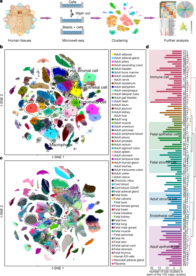

 for a complex disease is given by
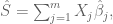
 different genetic loci, the
  are coded genetic markers for an individual at the
  are weights based on the marginal effects derived from a GWAS. The concept of a PRS is straightforward, but the details are complicated, in some cases subtle, and generally non-trivial. There is debate over how many genomic loci should be used in computing a polygenic risk score given that the vast majority of marginal effects are very close to zero (


 be the fraction of phone numbers out of the 23,184 that were “bad”, i.e. incorrect. We can estimate
  .
.  . I’m surprised the number is so low. One would expect that individuals who requested ballots, but then didn’t send them in, would be enriched for people who have recently moved or are in the process of moving, or have other issues making it difficult to reach them or impossible to reach them at all.

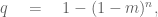
 .
. , then
 .
.
 clearly had wrong indices). I asked that he post it on the bioRxiv so it could receive community feedback, and suggested he fill in some details so I and others could better evaluate the methods (e.g. I pointed out that I thought the use of a Gaussian for
  was problematic).
Recent Comments